Which Sectors To Hold And Which Ones To Fold?
In my Tuesday webinar, I opined that the US equity market is pretty close to a make or break point. While several indicators were still bearish it would not take much in the way of upside action to turn them positive. Of course, they never make it easy, and right now most of the short-term indicators are bearish. That suggests that even if the market does break to the upside such a move would be delayed for a couple of weeks as some kind of trading range forms or downside action works off the overbought condition.
The point of this article, though, is not to examine the market itself, but to see from a long-term perspective which sectors look to be the most and least promising. By “long-term” I am talking about the primary trend, the one that revolves around the business cycle and typically lasts from 9 months to 2 years. Using the PPO, MACD or short-term KST, pretty well all of the sectors are in some way overbought and are declining. This suggests that any broad-based extension to the recent rally if it is to materialize, should evolve later rather than sooner. We also need to remember, that starting in the second week in May, the market enters the more negative holding May-November period. Those short-term KSTs, plus that for the SPY, are featured in Chart 1, where all can be observed to be in an overstretched and negative mode.
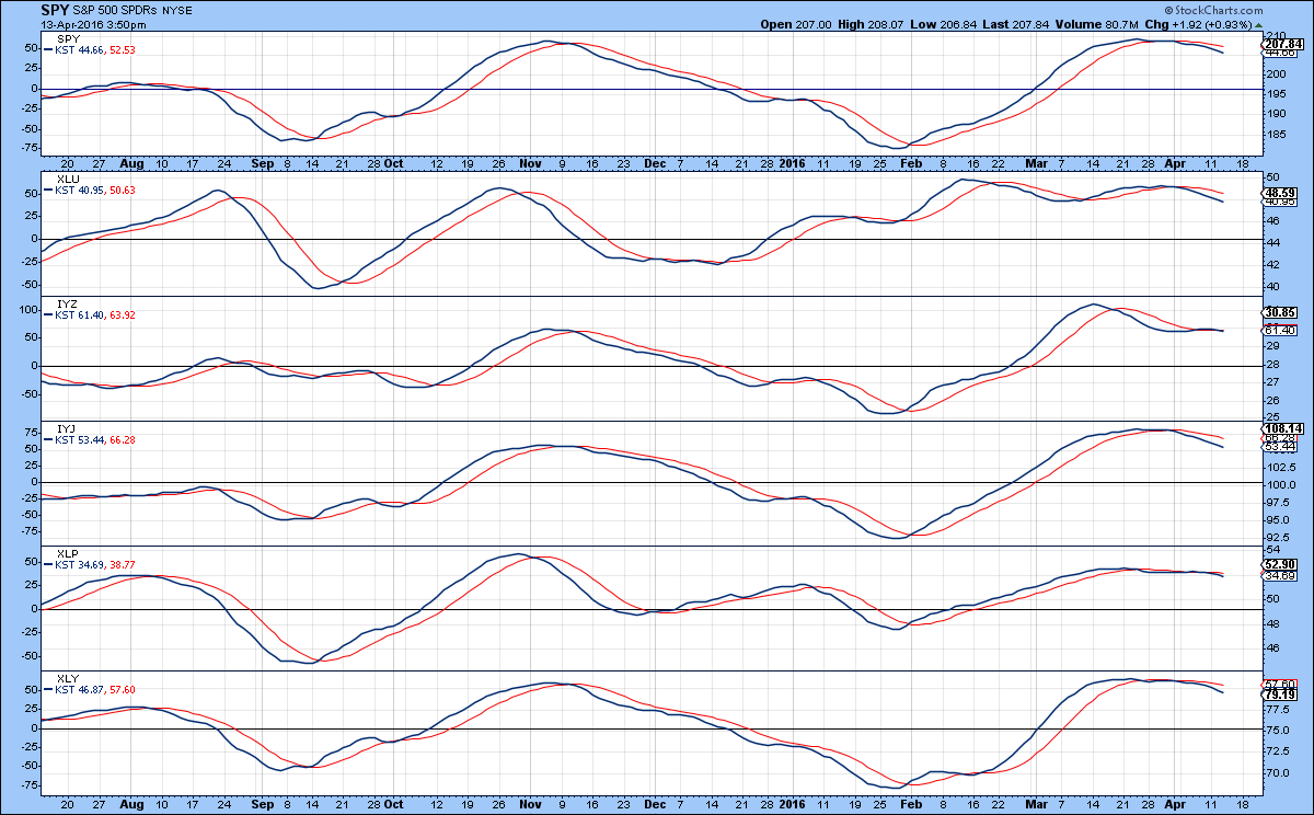
Chart 1
The charts I am using feature what I term my “Nirvana” template. I call it that because it contains all of the key factors that go into a successful long-term analysis. Two windows containing absolute prices, including a 65-week EMA as an objective measure of trend, together with a long-term smoothed momentum (KST) that locates where we are in the cycle. A low and rising KST indicates an emerging bull, whereas a high and declining one suggests a possible impending bear market or an extended trading range. Similar measures are featured for relative action against the S&P Composite in the lower two panels. In an ideal world, we want to identify situations where both KSTs are below zero and crossing their 26-week EMA’s as well as observing a trendline break or a positive 65-week EMA for the price and RS line. A good example is shown in Charts 4 and 6. The opposite example, during the formation of a top, is featured in Chart 3. I want to stress that is by no means a perfect approach, but following it on a consistent basis does place the odds in your favor. If you want to use this template yourself just click on one of the charts using this arrangement and save it as a chart style. Bearing all that in mind let’s take a look at some of the more promising sectors. There’s too much to follow in one article, so I will examine the missing sectors later this week.
Utilities
The Utilities (XLU) are probably the most advanced in their uptrend as any sector. There is no question that on a short-term basis, utilities are overstretched and due for a pause. However, the breakout of the RS line from that seven-year base is impressive. One thing that looks worrying is the fact that the KST has gone bullish from a moderately overbought position. In my experience, a buy signal is a buy signal and is usually followed by a worthwhile advance from whatever level it is generated. The April 2013 signal by the orange arrow was not a particularly great one, but the two previous green arrows show a more normal and positive response from an above zero buy signal. Note that the one momentum failure, flagged by the orange arrow, was associated with a declining KST for relative action. That’s a good example of why one should try wherever possible to have both absolute and relative action agreeing with each other.
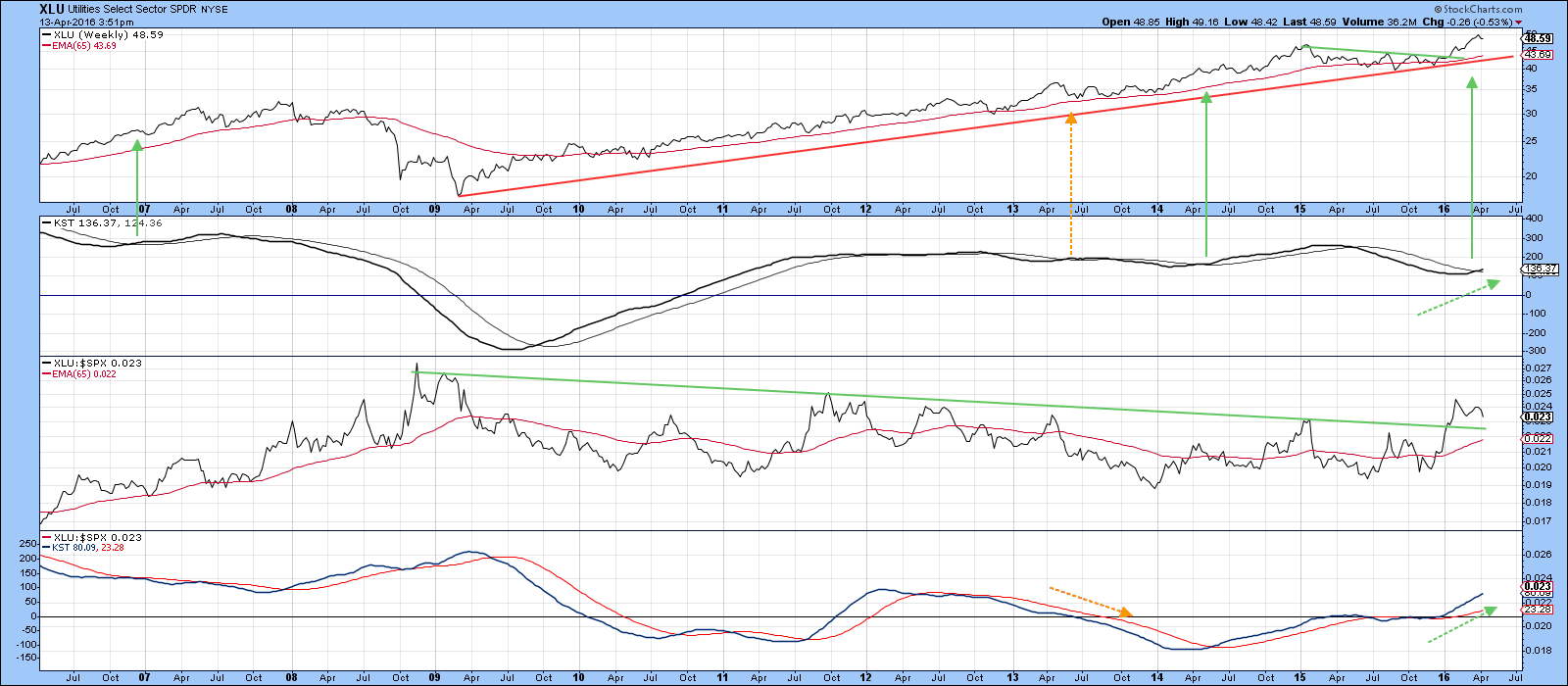
Chart 2
Telecom
The Dow Jones Telecom ETF, the IYZ has also broken out to the upside and crossed its 65-week EMA. Historically crossovers of this EMA have been reasonably reliable except that in the recent trading range there were several whipsaws. The absolute KST is still below its EMA but is nevertheless rising. The price breakout, once its current short-term overbought condition has been worked off, should enable that KST to go positive. In any event, the RS line has moved above a 5-year down trendline and its KST has clearly moved into a bullish mode.
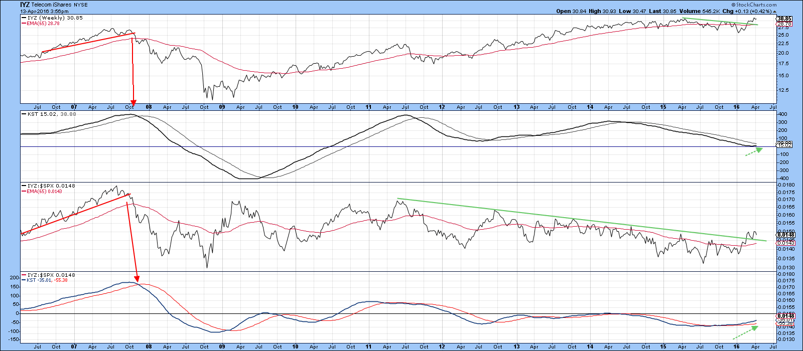
Chart 3
Industrials
I am using the Dow Jones Industrial ETF (IYJ) instead of the Spider Industrials (XLI) because the latter includes transportation stocks which tend to be a market leader whereas industrials are more of a laggard. The IYJ is just below resistance in the form of the green trendline and its KST has gone flat. Consequently, it looks poised to break to the upside. Regardless of whether it does or does not, you can see that the RS line has already broken to the upside and its KST has gone bullish i.e. crossed above its 26-week EMA. Bottom line, the IYJ looks set to outperform the S&P for a while.
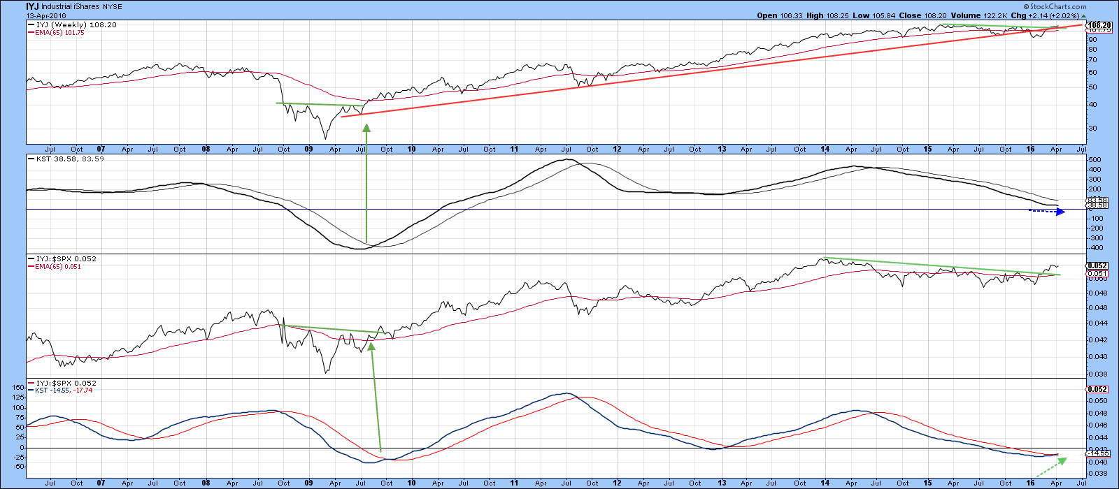
Chart 4
Consumer Staples
The Spider Consumer Staples, the XLP, recently broke above a 1½-year up trendline, which, together with a long-term KST buy signal, suggests higher prices are to come. Note that the price has also been above its 65-week EMA since the beginning of 2009 thereby demonstrating “the trend is your friend” principle in spades.
The relative action is even more impressive as the RS line has broken out from an 8-year base and the KST for relative action is in a bullish, but a relatively subdued trend.
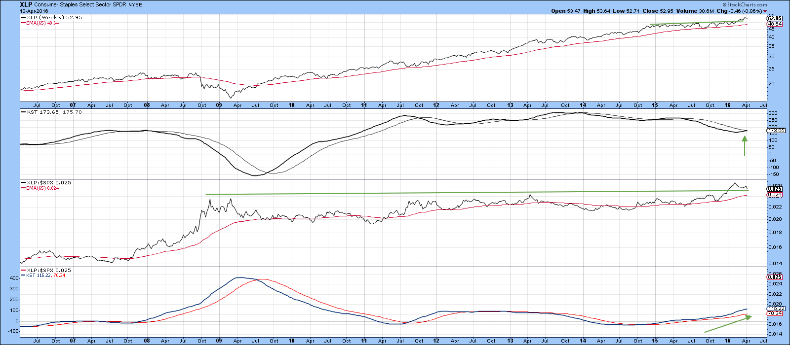
Chart 5
Consumer Cyclicals
Consumer cyclicals in the form of the XLY, have been a stellar performer since 2009 but that may be about to change. First, the price has violated a secondary up trendline. It’s a fairly impressive one due to its length, but also, because it has been touched or approached on numerous occasions. The violation is, therefore, the equivalent of the breaking of a major support zone. The absolute KST has also been bearish for a while. Even so, the price remains above its 65-week EMA and there is no sign yet of a series of declining peaks and troughs. I am therefore assuming that the trend is still positive.
When we turn to relative action the RS line remains above its bull market trendline and 65-week EMA, thereby signaling a positive trend. However, one worrying factor lies in the potential peak of the relative KST. A sell signal has not yet been given but we need to watch this situation very carefully.
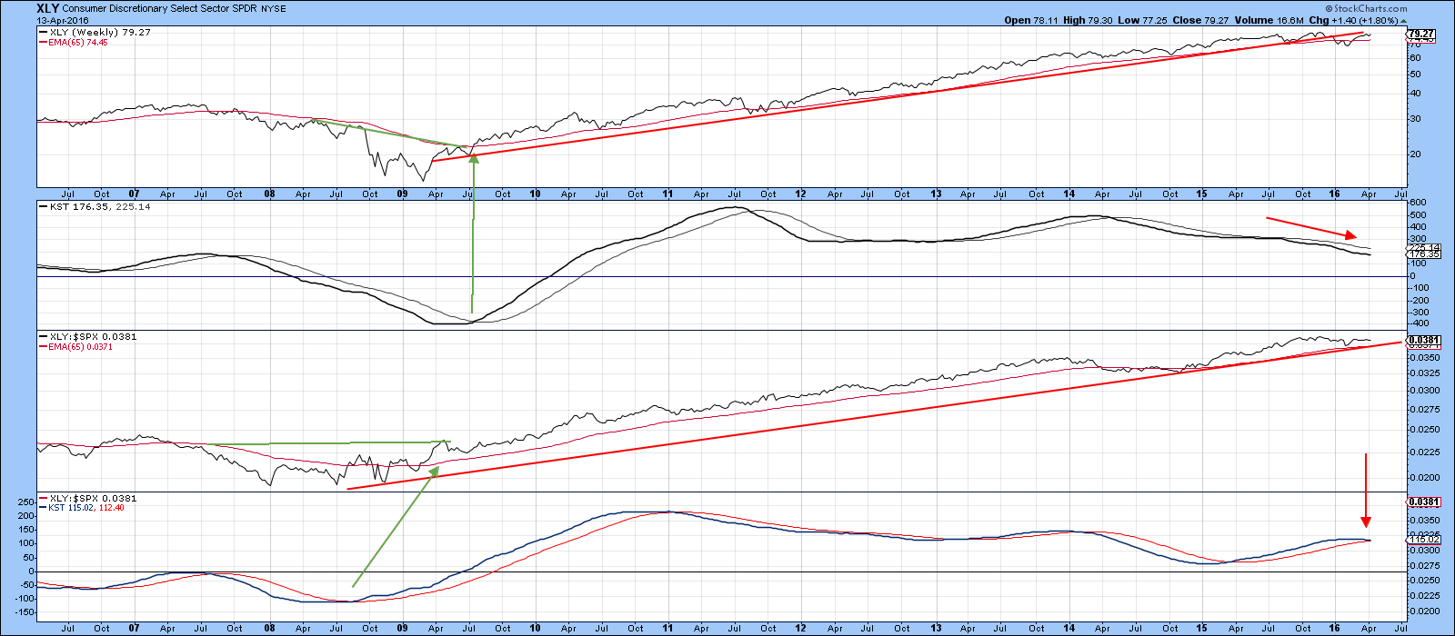
Chart 6
Staples versus Cyclicals
Finally, Chart 7 features the ratio between the two consumer sectors. In the last 15-years or so we have seen three major trendline breaks, two bullish (for staples) and one bearish. The latest penetration took place at the turn of the year and was supported by a rising long-term KST of this relationship. Staples are currently correcting some of that sharp November/February rally, but once those relative gains have been digested it seems likely that they will extend their trend of superior performance. In case your favorite sector has been left out, I'll be covering it in a Part II article later on in the week.
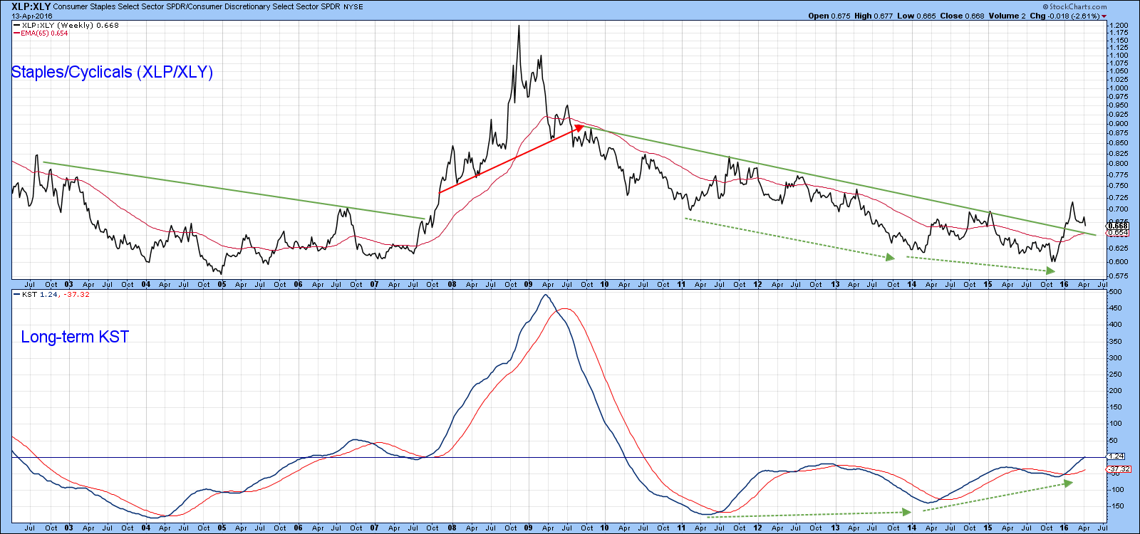
Chart 7
Good luck and good charting,
Martin J. Pring
The views expressed in this article are those of the author and do not necessarily reflect the position or opinion of Pring Turner Capital Group or its affiliates.


