US Equities Primed To Move Higher
- Market reacts to bad news with a nothing-burger and that’s bullish
- NYA Coppock goes bullish
- NYSE A/D Line at all-time high
- Pretty well all sectors pointing north
- Those interest rates
Market reacts to bad news with a nothing-burger and that’s bullish
In my book Investment Psychology Explained, I wrote words to the effect that if a market fails to react to bad news by selling off, then it’s probably in very good technical shape, usually because those expectations have already been factored into the price. Well, that’s exactly what happened on Friday, as the market was hit by two pieces of less than stellar news. Those events were a weak ISM Non-Manufacturing report and an employment report that was way below-expected levels. Bonds and the dollar reacted in the expected way with bond prices rising and the US Dollar falling as shown in Chart 1. Gold chose to advance off the back of a weaker dollar rather than sell-off in the face of a weaker than expected economy. I would have thought that equities would have tanked as prospects for improved profits shrank before our very eyes. Instead, some averages, such as the NYSE actually went up a tad. Could it be that the market, in its wisdom is choosing to focus on some of the better numbers that have been coming out of the Conference Board’s Leading Indicator, the ECRI Weekly Economic Indicator? Could the market be looking at the recent firming on a leading signal like the housing sector? Regardless, the technical picture looks sound to me.
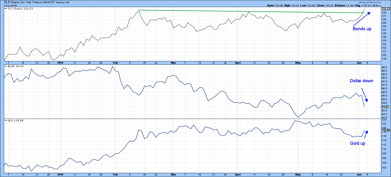
Chart 1
NYA Coppock goes bullish
Chart 2 features the NYSE Composite ($NYA). It’s true that the Index remains within the trading range of the last year, but it is above its 12-month MA. The Coppock Curve, in the lower panel, turned up at the end of May. Such signals, with the notable exception of 2001-2 have accurately called major lows in the last 80-years or so.
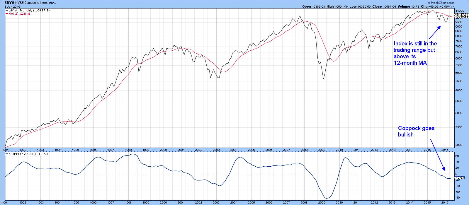
Chart 2
Chart 3 shows that the $NYA also continues to trade above its 200-day and 50-day MAs and the short-term KST has just gone bullish by crossing above its MA. That suggests that an attempt at the overhead resistance at 10,600 is in the works.
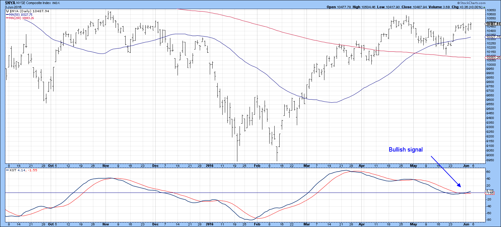
Chart 3
This can be seen more clearly in Chart 4, which shows similar resistance for the S&P 500 ($SPX) and World ETF, the (ACWI). Because the KST is currently trading at a subdued level there is an excellent chance that we will soon see a successful triple breakout.
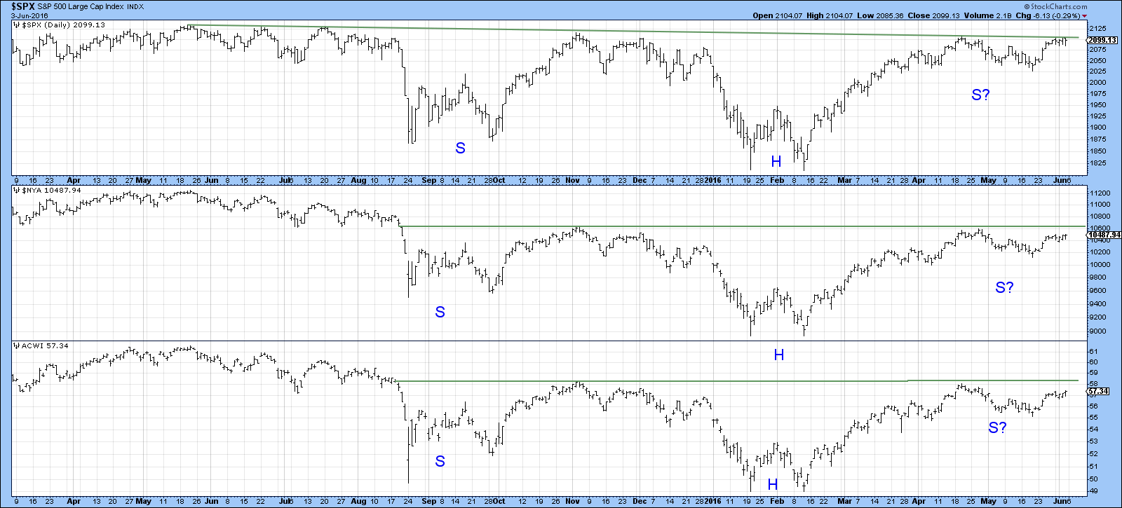
Chart 4
NYSE A/D Line at all-time high
One thing that has impressed me about this rally is the breadth numbers. Chart 5 features the NYSE A/D Line, in the third window. This series has recently registered a new all-time high. Some people complain about this measurement of breadth because it includes non-operating interest sensitive instruments. However, the common stock based A/D line (!NETADNYC), while not at a new high, has certainly cleared the May 2015-June 2016 down trendline. It’s also moved above its previous (April) high, a feat which the NYSE Composite has not so far managed to achieve. The 30-day ratio of this breadth indicator has been in a downtrend for a while. It is currently positioned so that even a small upside push could result in an upside trendline violation.
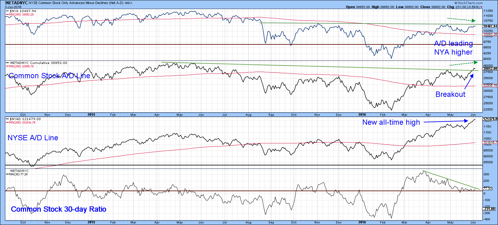
Chart 5
Pretty well all sectors pointing north
Charts 6, 7 and 8 feature the short-term KSTs of the sectors and some key industry groups. They have one thing in common: A rising and subdued KST. There is one exception, the Gold Share ETF, the GDX. Even that one has started to turn. This very broad participation backs up the strong showing in the breadth data and adds further fuel to the idea that those resistance levels in Chart 4 will soon give way under the pressure of rising prices. Remember that these indicators are still at very subdued levels, which leaves plenty of room for upside action before they become overstretched on the upside.
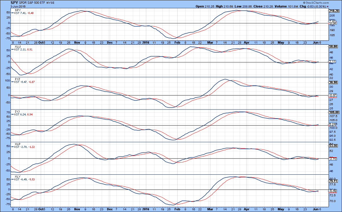
Chart 6
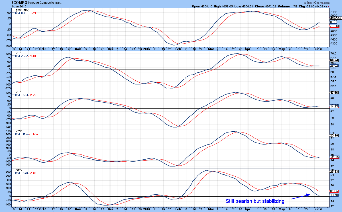
Chart 7
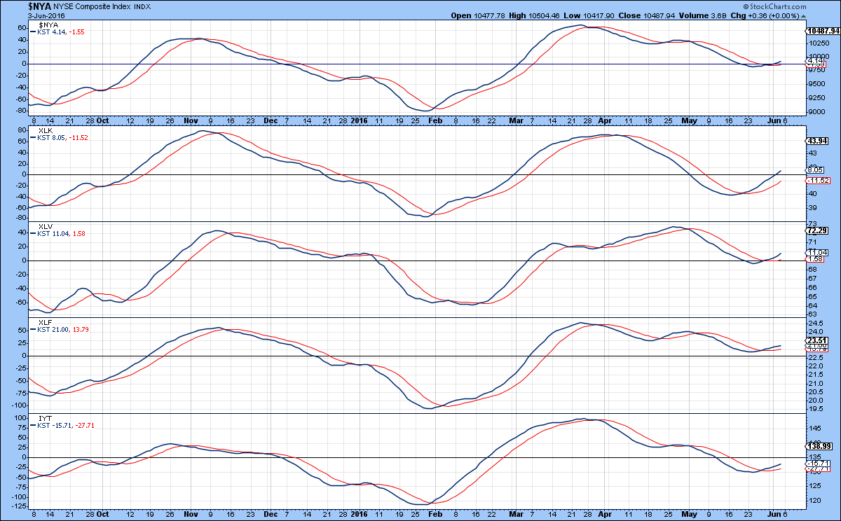
Chart 8
Those interest rates
The credit markets took the weak employment numbers in their stride by rallying sharply on Friday with a commensurate beating down of yields. I must confess, I have vacillated back and forth in the last few weeks on the true direction of rates, principally because the short-term momentum indicators have been doing the same thing. Fed officials have been in the same boat as last week the consensus seemed to be for a June hike, but with Friday’s report, not so much. The principal message the charts are telegraphing now is that many yield series have fallen to key support. Normally we get some valuable clues as to whether that support will hold or fold from the action of the various momentum indicators, but right now those signals are mixed. Take Chart 9, for example, featuring the Fed sensitive 2-year yield. It has fallen back to support in the form of the red up trendline and dashed line marking the previous low at .70%. The intermediate and long-term KST’s are both negative for yields, but their short-term counterpart is still rallying. Even so, it has started to hesitate, which means that a drop below that .70% level would be enough to turn it bearish.
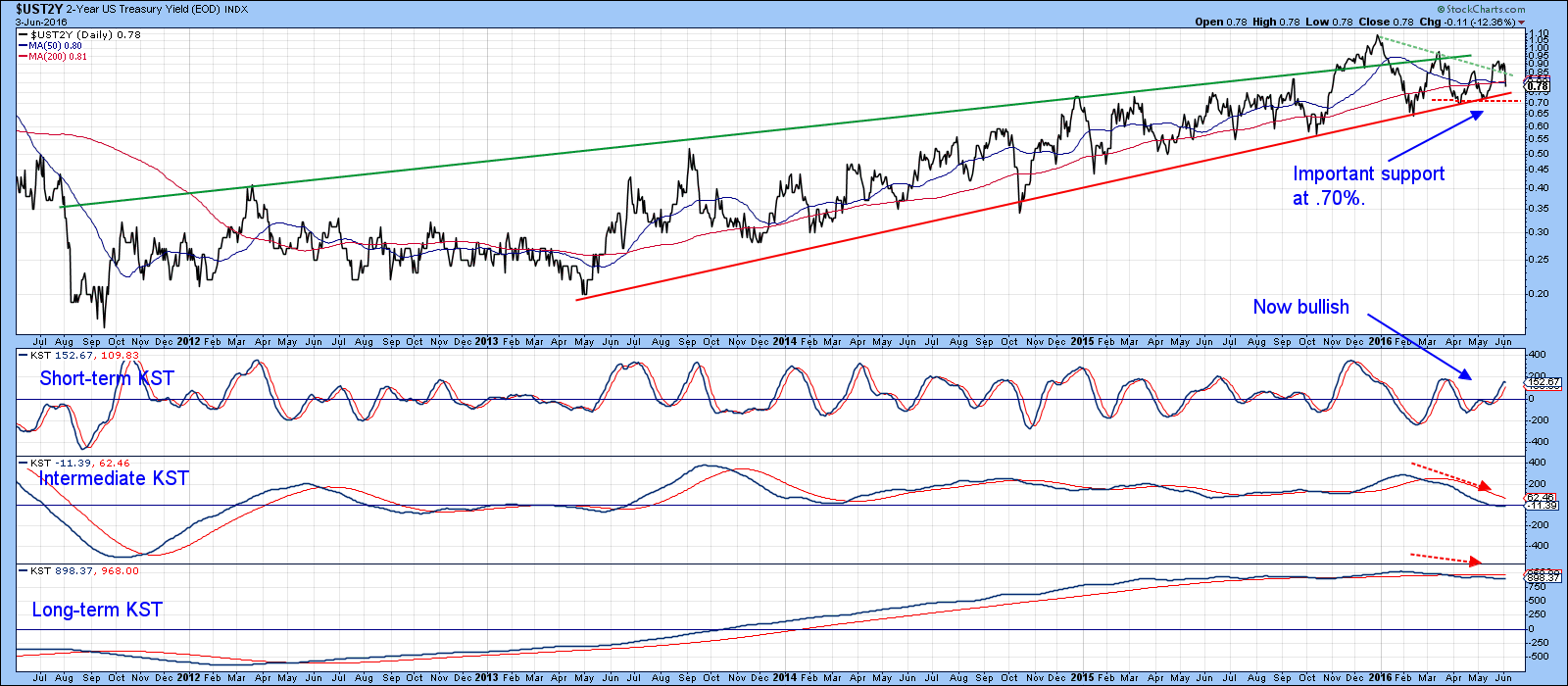
Chart 9
Chart 10 takes us to the other extreme, the 30-year yield. This one has again fallen back to support in the form of a possible neckline of a consolidation head and shoulders pattern. The momentum picture is again mixed with a bearish long-term KST, a slightly rising intermediate series, and a tentatively rising short-term one. One thing is clear, all three are very delicately balanced and could easily tip in either direction. In terms of benchmarks, the breakout points lie at 2.45% on the downside and 2.75% on the upside.
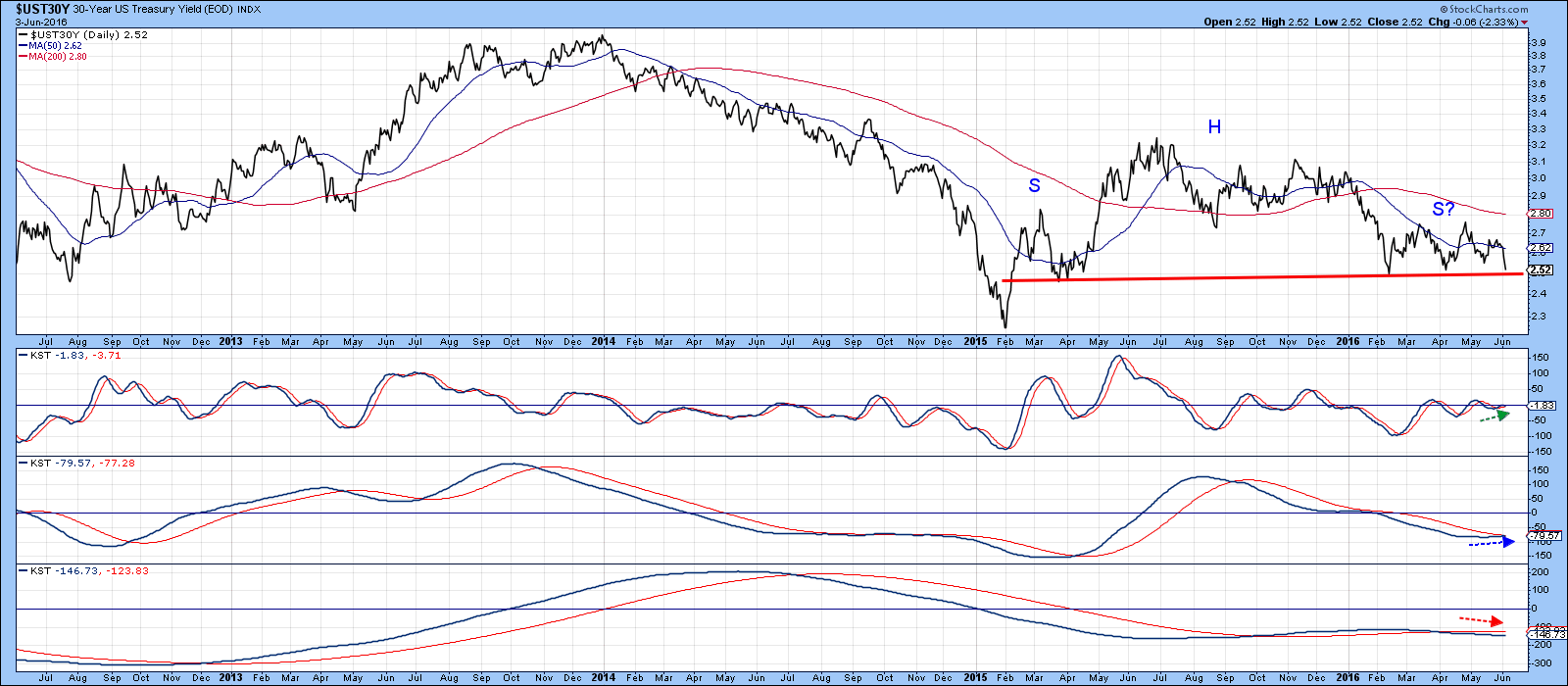
Chart 10
Good luck and good charting,
Martin J. Pring
The views expressed in this article are those of the author and do not necessarily reflect the position or opinion of Pring Turner Capital Group or its affiliates.


