Breakout Or Fakeout
- Take a deep 'breadth'
- Broadening formations
- Long-term indicators support an upside breakout
The recent breakout by the S&P and Dow to new high ground has caught the attention of market observers. Some say that the market is overvalued and that prices are unlikely to move higher. The first part of that statement is certainly true but in a close-to-zero rate interest rate environment in the US, arguably stocks may not be so expensive. I have always felt that valuation tools, such a P/E’s, are really measures of sentiment as much as anything else. Their readings certainly indicate vulnerability when at high levels. However, I believe that the trend of sentiment is more important than the level. Just because elastic becomes stretched doesn’t mean it’s going to snap right away, as it can continue to extend well beyond what we may assess as the likely breaking point. The same is true of markets, which are perfectly capable of overshooting.
Take a deep 'breadth'
It seems to me that we are better served by putting some of these factors aside, focusing instead on the tape. Chart 1, for instance, shows that the NYSE Composite ($NYA) is being led higher by the basic NYSE A/D Line. Some argue that this series is flawed because it includes numerous interest sensitive securities. That argument misses the point that falling interest rates are generally bullish for the economy and therefore the equity market. In any event, the A/D Line constructed solely from common stocks has also reached a new high.
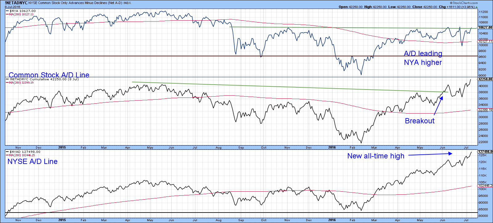
Chart 1
Chart 2 underscores the strong underlying breadth, since the NYSE upside/downside volume line has broken above a key resistance trendline. Now it’s true that this market measure has not registered a new all-time-high. However, since the February low it has confirmed every new high in the A/D Line itself. As long as that continues to happen it’s definitely a plus.
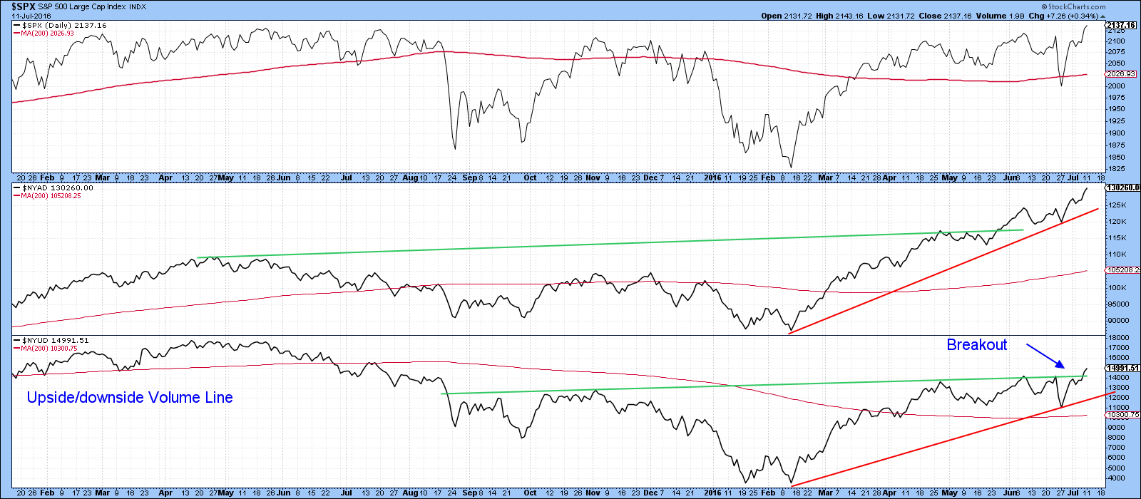
Chart 2
Broadening formations
Chart 3 shows that the S&P Composite ($SPX) has just completed a bullish continuation right-angled, broadening formation. These, patterns, otherwise known as broadening formations with a flat top, when completed, typically offer a big bang for the buck. They often push prices far higher than their size might suggest. The reason, which would certainly apply in this case, is that the broadening part gradually weeds out weak and nervous holders, as successive lower lows triggers stop losses and the like. After the final shakeout prices are not only then free to follow their upward course, but gradually attract more short-covering as prices work their way higher. In the current situation that final decline was 'short in-time but long on-panic', as the Brexit sell-off unexpectedly unnerved many traders who were expecting a “Remain” vote. When a market reacts to bad news by moving above the point where the news developed that’s usually a very positive sign. Note that the KST has just started to turn up from a position very close to zero. On the one hand, that’s bullish because it means that prices can move much higher before this indicator becomes overbought. On the other, it also means that they must continue to work their way higher, otherwise, the KST will reverse to the downside from a very low reading. A breakdown from a low reading is a sign of vulnerability when confirmed by the price. In this instance, that confirmation would come with a drop below the red up trendline.
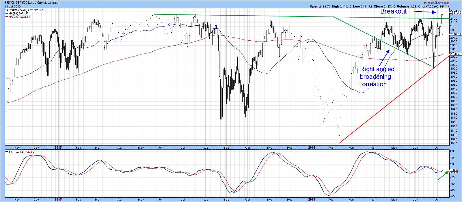
Chart 3
The situation is certainly a crucial one. Chart 4 shows us that the NYSE Composite ($NYA) is right at its breakout point, so it has not yet confirmed the S&P ($SPX) and the Dow ($INDU). Once again, the KST is positive, but hesitation at this point could result in a reversal from a very low level.
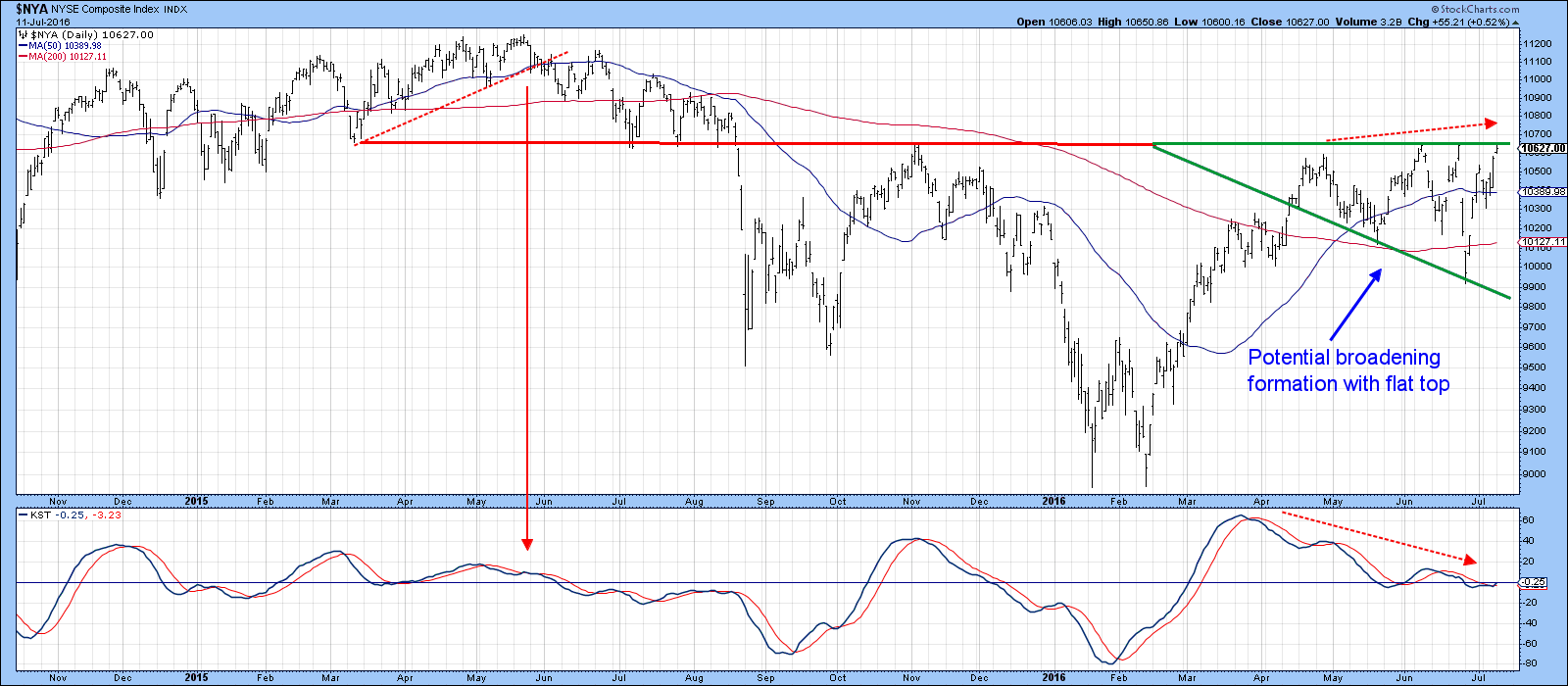
Chart 4
Long-term indicators support an upside breakout
The longer term indicators are, on balance, supportive of a successful breakout. Chart 5 shows that the Coppock Indicator has reversed to the upside from a position below zero. This series has a very long and accurate record of triggering new bull market moves in this way. The premature 2001 buy signal represents the exception rather than the rule.
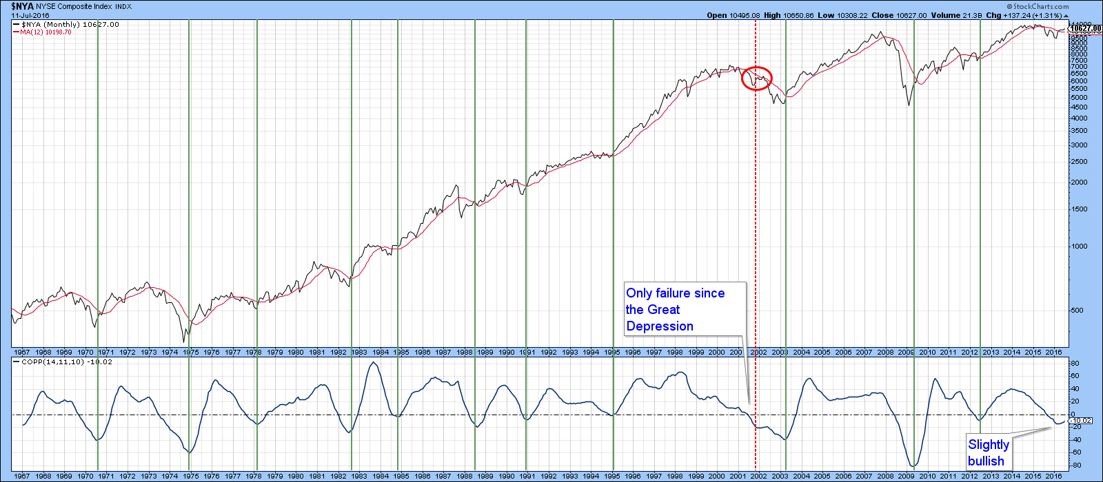
Chart 5
Also, Chart 6 compares the monthly progress of the S&P 500 ($SPX) to the long-term KSTs of the principal Spider sectors plus telecom (IYZ). The vertical lines approximate points on the chart when the majority of these series has reversed direction. Red lines indicate bear moves and green lines indicate bullish trends. This is by no means a perfect approach, as the sell signal in 2011 will attest. However, it does indicate that when most series are rising, the S&P rallies. Right now the majority of the long-term KSTs for the various sectors are advancing, which supports the recent S&P breakout. It does not tell us how high or how long or the implied advance might take. As long as the majority of these series continue to rally, it does suggest that US equities will experience broad upside participation. Incidentally, if you want to follow this chart arrangement please click on it and save the result in a chart list. Unfortunately, there is no way to eliminate the multiple equilibrium lines.
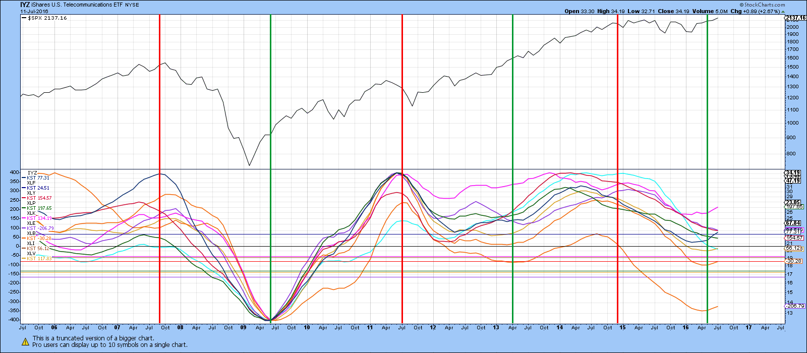
Chart 6
Another long-term indicator worth monitoring is the Special K (SPK). I’ve been featuring the SPK for the NYSE Composite in my webinars for the last couple of months or so because it has been very close to a major buy signal. This indicator, which is constructed from the sum of the short, intermediate and long-term KSTs simulated for daily data, usually peaks and troughs with the price series it is monitoring. That’s easy to see with the benefit of hindsight, but the trick is being able to identify reversals close to their primary trend turning points. That can most easily be done with trendline violations. Using that approach Chart 7 shows that this indicator is extremely close to triggering an upside breakout.
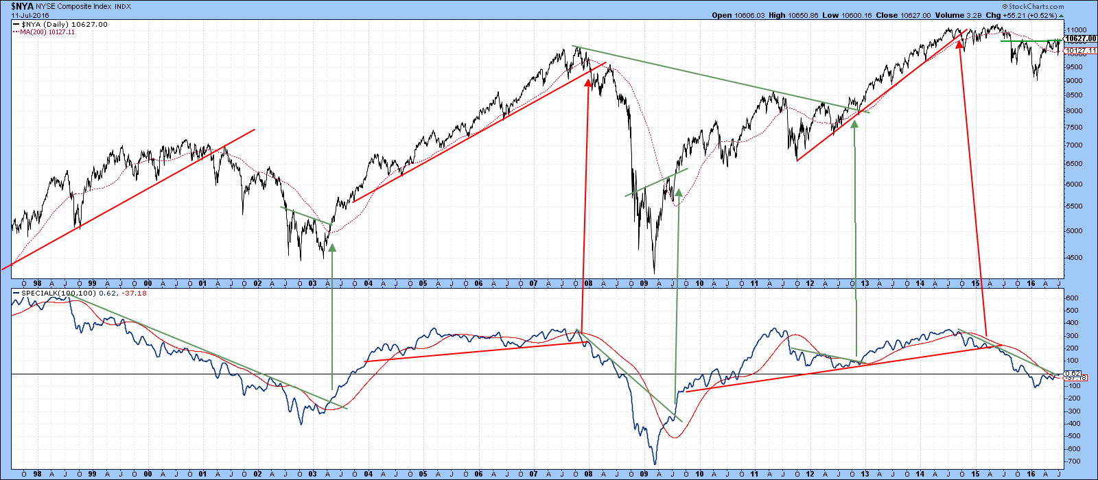
Chart 7
Since the price itself, as you can see from Chart 8, is also at resistance, I think we can say that the NYSE Composite has reached a very important technical juncture. Note the false Brexit downside move below the red trend line. Usually, false moves such as this are followed by above-average advances, as traders reposition themselves in the direction of the true upward direction of market activity.
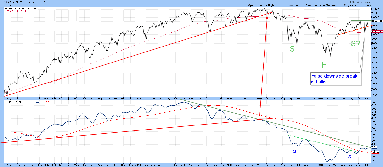
Chart 8
Good luck and good charting,
Martin J. Pring
The views expressed in this article are those of the author and do not necessarily reflect the position or opinion of Pring Turner Capital Group or its affiliates.


