Bearish Short-Term Equity Indicators May Bring Tears To The Bears Themselves!
- Short-term technicals
- Two indicators that have not yet gone bullish
- More base building by commodities
- Oil greasing the way?
Last week we looked at some of the longer-term equity indicators. I concluded that prices were likely to work their way significantly higher for the balance of the year, despite historically high readings in the Shiller P/E ratio. I also stated, that while sell signals from short-term indicators do not have the same amount of power in a bull market as they do during primary bear trends, we still needed to be cognizant that many of them had already turned negative.
Short-term technicals
Bearing that in mind, Chart 1 compares the S&P to its KST. Note how this momentum indicator went bearish in April. Instead of declining, the market went sideways until July. After that, a new buy signal sent it higher. That’s typical behavior for sell signals that develop under the context of a bull market. They make it very difficult to profit from short positions unless your time horizon is extremely limited.
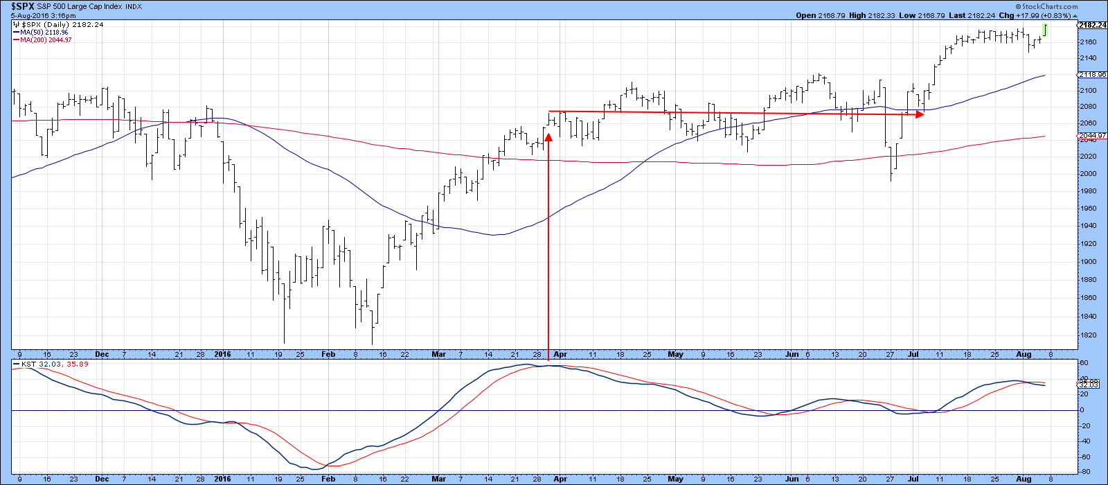
Chart 1
Chart 2 tells us that the $SPX, $NYA and MSCI World ETF, the ACWI, have all broken out from large inverse head and shoulders formations. The correction to that move has so far taken the form of ranging action, as prices in two instances, experienced a normal retracement move. In the case of the S&P, prices are starting to re-confirm that breakout as it pushes upwards to new high territory.
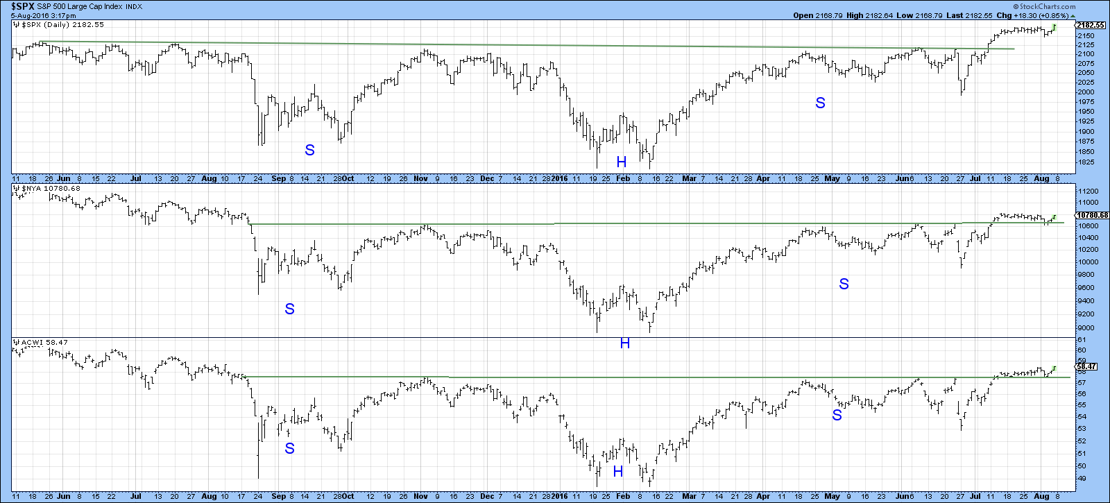
Chart 2
Chart 3 shows that our McClellan Volume Oscillator (!VMCOSINYC) model is still on its sell signal. That’s because the (black) 10-day EMA is trading below its (red) 20-day counterpart. Neither is overextended, so it’s possible that the model could turn bullish in the near future.
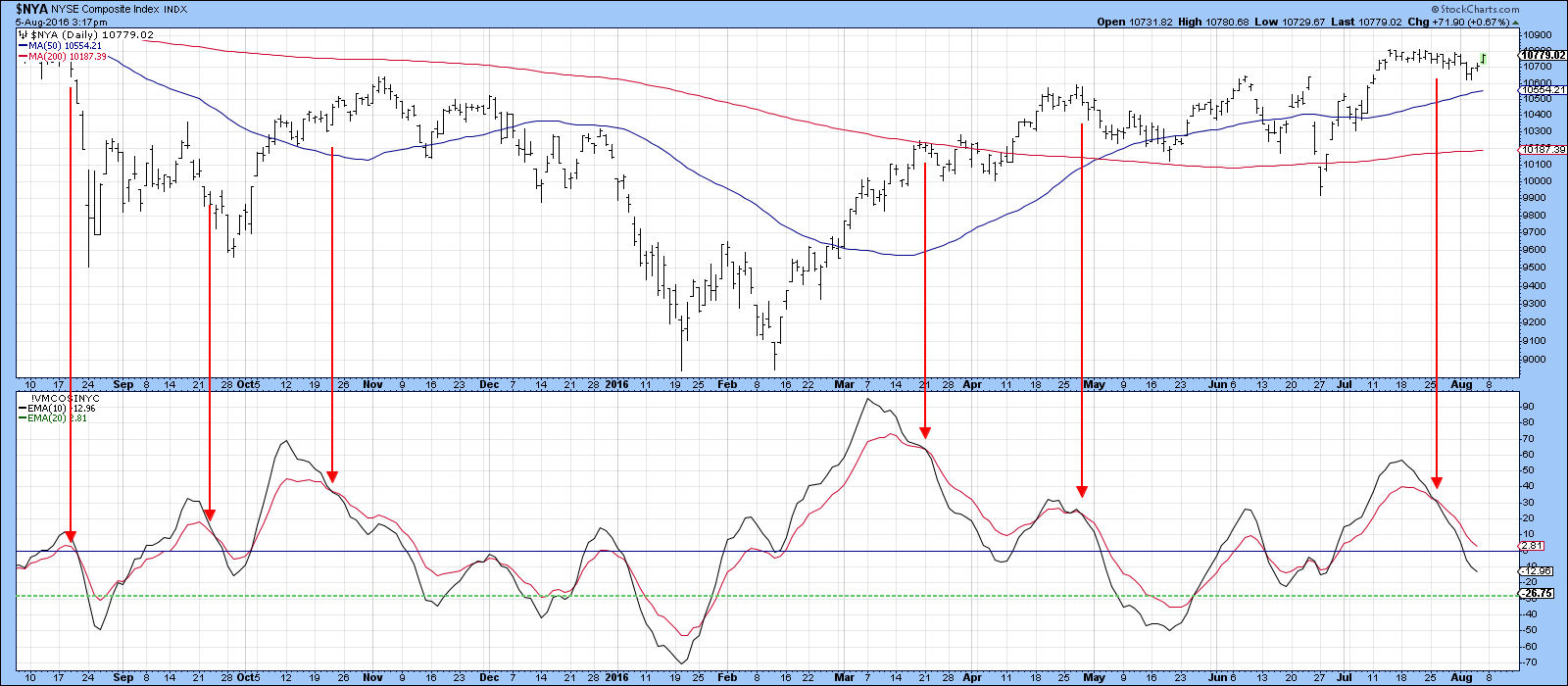
Chart 3
Two indicators that have not yet gone bullish
Charts 4 and 5 feature two long-term indicators that have not yet gone bullish. These are Dow Theory and the credit spreads. Of course, it’s not a bull market requirement that everything turns positive, but since technical analysis deals in probabilities, the more indicators that are positive the merrier!
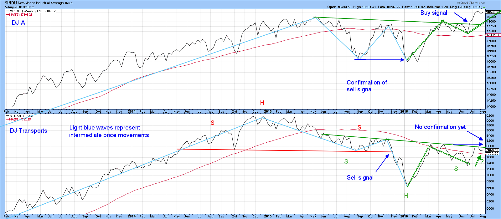
Chart 4
Dow Theory states that when the Dow Industrials ($INDU) are experiencing a series of rising intermediate peaks and troughs and the Transports ($TRAN)(formerly rails) are doing the same thing, the primary trend is bullish and vice versa. Most technicians use daily charts to analyze these relationships, but for simplification purposes, I have plotted Chart 4 (above) in a weekly format using Friday closes. The blue waves reflect intermediate moves. The Transports triggered a sell signal in November 2015 as the price slipped below the August low, but this was not confirmed until January when the Industrials also took out their August bottom. So far, that turned out to be a terrible signal as it developed right at the February low. No one ever said that the Dow Theory is perfect! Now we find that the Industrials are experiencing a series of rising intermediate peaks and troughs following their June breakout. The Transports, though, have not yet confirmed. They need a Friday close above their intermediate high of 8057 to do so. That means that based on this interpretation, Dow Theory is still bearish.
The bullish stakes are particularly high on this particular signal because a move above 8057 would mean that the Transports had completed a 1-year reverse head and shoulders pattern, which would then cancel the 2014-15 head and shoulders top. Cancellations of this nature, it should be noted, are often followed by above average price moves.
Chart 5 features the ratio between the Iboxx High Yield ETF, the HYG and the Barclays 20-year Trust, the TLT. A rising line means that bond investors are growing in confidence as they prefer risky junk to high-quality credit instruments. Because a rising curve reflects a trend in sentiment that downplays the risk of default, it’s also good for the economy and equity markets. Right now the ratio is in a bearish mode. That’s because it is below the 200-day MA and the red breakdown trendline. However, it looks as though that status may soon change since the Special K, in the bottom window, has crossed above its MA and the 2014-16 down trendline. Historically, MA and trendline crossovers have usually resulted in worthwhile moves. If so, that would strongly hint that the ratio itself will move above its 200-day MA and the red breakdown line. A daily close above 0.65 would, I think, do the trick.
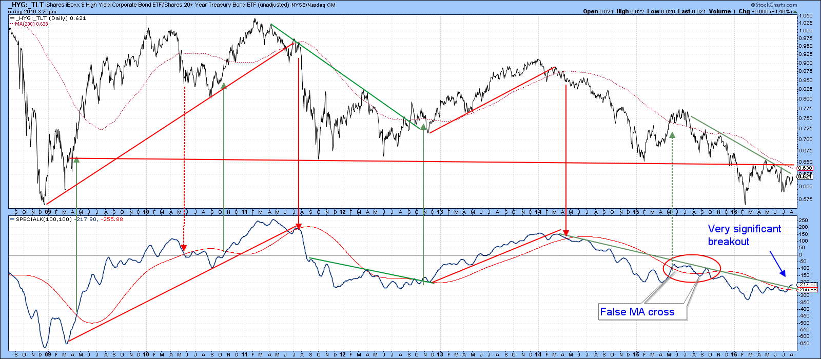
Chart 5
More base building by commodities
Last week I pointed out that the DB commodity ETF (DBC) and the Bloomberg Commodity ETN (DJP), respectively, had experienced bullish outside bar and three-bar reversals. It was also suggested that a “right” shoulder rally of a potential reverse-head-and-shoulders pattern was in the wings. Commodities immediately thumbed their nose at this idea by temporarily breaking below the extremity of the outside day, but in the meantime have begun to reverse again. As a result, the DB Commodity ETF, the DBC, has violated its July/August down trendline and the 12-day ROC has penetrated an even longer one. This is shown in Chart 6. Note also, the recent pick-up of volume in the ellipse. This indicates that a small selling climax has developed.
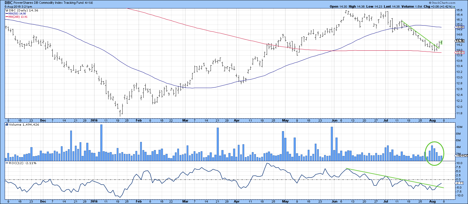
Chart 6
Chart 7 features the Bloomberg Commodity ETN (DJP), a more broadly based series, which explains its slightly different price action. However, the two indicators in the third window look as if they may be in the process of bottoming. They represent a smoothed ratio of commodities registering net new highs over a 10- and 50-day period. Note that the chances of success when the 50-day series bottoms out is much greater during a bull market. We are labeling the current trend as being bullish in view of the fact that long-term momentum is positive, as is the price relative to its 200-day moving average.
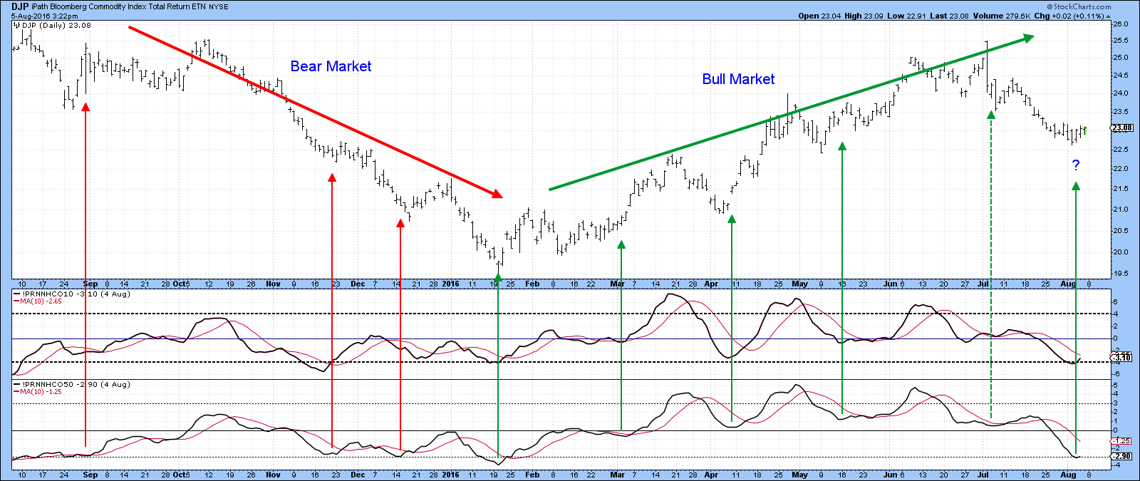
Chart 7
Chart 8 sets the scene from a longer-term perspective, where you can see that the DBC has bounced exactly where it should i.e. at the 200-day MA. If the current oversold momentum indicators can translate into a bounce that takes the price above the $16 level, then it would have completed a very important base. The two ratios in the middle and bottom window offer the stock market’s point of view since they compare an inflation sensitive to a deflation sensitive stock group. They are much closer to an upside breakout. Remember, you can follow this chart yourself by clicking on it and saving the result in your favorite chart list.
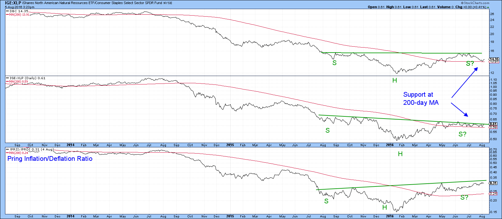
Chart 8
Oil greasing the way?
Chart 9 shows that Brent crude is most likely in a primary bull market since it is above its 200-day MA. Also, the Special K is above its average and has violated two important trend lines. This week $BRENT passed a key test by rallying back above its 200-day MA. If this truly is a bull market, which we believe is the case, then the current oversold KST condition will be sufficient to push the next rally above the neckline of a potential reverse head and shoulders pattern.
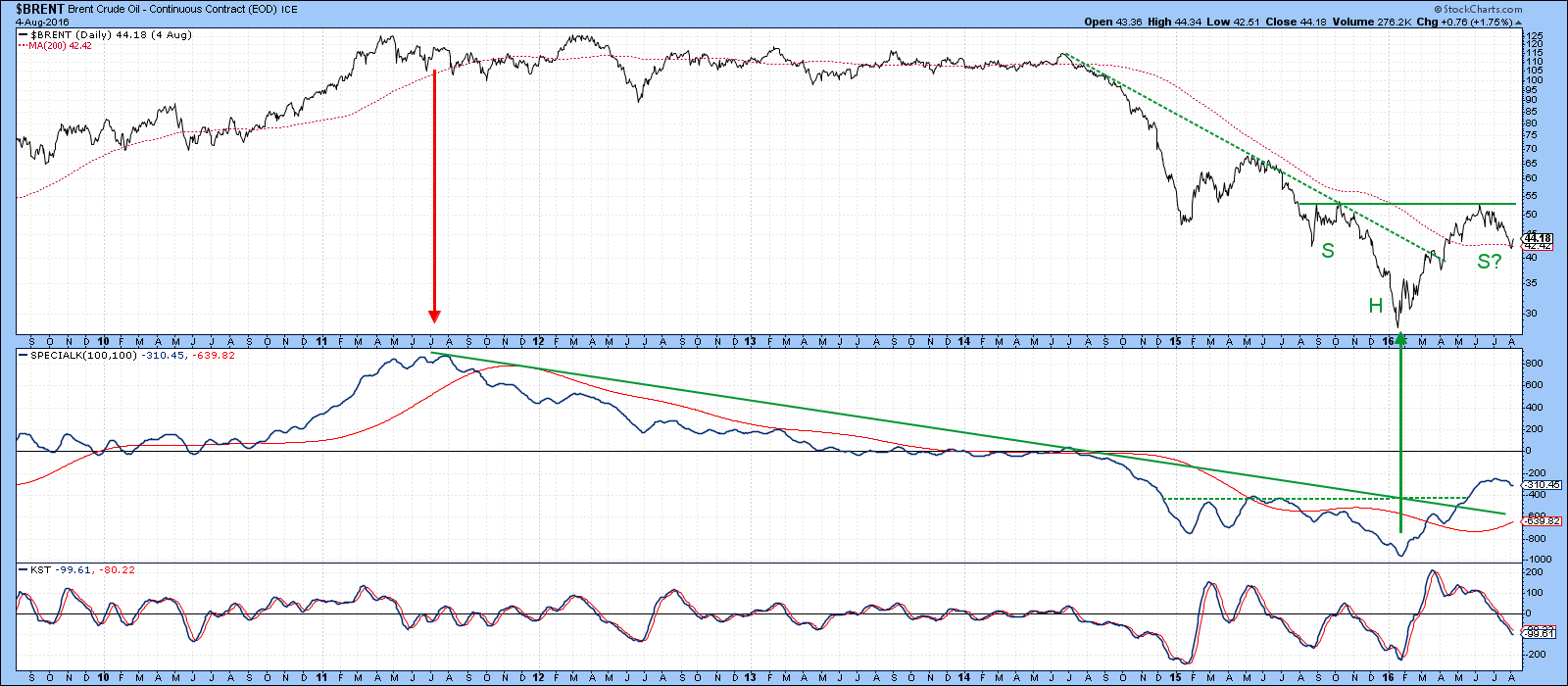
Chart 9
Good luck and good charting,
Martin J. Pring
The views expressed in this article are those of the author and do not necessarily reflect the position or opinion of Pring Turner Capital Group or its affiliates.


