Bullish Seasonals And A Near-Term Oversold Condition Argue For An Interesting November
- Seasonals are bullish
- Current condition of some short-term indicators
- The bullish part of the year
- Time to raise those beta glasses?
The stock market has really been in a trading range for the last two years. At my bi-weekly webinar this week, I pointed out that several long-term indicators have already gone bullish. I used my Financial Velocity Index (FVI) as an example, but I could have drawn from a host of other indicators to make the exact same point. The FVI is constructed by combining momentum measures for stocks, bonds and commodities into one composite series. Since the raw data are pretty jagged the series plotted in the chart is a 6-month smoothing. The idea is that when the indicator falls to the green dashed horizontal line and reverses to the upside it reflects the fact that enough liquidity has been pumped into the system to be consistent with rising equity prices. The vertical lines flag previous signals since the turn of the last century. In total, there have been twenty. All were associated with an advance of some kind, but three (flagged by the red lines) were not particularly timely. The remaining seventeen though, offered some pretty good signals. Another signal was recently generated. The size of the ensuing advance is always a mystery at the time, but based on most previous instances, the current one should last well into 2017. Bearing in mind that positive backdrop, let’s examine the current short-term technical picture to see whether it might be consistent with the start of a rally.

Chart 1
Seasonals are bullish
First, it’s important to understand that next Monday starts the end-of-the-month bullish seasonal. There are different versions of when phenomenon starts and ends, depending on the historical range of dates over which it is calculated. The period I used in my book Technical Analysis Explained was based on calculations made by Bruce Jacobs and Kenneth Levy for the 89-year period ending in 1986. Their results are shown in Chart 2, covering the last trading day of the month and the first three of the new month. It certainly does not mean that every month works this way, but it does substantially increase the odds compared to the average day on the extreme right. Some say this seasonal has swung since the 1980’s to embrace the last four and first five, of the old and new month respectively. However, whichever way we look at it, this bullish seasonal is close at hand.
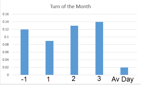
Chart 2
The November-April period is also bullish. Jeffrey Hirsch, in the Stock Trader’s Almanac, calculates that the average S&P gain for these months has been 7.1%, compared to 1.4% for the May/October period. November starts next week, so let’s have a look at some of the short-term oscillators to see what they are saying.
Current condition of some short-term indicators
Chart 3 compares the S&P Composite ($SPX) with the percentage of NYSE stocks that are above their 50-day MA. The arrows show when this series has reversed from or below the oversold green zone that prices have usually rallied. The dashed arrows flag sub-par or failed signals. The indicator recently reversed once again, suggesting that prices are likely to advance in the near future. If prices do not advance, that could be problematic because each of the failed signals, flagged by the dashed arrows, were followed by a nasty decline.
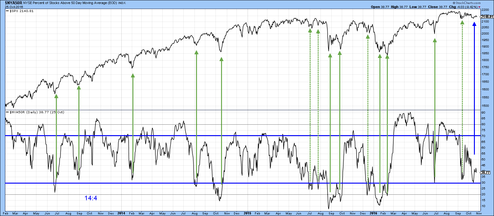
Chart 3
Chart 4 shows a 10-day EMA of the McClellan Volume Oscillator ($VMCOSINAS) for the NASDAQ. It has just reversed to the upside from an overstretched position. The solid vertical lines indicate that most of the time such action foreshadows some kind of an advance.
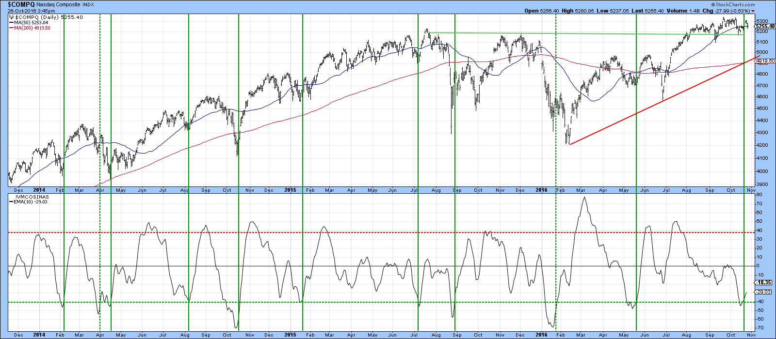
Chart 4
Finally, Chart 5 demonstrates that not all the indicators are oversold, as the KST has been moving sideways at a pretty neutral level. This indicates a fine balance between buyers and sellers. I am expecting an upward resolution, because of the factors cited above. However, a daily close by the S&P ETF (SPY) below $212 would signal that further corrective action lay ahead. On the other hand, if the market can prove itself, with a daily close above the upper trendline and 50-day MA, say to $216, that would likely do the trick.
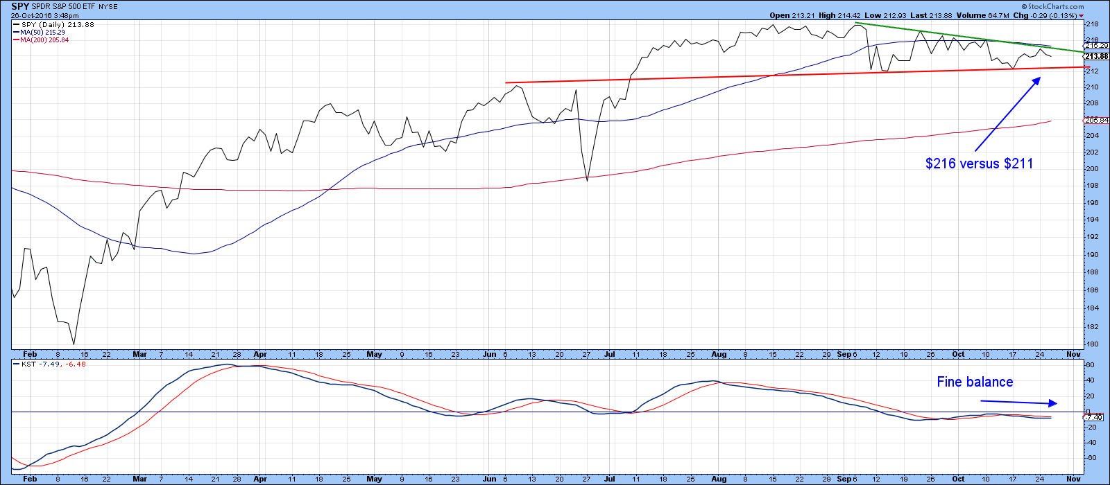
Chart 5
The bullish part of the year
If our positive scenario works out, we can take this a step further by considering which specific sectors outperform the market in the November-April period. My friend Sam Stovall at S&P Capital IQ has done some work on this. Sam is quoted in a US News article in 2015 by Kira Brecht, saying that higher beta groups, such as technology, industrials, and materials tend to do better during this time of the year. This contrasts with the “Sell in May and go away" until the end of October period, where defensive consumer staples and health care make good hiding places.
In that respect, Charts 6 and 7 feature technology and industrials. Clearly, as far as this year is concerned, these sectors are well positioned to benefit from a strong seasonal tailwind as both have broken to the upside on both an absolute and relative basis and are experiencing positive KST action.
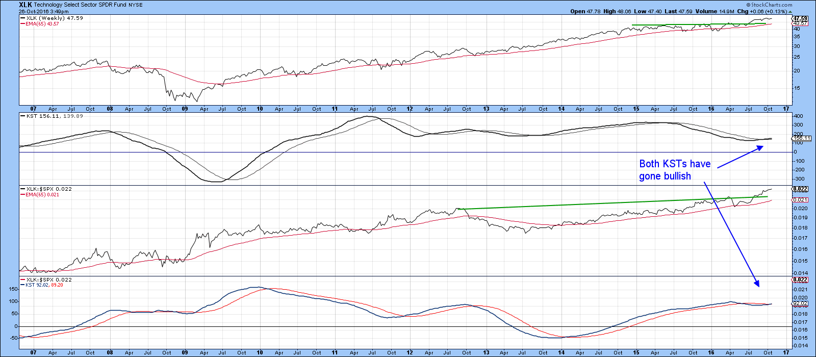
Chart 6
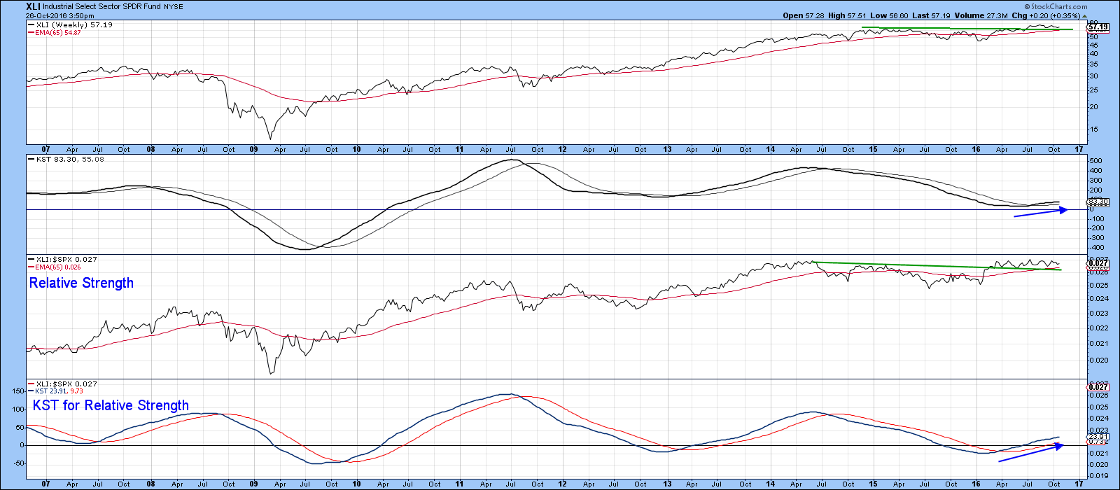
Chart 7
On the other hand, if there is going to be vulnerability, Healthcare would be one of the places to watch. That’s because the price and relative action of the XLV have both violated key up trendlines. The absolute violation is not that decisive as yet. However, the fact that both KSTs are in a bearish mode suggests that this sector will be swimming against the tide for a while.
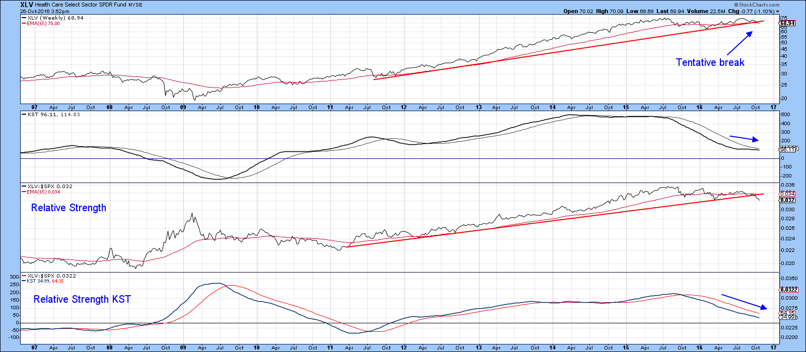
Chart 8
Time to raise those beta glasses?
Aggressive investors could consider the S&P High Beta ETF (SPHB). This includes the 100 stocks that have the highest trailing 12-month standard deviation, or more simply "the greatest wiggle over the last year," as quoted by Stovall. For investors who may be more comfortable riding a potential roller coaster, the S&P High Beta index has outperformed the S&P 500 since November 1990, with an average gain of 12.3 percent from November through April versus an average gain of 8.1 percent in the S&P 500. Note in Chart 8 that it also looks pretty attractive this year as well, with a nice absolute and relative breakout, nicely supported by both momentum indicators.
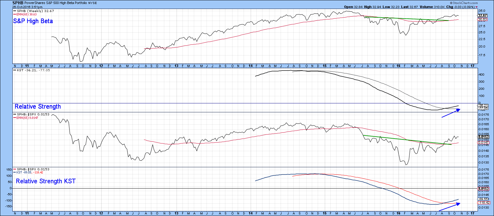
Chart 9
Good luck and good charting,
Martin J. Pring
The views expressed in this article are those of the author and do not necessarily reflect the position or opinion of Pring Turner Capital Group or its affiliates.âÂÂ


