Is It Time To Give Up On The Stock Market?
- What’s happening at the margin?
- Short-term technical position oversold…but
- Gold breaks out against bonds
- Dollar showing weakness
What’s happening at the margin?
Last week I wrote an upbeat article pointing out that the stock market was oversold on a near-term basis as it approached a bullish seasonal 'end-of-the -month' and the bullish November-April holding period. That suggested to me that since the long-term indicators were bullish, a rally to new highs was in the cards. I also pointed out that if the S&P ETF (SPY) broke below $212 that the rally would be delayed and that further re-accumulation would be likely. Well, that $212 level has been slightly exceeded and the red trendline in Chart 1 decisively violated. So far, my scenario has failed to play out. At this point is seems that the uncertainty of the election will put the rally on hold, even though many indicators are already oversold. The way I look at it, is that the more cautious people become, the stronger the technical position when the market finally turns.
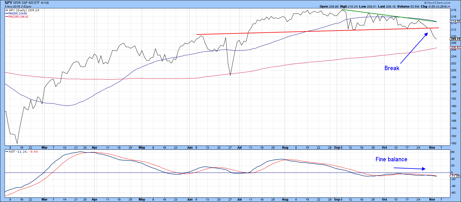
Chart 1
However, I remain optimistic, since the longer-term indicators I follow are to a man (or woman if you prefer), still bullish. Indeed, NYSE margin data for September was recently reported. Chart 2 shows that the PPO, calculated using the 4/18 month parameters from that data, recently crossed zero, thereby signaling a positive expansion in debt accumulation. In other words, market participants are growing in confidence as they choose to take on a greater number of speculative positions. The green arrows flag that the previous nine occasions of a positive zero crossover in this momentum series were all followed by a worthwhile stock market rally. Not every situation was followed by an immediate advance, such as the 1967 and 1975 experiences. However, none were associated with a major decline either.
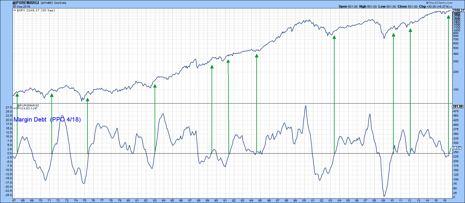
Chart 2
This improvement in the technical position by margin debt and other long-term indicators look likely to outweigh short-term considerations such as the red line violation in Chart 1. Indeed, most of the major market benchmark indexes remain above their 200-day MA’s. For example, the S&P ETF (SPY), at $209, remains above its 200-day MA (Chart 1), The NASDAQ Composite (Chart 3), and the MSCI World Stock ETF (ACWI) in Chart 4 are also positively positioned against the 200-day time span.

Chart 3
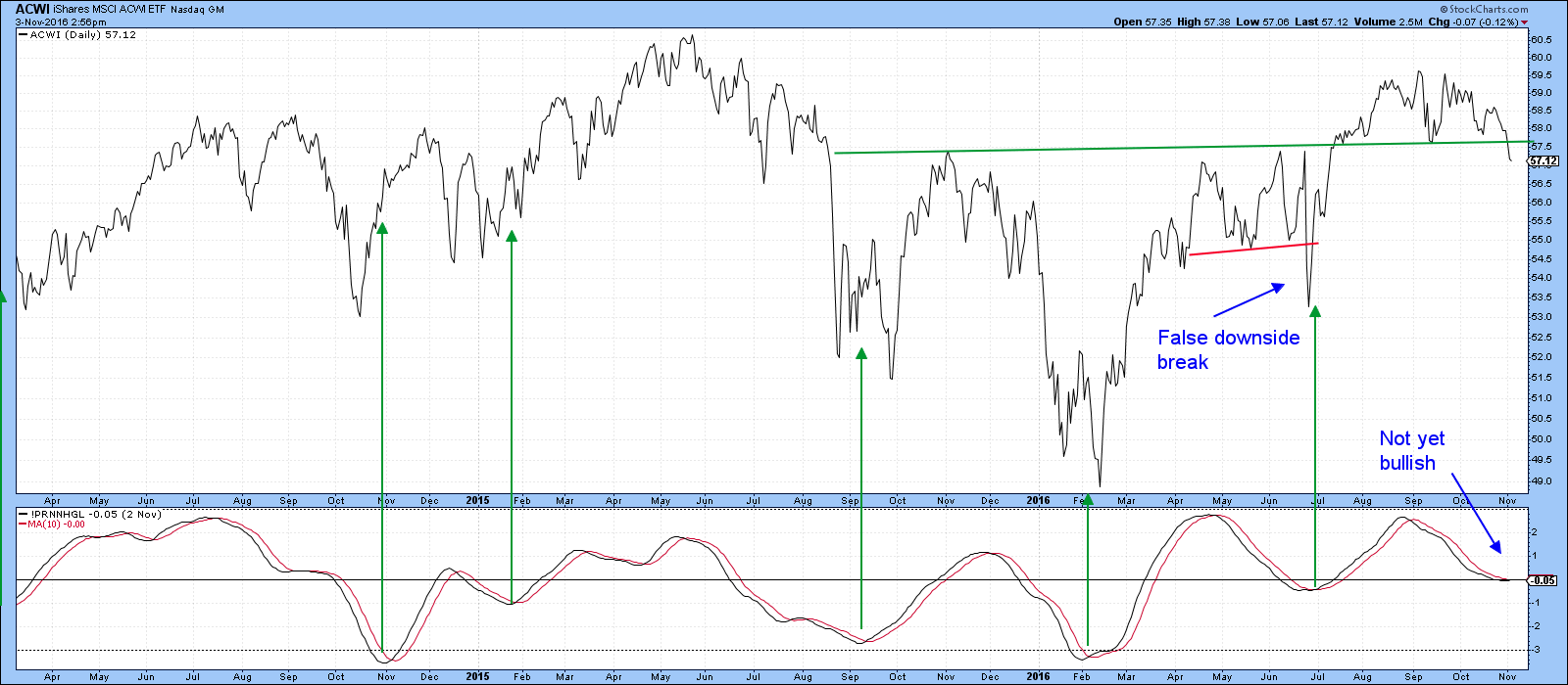
Chart 4
Short-term technical position oversold…but
Chart 5 compares the NYSE Composite ($NYA) to a price volume oscillator (PVO) using the 12/26 parameters. A rising indicator indicates expanding volume. If this accompanies a price rise a reversal in the indicator from a high peak indicates a buying climax and is generally bearish. Previous instances have been flagged with the red arrows. On the other hand, if the indicator rises and prices fall, subsequent peaking action indicates a selling climax, which is a positive factor. These are shown by the green arrows. Right now, the indicator is rising against a falling price drop background, but the PVO has yet to reach the red line and reverse. That suggests that further selling, perhaps temporarily pushing the Index below its 200-day MA, is a possibility before a full-fledged selling climax develops.
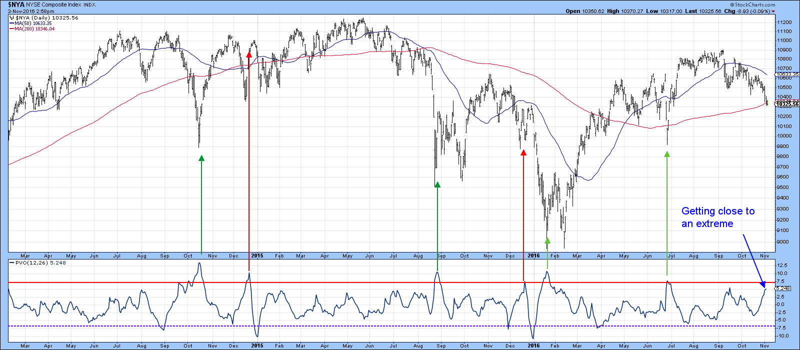
Chart 5
Chart 6 shows that the percentage of NYSE stocks above their 50-day MA ($NYA50R) has now fallen below the blue oversold line. At this point there is no sign of a reversal. Until there is, we should assume that the short-term decline is still intact. The three dashed arrows all indicate failed signals. Each one was preceded by a very small drop in prices. That compares to the current situation, which has experienced a larger decline. Therefore, while there is a possibility of a failed signal when the indicator reverses again, it is more likely to be a valid one.
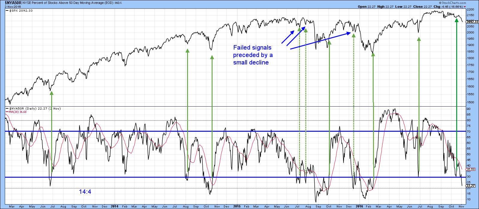
Chart 6
I pointed out that Chart 2 reflected the fact that confidence was returning to the marketplace in the form of a new trend of expanding margin debt, but there are other signs of a risk off sentiment. Two of them are represented in Charts 7 and 8. They both monitor confidence relationships. First, that between high yield and quality bonds (HYG/TLT). Second, the ratio between high beta and high quality (SPHB/SPHQ). In both situations a rising relationship reflects a preference by traders for the more risky asset. The green arrows near the latest data show that while the S&P has been declining since August, both ratios have been moving irregularly higher. As long as this divergence is maintained it indicates that traders are growing in confidence, and that’s a good thing. One caveat, and that lies in the fact that the short-term KST has started to roll over in Chart 7, so it's possible that this relationship will begin to show some weakness.
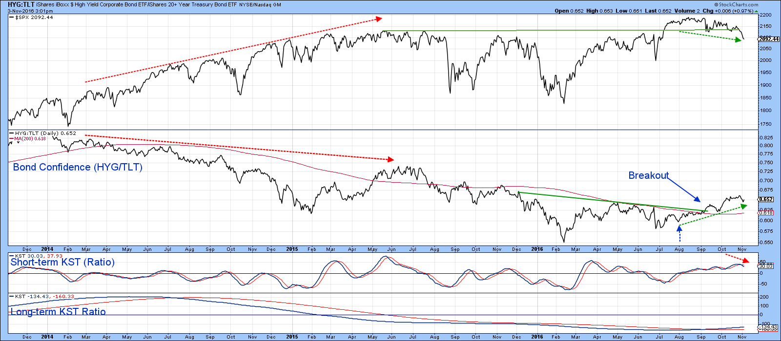
Chart 7
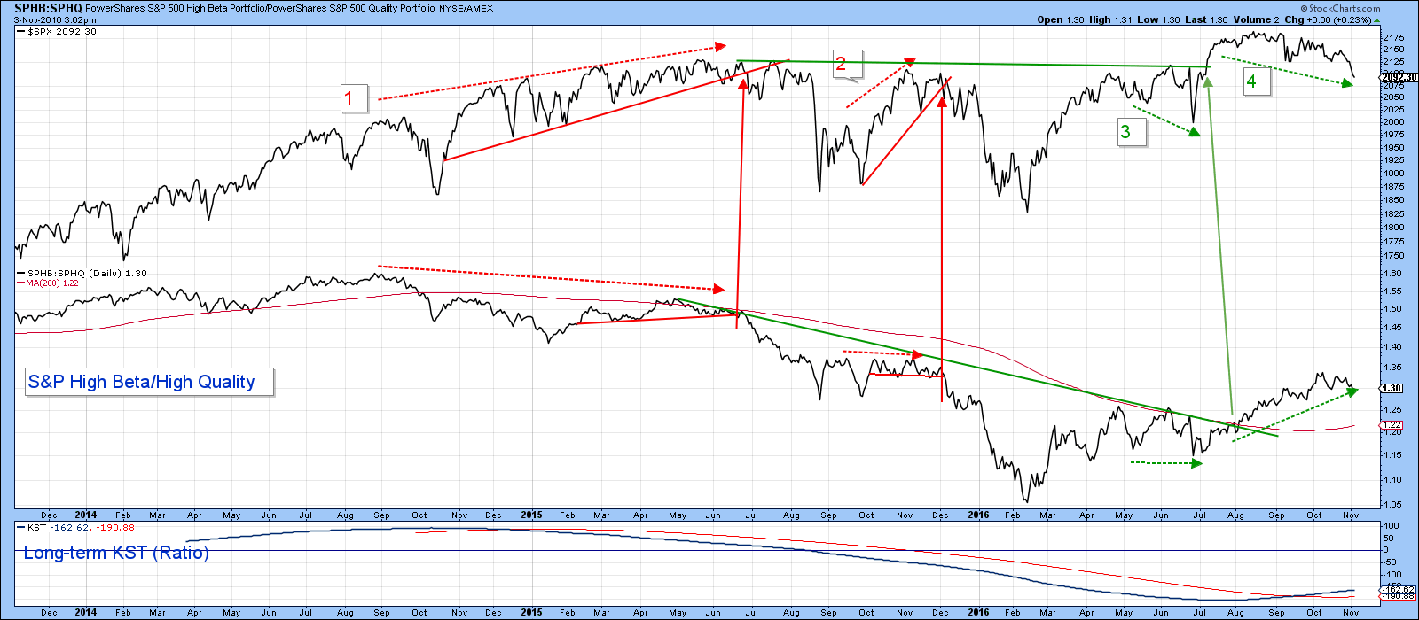
Chart 8
Gold breaks out against bonds
One area that’s started to break to the upside is the ratio of gold to bonds. Gold has a habit of discounting higher industrial commodity prices, and bonds are a refuge during deflationary periods. That means that a rise in this relationship has inflationary consequences. Today the ratio completed a base and started moving to the upside. This action is being supported by the short-term and long-term KSTs. However, the intermediate series has yet to confirm with a bullish signal of its own. Since the intermediate indicator is basically flat, it seems likely that higher near-term prices implied from the breakout and rising short-term series, will result in an upside reversal in the period directly ahead.
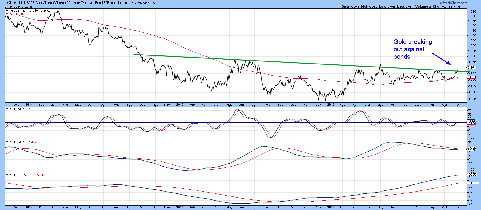
Chart 9
Dollar showing weakness
The Dollar and gold usually move in opposite directions, so it is probably no coincidence that the Dollar Index ($USD) has just experienced a KST sell signal. The Index itself has just come off a couple of rough days, so it may need to consolidate recent losses. However, the high reading in the KST suggests that it will eventually work its way lower.
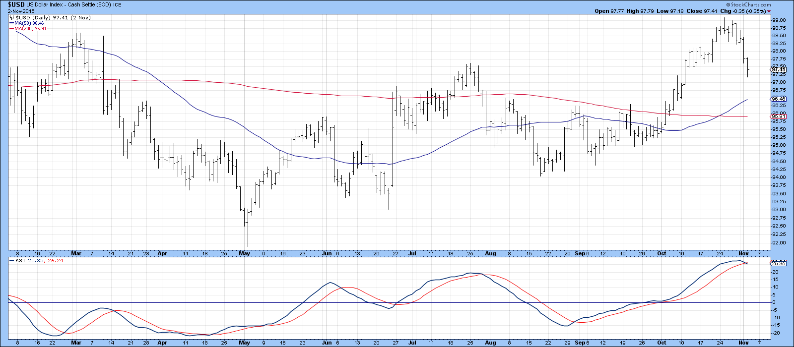
Chart 10
Chart 11 shows that the Index is also just above support in the form of an inverse head and shoulders neckline If that line is violated it would suggest that the breakout was a whipsaw move thereby setting up a test of the all-important dashed red up trendline. Another problem lies in the fact that the dollar diffusion indicator (!PRDIFCUR), in the lower panel, failed by a wide margin to confirm the higher high in the Index (see the two red arrows).
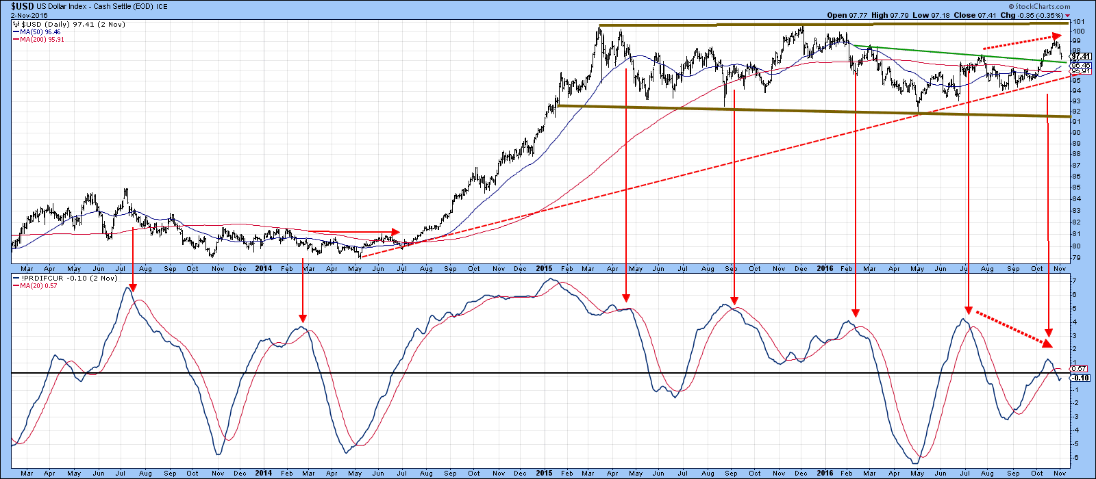
Chart 11
Good luck and good charting,
Martin J. Pring
The views expressed in this article are those of the author and do not necessarily reflect the position or opinion of Pring Turner Capital Group of Walnut Creek or its affiliates.


