Why Is 1.75% So Critically Important?
- What’s the direction of the primary trend of interest rates?
- What do the shorter-term maturities say?
- Appraising the short-term technicals
In early September, I wrote an article suggesting that things were beginning to fall in place for higher yields. Since then they have edged up a bit, but look a little overdone for the time being. We have to be a bit careful on the “overdone” part because some major indicators have given primary trend buy signals for yields (sell signals for prices) and that means that the character of the short-term technical indicators has changed. The reason for this is that prices in bull markets often blow off short-term overbought conditions with a miniscule correction. That compares to overbought conditions in bear markets which are typically followed by a new leg down. The reason I bring this up is that I believe that the preponderance of evidence now points to a primary bull market in US treasury yields. That, of course, means a bear market for prices. I’ll get to the short-term situation later, but for now let’s take a look at the longer-term picture.
What’s the direction of the primary trend of interest rates?
A key objective measure I use for identifying primary trend reversals is to see whether the price is above its 12-month MA and the long-term KST is positive. These two benchmarks have been plotted in Chart 1, where we can see that the 30-year yield ($TYX) is above its 12-month MA and the KST is still bearish, because it has not quite crossed above its MA. Even so, it’s pretty darn close! The solid arrows show KST MA crossovers that could be considered successful and the dashed ones failed signals, or ones that came too late to be of any use. Only the 1994 and 2012 crossovers were followed by a really meaningful signal. The reason lies in the fact that the whole period covered by the chart was one in which the secular or very long-term trend was down. Just as short-term oversold conditions in a primary bear market have difficulty in generating worthwhile moves, so do primary oversold readings in a secular bear, as is fairly evident in this chart. That’s because all the magnitude lies on the downside. If you believe that the secular bear is still intact and that the next yield decline will take the 30-year series to a new low, then the case could be made that the current rally, having already experienced the same magnitude as its 2014-15 predecessor has probably run its course.
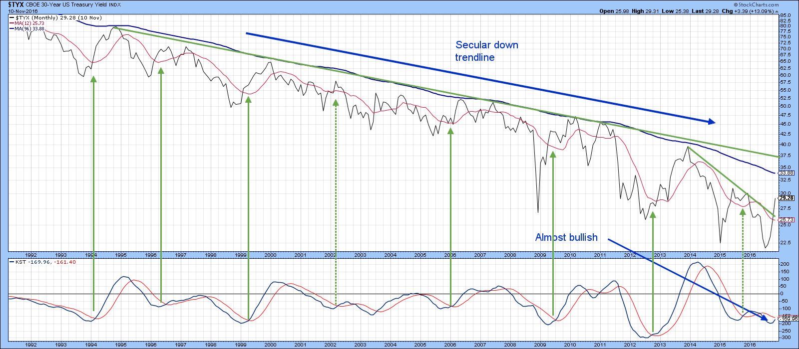
Chart 1
One argument for lower prices lies in Chart 2, where you can see that the Barclays 20-year Trust, the TLT, has just violated a key up trendline as has its Special K indicator. The Special K has also moved decisively below its signal line and set up a series of declining peaks and troughs, thereby unequivocally signaling that some kind of trend reversal started last summer. The momentum action on its own suggests that further downside for prices (upside for yields) has room to run.
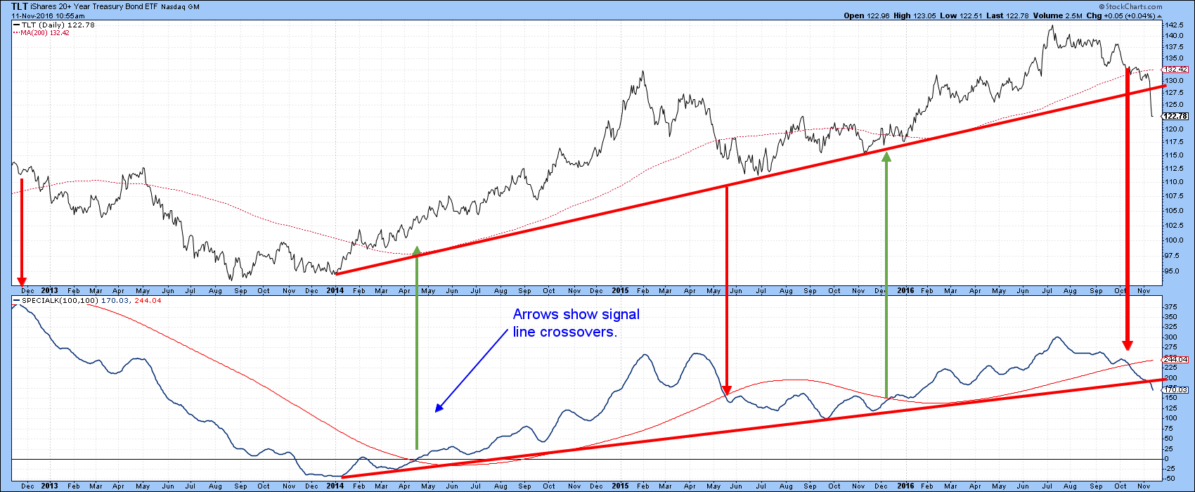
Chart 2
That would be consistent with a 2016 secular trend reversal, but at this point we need more evidence before coming to a conclusion in this direction. That’s because the green down trendline and the blue 96-month MA, in Chart 1, both remain intact. Moreover, we have yet to see a series of rising primary trend peaks and troughs.
What do the shorter-term maturities say?
If we move back along the yield curve we find that, starting with the 7-year maturity ($UST7Y), the 2016 low was formed at a higher level than its 2012 counterpart. Compare that to the 10-20- and 30-year series, all of which registered new secular lows in 2016. That’s important because the 7-year gives us a secular benchmark to beat. That benchmark is the 2014 high, which has been flagged by the dashed green horizontal line in Chart 3 at a fraction below the 2.5% level. We can also see resistance at the (blue) 96-month MA and 2003-2016 down trendline, the higher of which is at 2.02%. No moving average is perfect of course, but the 96-month (8-year) time span seems to work well for secular trends since it encompasses two, so called, 4-year business cycles. Once again we can see that during the secular decline primary trend KST buy signals had mixed results. Right now that long-term series is bearish, but is very close to a buy signal.
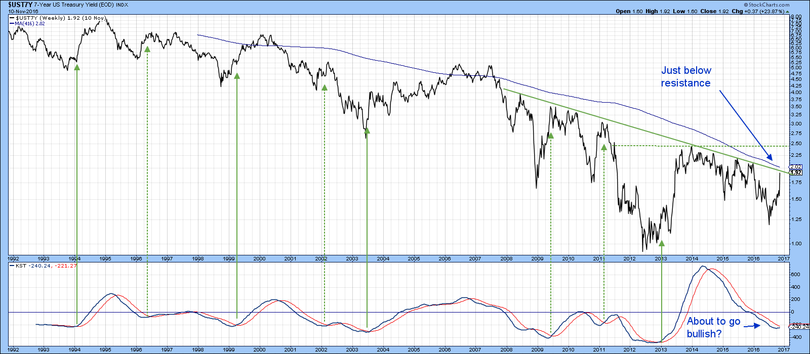
Chart 3
My preference though, is to consider the 5-year yield ($FVX) because the secular benchmark becomes much clearer. That’s shown in Chart 4, where you can again see that the 2016 low was higher than that set in 2012. Recent price action is setting up the possibility of a giant double bottom, a pattern which would be completed with a break above the resistance marked by the 2013-16 highs at 1.75%. The 5-year resistance is much more formidable than that for the 7-year yield, since it has taken longer to form and is horizontal in format. Note that the yield is currently right at its 96-month (416-week) MA. A rally above 1.75% would signal a reversal in the series of declining (red) primary trend peaks and troughs, thereby offering an even stronger signal of a secular trend reversal to the upside. The red waves, with their declining peaks and troughs represent the secular down trend and the green ones a possible scenario for its reversal.
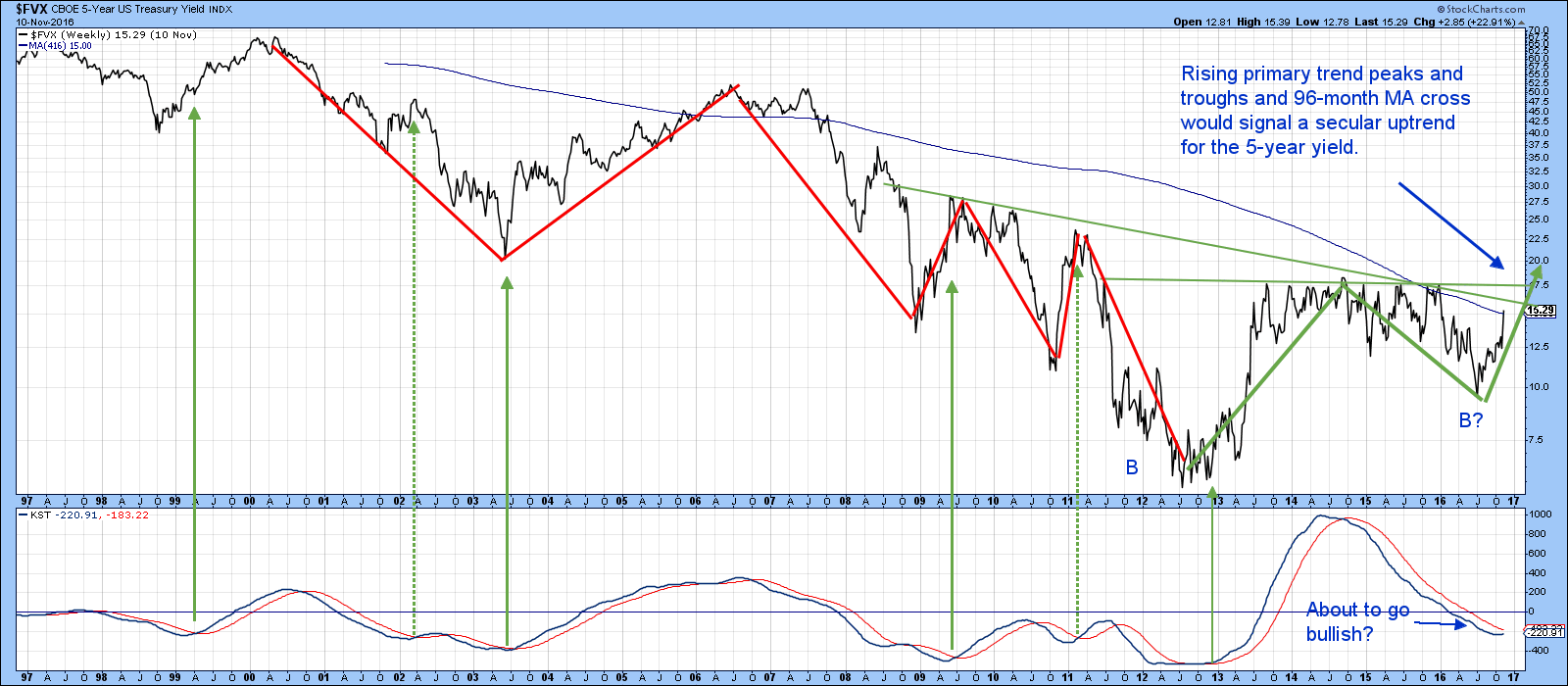
Chart 4
Finally, Chart 5, again featuring the 5-year maturity ($FVX) shows that this week experienced a trendline break in the Special K as well as a positive crossover of its signal line. Note also that this indicator has now begun to experience a series of rising peaks and troughs, thereby completing a very bullish primary trend momentum picture. It’s possible that the whole price action since 2013 could turn out to be a very bullish broadening formation with a flat top, otherwise known as a right angled broadening formation. The 1.75% level still remains the number to beat. However, on this daily chart 1.80% looks to be a safer bet.
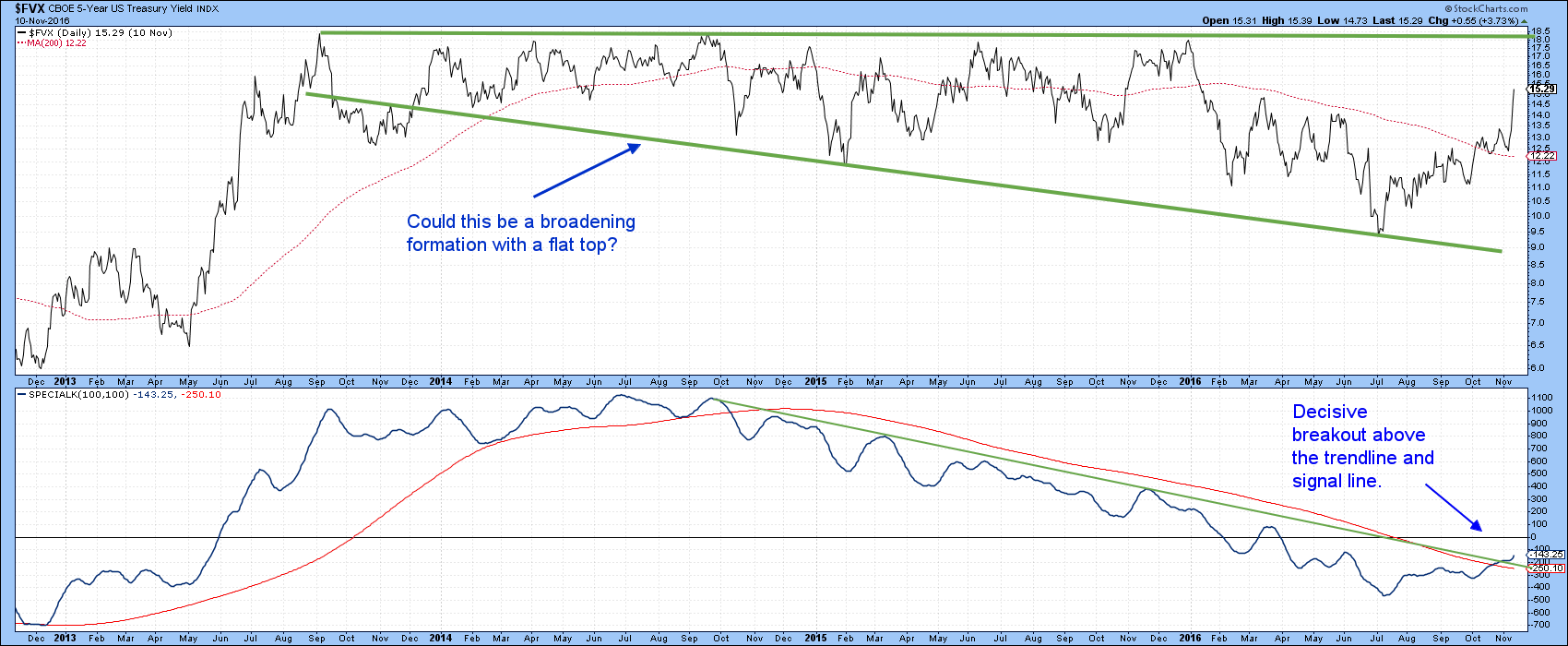
Chart 5
Appraising the short-term technicals
Chart 6 focuses on the short-term picture for the TLT, by comparing the price to its price volume oscillator (PVO). The arrows flag buying (red) and selling(green) climaxes i.e. when the indicator reverses from an overstretched condition. The PVO is still rising, so it has not yet triggered a signal. However, when it does a counter-cyclical correction of some kind is likely.
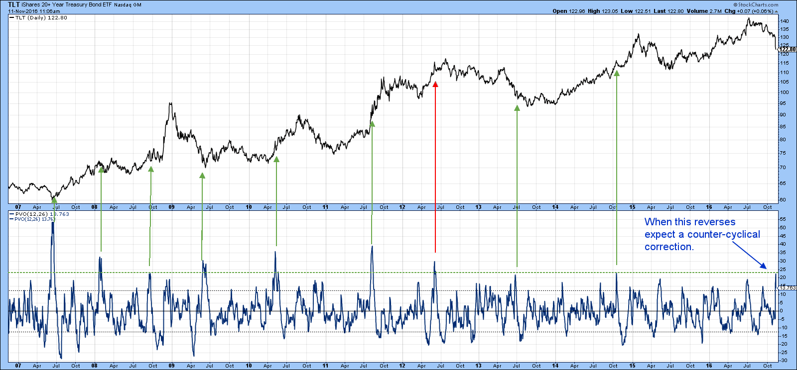
Chart 6
Chart 7 features a 45-day ROC for TLT, which has also fallen to an oversold level. That certainly does not guarantee a rally but it does suggest that the near-term odds of one are better than even.
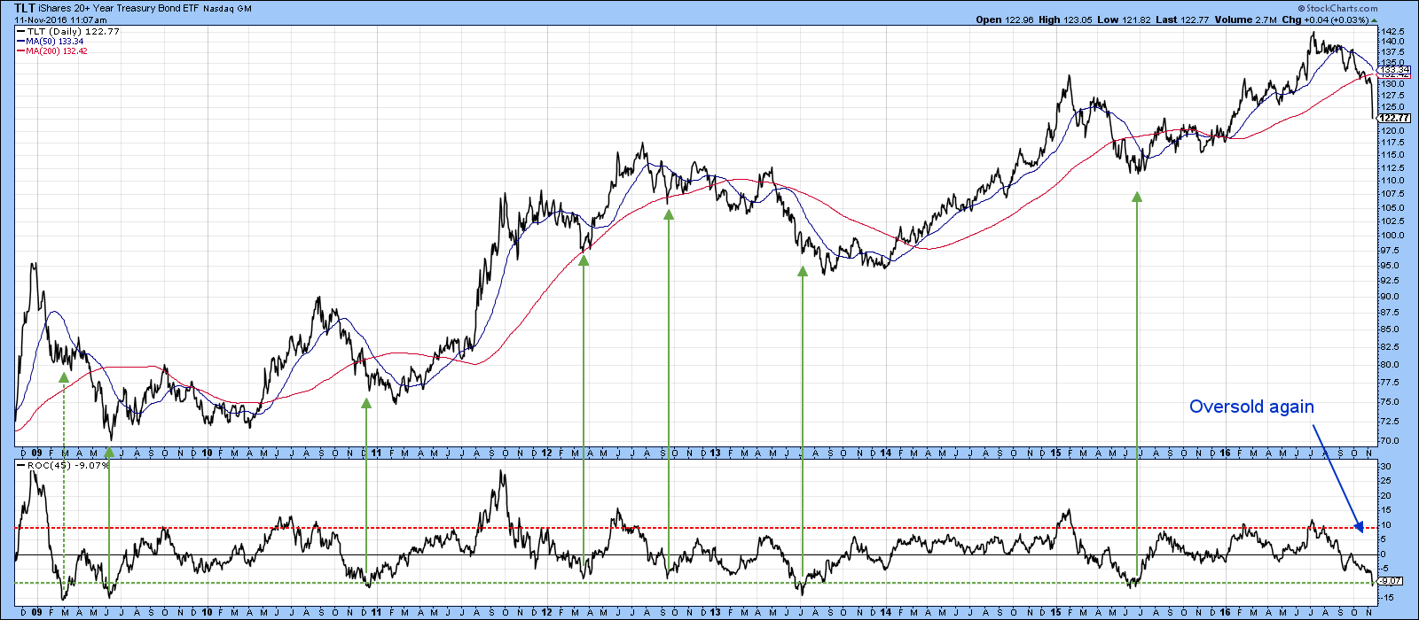
Chart 7
Finally, Chart 8 shows the 7-10-year trust, the IEF, and a daily KST. It indicates that the price has fallen back to support in the form of the March low, with the possibility of a rally back to the 200-day MA and a subsequent new low. That’s highly speculative of course, especially as the KST has just reversed to the downside. However, given the extend to the damage already inflicted it is not unreasonable to expect some respite from further price erosion.
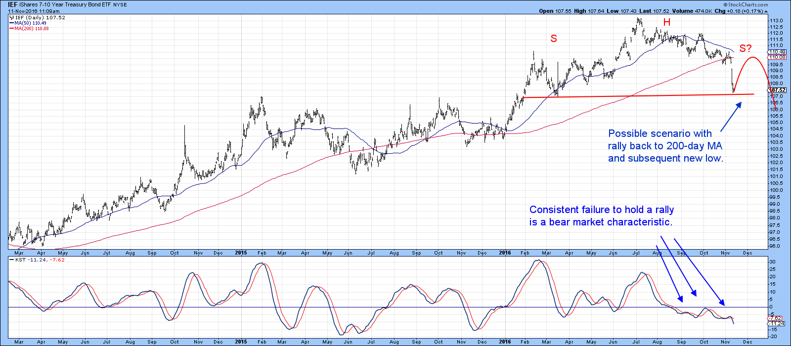
Chart 8
Good luck and good charting,
Martin J. Pring
The views expressed in this article are those of the author and do not necessarily reflect the position or opinion of Pring Turner Capital Group of Walnut Creek or its affiliates.


