Three Charts That Suggest Dow 20,000 Will Happen Later Rather Than Sooner
- Signs of short-term exhaustion
- Watch those housing ETF’s
- Shanghai is down, but is it out?
Even bull markets need to pause for breath as profits are digested and doubts sown concerning the validity of the prevailing trend. We may have come to such a moment.
Signs of short-term exhaustion
At a recent webinar I showed Chart 1, which features a 30-day ratio of NYSE advances to declines. The shaded areas point up periods when the indicator is above the 300 level. Shaded areas that are quite wide mean the market possesses a lot of upside momentum and declines are less probable. However, when the indicator goes through that red dashed 300 line and then quickly retreats, a sell-off is much more likely. You can see such instances by the narrower shaded areas and the downward sloping red arrows against the price. Last week it briefly moved above the 300 line and has since backed off a bit. That suggests that a sixth signal since 2012 has been just been triggered. Based on its track record some kind of correction should be expected.
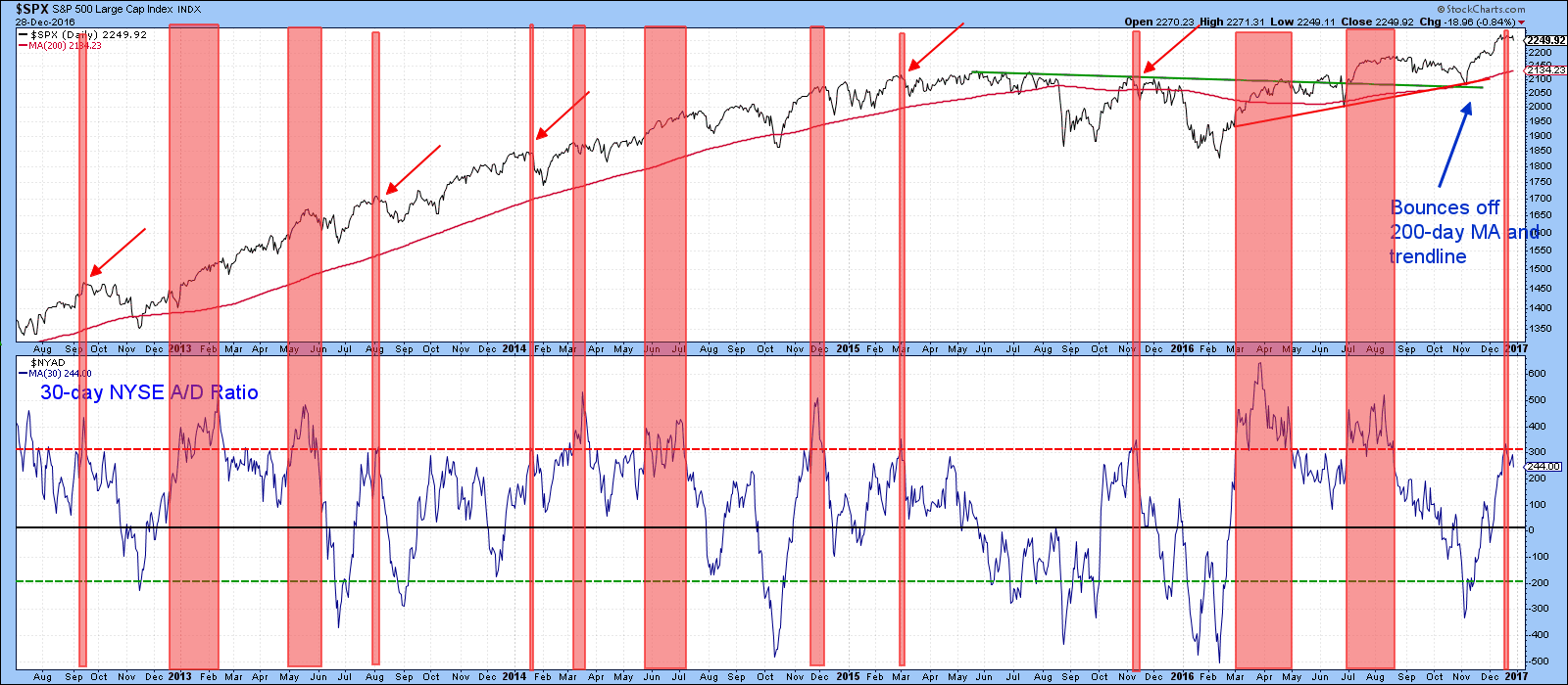
Chart 1
I have also been watching the VIX, or more specifically the KST of this popular indicator. I like the KST because it smooths out some of the random fluctuations in the raw data. It’s been plotted inversely in Chart 2 in order to correspond with movements in the S&P itself. The red arrows flag reversals in this volatility measure that have developed from at or above the horizontal dashed red line. Altogether 18 signals have been triggered in the last 3 ½-years. Each one was followed by some form of correction. Right now the indicator is in a rising mode, but the overextended nature of the latest reading argues for an imminent reversal.
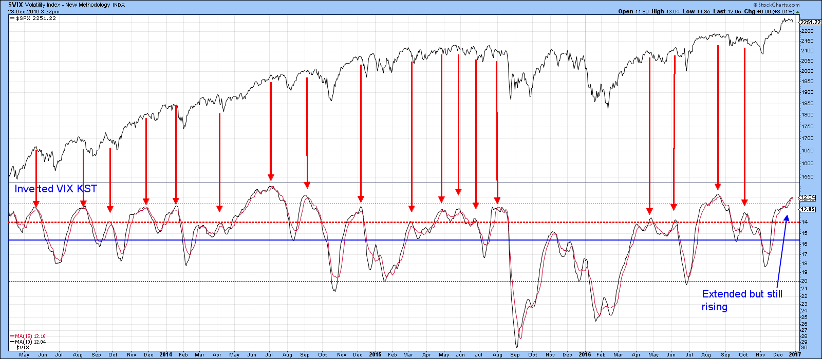
Chart 2
Chart 3 shows that the market has recently lost a lot of upside momentum. First, through the short-term KST sell signal, and second, with the decisive rupture of the post-election up trendline.
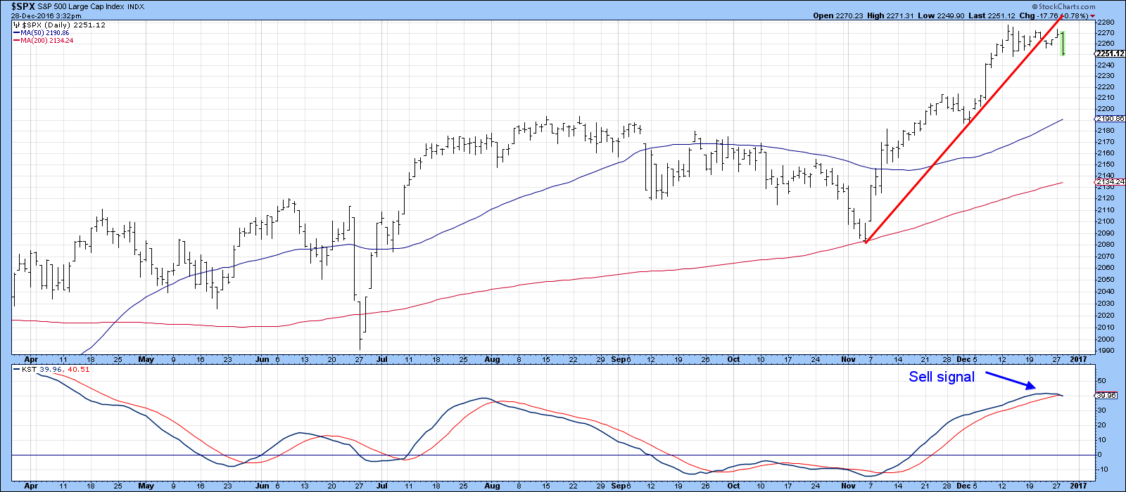
Chart 3
Finally, the price volume indicator (PVO) monitors the relationship between two moving averages of volume. A high reading indicates volume exhaustion and reflects buying or selling climax, depending on the direction of the price move. On the other hand, a low reading reflects a total disinterest between buyers and sellers, which is of course, a reflection of a very finely balanced technical situation.
Charts 4 and 5 show the history of this indicator, based on the 12/26 parameters, since the turn of the century. The upward pointing arrows indicate when it has reversed from, at, or below the dashed oversold line. In almost all situations, this condition manifests itself at the year-end period, when most traders are taking a well-earned vacation and volume is abnormally low. In the last week, as if on seasonal cue, this indicator once again sunk back to an oversold condition. All this tells us is that there is currently a fine state of balance between buyers and sellers. That balance will undoubtedly be resolved early in 2017, but which way? Since we have shown that the market is very overstretched on a short-term basis, it would seem likely that it will experience a near-term decline, as was the case in 2000, 2008, 2009 and 2010 in Chart 4, or 2014, 2015 and 2016 in Chart 5.
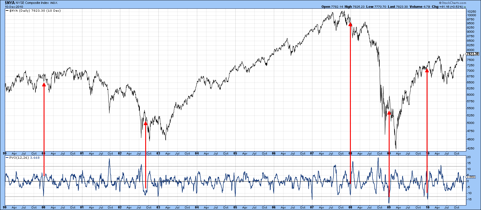
Chart 4
In 2012, a low PVO reading was followed by a rally, but in that instance the oversold volume reading was preceded by the November/December decline. In other words, the market was set up for an advance. However, despite the 2011 volume low being preceded by a rally, prices continued to move sharply higher. That example warns us that, even though the odds favor a decline in early January, in technical analysis there are no guarantees.
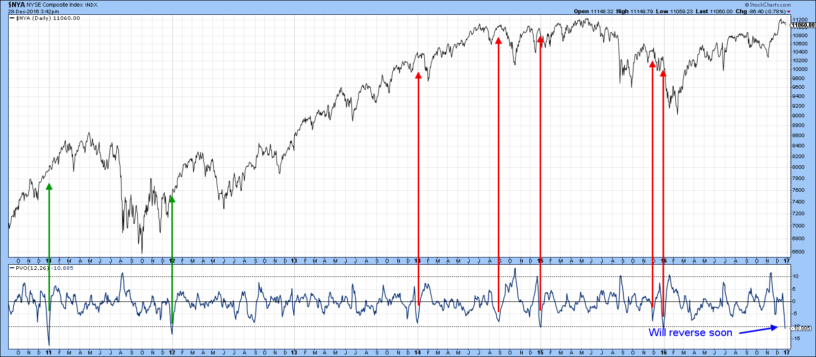
Chart 5
Regardless of whether there is a January decline, I am still expecting to see the bull market extend later on in 2017.
Watch those housing ETF’s
One sector that has been quietly moving sideways as the overall market has been advancing is housing. In this respect the Spider Housing ETF (XHB) has been plotted in Chart 6. Note the underscore in front of the symbol. This means that dividends have not been included, as is usually the case with StockCharts. The XHB peaked in mid-2015, but this was not confirmed by the relative strength line in the third window. As we move to 2016, a smaller divergence between the price and RS action took place. The RS line is also below its 65-week EMA and the red breakdown trendline. Note also its long-term KST, in the bottom window, is already in a bearish mode.
Absolute price action is pretty neutral at this point, but the weak relative performance warns us that, if a correction does develop in the overall market, housing stocks will be particularly vulnerable. That $30 level is especially crucial, since its penetration would complete a four-year head and shoulders top.
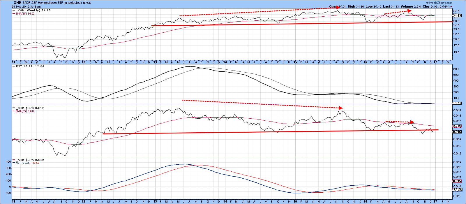
Chart 6
Chart 7 shows the short-term situation, where we can see that the KST has just triggered a sell signal. Also, Wednesday’s action took the form of a consolidation outside day and the price has violated the post November up trendline. Both these developments suggest a test of that $30 area is likely.
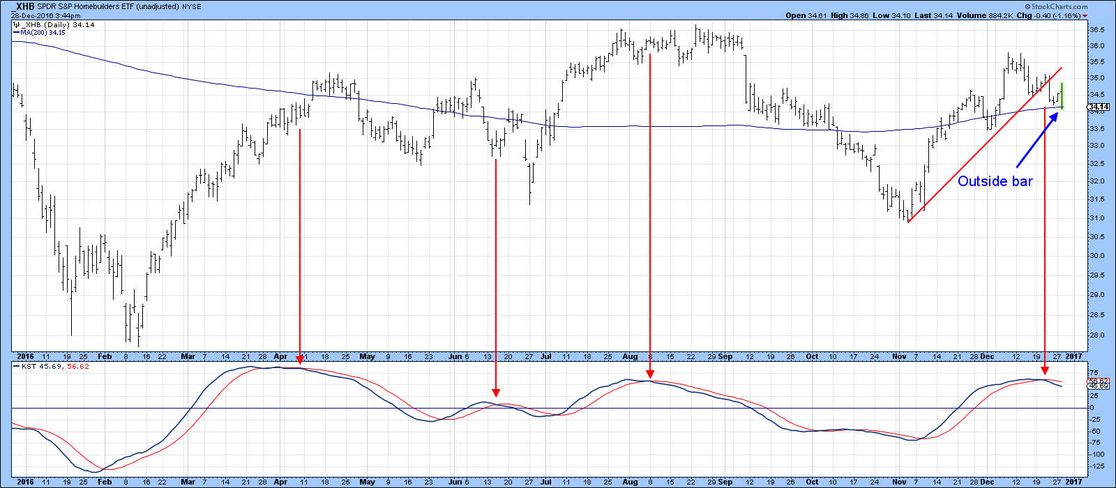
Chart 7
Shanghai is down, but is it out?
The Shanghai Composite ($SSEC) has recently come under some pressure, but has now reached a critical juncture point. This can partially be seen from the red support trendline that joins the real body candle lows since the early summer. The good news is that Tuesday’s action took the form of a bullish piercing white line. That’s where a white candle opens below the trading range of its (black) predecessor, but closes half way up its real (black) body. It indicates that after a period when bears were in control that the upper hand has reverted to the bulls. That may be enough to buy time for a KST reversal and a move above key resistance at 3150. We will have to wait and see.
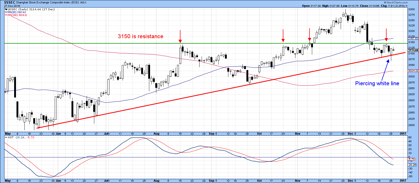
Chart 8
In the meantime, Chart 9 demonstrates how crucial the current situation is. That’s because the whole action since February of this year could turn out to be a giant trend channel. That channel would be completed with a break through either trendline, which would be 3350 on the upside and 3100 on the downside. Clearly, the declining long-term KST and the rolling over action of the intermediate series do not leave much room for downside error.
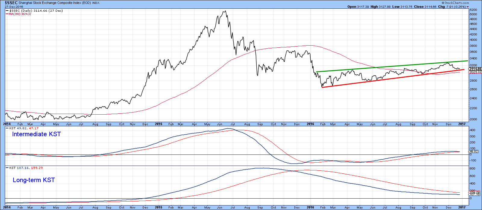
Chart 9
Good luck, good charting and a happy New-Year!
Martin J. Pring
The views expressed in this article are those of the author and do not necessarily reflect the position or opinion of Pring Turner Capital Group of Walnut Creek or its affiliates.


