Three Steps And A Stumble?
- Three steps and a stumble
- Interest rates are now driving the US Dollar
- Charts for the Euro, Yen and Swiss Franc continue to erode
Three steps and a stumble
The late great Edson Gould coined the term “Three Steps And A Stumble”. He was referring to his observation that when the discount rate had been raised for the third time in a particular cycle, investors should watch out because the equity market was likely to stumble. That’s because the third hike indicated that the Fed was getting serious about raising rates and the effect on the economy would likely be negative. Since the stock market anticipates changes in the direction of the economy, the third hike was a signal that the clock had started to tick for the next bear market.
The second much touted hike in the Fed Funds rate to .625% took place on Wednesday, but what is not widely appreciated is the fact that the Fed also raised the discount rate to 1.25%. According to their data that rate was originally raised to .75% in February 2010, and then to 1.0% in December 2015. Wednesday’s hike therefore represented the third one for the current cycle. Now it’s true that the discount rate has lost a lot of its importance as a monetary tool, but reversals in its direction still reflect changes in policy. The key question of course, is what does this third hike mean for equities? To answer, is that we need to go back to the history books, or take a short-cut by referring to Chart 1.
It compares the S&P to the discount rate back to the early part of the last century. The vertical lines approximate the third hike and the arrows the lead between the third hike and the bull market high. Some arrows slant to the left because the third hike came after the equity market peak, but these are the exceptions rather than the rule.
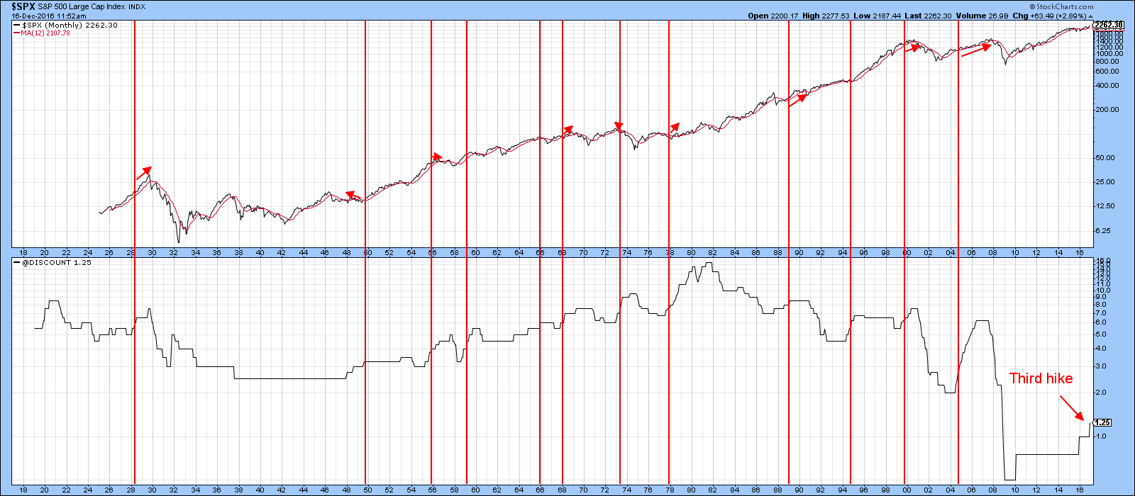
Chart 1
Using this relationship as a pin-point guide to the final peak for this bull market is problematic because it’s all over the place. The lead time ranges from -14-months in 1949 to +37-months between September 2004 and October 2007. About half the time the lead time fell within the 4-month to 9-month range and that seems to be the most likely as the average for all periods since 1919 has been just under 6 months. While the data tells us that a peak could develop at any time, the average gain following all previous third hikes was just under 9%.
My conclusion, is that the third hike is a financial signpost that points out the current cycle is slowly but surely maturing. I have been guessingfor some time that we will see a top to this market in the first half of next year, so the 6-month, 9% average gain seems to make sense. However, I really want to stress the word “guessing” because that’s exactly what it is. As long as the majority of the longer-term indicators continue to point higher I continue to remain vigilant, but unequivocally bullish.
Charts 2, 3 and 4 break down the historical perspective to offer greater detail.
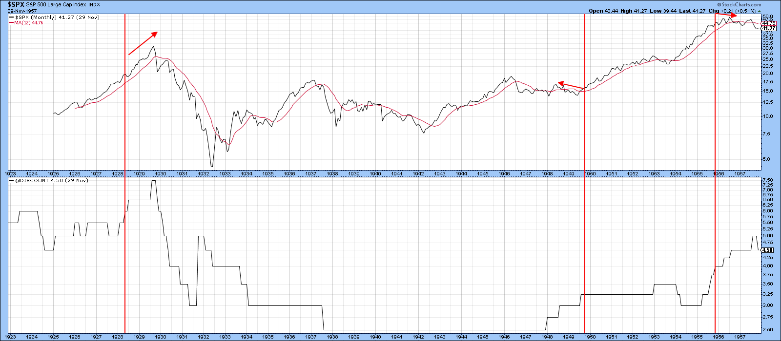
Chart 2
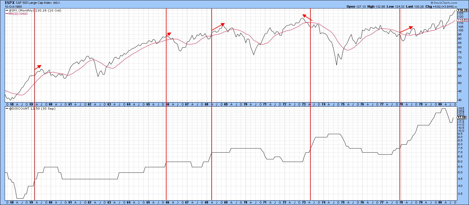
Chart 3
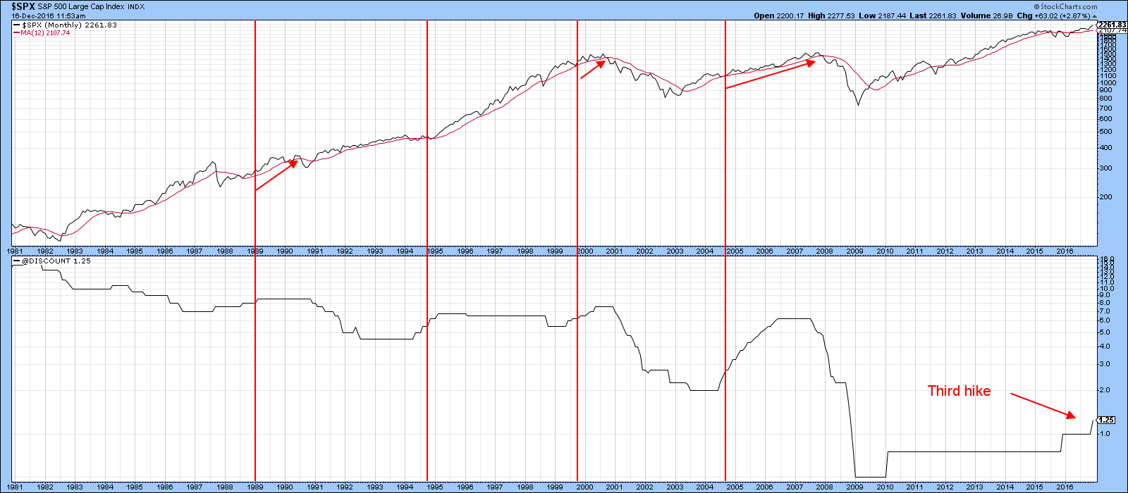
Chart 4
Interest rates are now driving the US Dollar
The US Dollar has recently broken out on the upside against several currencies, but the driving force has changed since the early fall. Chart 5 shows that prior to then, movements in the dollar were closely tied to the ratio between government and high yield bonds (TLT/HYG). Rallies in this relationship reflect a rush to quality, as market participants preferred high quality over high yield. Since both series in the chart were moving in similar, but certainly not the exact same direction, it meant that dollar movements were being greatly influenced by the currency’s perceived value as a safe haven. As you can see from the chart, both series are now moving in exactly the opposite direction, which means that the dollar is no longer valued for its relative safety.
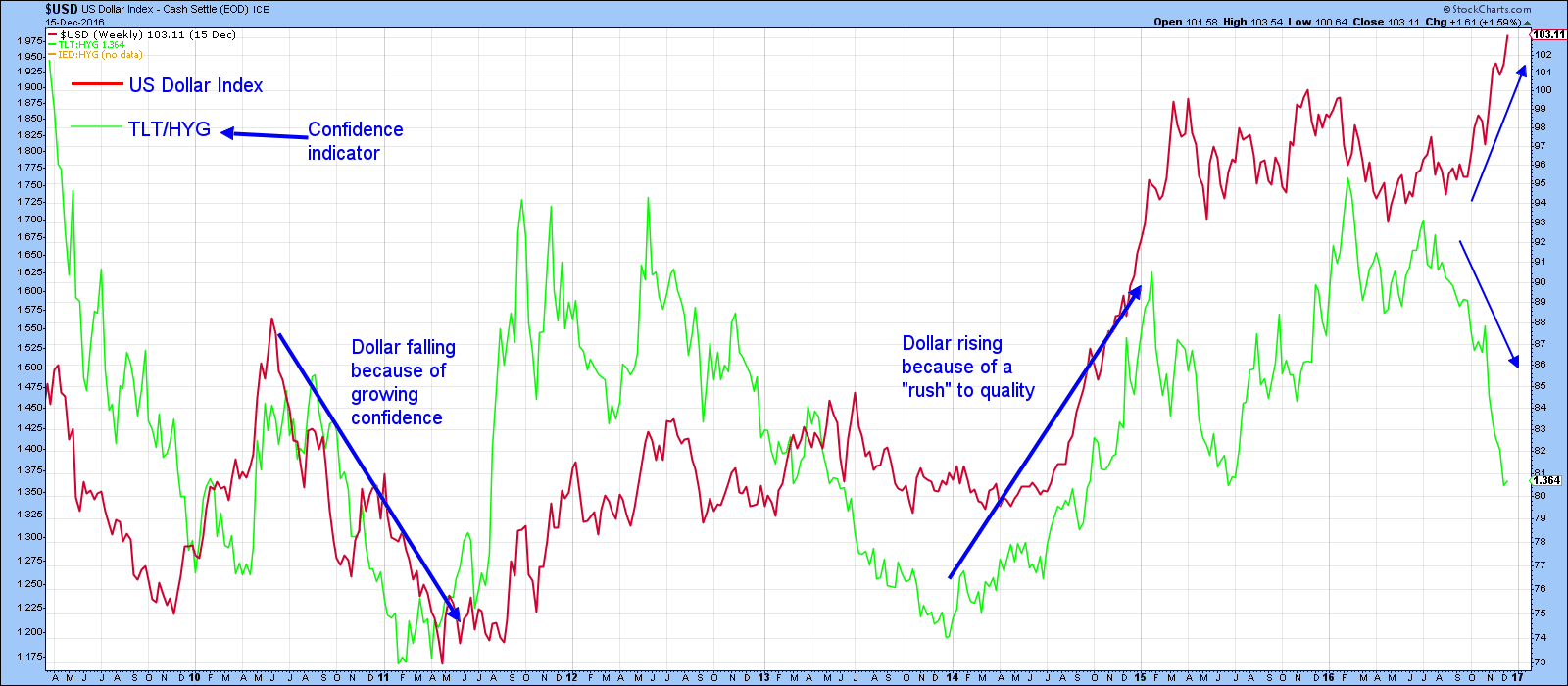
Chart 5
Chart 6 shows that prior to early 2015, movements in the 10-year yield were not connected to dollar movements. However, since then the green and red arrows show it to be a prime influence.
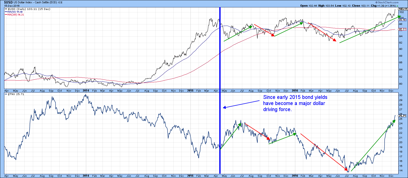
Chart 6
If this relationship continues to hold, Chart 7 argues for a higher dollar as the yield has violated a key down trendline and only just experienced a KST buy signal.
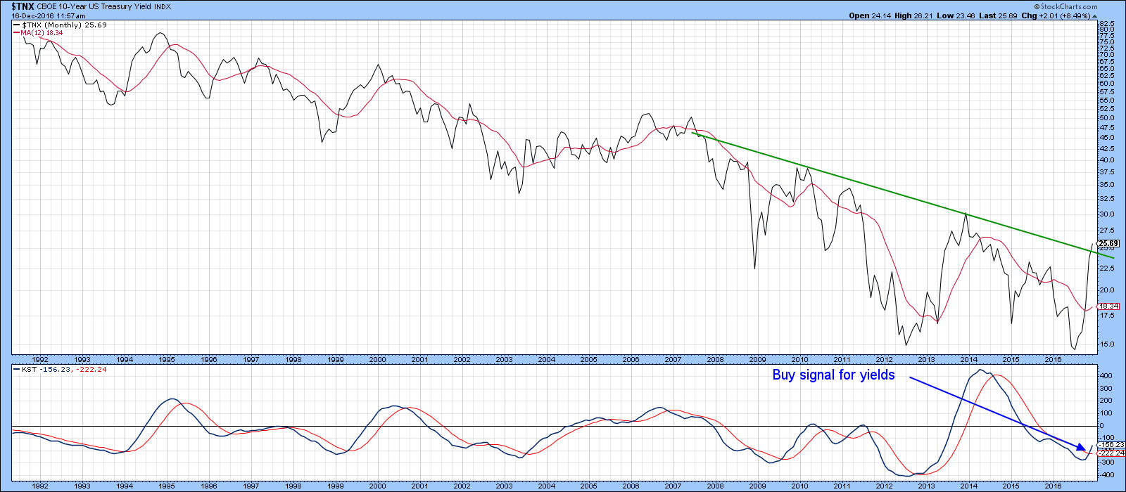
Chart 7
Charts for the Euro, Yen and Swiss Franc continue to erode
Charts 8, 9 and 10 indicate continued deterioration in some of the major currencies. Chart 8 tells us that the Euro has broken down from its recent trading range and has still yet to achieve the downside objective from the 2003-14 major top. The KST is still bullish, but has begun to flatten out.
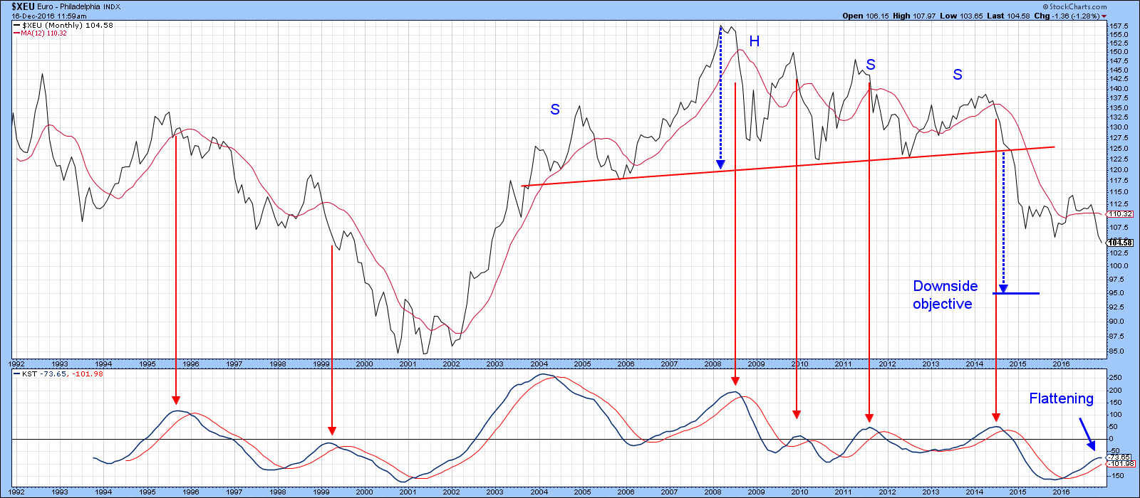
Chart 8
The Yen is also looking a bit sick as the currency recently experienced a false break above the extended red up trendline. As a result, it is now decisively below its 12-month MA. The KST has also started to hook over as a possible prelude to a sell signal. The solid arrows show that KST buy and sell signals have been reasonably accurate for the yen. The dashed ones indicate failed signals. Finally, the downside objective from the 1986-2014 top of around 50 cents has yet to be reached.
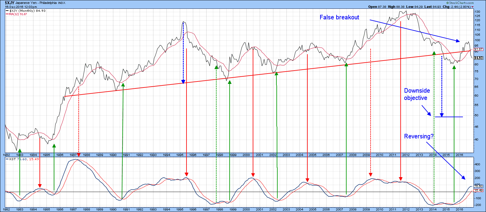
Chart 9
Chart 10 features the Swiss Franc, where we can see that the downside objective of a large downward sloping triangle has yet to be achieved. We need to wait until the end of the month for the final December plot, but right now the Franc is on target to extend the series of declining intermediate peaks and troughs. Note also that the KST has started to roll over again.
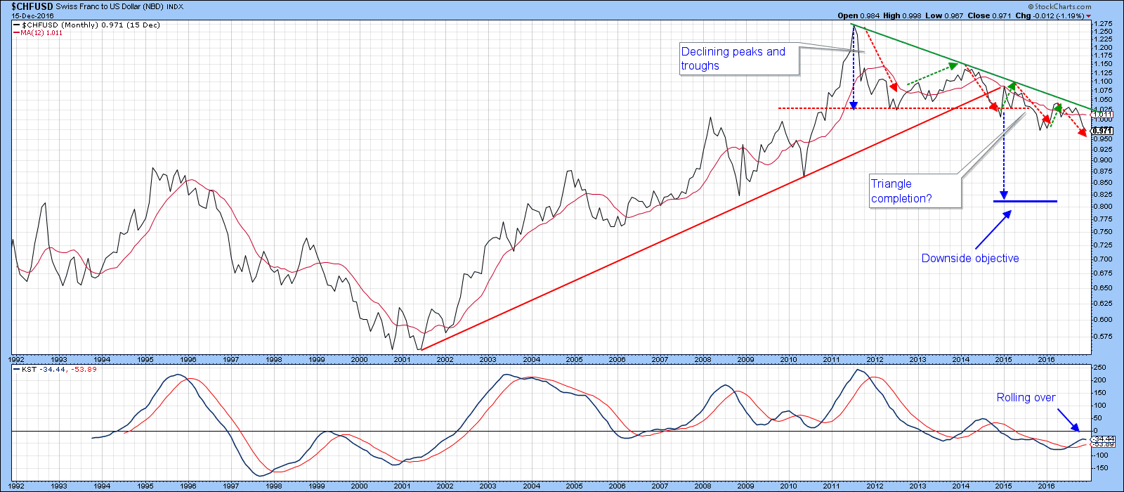
Chart 10
Good luck and good charting,
Martin J. Pring
The views expressed in this article are those of the author and do not necessarily reflect the position or opinion of Pring Turner Capital Group of Walnut Creek or its affiliates.


