Is The Pound About To Head For Parity With The Dollar?
- Long-term perspective
- The short-term picture
- The Pound against other major currencies
- Watch that gold!
Long-term perspective
Last October, I wrote an article entitled “British Pound Headed For Par, But Not Now”. The long-term case rested on the fact that the Pound, when measured against the Dollar, had completed a 30-year top. The price objective, calculated by taking the maximum depth of the pattern and projecting it in a southerly direction at the time of the breakout, called for a move somewhat below par. This possibility is featured in Chart 1. In technical analysis speak, we say this is the minimum ultimate downside objective. Minimum because prices often move further than the objective, typically in multiples of it. Ultimate, because the downside target is not usually attained in a direct move. Rather, it takes the form of a zig-zag up or down, depending on the direction of the breakout.

Chart 1
The short-term picture
Having said that, I also pointed out that things were probably overdone for the time being as the news background, from a contrary point of view, was very bullish, of the kind often associated with a minor crisis. The currency did subsequently drop for a couple more days, but has since rallied and managed to remain above last fall's low. In the last week it has fallen back again, and a test of the October low is now underway. Naturally the question arises as to whether it’s going to break lower in keeping with the long-term downside projections. Alternatively, was the extreme bearish sentiment last October sufficient to enable the currency to postpone such a likely drop? Until the price falls decisively below the October low the answer will be in doubt.
Chart 2 shows the late September break from a consolidation head and shoulders, the subsequent drop and the formation and completion of a second head and shoulders last week. Taken on face value, with a bearish KST this would seem to argue for another leg down.
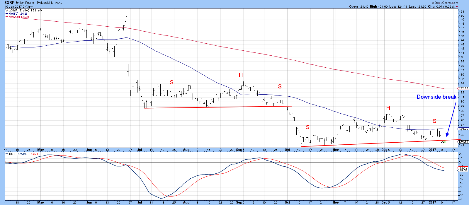
Chart 2
However, Chart 3 shows a more conservative trendline, which joins the October and January lows. It also features a stochastics using the 14,10,10 parameters. The arrows show that recent reversals in this indicator have been associated with small advances. Clearly, the bearish KST in Chart 2 and the bullish, but more sensitive, stochastic offset each other to some degree. That means that we need to look elsewhere for clues.
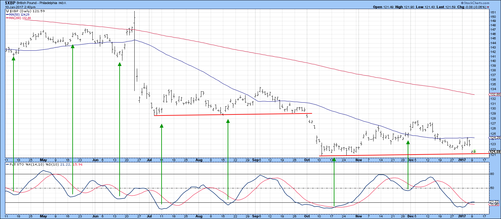
Chart 3
The Pound against other major currencies
In that respect, Chart 4 shows the Pound to the Euro in the middle panel. Note that the Pound/Euro series broke to the downside along with the Pound/Dollar in October. Now we are seeing a similar phenomenon, with a decisive break by Pound/Euro again, fully supported by a declining short-term KST. In other words, the Pound/Euro may well be leading the Pound in its relationship to the Dollar lower. That could all change with a break by the Pound/Euro above the green dashed trendline and 200-day MA at 1.20. However, right now this cross rate is in a primary bear market favoring the Euro.
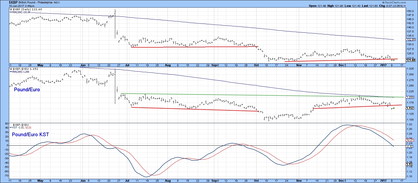
Chart 4
Chart 5 extends the analysis to the Japanese Yen, where we can see that the Pound/Yen cross has just completed a small head and shoulders top against the Pound. Note also that the KST is declining and is nowhere near an oversold condition at this point. Also worth our attention is the fact that this relationship crossed above its 200-day MA but was unable to hold above it. That’s not a guarantee that the Pound will continue to sell off against the yen, but it does point up some severe vulnerability in this direction.
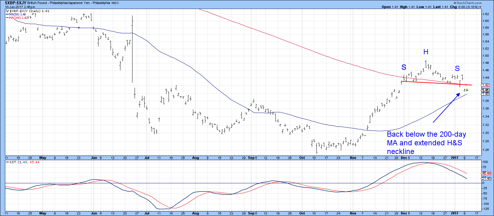
Chart 5
Finally, Chart 6 compares the Pound to three other cross relationships, the Swiss Franc, Canadian and Aussie Dollars. The Pound has broken down against all three, but also finds itself support in the form of solid trendlines. This again underscores the very finely balanced near-term technical picture. At this point the break in the Pound/Euro and Yen cross rates argue narrowly for a widespread break to new lows. The verdict is likely to come down in the period directly ahead.
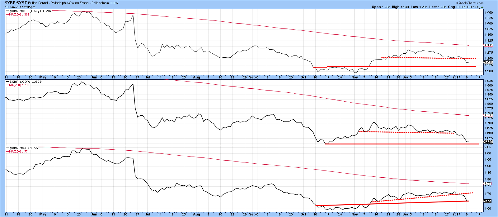
Chart 6
Watch that Gold!
Gold has rallied in the last couple of weeks. I have been treating this advance as a counter-cyclical one because the price is below all of the primary trend moving averages that I follow, such as the 12-month MA and 65-week EMA. In addition, Gold usually, but certainly not always, moves in the opposite direction to the Dollar, and the Dollar is in a bull market. That fact certainly provides a headwind for the price of the yellow metal.
However, there is one thing I am watching to see whether that stance is likely to be the right one or not, and that has to do with the character of RSI. In that respect, Chart 7 displays the 14-day RSI for the Gold Trust (GLD) between 2005 and 2011, a period that largely encompassed a primary bull market. The pink shading flags the 2008-09 bear trend. The arrows try to capture periods when the RSI initially rallies up to its overbought zone, which I treat as sell signals. The solid arrows indicate valid ones, where the price corrected substantially on the downside or experienced some extended ranging action. The dashed ones represent invalid bearish warnings. Clearly, the bear market experienced two successful sell signals. However, during the bull market the vast majority of such instances experienced failed signals, as flagged by the dashed arrows. In other words, prices are very sensitive to overbought conditions in bear markets, but that is not the case in bull markets.
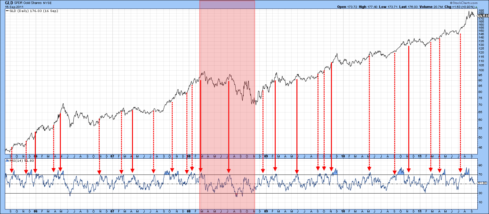
Chart 7
Fast forward to Chart 8, which covers the predominantly bearish period since 2012. In this instance pretty well all of the RSI sell signals were associated with a major correction of some kind. I have shaded the December 2015-July 2016 period as a primary bull, since the price crossed above its 12-month MA etc. during that time. Also, the sell signal in early 2016 was a total failure, indicating a bull market characteristic. The June signal was also a failure. Since July though, the RSI has been acting as if gold was in a bear market. Those characteristics include a strong downside move following that July sell signal, combined with a failure to respond positively to the October oversold condition. A big test is coming. First the indicator is approaching the red bear market sell line at 60, a level that turned back the brief October rally (see the dashed blue arrow) and several others in 2015 and 2016. Second, if it survives that, we would be looking at the overstretched 70 level again. A rally peak at that point would re-affirm the bear market. On the other hand, failure to weaken would increase the odds of a bull market in the event of another crossing of the 12-month MA.
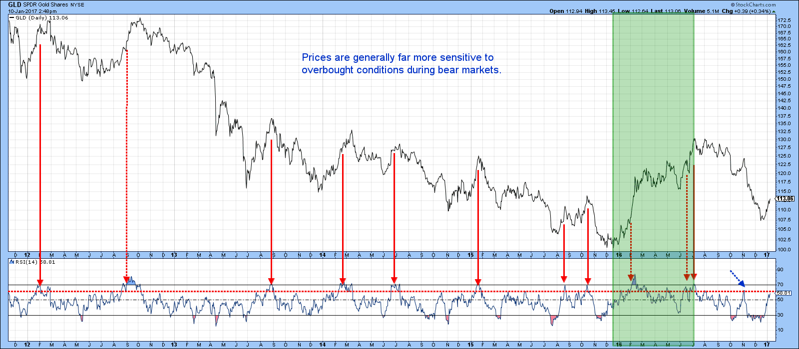
Chart 8
Good luck and good charting,
Martin J. Pring
The views expressed in this article are those of the author and do not necessarily reflect the position or opinion of Pring Turner Capital Group of Walnut Creek or its affiliates.


