New Highs In The Market ... But Fewer Stocks Are Participating
- Market still overstretched
- Greater selectivity as the market moves higher
- Whatever happened to China?
Last week, I pointed out that several indicators were pointing to a short-term correction. I also said that counter-cyclical corrections are difficult to play, essentially because they are usually over before you realize it. To quote from that article.
“….we should be aware of any near-term vulnerabilities, but focus on the main upward trend and not worry about any counter-cyclical moves unless the technical situation looks especially bad with say, a plethora of negative divergences.”
Market still overstretched
Right now, with the market at new highs, there is certainly no shortage of extended short-term indicators. One that I follow closely is my Dow Diffusion series. This one monitors the components of the DJIA to see those which are in a positive short-term trend. It is featured in Chart 1. The red arrows point up those periods when it peaks from above the overbought line and crosses through it. The dashed ones, flag what I regard as failed signals, the solid ones, valid indications of forthcoming weakness. Since 2012 there have been 10 signals, two thirds of which were followed by some ranging action or some kind of decline. That indicator is still moderately overstretched on the upside, thereby suggesting potential general market weakness.
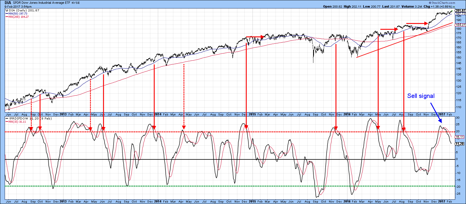
Chart 1
Another, useful series consists of two moving averages of the VIX. They have been plotted inversely in Chart 2 to correspond with market movements. The arrows show that reversals in this series have traditionally been associated with near-term corrections of some type. The indicator has been overstretched for some time, but has stubbornly refused to buckle. It’s still in a vulnerable state, but the S&P has continued to power higher. Even so, we can honestly say that a correction has been taking place. How so?
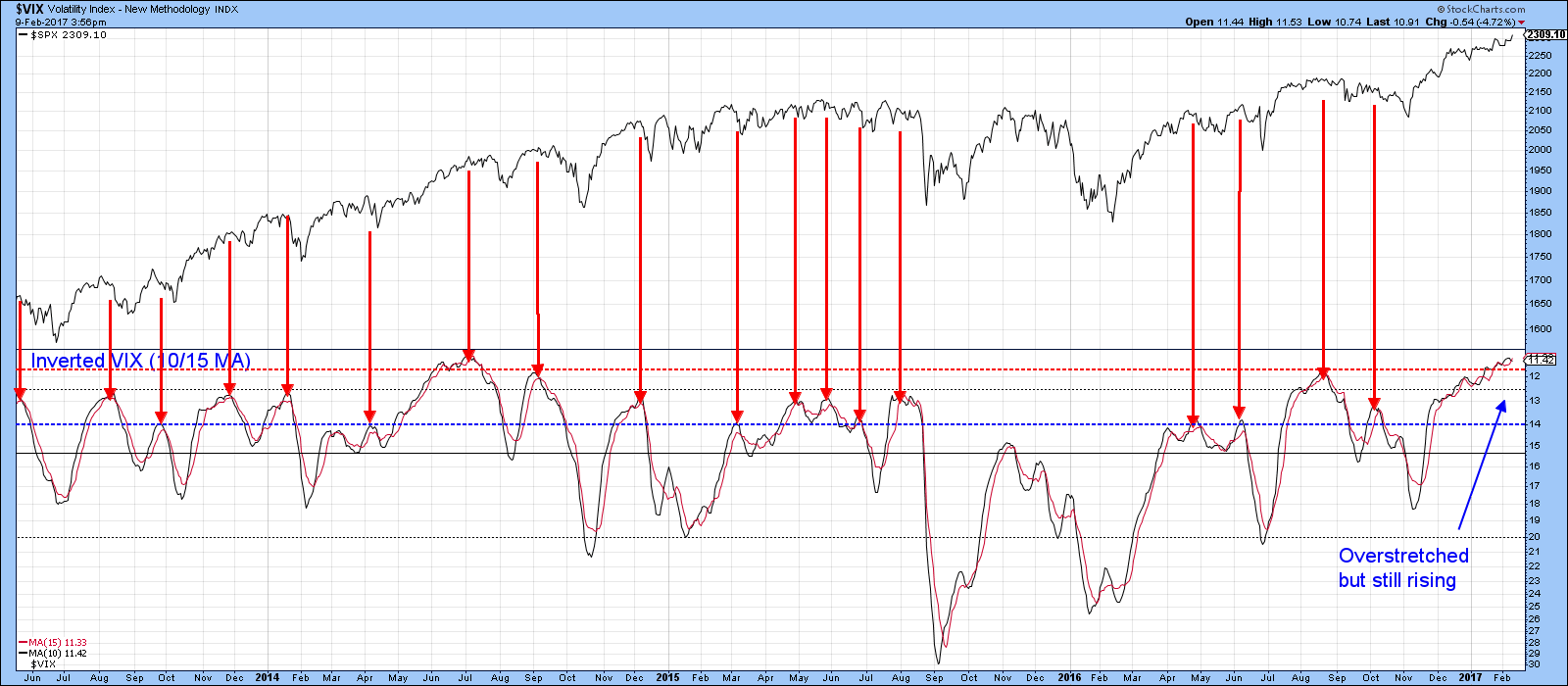
Chart 2
Greater selectivity as the market moves higher
Chart 3 compares the S&P to the percentage of its components that are above their 50-day moving average. For all intents and purposes, it peaked in early December, moved sideways, and has subsequently dropped slightly. Since early January it has been moving lower in the face of a rising Index. Obviously there has been no correction in the S&P itself. However, we can see that under the surface, fewer stocks are trading above their 50-day MA.
At the very end of January, the indicator completed a head and shoulders top. The implication, is not so much that the S&P is likely to decline, although, that may well happen. At this point, the break is merely indicating a downtrend in the indicator, which implies more and more stocks are likely to fall below their 50-day MA’s. That’s by no means the kiss of death, but it strongly suggests that traders will be facing a bigger challenge, as the market becomes progressively more selective, until indicators such as this bottom out.
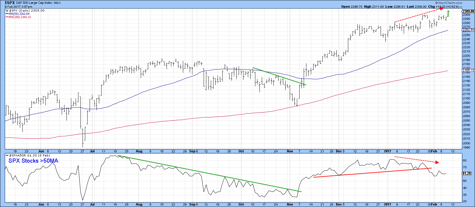
Chart 3
Monitoring the number of stocks greater than a lengthier MA, such as the 150-day span, reflects the longer-term position. Chart 4 shows that the indicator has been in a persistent uptrend since last November. No decline in selectivity here, as 70% of the S&P components are currently trading above their 150-day MA’s. However, it is also evident that 70% is significantly below the 85% reached in July of last year. Today the S&P is around 2,300, whereas then it was under 2,200. Clearly there are fewer issues participating in the “Trump” rally than the “Brexit” one. That’s more of a potential longer-term problem that we will be faced with down the road. Right now though, the trend of the indicator is a positive one. The technical event to look out for going forward is when that red up trendline in the 150 series is penetrated. At that time, we would expect to see an advance powered by fewer S&P stocks or, more likely, an actual decline.
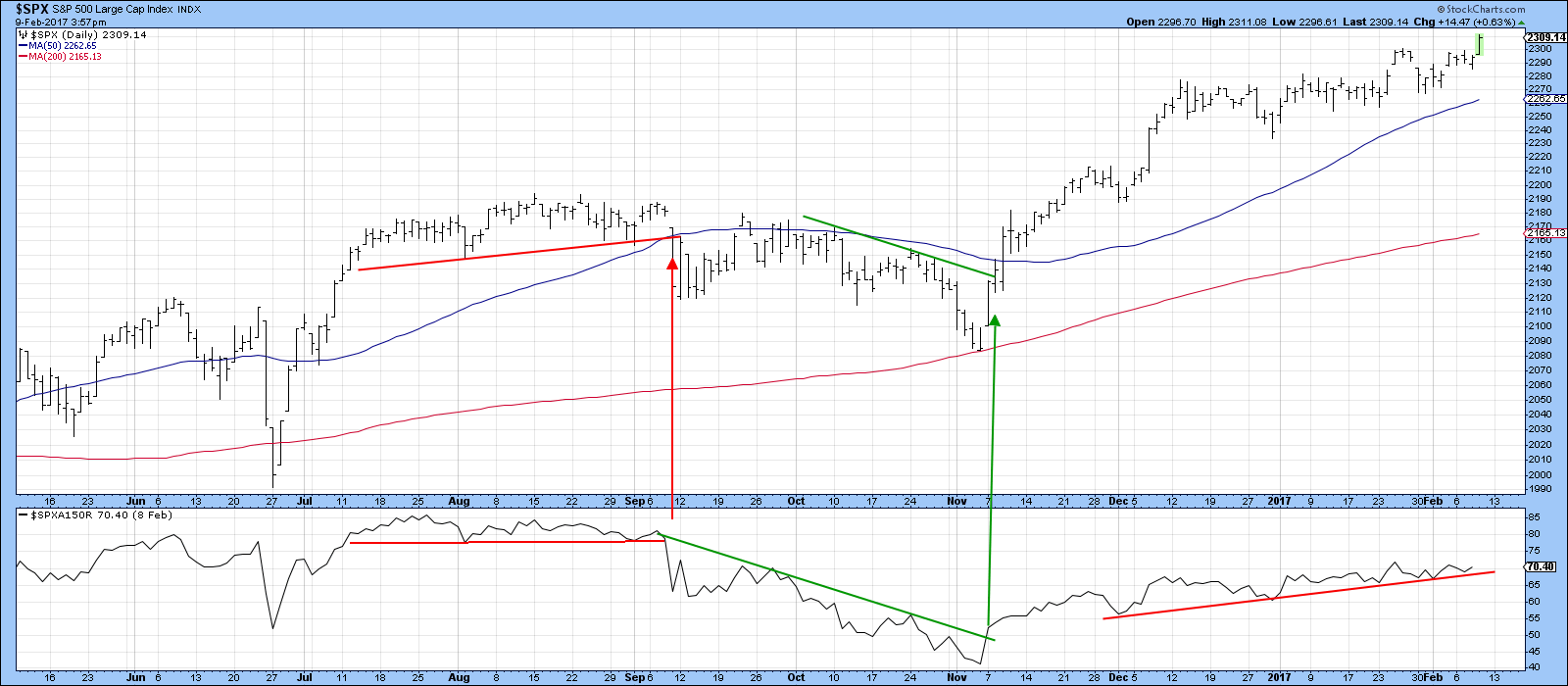
Chart 4
Whatever happened to China?
In recent months the Chinese market has been under-performing the rest of the world, but some of my Chinese short-term indicators have begun to spring to life. The most liquid Chinese ETF is the iShares China Large Cap, the FXI. It consists of large cap Chinese stocks listed in Hong Kong and maintains heavy biases towards certain industries (financials and energy, while going light on tech and consumer stocks). For short term traders who value liquidity, FXI is a great option. Chart 5 shows that it has just broken out from a reverse head and shoulders pattern and its relative strength line has also violated a down trendline. Note also that the KST for relative action (Bottom window) has started to re-accelerate to the upside.
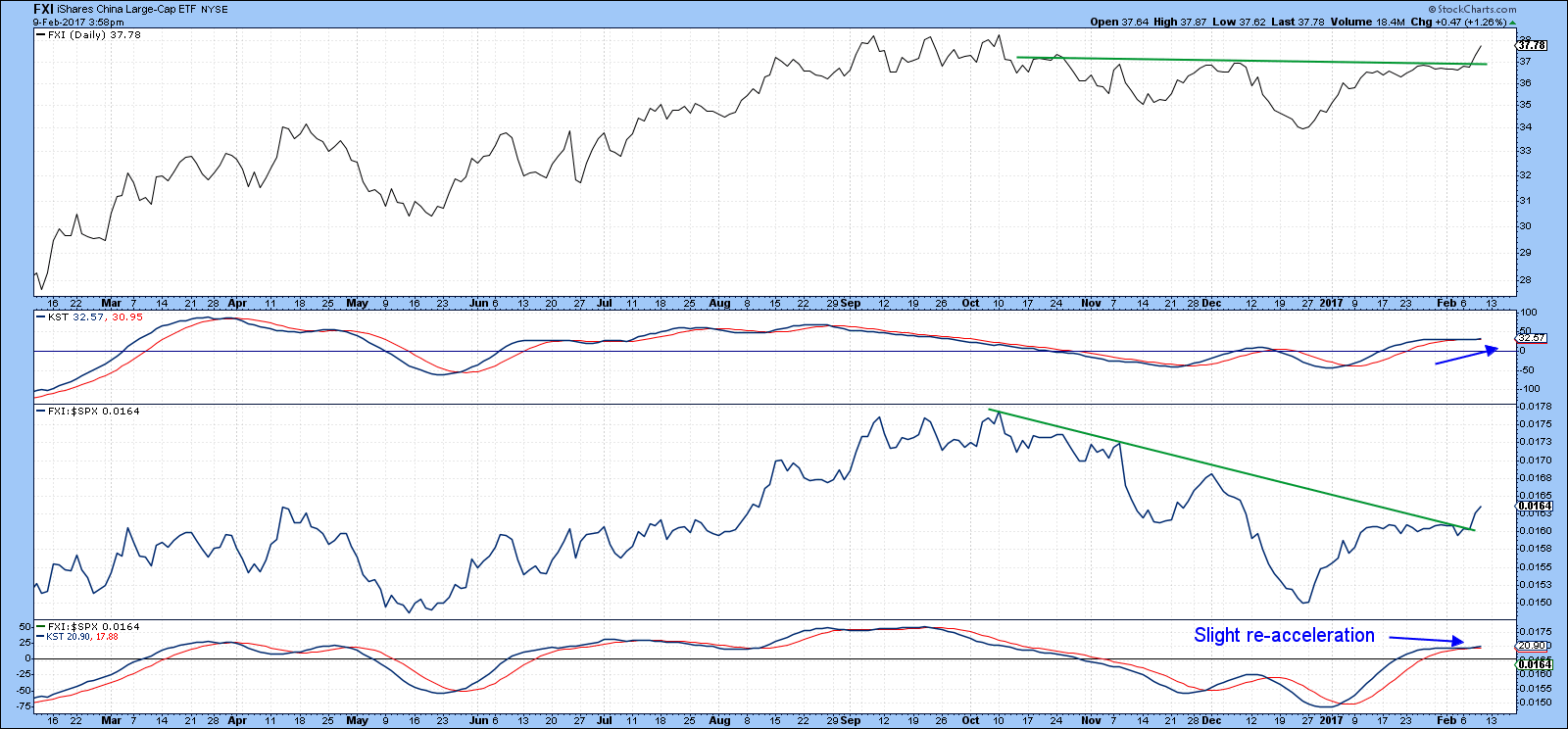
Chart 5
Three Chinese sector ETF’s can be seen in Charts 6, 7 and 8 for financials, industrials and consumer stocks respectively. The Global X China Financials (CHIX) has broken out from a downward sloping reverse head and shoulders on both an absolute and relative basis and both KSTs are in a bullish mode. Neither is overextended, which suggests further upside potential. Both 200-day MA’s have just recently been cleared.
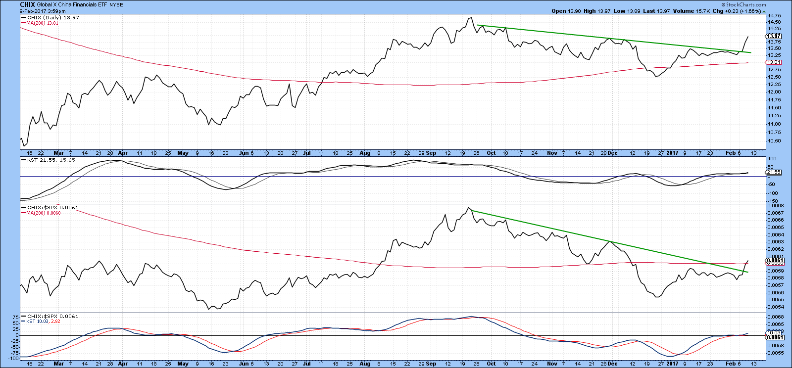
Chart 6
Chart 7 displays the Global X China Industrials (CHII). Here too we see some nice breakouts and positive KST action. However, the jagged nature of the price action is a reminder that this is not a liquid ETF.
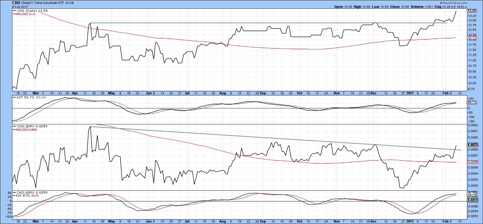
Chart 7
Chart 8 takes a slightly longer view, this time for the Global X China Consumer (CHIQ). Here we can see a long-term breakout underway as the price has cleared the green down trendline and is now right at its 65-week EMA. The RS line, in the third window is set to do the same. Both KSTs, which monitor long-term trends, are in a well-established bull trend.
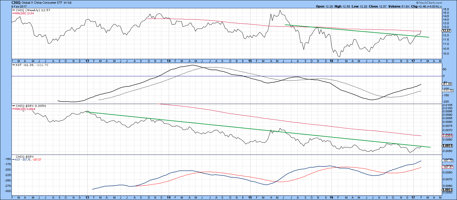
Chart 8
Good luck and good charting,
Martin J. Pring
The views expressed in this article are those of the author and do not necessarily reflect the position or opinion of Pring Turner Capital Group of Walnut Creek or its affiliates.


