When Will Rising Rates Hit The Stock Market?
- No consistent relationship between rates and equity prices
- Three step and a stumble
- Combining interest rate movements with equity trends
No consistent relationship between rates and equity prices
A lot of prognosticators have recently raised concerns that rising rates will soon affect equities in an adverse way. Last week at my monthly webinar, someone posed the question of when that might happen. My answer was less than forthcoming. The reason lies in the fact that I was focusing on what level or what rate of acceleration in rates would be sufficient to terminate the equity party. History shows that there is no consistent relationship between the level of rates and the level of equities, nor is there a consistent relationship between the magnitude and duration of the speed of any particular jump in rates and the onset of the subsequent bear market in equities. What I should have said was that the best approach would take into consideration when the market itself starts to respond to rising rates. I’ll get to that later, but for now let’s consider the fallacy of using rises in rates themselves as a trigger used to justify lower equity prices.
Take Chart 1 for instance, which compares the S&P Composite to the yield on 3-month commercial paper. You can see that when as the rate doubled in 1980 from a high reading of 8% to an incredibly excessive one of 16% (at point 1) stocks continued to advance and did not start falling until early 1981. On the other hand, the rate rose from around 4.9% in March of 1999 to 6.7% in May of 2000 (point 2). That’s a far smaller 36% advance that was followed immediately by a major bear market. Rates rose from 1% in March to 5.6% in June of 2006, a five-fold increase (point 3). However, the market did not respond in a negative way until October 2007, well over a year later.

Chart 1
Chart 2 shows the situation in a slightly different way, where the S&P is compared to a 12-month ROC of short-term rates. Using the left axis as a reference point I have incorporated the +30% level as a benchmark, so that when the ROC reverses from at or above that level a vertical line is generated. As you can see, most of the lines are dashed, which means that the signal failed to trigger a bear market. Four of the signals were spot on, but the vast majority false negatives. I could have used a different parameter or different maturity, such as a 20-year bond, but the results would have been similar. There is no consistent relationship!
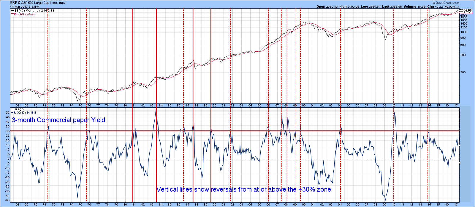
Chart 2
Three step and a stumble
One technique that has been followed on Wall Street for quite a while has been the so-called “Three Steps And A Stumble”. It was initially coined by the late great Edson Gould and referred to the observation that when the discount rate had been raised for the third time in a particular cycle, investors should watch out because the equity market was likely to stumble. That’s because the third hike indicated that the Fed was getting serious about raising rates and the effect on the economy would likely be negative. Since the stock market anticipates changes in the direction of the economy, the third hike was a signal that the clock had started to tick for the next bear market. I wrote about it in December and observed at the time that the discount rate had been raised for the third time. In recent years, the Federal Funds rate seems to have come more to the fore as a key policy rate. That rate had only been raised twice at the time of the article. This week’s expected action would be the third.
The key question of course, is what does this third hike mean for equities? To answer, is that we need to go back to the history books, or take a short-cut by referring to Chart 3.
It compares the S&P to the discount rate back to the early part of the last century. The vertical lines approximate the third hike and the arrows show the lead between the third hike and the bull market high. Some arrows slant to the left because the third hike came after the equity market peak, but these are the exceptions rather than the rule.
Since the 1920’s the market peaked on average 6-months after the third hike. That figure includes those instances where equities topped out slightly before the third hike. To demonstrate how in imprecise this approach is, the range was from 4-months at the 1973 peak to a 37-months lead between September 2004 and October 2007.
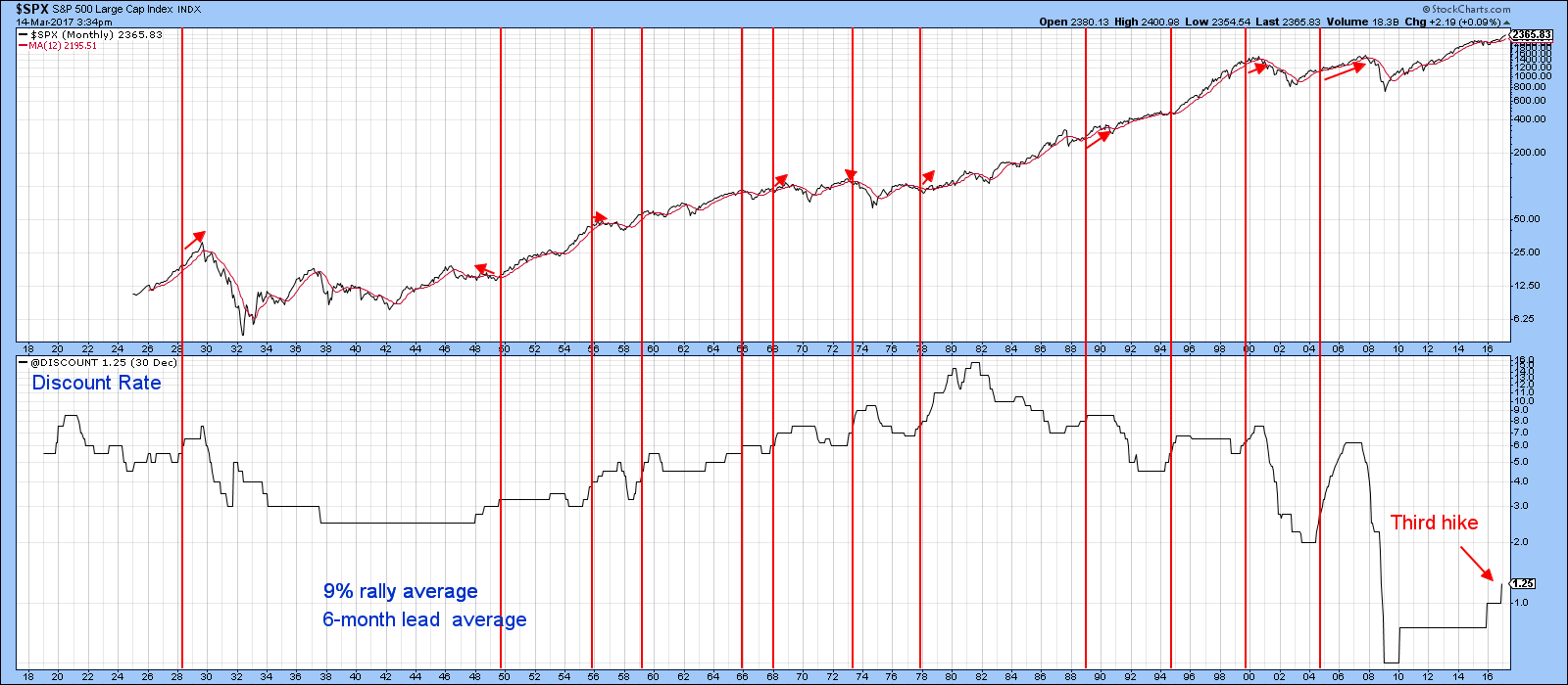
Chart 3
Combining interest rate movements with equity trends
We know that rising rates are poison for the stock market, but what we do not know is how much poison each bull market can take before it keels over. Several decades ago I developed what we at Pring Turner, call the “120% rule”. We call it that because it offers a very persuasive risk reward when bullish. By the same token, it also keeps us out of major trouble. Indeed, the late great Nelson Freeburg, who used to test systems for a living, classified it as one of the best ones he had ever come across. Its problem, is that it takes patience to wait for the signals and even more to follow them.
The system uses two variables, the commercial paper yield and its 12-month MA and the S&P with its 12-month MA. It goes bullish when the paper yield is below its MA and the S&P responds to this easy money condition by crossing above its MA. Bearish situations are triggered when the commercial paper is above its 12-month MA and the stock market takes umbrage by crossing below its MA. When the two are in conflict the model is neutral and has no investment implications. In effect, the MA test for the yield, which looks to see when the poison is being administered and the 12-month MA crossover for equities, which tells us when the patient is responding to that poison. The vertical lines in Chart 4 (1926-1978) and Chart 5 (1978-2017) show valid sell signals. The ellipses indicate false negatives.
Between 1900 and 2010 the system returned a rounded annualized monthly return of 21% when bullish, with a standard deviation of 13%. This compared to the S&P with a 10% and 16% return and deviation for the same period. Bearish signals averaged -3% and 15% respectively.
Right now, the system is in neutral mode, because both series are rising. Whenever the S&P crosses below its 12-month MA that will be the time to worry. Until then, it would seem that the trend is your friend!
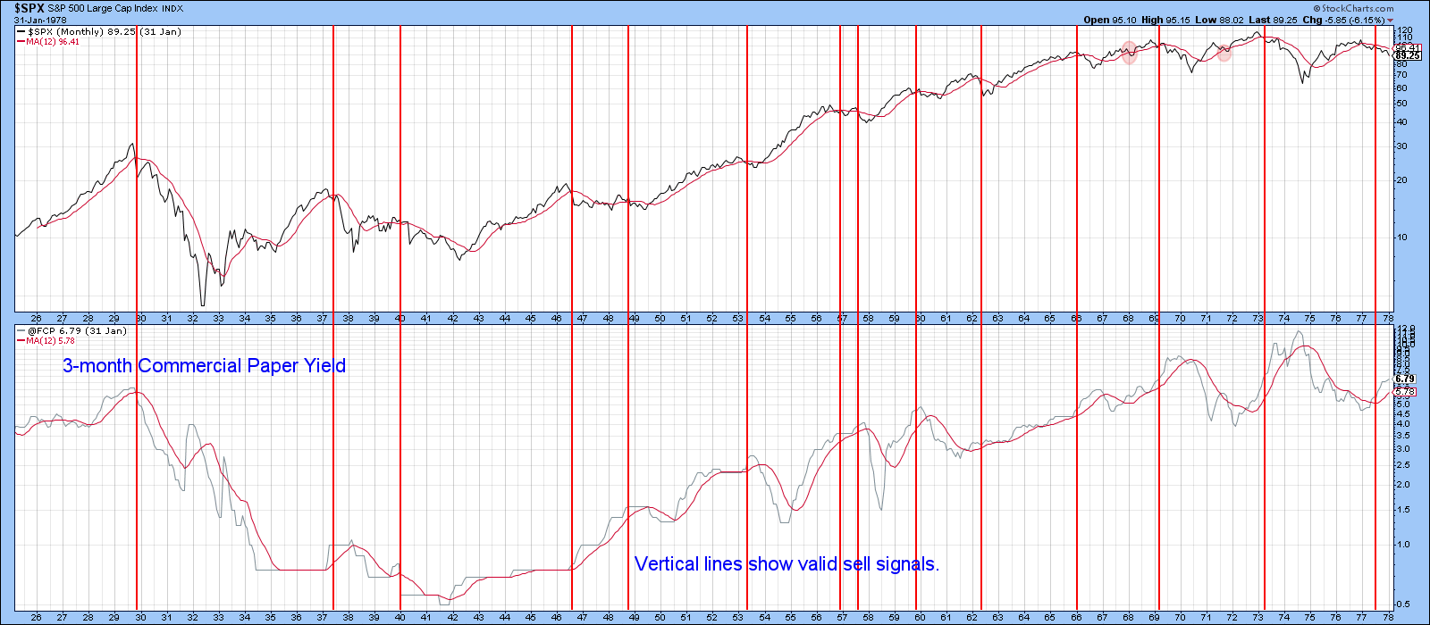
Chart 4
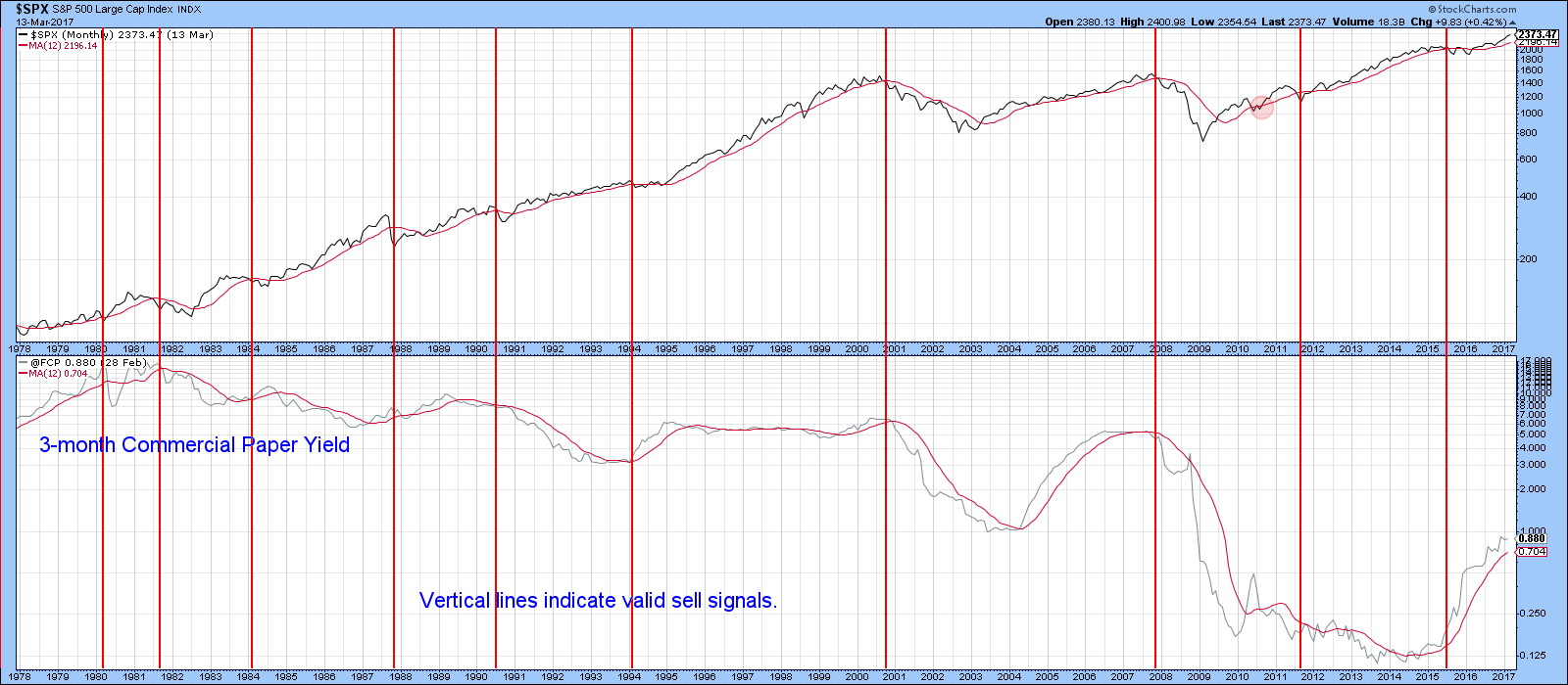
Chart 5
Good luck and good charting,
Martin J. Pring
The views expressed in this article are those of the author and do not necessarily reflect the position or opinion of Pring Turner Capital Group of Walnut Creek or its affiliates.


