Chinese ETF's Are Playing Good Cop Bad Cop
- Trying to replicate the Shanghai Composite with a Chinese ETF
- Global Update
Years ago, investing in China was a challenging proposition for US based investors. In recent years though, a number of ETF’s have been listed that embrace Chinese Indexes as well as specific sectors. The big daddy of them all is the iShares China Large Cap, the FXI. With approximately $3 billion of assets under management (AUM), it is by far the most liquid of the 40 or so listed ETF’s that specialize in China. Its next nearest rival is the iShares MSCI China (MCHI), which has an approximate AUM of $2.3 billion. Both these volume leaders do not invest in China directly, but are exposed to large cap Chinese A shares that are listed in Hong Kong. Chart 1 compares their performance.
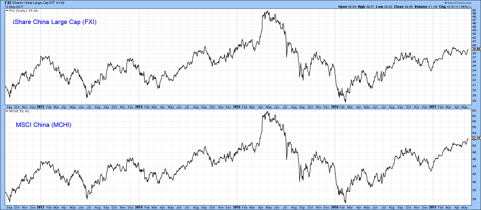
Chart 1
Trying to replicate the Shanghai Composite with a Chinese ETF
Indeed, if you look at Chart 2, which compares the Hang Seng with the FXI and the Shanghai Composite, it’s apparent that the FXI often diverges with the Composite, as flagged by the arrows. In effect, the FXI trades somewhere in the middle between the HSI and the Shanghai Composite, so it’s clearly not a pure play on the Chinese stock market if we use the Shanghai Composite as our benchmark.
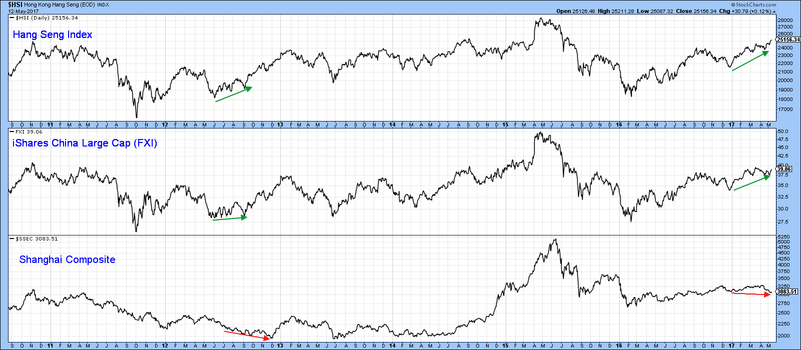
Chart 2
Chart 3 plots the FXI and the Market Vectors China AMC A-Share ETF (PEK) together with the Shanghai Composite. As you can see, the less liquid (approximate $85 million AUM) PEK is a far better fit, if you are trying to replicate the Shanghai Composite. That's a two edged sword of course. It worked well during the 2014 run-up, not so well recently with the downside trendline violation.
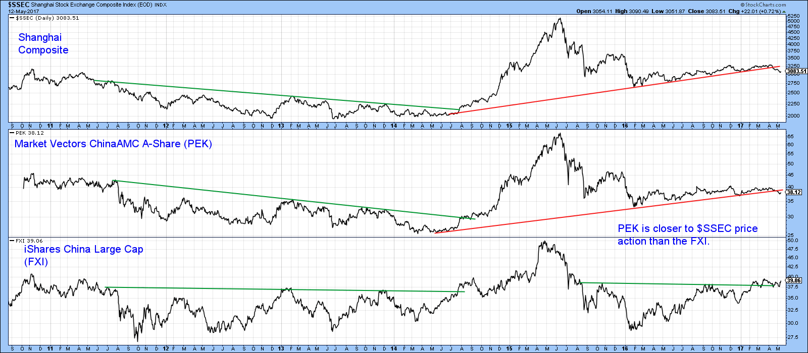
Chart 3
Indeed, if you look at chart 4 the ratio between the Hang Seng and the Shanghai ($HSI:$SSEC) closely resembles the ratio between the FXI and the PEK. It turns out that FXI is a better play for Hong Kong and PEK for the Chinese market itself. So far this year FXI has played the good cop, with a gain of 12.5% whereas “bad cop” PEK has only advanced by 3.25%.
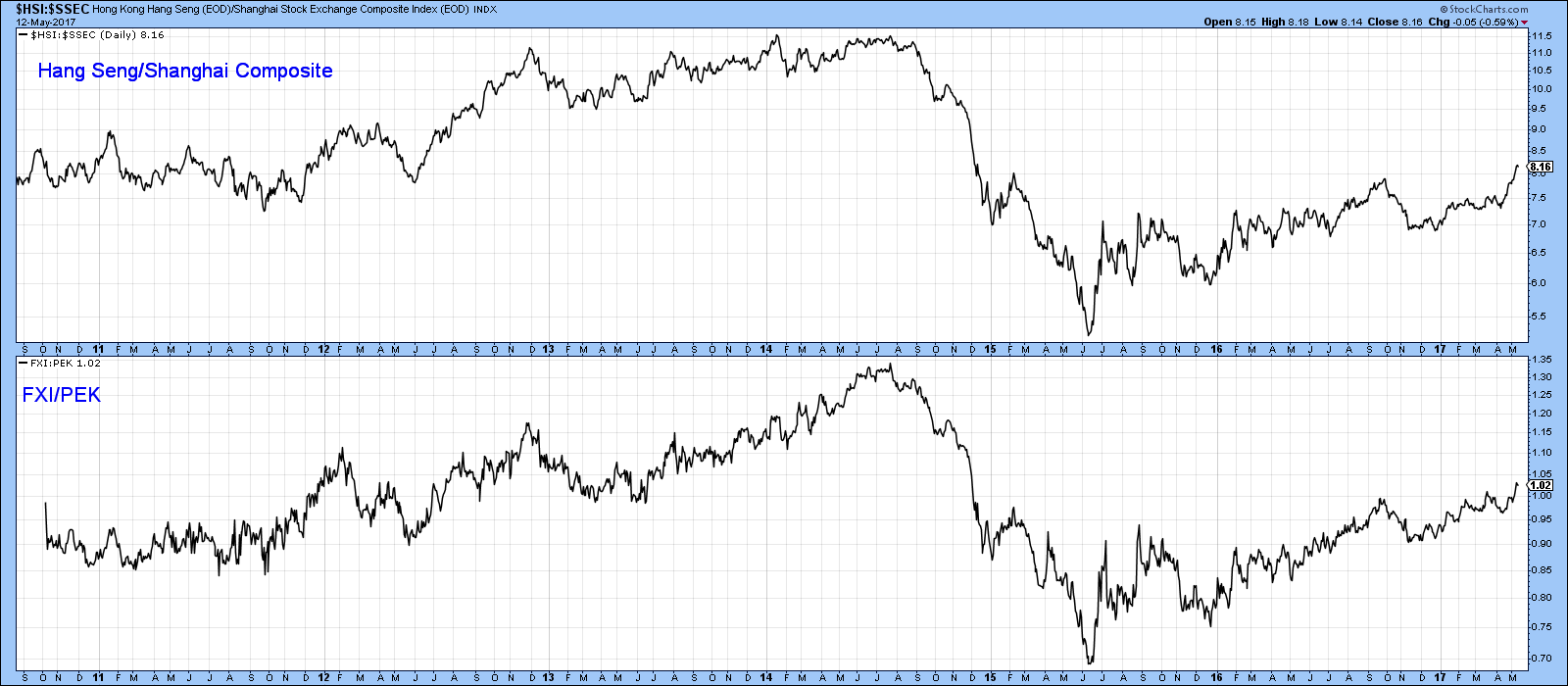
Chart 4
Chart 5 shows that the FXI, has recently broken out from a small reverse head and shoulders pattern and is above the 65-week EMA. In addition the long-term KST is rising and positively placed above its EMA. Unfortunately, the relative action against the S&P Composite (FXI:$SPX) has not yet succeeded in breaking above its 2010-17 down trendline. That suggests that FXI will rally but unless that down trendline is penetrated on the upside, that advance will be less than the S&P performance.
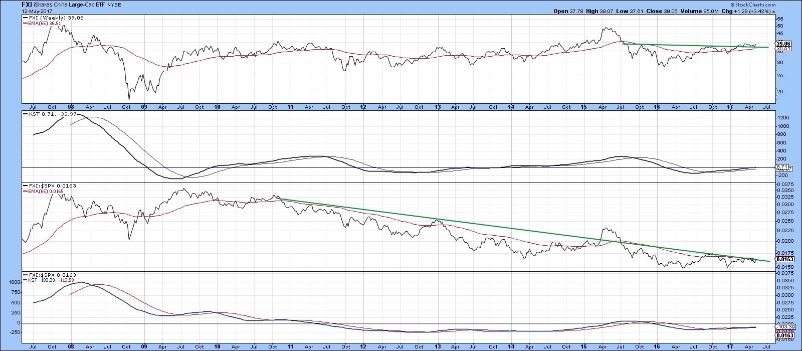
Chart 5
This compares to PEK, which has recently violated a key up trendline going all the way back to 2014. The long-term KST is also bearish. Furthermore, the RS line touched a new bear market low it early May. Both it and the absolute price are trading below their respective 65-week EMA’s.
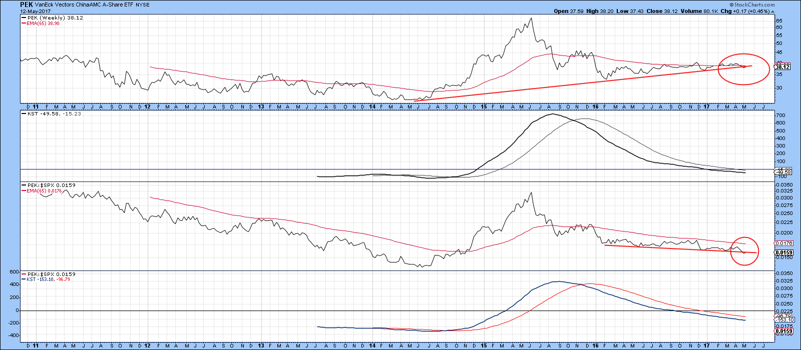
Chart 6
Little wonder, that when we compare the two ETF’s in Chart 6, it is apparent that the FXI has not only been the superior performer, but has, in the last few weeks, broken out to the upside. In addition, all three KSTs are in a positive mode, which strongly suggests that FXI will remain the good cop on the block.
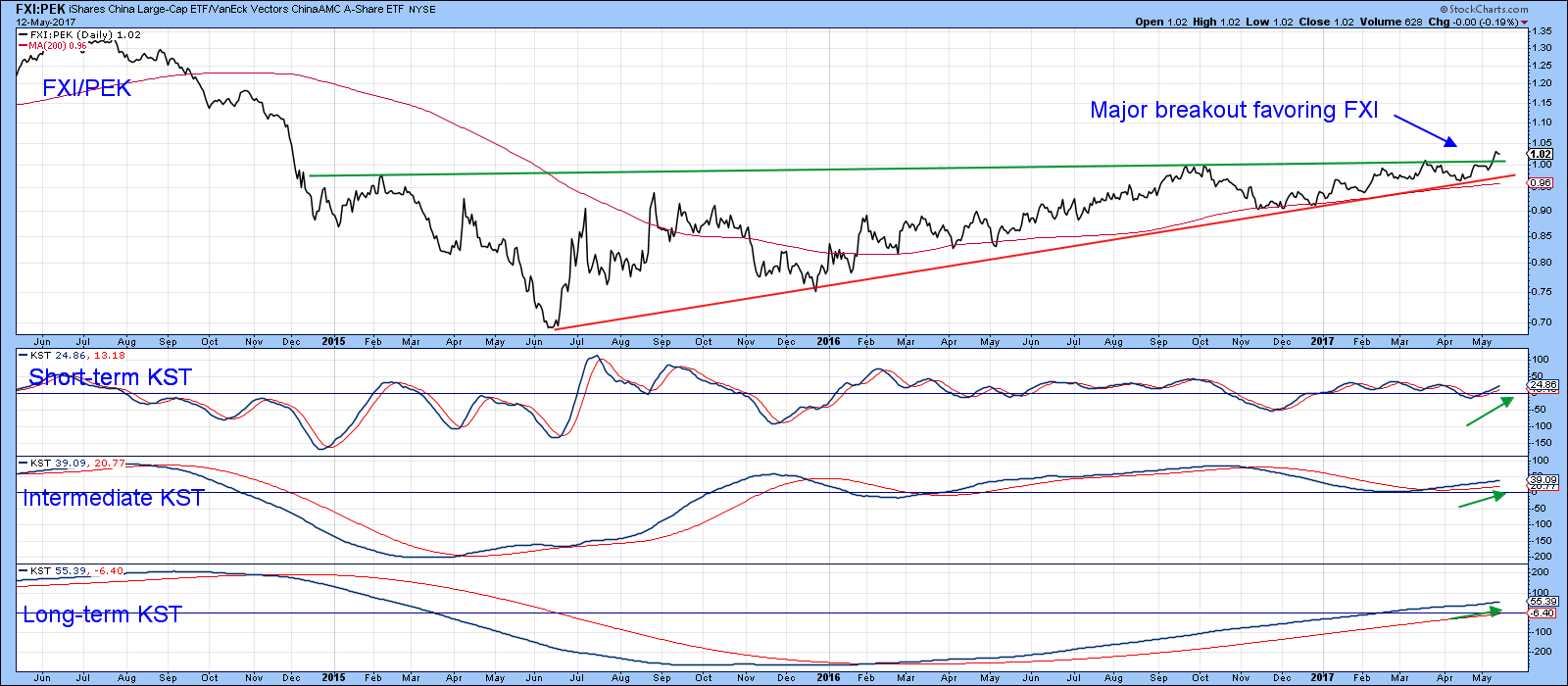
Chart 7
Global Update
Chart 8 compares the MSCI World Stock ETF, the ACWI, with my Global A/D Line (!PRGLAD). This indicator is calculated from the daily cumulative plurality of a basket of country ETF’s. A sign that a market may be in the process of topping out develops when the ACWI registers a new high, but the global A/D Line does not. In the current situation, the ACWI has been moving sideways but the A/D line registered a new high on Friday. That suggests the global advance is much broader than that indicated by the blue chips, which is a positive development.
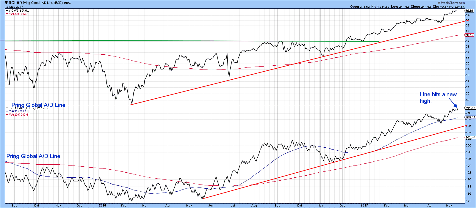
Chart 8
Charts 9 and 10 feature two global oscillators. The first is my Global Diffusion Indicator (!PRDIFGLO). This one monitors a basket of country ETF’s that are in a positive trend. It’s clearly getting overextended, but the fact that it has managed to re-cross above its MA suggests that there is a little more that can be squeezed out of this rally.
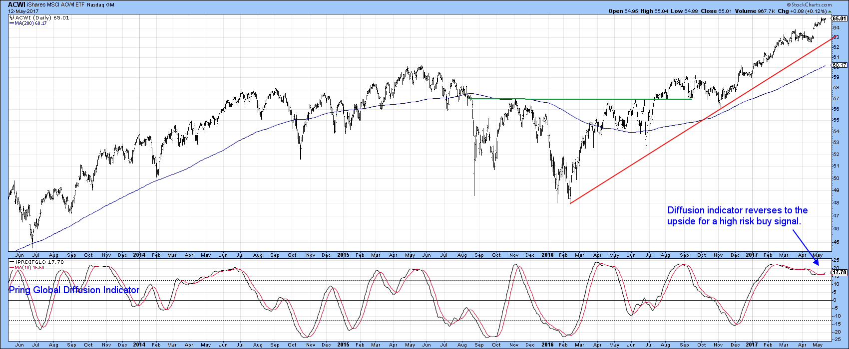
Chart 9
We get the same impression from Chart 10, where the oscillator this time has been constructed from net new high data (!PRNNHGL) derived from a basket of individual country ETF’s. It too, had begun to decline, but has now reversed to the upside. Once again, this is coming from an extended reading, but last week’s upside reversal says there is still some life left in this rally.
Our danger point would be a decisive break below the previous minor low and the red up trendline in Chart 10. That benchmark is at $62.50.
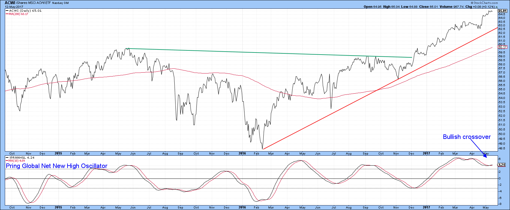
Chart 10
Good luck and good charting,
Martin J. Pring
The views expressed in this article are those of the author and do not necessarily reflect the position or opinion of Pring Turner Capital Group of Walnut Creek or its affiliates.


