When Does A Low VIX Reading Matter?
- The VIX
- The Dollar Index
- The Euro
- Swiss Franc
- Japanese Yen
The VIX
Most of this piece is devoted to the dollar and some interesting looking currencies. However, I have been intrigued by a couple of articles and news stories recently appearing in the general purpose media. They have pointed out that the CBOE Volatility Index, aka the VIX ($VIX), is at its lowest level since the early 1990’s. That should trigger alarm bells as this indicator tends to move inversely with prices. Lots of volatility spells lots of fear. When investors are fearful, its usually because most of the bad news is out, prices have fallen and traders have sold. Under such conditions, prices are free to move higher. Fearing fear itself may work in everyday life, but not in the markets, where it should be embraced!
By the same token, a lack of fear is the kind of stuff from which tops are made. That’s because it indicates investors are getting careless in their decision making. Careless decisions unravel quickly when prices start to slip.
Chart 1 shows the $VIX plotted inversely so that it corresponds with price movements in the S&P. The two series are actually 10- and 20-day EMAs. You would think that an extremely high reading i.e. absence of fear would be associated with an important market top, but that has not been the case in the last few decades. Just look, for instance, at the low reading at the top of the tech bubble in 2000. Even the late 2007 peak was preceded by a high in the $VIX that was registered 11-months or so earlier. If past is prolog, this week’s record reading will not amount to anything major over the near-term.

Chart 1
Talking of the near-term, Chart 2 tells us that in the last 4-years, reversals in these two EMA’s from a relatively high reading has been useful for timing short-term corrections. At present, both averages are in a rising mode, and have not therefore generated a sell signal yet. Having said that, it would not take much to trigger one, after all we are in the month of May.

Chart 2
My conclusion from all this, is that extreme readings in $VIX are not as bad as we might fear from a long-term perspective. On the other hand reversals from extreme levels are relevant from a short-term point of view.
US Dollar Index
The Dollar Index ($USD) remains in a very tightly balanced technical position as you can see from Chart 3. On the one hand, it has bounced off its 65-week EMA, but by the same token has not yet managed to climb above the two converging trendlines. Things do not look positive from a momentum aspect because all three series are in some form of decline. It seems to me that a Friday close below the recent low at 98 would seal its fate on the bearish side.

Chart 3
On the other hand, Chart 4, which features daily data, sees the Dollar Index ($USD) slightly above its 200-day MA and (red) breakout trendline. It will require a rally above the green line at 101 to signal the all-clear, but the upside reversal in the KST monitoring very short-term trends looks as though it may have begun to turn up. The two demarcation points are 101, on a daily basis, and 98 on a Friday close one.

Chart 4
The Euro
The Euro ($XEU) has a 57% weighting in the US Dollar Index, so it is somewhat of a mirror. Chart 5 shows that it is hovering about its 12-month MA, but has not yet gone through. The red arrows flag KST sell signals, but that indicator is still positive. However, the Coppock Curve, in the bottom window has gone bearish and its movements, whilst more sensitive than the KST, are usually followed by similar ones for this slower moving series.

Chart 5
The daily chart also shows a finely balanced situation, as the Euro managed to rally above the green trendline for a second time, as well as its 200-day MA. That MA was resistance, but should now reverse its role to one of support. Nevertheless, the mid-April gap has not yet been closed, and the KST has started to roll over, so we may yet see a drop below the MA.
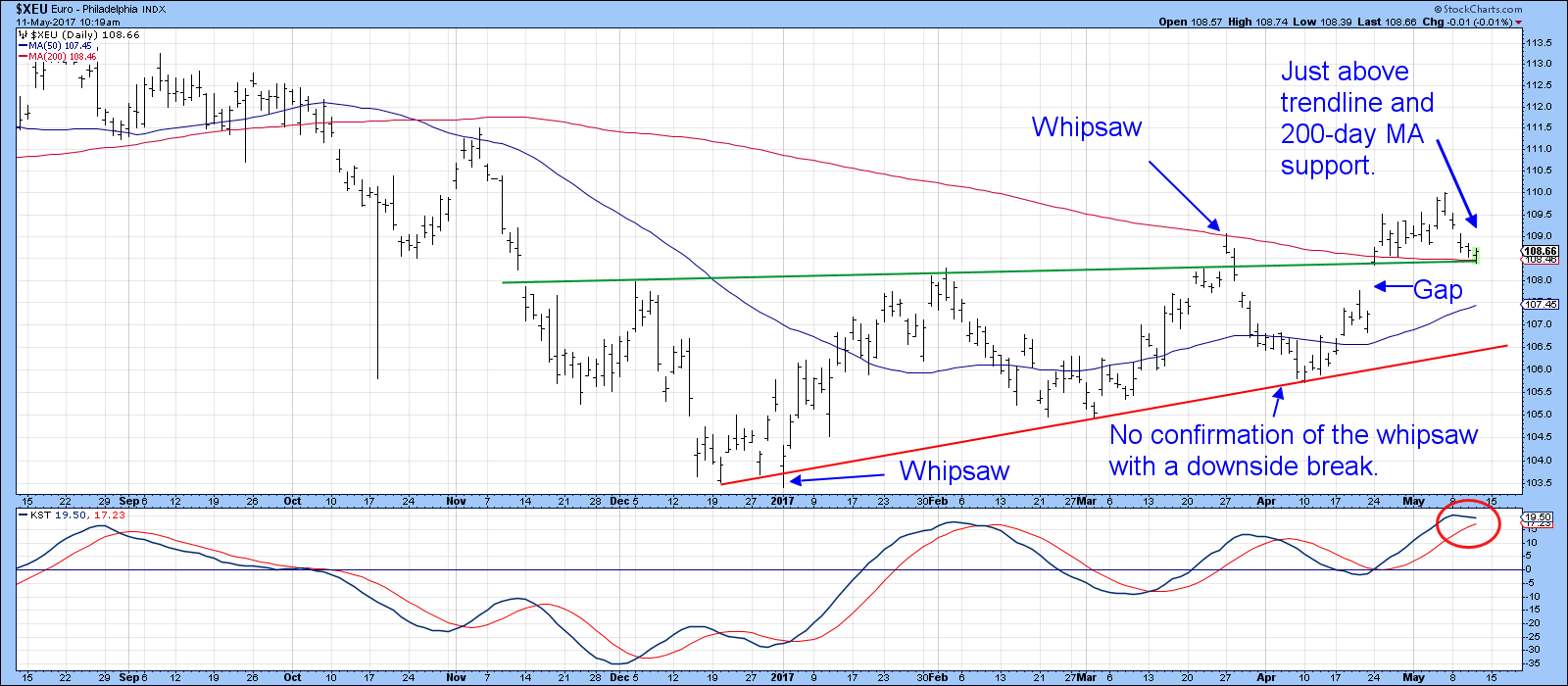
Chart 6
Swiss Franc
The Swiss Franc ($CHFUSD) (Chart 7) has completed a large top, but is stubbornly refusing to comply with the recent technical break. At this point the series of declining peaks and troughs, as flagged by the dashed arrows, is still intact and the currency is below its 12-month MA. However, the last year and a half has really been a trading range. Until we see a breakout in either direction, the longer-term technical position will not be resolved. Underscoring the finely balanced long-term technical position is the flat KST, which could easily move in either direction.

Chart 7
Chart 8 seems to break the impasse for the Swiss France shown as $XSF. That’s because the price has violated its 2017 up trendline and experienced a KST sell signal.
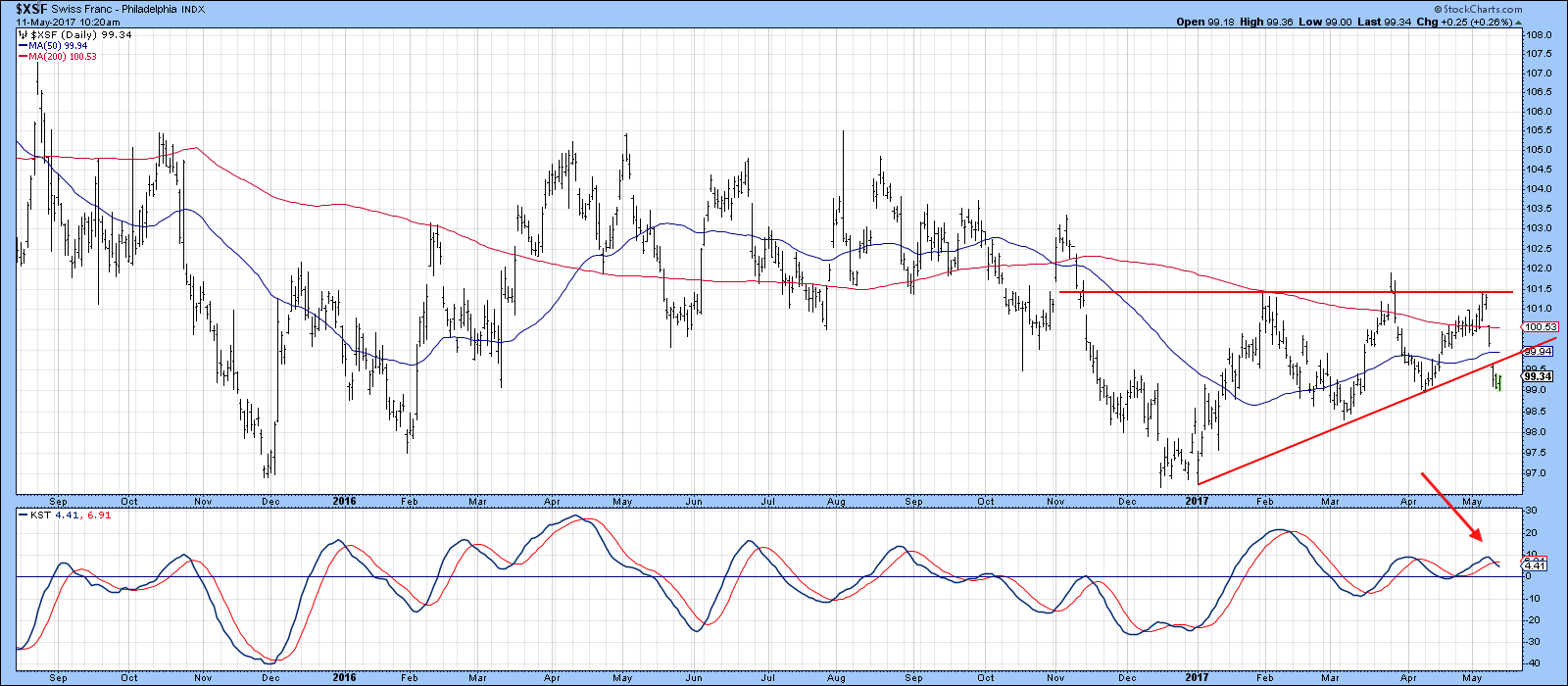
Chart 8
Japanese Yen
The Japanese Yen ($XJY) looks as though it may have failed to cross above its 12-month MA, which itself, has started to roll over to the downside. The KST has gone bearish, so a test of that 20-year red up trendline appears likely.

Chart 9
The first barrier for the $XJY is the up trendline in Chart 10, which is at 86. The recent short-term KST sell signal suggests that will happen. If not, the thing to look for would be a break above the two green down trendlines for the currency and its Special K indicator.

Chart 10
Good luck and good charting,
Martin J. Pring
The views expressed in this article are those of the author and do not necessarily reflect the position or opinion of Pring Turner Capital Group of Walnut Creek or its affiliates.


