Confidence Indicators And Small Caps Point To Higher Stock Prices
- What is a confidence indicator?
- Credit Spreads to the rescue
- Equity market spreads
- Growth versus Value
- Small caps: Are we there yet?
Washington may be suffering from acute dysfunction but Wall Street doesn’t seem to care, or perhaps knows something that we mere mortals do not. Failure to agree on healthcare reform this week should have been a great excuse for an overbought market to take some profits. That did not happen though, as equities continue to climb that proverbial “wall of worry”. Technically, several intermarket relationships that I follow are all hinting in one way or another that traders and investors are growing in confidence, which supports this contrary picture. Let’s take some time to review several of them.
What is a confidence indicator?
When I use the term confidence indicator I am referring to the relationship between a risky and less risky security. When the riskier of the two series is out-performing its more defensive counterpart that’s positive because the indication is that market participants are willing to take a chance. In other words, they are growing in confidence.
Credit Spreads to the rescue
One of the more obvious of these relationships is the ratio between poor quality or junk bonds and high quality governments. The IBoxx High Yield ETF (HYG) when related to the Barclays 7-10 year Trust, the IEF, offers a great example. A rising ratio indicates that traders are favoring junk over high quality and vice versa. When this relationship fails to confirm a new high in the S&P, as was the case in late 2015, this is not a good sign as it warns of potential weakness. This instance has been flagged by the two dashed arrows. However, Chart 1 shows that that things are far more positive right now, as this series has just broken to the upside. Thus we have an indication of an improving trend of confidence, which should transfer to the equity market.
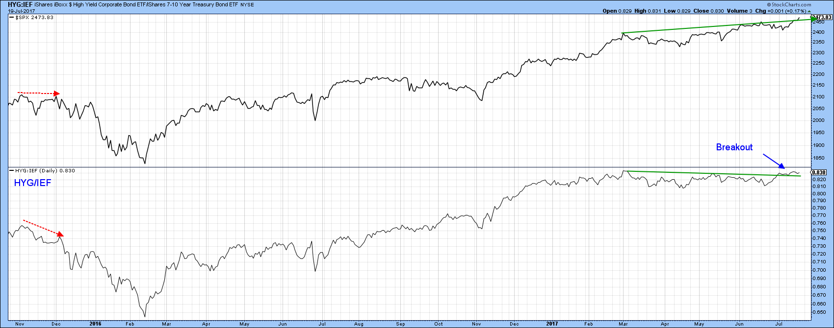
Chart 1
Equity market spreads
Chart 2 compares the performance of the S&P High Beta ETF, the SPHB, to the S&P High Quality ETF, the SPHQ. A rising ratio indicates that investors are once again willing to take the plunge by betting on more volatile stocks and vice versa. This relationship has been declining since late last year, but has begun to improve. The latest rising trend started in mid-June, when the ratio rallied as the S&P experienced a 2-week down trend. This situation has been flagged by the three dashed blue arrows., Now the ratio has built on this strength by moving above the December/July down trendline. It has also completed a double bottom formation and the short-term KST is in a bullish mode. It’s obviously going to take a long time for the ratio to confirm new highs in the S&P. Indeed, it may never do so. The important point, is that the current trend is bullish and likely to extend, a condition that should be positive for equities as a whole.
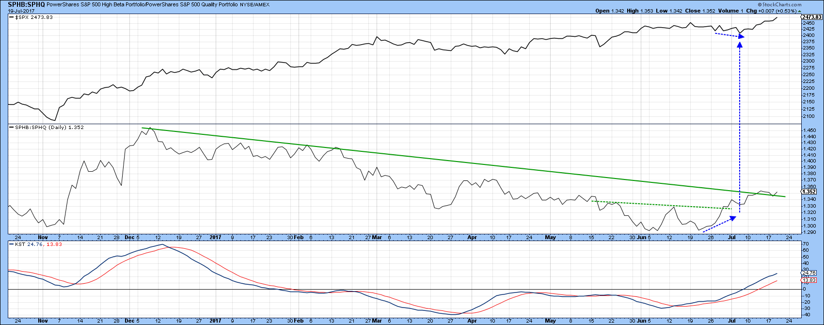
Chart 2
One of my favorite confidence relationships is that between technology (XLK) and consumer staples (XLP). A rising line means that traders are throwing caution to one side as they bid up the more speculative technology issues relative to the highly defensive consumer staples. Chart 3 shows that this XLK/XLP ratio broke out from a base in mid-2016, but more recently cleared the solid green line marking the top of an even larger base extending over a whopping 15-year time span. That’s important if you are making a decision as to whether to invest in technology over staples.
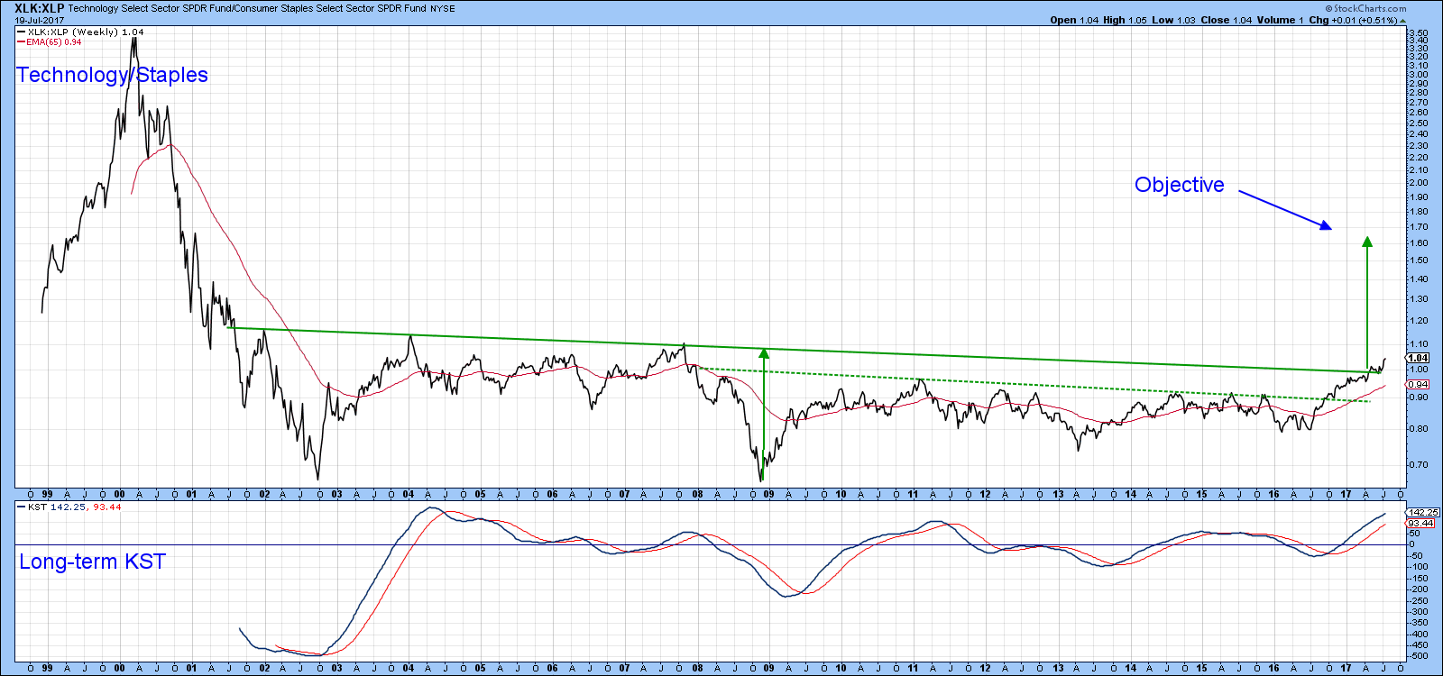
Chart 3
However, it’s more momentous than that, because the green shaded areas in Chart 4 tell us that when the ratio is rising this implied trend of growing confidence is positive for stocks in general.
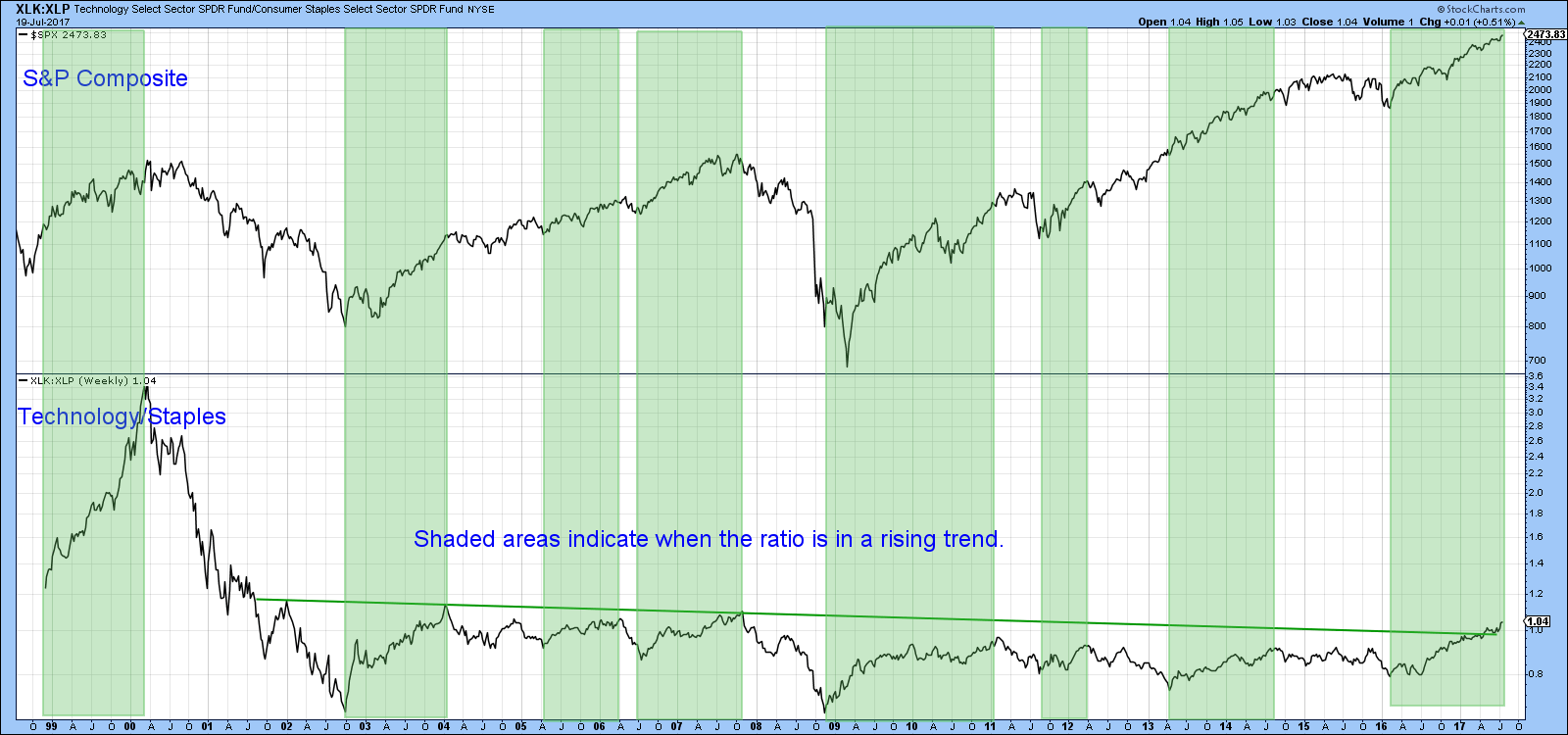
Chart 4
Growth versus Value
You would think that growth versus value would represent a good reflection of swings in confidence, but apparently not, as we can see from Chart 5. For most of the period covered, the ratio and the S&P go their separate ways. However, we can say that the ratio is currently in an uptrend favoring growth. That’s because it has broken out from a 2016-17 base, and experienced a positive short- and long-term KST buy signal.
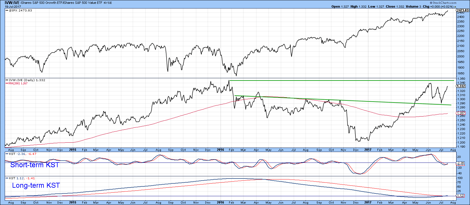
Chart 5
Small caps; are we there yet?
Several weeks ago, I wrote about the possibility of small caps breaking to the upside. I thought at the time that the odds were pretty good, as the relative strength line had broken above its green down trendline (by the blue arrow). That break turned out to be a false one, but with Wednesday’s action things are looking a little brighter as the RS line has edged through the line again. This time though, the actual price has closed above its resistance trendline, and the KST in Chart 7 has started to re-accelerate on the upside.
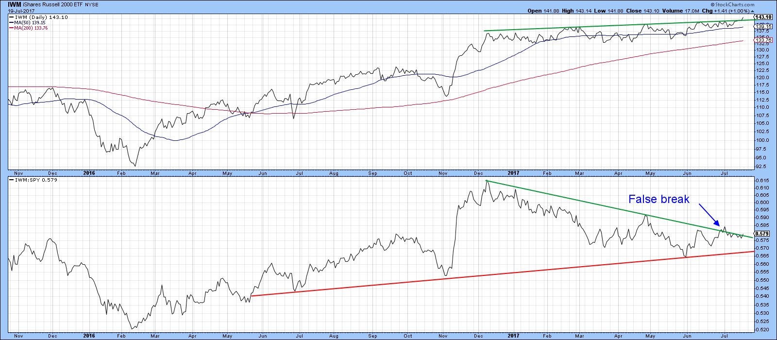
Chart 6
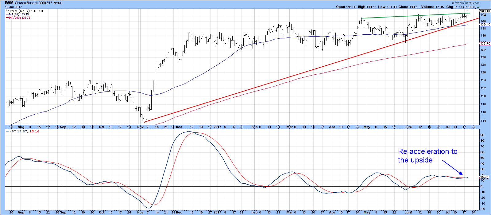
Chart 7
Finally, Chart 8 tells us that the Small Cap A/D Line is in gear with the IWM itself, as both are challenging their bull market highs.
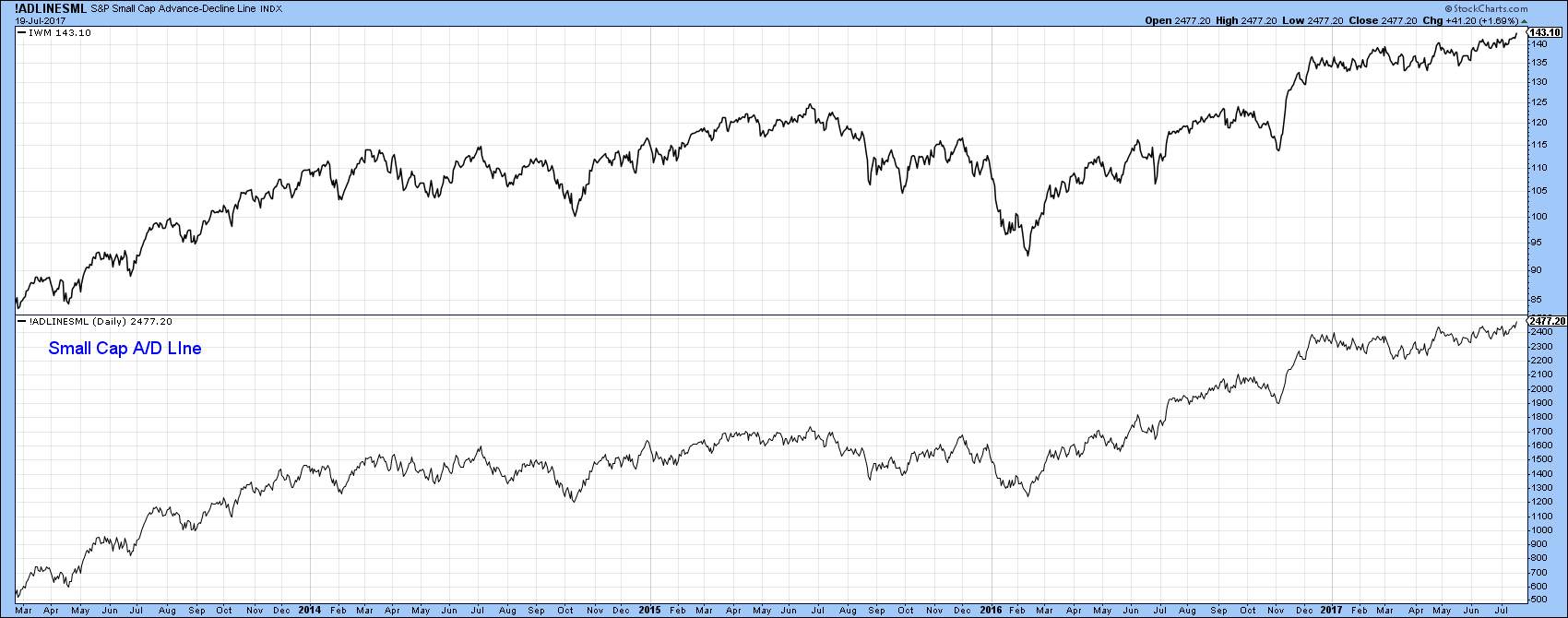
Chart 8
Good luck and good charting,
Martin J. Pring
The views expressed in this article are those of the author and do not necessarily reflect the position or opinion of Pring Turner Capital Group of Walnut Creek or its affiliates.


