A Take On The Utilities In An On-going Correction
- Bearish short-term charts suggest there is more to come on the downside
- Consumer Discretionary—not so discreet
- Energy—out of gas
- Utilities—a place to hide?
Bearish short-term charts suggest there is more to come on the downside
For the last two weeks, I have been zeroing in on a deteriorating near-term technical situation. Since the long-term indicators, such as the Coppock Curve, the averages relative to their 12-month MA’s etc. are still positive, I am treating this correction as one that is taking place under the context of a primary bull market. That does not mean that we should not worry about a bear market, but at this time the balance of evidence remains with the long-term bull.
One area that does suggest some important intermediate damage has been done, is featured in Chart 1. Here you can see that the two A/D lines have now decisively violated important up trend lines. This is not the end of the world, but these penetrations do signal the likelihood of a trading range or downside reversal. In effect, we have a loss of upside momentum going into the seasonally weakest period of the year.
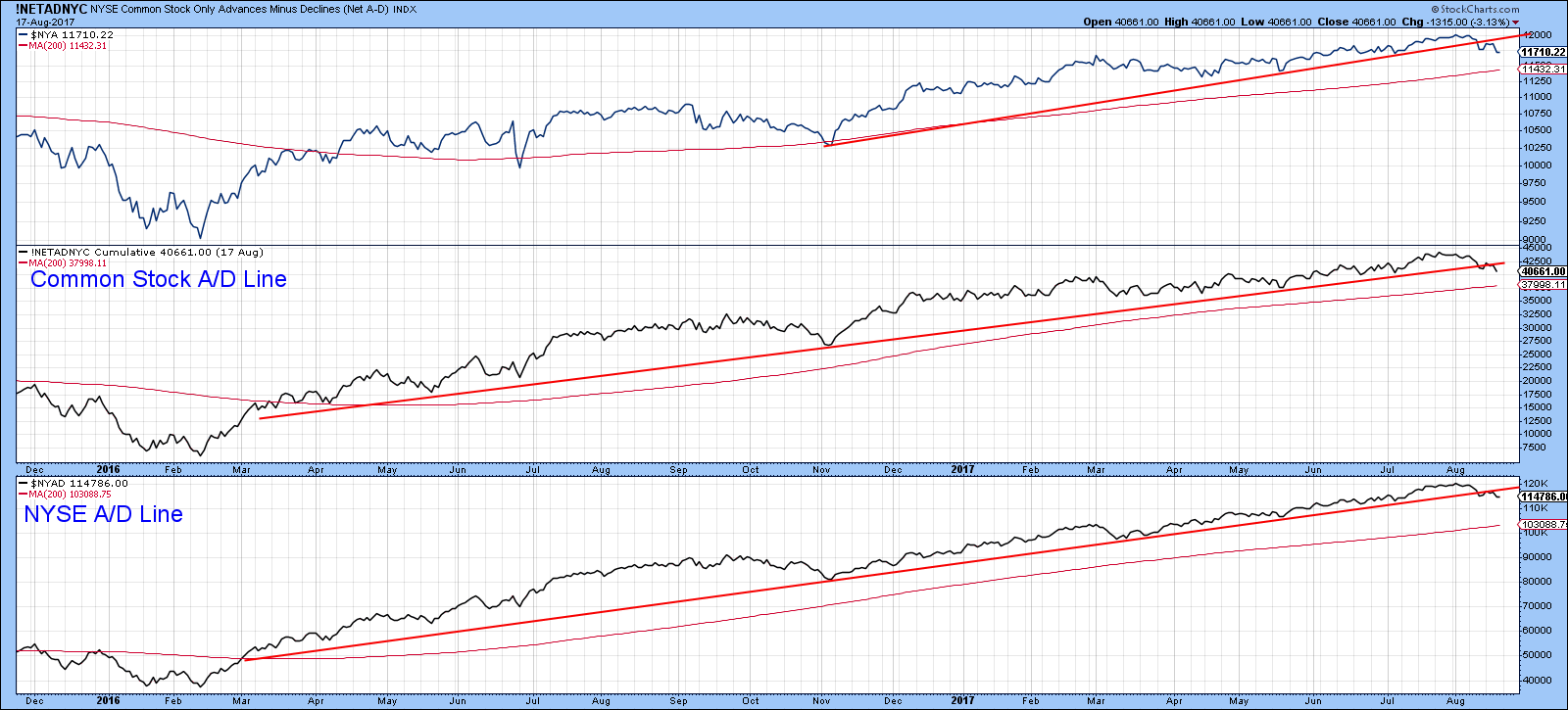
Chart 1
Two days ago, the $NYA completed a head and shoulders top, with an indicated objective close to the red 200-day MA. In the next few days, of course, the MA will continue to move higher, which means that the objective and MA will soon be at an identical level. Should a drop to this level prove to be the case, some kind of bounce would be expected.
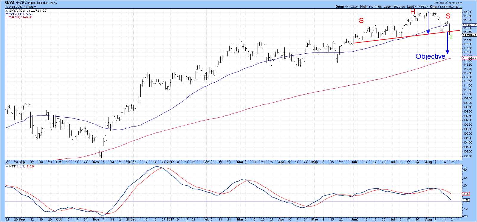
Chart 2
Chart 3 shows two moving averages of the $VIX, a 10-day and 15-day EMA. They have been plotted inversely to correspond with price movements in the S&P. The solid red arrows flag corrections that have followed reversals that have taken place above the red dashed horizontal trend line. The dashed arrows indicate failed bearish signals. Had the recent decline pushed these EMA’s below the blue moderately oversold horizontal line, this would suggest that an upside bounce would be in order. However, that is not the case as it is still at a relatively high reading and remains in a downtrend. Note also, that both EMA’s have completed tops. There are two previous instances of top completions shown in the chart. Both were followed by a relatively more extended decline than other signals.
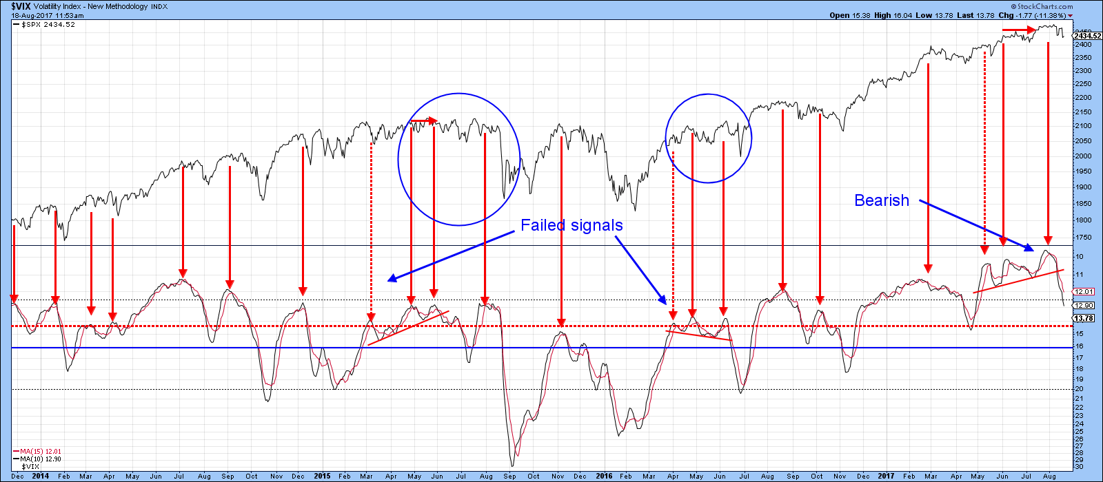
Chart 3
One of my favorite indicators is the Dow Diffusion series, as displayed in Chart 4. This one monitors the number of Dow stocks that are in a positive trend. The red arrows show when it has reversed direction from at or above the 14 level (red dashed horizontal line). In most instances this has been followed by a decline. Since the latest peaking action has only just taken place, it seems as though further corrective activity is in the cards. The four blue ellipses tell us that corrections in the last four years have tended to be sharp scary affairs. That would suggest that we could well see some excitement in the period ahead. The good news is that “sharp and scary” are two terms that characterize down moves in an on-going bull market. The signs I would be looking for, to suggest any downside moves are counter-cyclical in nature, would be a drop in the (inversely plotted) VIX indicator in Chart 2 to a very oversold reading, as well as some key currently weak sectors, such as energy, small caps, consumer discretionary (Cyclicals) etc. failing to confirm new lows by the averages. Talking about sectors now might be a good time, to take a look at the good the bad and the ugly. I’ll start with the “ugly” and end up on one sector that appears to offer more bullish undertones.
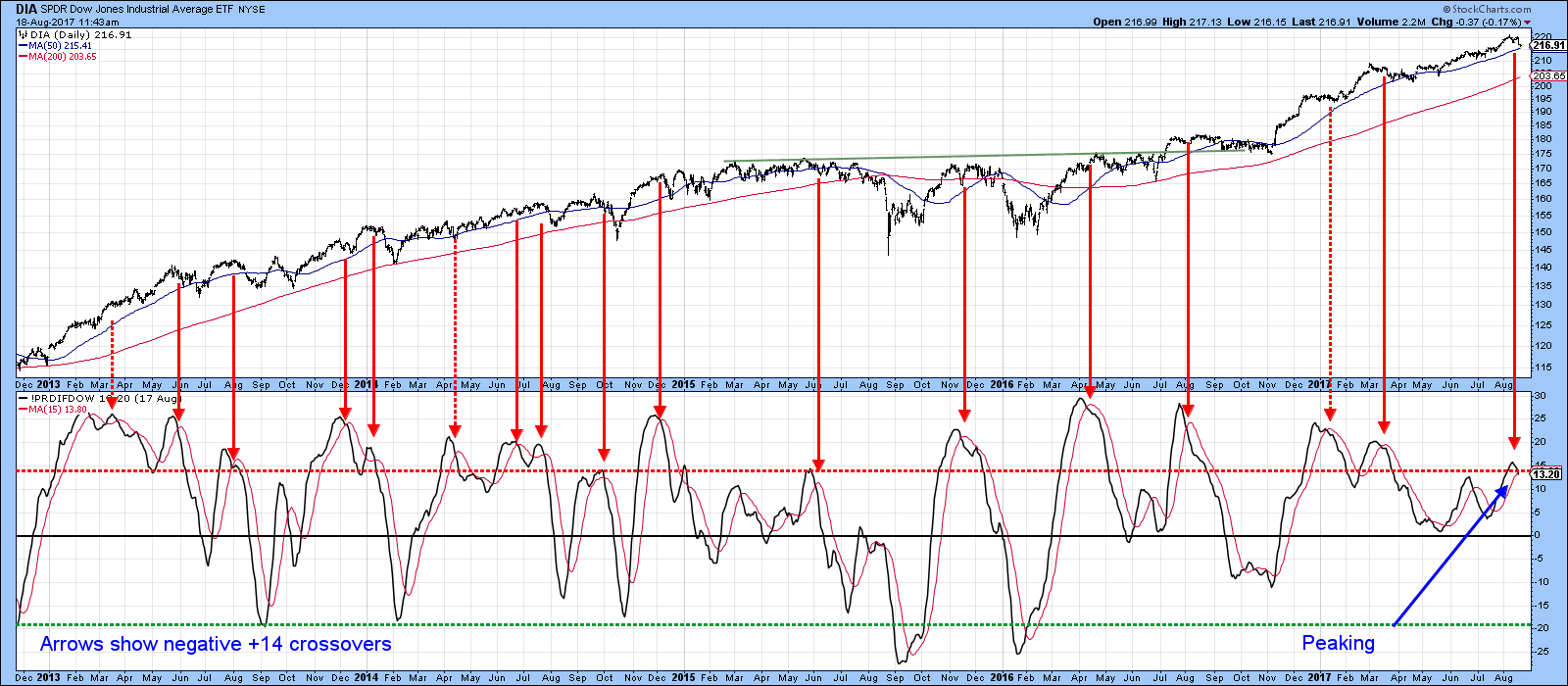
Chart 4
Consumer Discretionary—not so discreet
Consumer discretionary remains above its secular dashed red up trendline, but only just. The same cannot be said for the RS line, which peaked at the end of 2015 and failed to confirm the latest high in the absolute price. Far worse, the RS line has decisively violated its 2010-17 up trendline. The relative line now rests just above the horizontal solid red trendline.
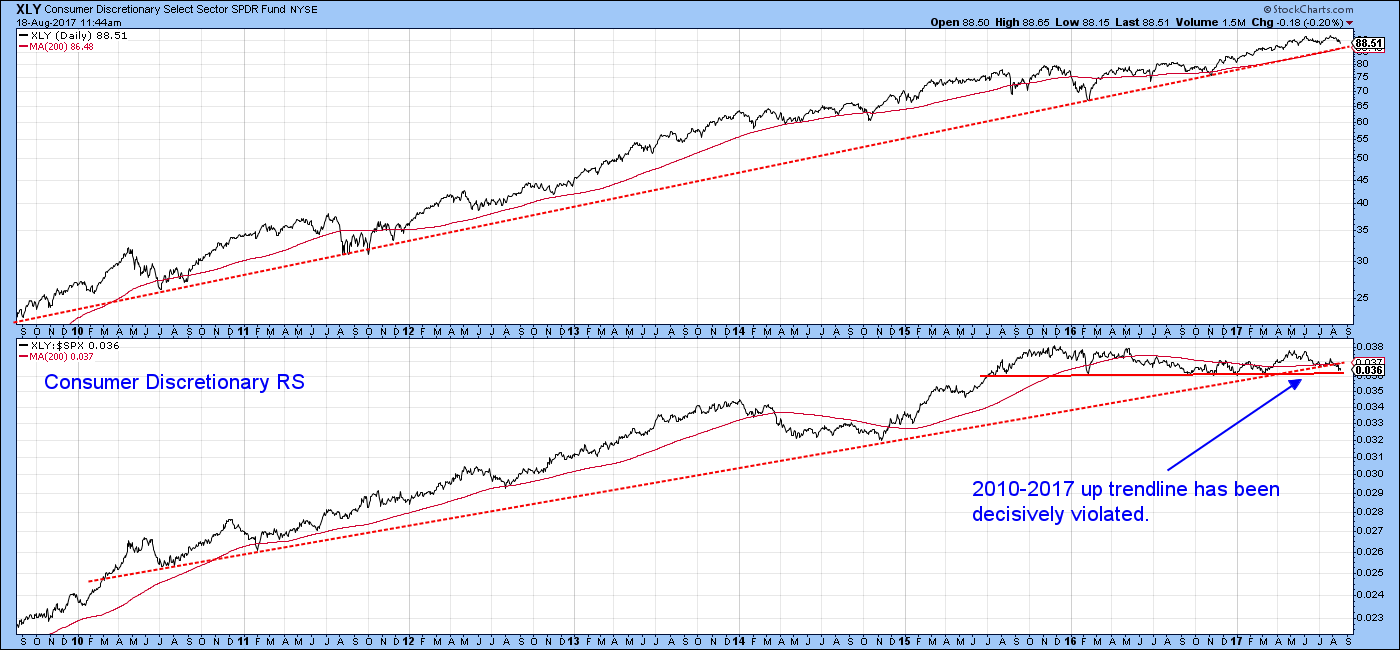
Chart 5
One reason why this sector is likely to get weaker can be seen from Chart 6, which indicates that the price has just completed a double top. We need to be a bit careful, since this chart does not include final data for Friday August 18, but at this point things do not look all that encouraging.
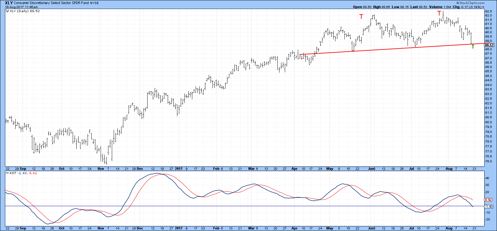
Chart 6
One key component of this sector is retail. It has received some bad press recently, but not without due reason, as we can see from Chart 7. This one features the Spider Retail ETF, the XRT. The price is below its 200-day MA, but more importantly, is resting on a major trend line that could turn out to be the neckline of a 4-year head and shoulders top. The declining absolute KST, in the second panel suggests that it will.
So too, does recent relative action, which has been deteriorating since mid-2015, and especially in 2017. Usually when the relative and absolute price performance differ so greatly, it is a prelude to a major decline in the absolute price. That’s because such diverse action indicates that the absolute price is being temporarily held up by a rising overall market, not due to its own strength.
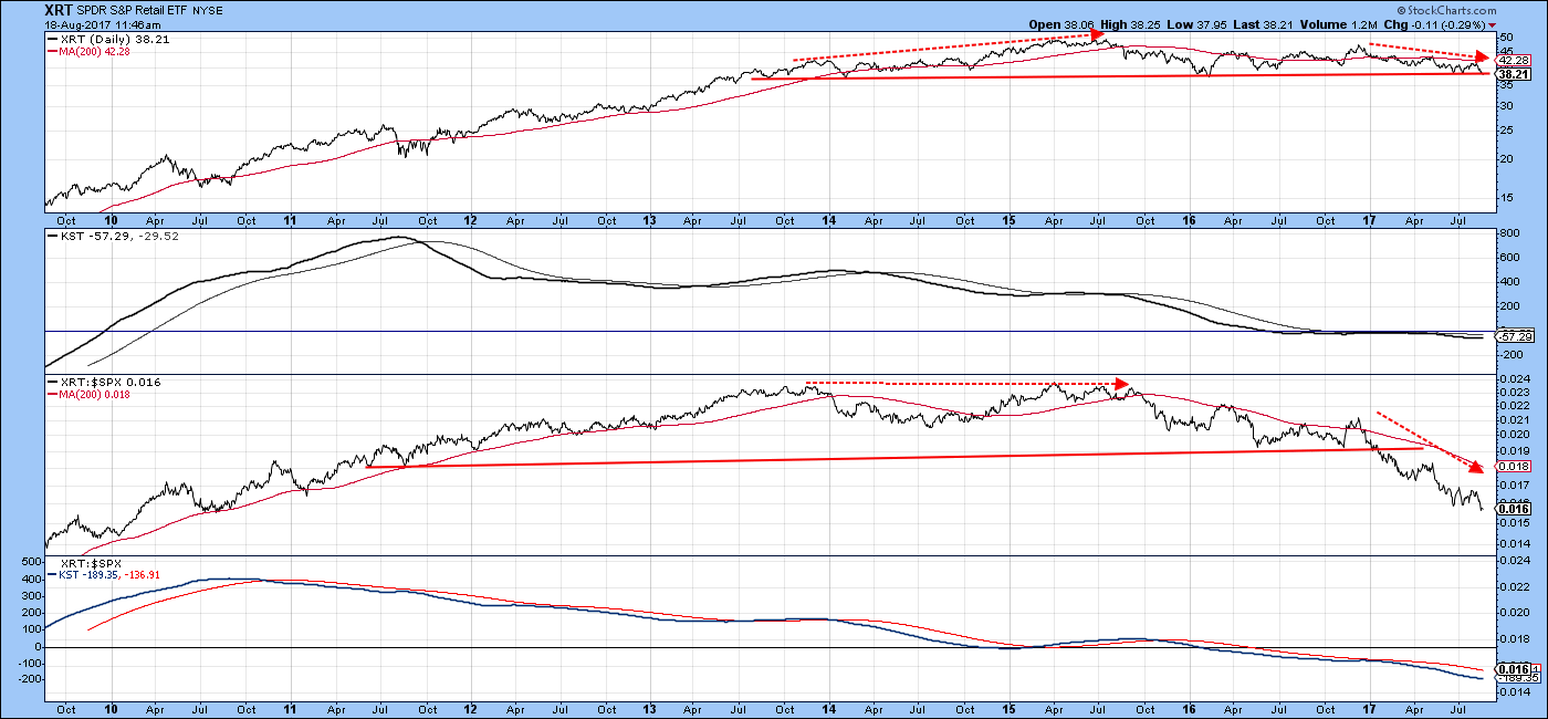
Chart 7
Energy—out of gas
Another sector that is in bad technical shape is energy. Chart 8 shows that the Spider Energy, XLE, has just broken down from a head and shoulders top. In this respect, it has joined the RS line that completed one of its own in late April. Both KSTs are rolling over and the relative one is actually below its MA. That suggests that energy is headed lower despite its current oversold status.
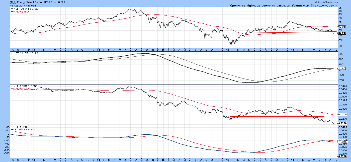
Chart 8
Chart 9 confirms this action by showing the energy A/D Line to be at a major new low.
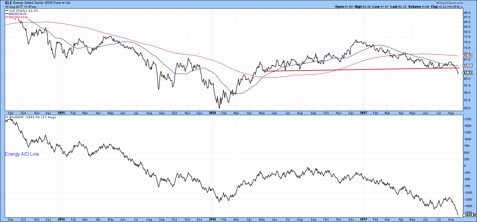
Chart 9
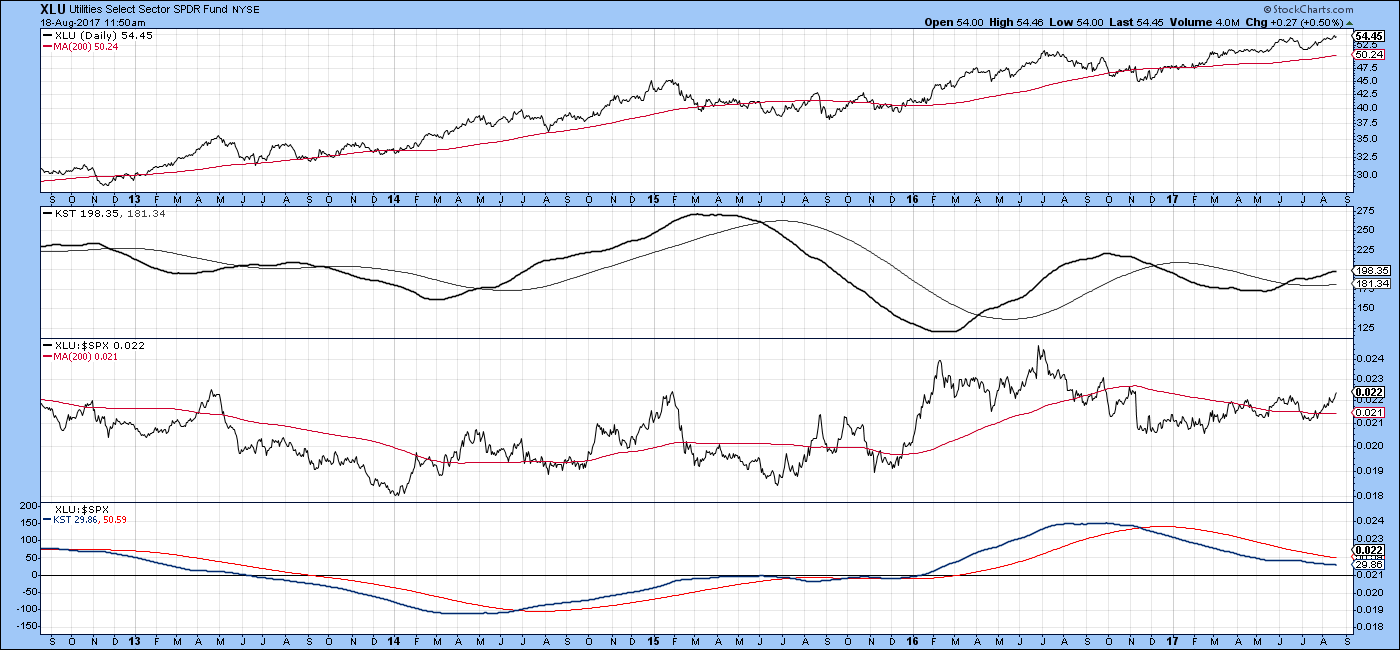
Utilities—a place to hide?
Finally, Chart 10 shows that the Utilities are in an uptrend as well as experiencing positive long-term KST action. The RS line, to its credit, has just completed a 2016-17 base and tells us that utilities are likely to out-perform in the period ahead. The one negative on the chart lies in the fact that the KST for relative action, in the bottom window, is still bearish.
">
Chart 10
Good luck and good charting,
Martin J. Pring
The views expressed in this article are those of the author and do not necessarily reflect the position or opinion of Pring Turner Capital Group of Walnut Creek or its affiliates.


