US Stock Traders Get Out Their Hammers
- Bottoms are being “hammered” out
- VIX is quietening down
- Net new highs offer green shoots
- NASDAQ Chart is turning
Bottoms are being “hammered” out
It has certainly been a wild ride this week, but Friday saw several major indexes trace out a Japanese candlestick pattern known as a “hammer”. This is a bullish one bar formation, that sells off substantially during its formation, but closes near the opening, leaving a narrow real body and a long hanging wick. It gets its name because the price is said to be “hammering out a bottom”. In trading terms it’s a pattern that forms after a serious decline, in which sellers are in control. By the end of the session prices regain most, if not all of their decline, leaving buyers in the driving seat. These formations only have a short-term effect, expected to last for between 5-10 bars. However, that period is often long enough to enable some of the oscillators, like and MACD, to reverse trend as well.
Chart 1 shows one for the Dow. In this instance I have used the candle volume format, where the width of the candles represent volume. The wider the bar the greater the trading activity. The candle volume lines leave no doubt as to the significant selling climax we have witnessed in the last 6-trading days.
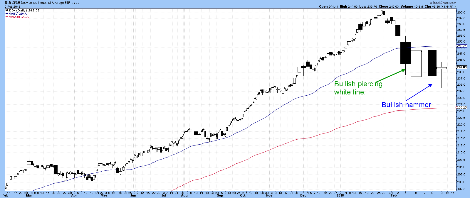
Chart 1
Chart 2 shows regular candles for the NASDAQ and S&P Composite. Note how the S&P bounced off its red 200-day MA. None of this action says that the market is going to explode on the upside, merely that it is unlikely to go down. Earlier in the week I pointed out the piercing white line featured in Chart 1. Usually when you can observe these patterns they represent a warning that things have turned in an upward way. In this case we saw a temporary penetration of the “piercing” low later in the week, but now the price is back above it.
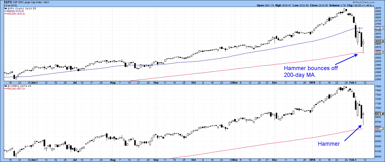
Chart 2
$VIX is quietening down
Two other factors suggest that we have touched a low watermark for this “February Fright”. The first is price action for the $VIX, as shown in Chart 3. Here we can see that the uptrend line for the hourly bars was severely ruptured right at the end of the Friday session. That strongly suggests that the uptrend in volatility, which is associated with declining prices, is over.
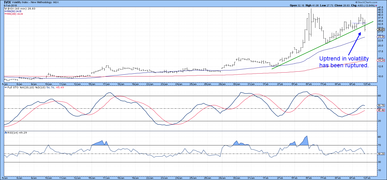
Chart 3
Chart 4 also hints at the same thing because the 10-day ROC for the $VIX, having reached a record high reading was unable to register a new high as the S&P was registering a new low for the move.
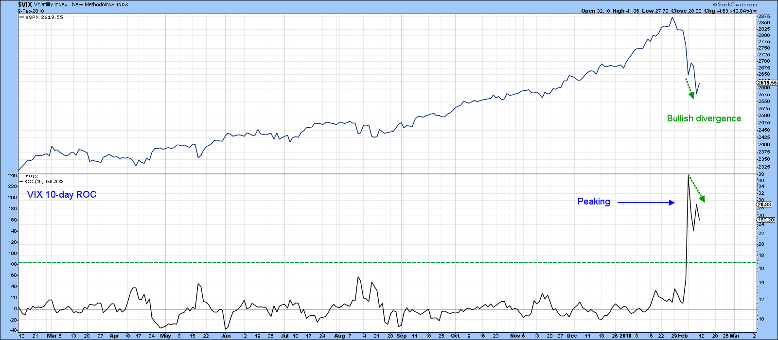
Chart 4
Net new highs offer green shoots
Another positive green shoot comes from the NYSE net new high/low numbers. In this respect, Chart 5 indicates that the NYSE Composite reached a new low for the move on Friday. However, the actual number of individual stocks touching new 52-week lows was far less. That indicates that fewer stocks are breaking down, which is a positive sign.
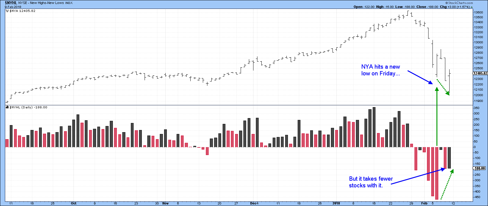
Chart 5
NASDAQ Chart is turning
Chart 6 shows an hourly chart for the NASDAQ. The price has violated a small down trendline, as has the RSI. Both breaks suggest that a test of resistance flagged by the green horizontal line is a real possibility.
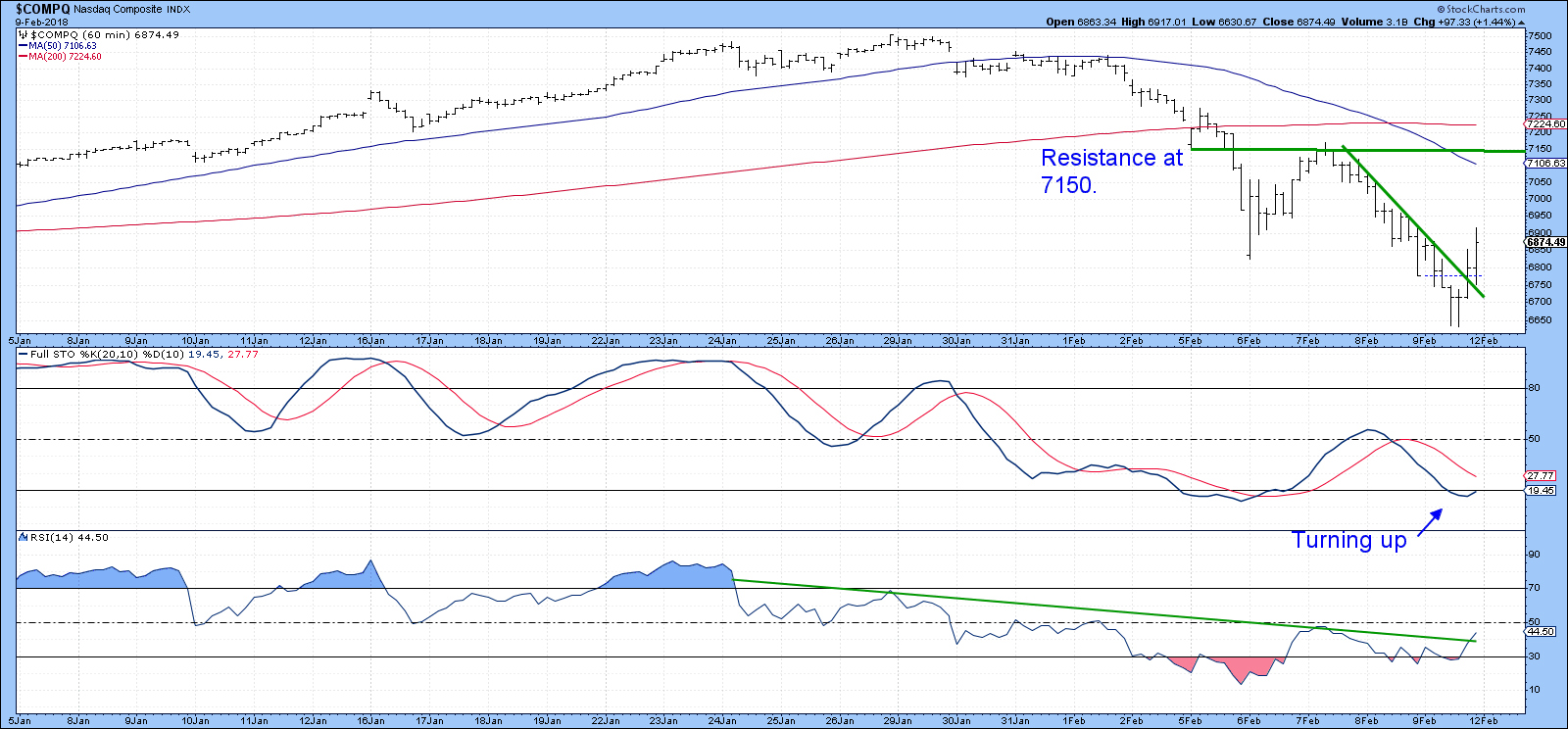
Chart 6
12-day ROC for the S&P reaches a juicy level
Finally, Chart 7 shows that the 12-day ROC for the S&P has fallen to an extreme oversold reading. Oscillators in primary bull markets are typically very responsive to oversold conditions. That means that if a new bear market began last week this reading will not mean very much. However, if the recent decline is a temporary interruption of a primary bull market, a reversal in this indicator from such an extreme would be a strong signal of an impending rally. None of the long-term moving averages reflecting primary trends have yet turned bearish, so this extreme reading may well be providing a useful buying opportunity.
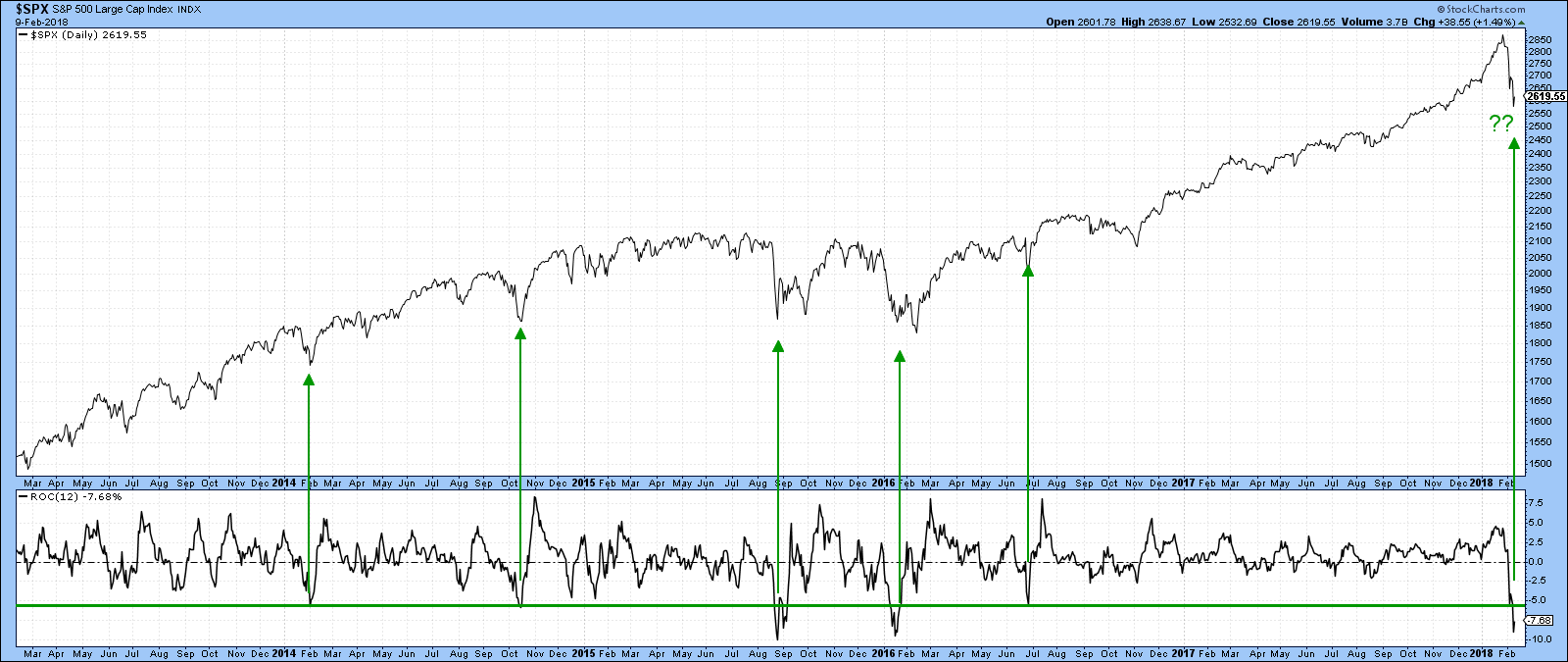
Chart 7
Good luck and good charting,
Martin J. Pring
The views expressed in this article are those of the author and do not necessarily reflect the position or opinion of Pring Turner Capital Group of Walnut Creek or its affiliates.


