DJIA Engulfing Pattern Suggests A Pause Before Higher Prices
- A small correction ahead?
- Short-term oscillators are primed for a rally
- Bitcoin is breaking out again
A small correction ahead?
If you want to be bullish, Friday’s technical action was somewhat disappointing. That’s because it represented an engulfing pattern for the DIA, as shown in Chart 1.
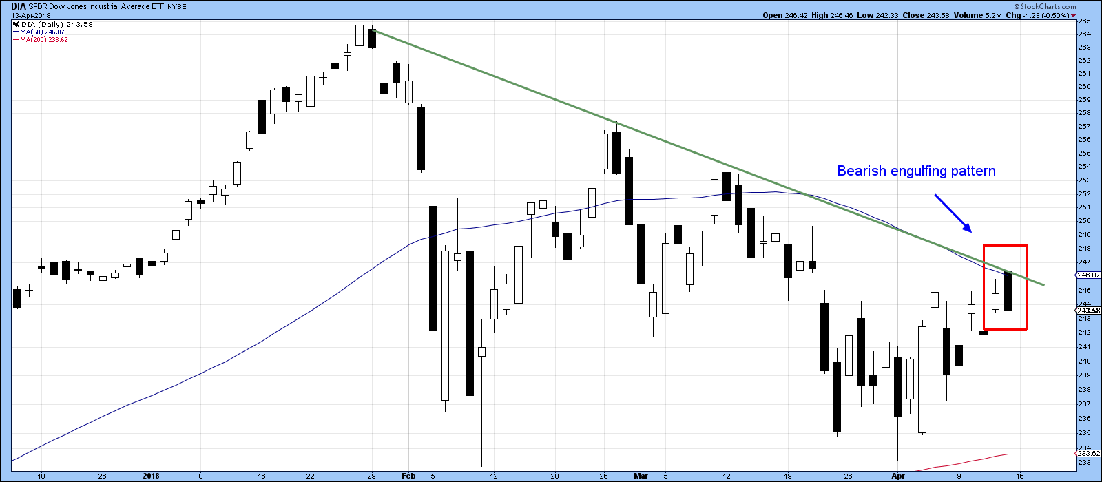
Chart 1
Chart 2 shows that bearish characteristics for the S&P Composite emerged in the form of an outside bar, where Fridays trading range exceeded that of Thursday. I don’t want to make a big deal of these patterns, as they typically only have a negative effect on prices for between 5-10 sessions. Moreover, stronger reversals follow stronger rallies, and the advance since the opening session of the month has not been particularly strong, so any corrective activity is likely to be brief.
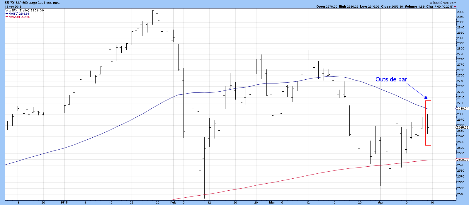
Chart 2
Both series failed at their respective 50-day MA’s. Note that the DIA, in Chart 1, was unable to move above its correction down trend line. That line now takes on added significance since it has now been touched for a fourth time. Since it also intersects with the 50-day line the two of them represent a very important barrier to upside action. When that has been cleared, there is a good possibility that the ranging action of the last few weeks will give way to a more durable rally.
My expectation then, is down to sideways for now, then up, probably to post March highs.
Short-term oscillators are primed for a rally
There are two reasons for my optimism. First, as laid out last week, the long-term indicators are mostly indicating that the primary bull market is still alive, and markets tend to be very sensitive to oversold conditions when the main trend is up. Second, a substantial number of those short-term oscillators have now turned bullish.
Chart 3, for instance, features my Dow Diffusion indicator. It monitors the DJIA components in a positive trend. The green arrows show that upside reversals from at or below the green dashed horizontal trend line, have typically been followed by a nice rally. Historically, most failures have developed under the context of a primary bear market. If our assumption concerning the status of the bull is correct, this signal should be followed by a nice rally once the correction, implied by the engulfing pattern and outside day, is over.
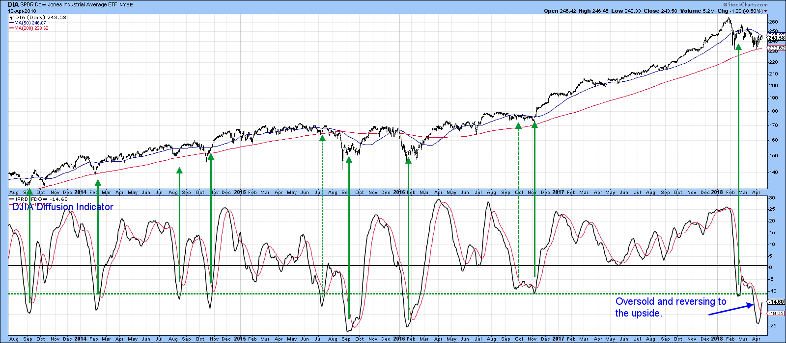
Chart 3
Chart 4 features the 10 and 20-day MA’s for the McClellan Volume Oscillator, calculated from NYSE common stock data. This series is also on a buy signal and has not yet reached overstretched status. Note that the NYSE itself, has violated its green correction down trend line. However, the 50-day MA remains an elusive target. The index is also threatening to complete a top, as flagged by the red support trend line. However, the oversold nature of the Dow Diffusion and other short-term oscillators argues against the probability of that happening.
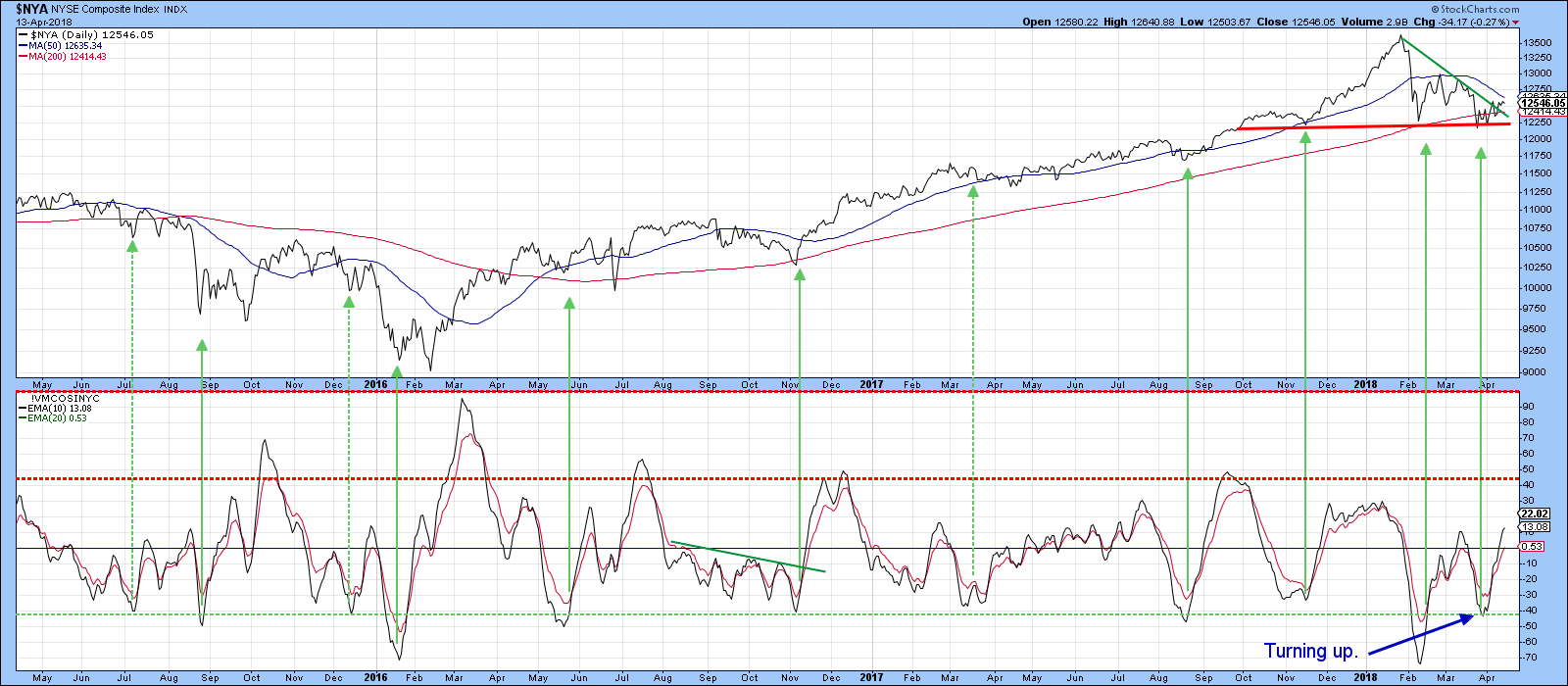
Chart 4
Upside/downside volume is also looking constructive. That’s because the cumulative line derived from NYSE data in Chart 5, experienced a higher bottom in March. Compare that to the NYSE itself, which made a lower one. While this is definitely an encouraging sign, the upside/downside line now needs to break above the solid green down trendline. It's bullish PPO suggests that it will. Such action would likely be followed by a move to new highs in this indicator. It’s also worth noting that the NYSE A/D Line is showing similar characteristics.
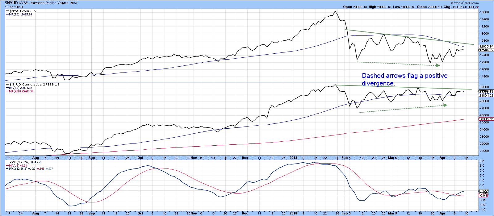
Chart 5
Finally, for the US, the 10-day MA for the put/call ratio has recently reversed from a high level, beyond the green horizontal line. This is featured in Chart 6. Once again, the solid green arrows demonstrate that previous reversals have overwhelmingly been followed by some sort of rally.
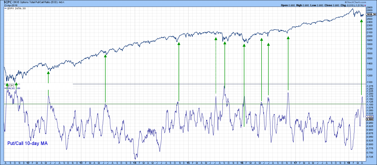
Chart 6
Another bullish oscillator is featured in Chart 7. This one monitors a universe of country ETF’s that are in a positive trend. The green arrows show that reversals from the oversold zone have mostly been followed by a nice rally. The mid-March signal came far too late to be of any use, but the indicator has just moved into positive territory again, thereby suggesting that a global equity rally is in the cards.
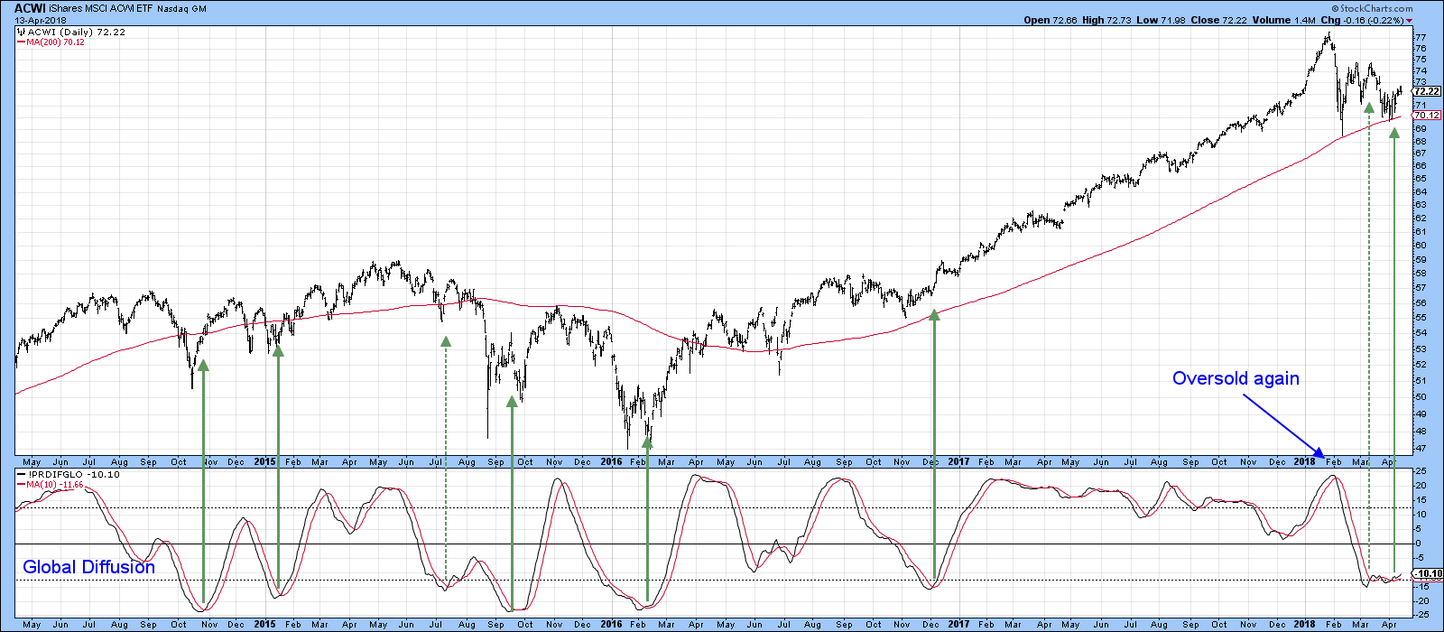
Chart 7
Bitcoin is breaking out again
After several months of corrective activity, it seems as though Bitcoin is poised for a rally. In this respect, Chart 8 features the Bitcoin Investment Trust (GBTC), which closely follows Bitcoin itself. The GBTC also comes with volume numbers, unlike the index. In any event, the chart indicates that the price has decisively broken above its green down trend line. Moreover, volume appears to have broken above a down trend line of its own. If the breakout holds, and we have no good reason for suspecting otherwise, that would also result in a KST buy signal. Now that the upside breakout has materialized, a drop below the red support line, would of course, be very bearish indeed.
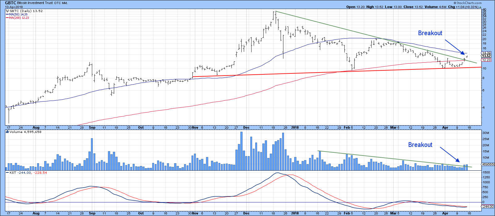
Chart 8
The outcome may be important for the equity market. In this respect, Chart 9 compares the GBTC with the S&P Composite. Prior to February, both series experienced a strong uptrend. The red and green arrows show that on many occasions, they experienced simultaneous minor turning points. The big exception has been flagged by the dashed red arrow, which indicates the far different timing of their tops. Since the S&P experienced its peak though, they have been far more correlated. The Bitcoin Trust led on the way down and perhaps last week’s breakout means that it is destined to lead the market up. I am not sure this relationship will continue to hold up. However, since Bitcoin represents the ebb and flow of speculative juices i.e. swings in confidence, it may be forecasting a strong equity rally. Watch for the rally once the very short-term effects of the engulfing pattern and outside day, discussed above, have been digested. Let’s see what happens, as they say!
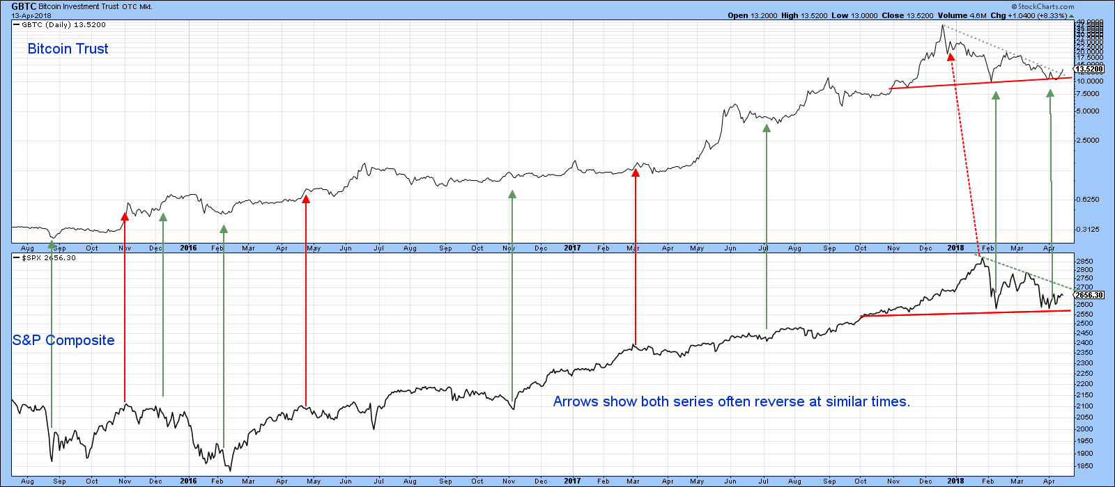
Chart 9
Good luck and good charting,
Martin J. Pring
The views expressed in this article are those of the author and do not necessarily reflect the position or opinion of Pring Turner Capital Group of Walnut Creek or its affiliates.


