This Rally Looks Like It Has Legs
- When a top is not a top
- The rally is broadly based
- Is the US about to out-perform the world again?
When a top is not a top
Last week I pointed out that several indicators were positioned for a nice rally. However, one of the lingering questions related to whether any advance would represent a new up leg in the bull market, or if it would form part of an overall topping out process. We still don’t know of course, but so far the entrails are pretty encouraging, since this move is being supported by breadth, expanding net new highs and volume. That could change at any time, but usually a broadly based start of a rally usually translates into a strong move.
Chart 1 shows that the NYSE Composite looked as if it might be in the process of completing an ugly looking head and shoulders top. However, the right shoulder never fully formed. Instead, we see the Index crossing above its dashed green down trend line. More importantly, it has now broken above the second potential right shoulder as flagged by the horizontal green line. This bettering of the right shoulder high usually this means the pattern will fail, and a large move in the opposite direction to that indicated by the formation takes place. It is usually quite powerful because many traders position themselves in the direction indicated by the pattern. When, as in this case, a downside break fails to materialize they are forced to unwind those positions. That, combined with the natural buying from the bulls has a powerfully positive effect.
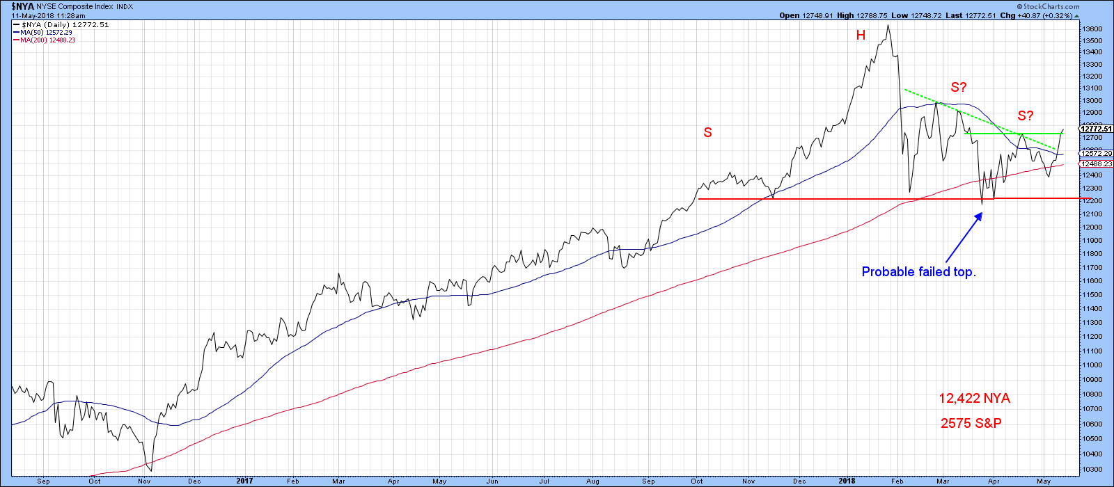
Chart 1
The rally is broadly based
We also find that other aspects of the technical picture are supporting the idea that prices will move higher over the summer. Chart 2, for instance, tells us that the NYA has yet to move above its earlier 2018 high. On the other hand, both the broadly based NYSE A/D line as well as that comprising just common stocks, have both touched bull market highs this week. That does not guarantee new highs for the major indexes, but it is certainly far better than having these breadth indicators drop to new lows.
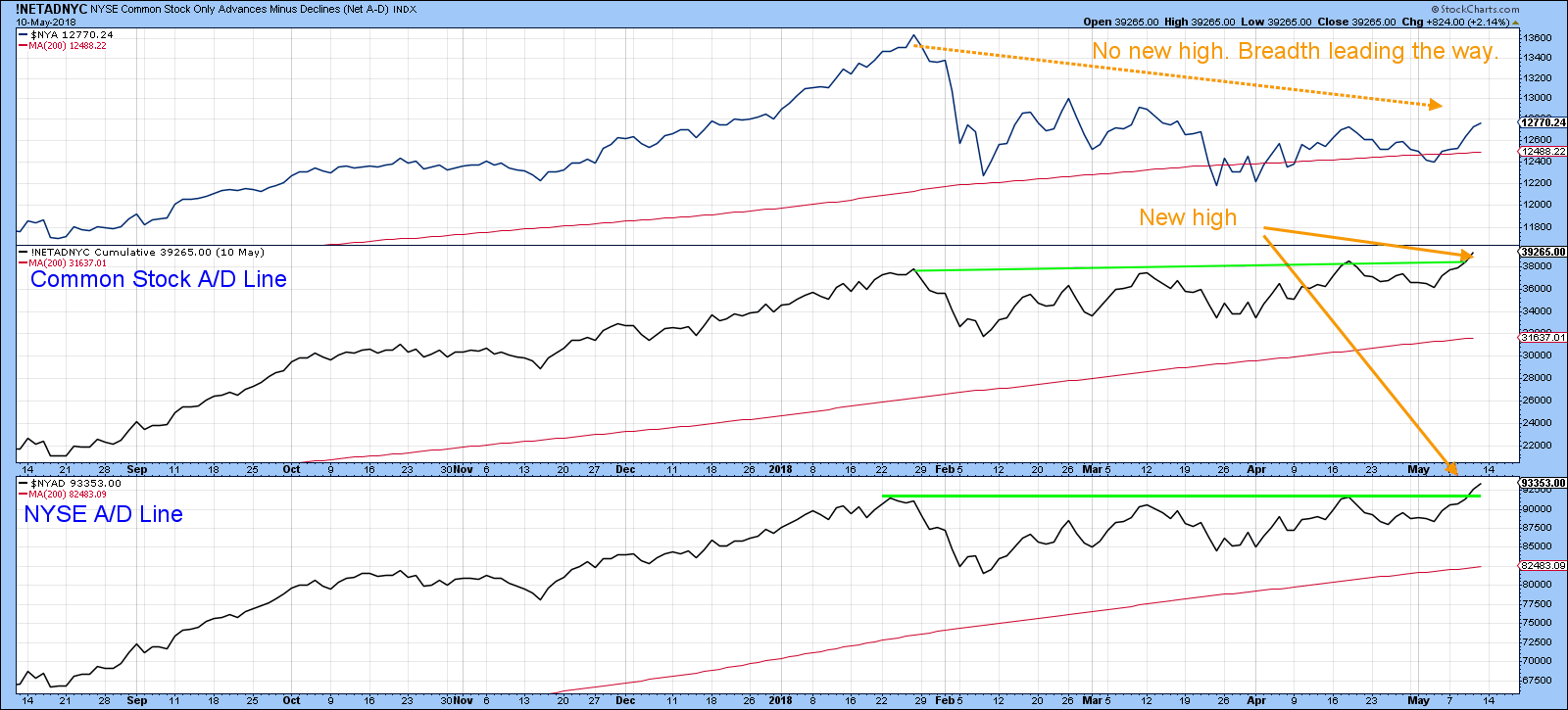
Chart 2
Net new high data is also showing some positive characteristics. It is always a good sign when we see the number of net new highs expanding as the various indexes touch new highs. However, in the current situation we see the net new high data registering a larger number compared to the short-term high set in April. This compares to the unweighted S&P, which has just touched the same level. Once again, we see the broad market, as expressed by net new high data, leading the market higher.
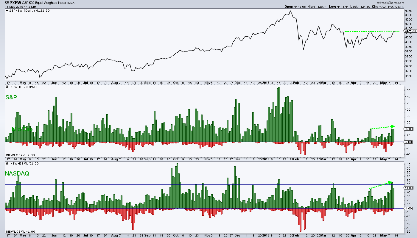
Chart 3
Chart 4 compares the bullish percentage to the NASDAQ Composite. The green shaded ares flag periods when the bullish percentage indicator is above its red 20-day MA. This kind of environment indicates that the rally is widening to include more and more stocks, and usually this translates into a higher NASDAQ as well. Recently the signals have not had much staying power because of the February/May trading range. However, the bullish percentage has just violated its 2018 down trend line, so this may provide support for a longer-term rally.
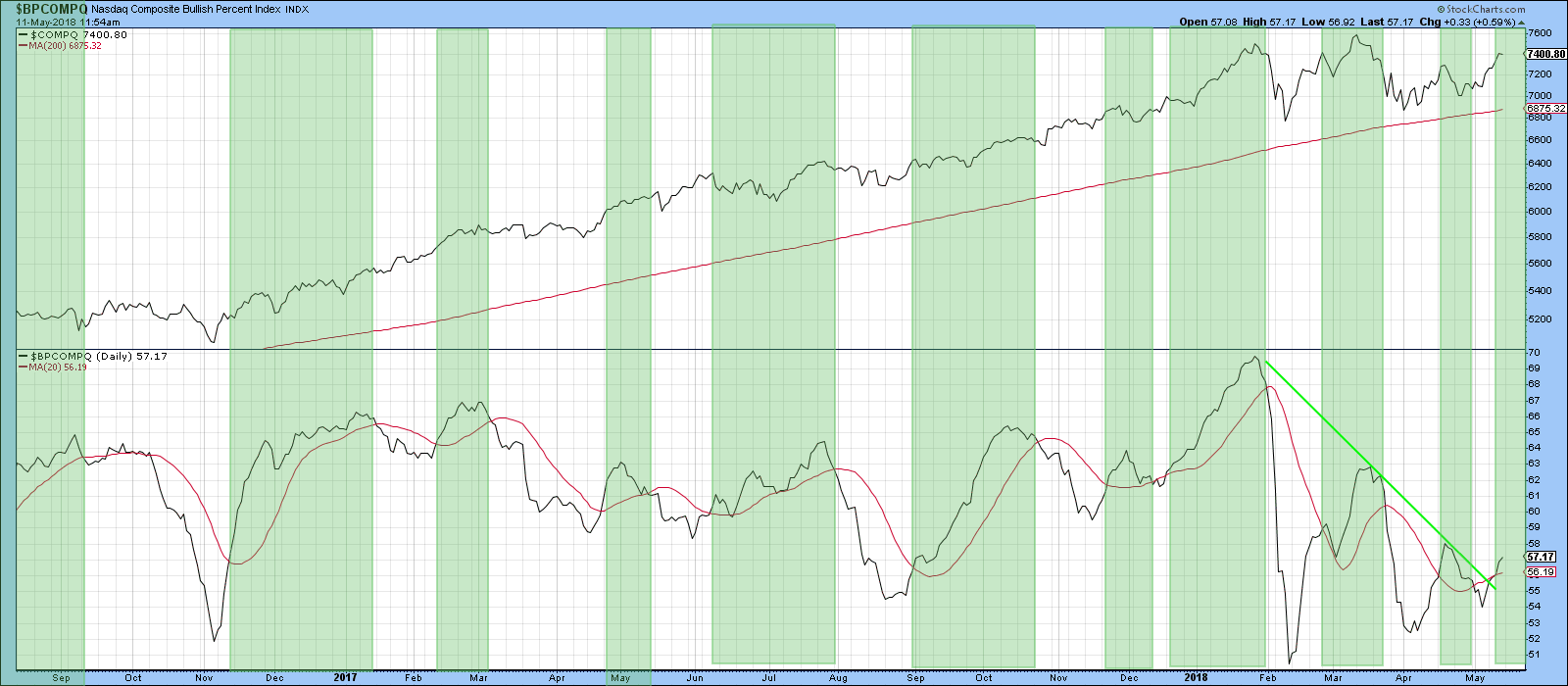
Chart 4
One area that looks encouraging, but is not quite as positive as the breadth data is volume. It's true that it is expanding, which we like to see. However, the PVO in Chart 5 has broken above its green trend line at zero, but not by much. If the rally does soon show signs of weakening, this is the area that it would most likely show up initially.
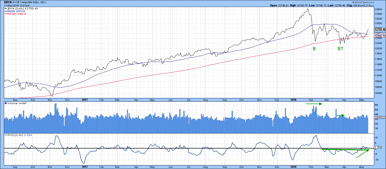
Chart 5
Is the US about to out-perform the world again?
The relative strength of US equities to the world is closely tied in to the performance of the dollar. We can see this from Chart 6, where the green shading reflects periods when the Dollar Index is in a rising trend. At such times the ratio is typically in a rising trend as well. Since the Dollar Index has recently broken to the upside, this suggests that the ratio will follow suit. It has been in a trading range since 2016 but is now attempting to break above that green resistance trend line.
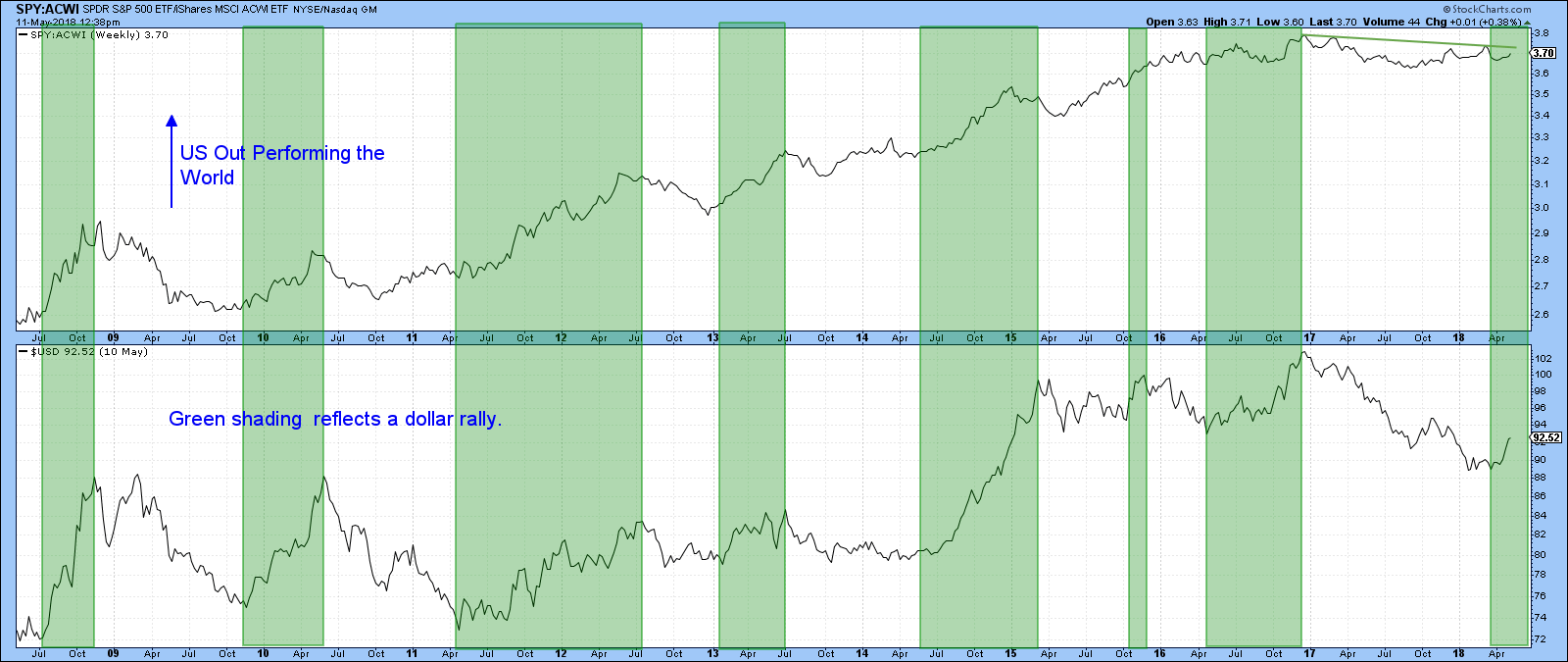
Chart 6
Good luck and good charting,
Martin J. Pring
The views expressed in this article are those of the author and do not necessarily reflect the position or opinion of Pring Turner Capital Group of Walnut Creek or its affiliates.


