Global Equities Are Falling Apart But It's MAGA For US Relative Action
- New bull market high for US equity relative action
- International markets are breaking down
- Commodities lose some upside momentum
US equities have been hit hard so far this week, but that’s nothing compared to China, Emerging Markets, Europe and other markets around the globe. As a result, we are getting some pretty powerful bullish signals for the US performance relative to the rest of the world. I wrote about this a few weeks ago, but now the signals are much stronger and more believable.
New bull market high for US equity relative action
Chart 1 for instance, compares the S&P performance to the MSCI World ETF (ACWI) as well as two “rest-of-the-world series, the MSCI Europe Australia Far East (EFA) and Vanguard World Ex the US (VEU) ETF’s. All three series have broken decisively above their 2016-18 trading ranges, indicating that on a relative basis the US is headed much higher. I have emphasized the relative nature of the breakout because that’s all it tells us i.e. that the US is likely to outperform the rest of the world. It doesn’t say the anything about the direction of the absolute price, just the relative one, though I think that the bulk of the evidence still points north for US equities.
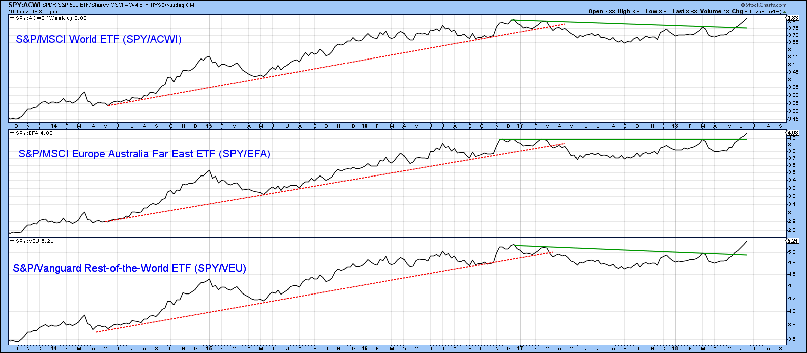
Chart 1
Chart 2 re-enforces that message of superior relative action. Price at any one time is determined by the interaction of numerous time cycles. The more that are operating in the same direction, the greater the ensuing price move tends to be. An individual ROC can only enlighten us on those cycles revolving around its specific time span. When we consider three ROC’s with widely differing time spans, more cycles are reflected in the chart. Being able to construct trend lines for all three and observing their violation tells us that all of the cycles being monitored are in gear. Of course, it would be nice to plot many more indicators reflecting more time spans, but graphically things would get very busy. Chart 2 shows that using three ROC’s, and observing their trend line violations as confirmed by a similar one for the price, a major reversal in trend reversal usually follows.
In the last week all three ROC’s have simultaneously broken to the upside, along with similar action by the RS line itself. Another point worth noting, lies in the fact that several previous breakouts were foreshadowed by the 40- and 65-week MA’s trading very closely together for an extended period. This indicated a fine balance between bulls and bears that once resolved foreshadowed strong upside price move when the RS line finally did rally above its resistance trendline. We see a similar setup preceding the current breakout.
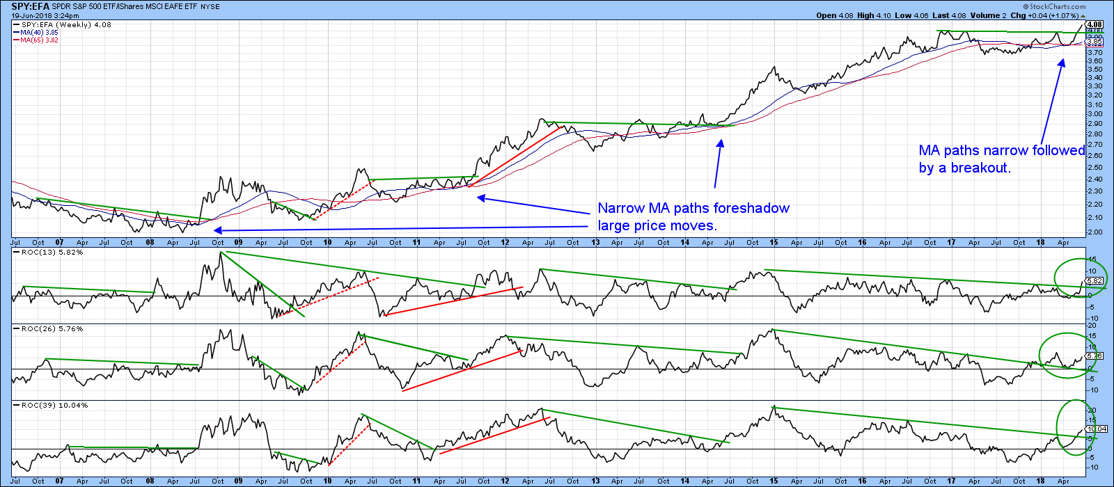
Chart 2
International markets are breaking down
The weakest areas seem to be found in the emerging space. For example, Tuesday saw the Chinese market decisively violate key support in the form of a head and shoulders neckline. This is shown in Chart 3, featuring the Deutsche-X- Trackers CSI 300 Chinese A Shares ETF (ASHR).
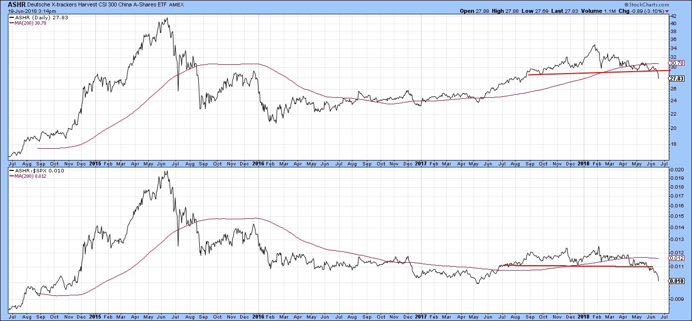
Chart 3
The Shanghai Composite in Chart 4 looks even worse, as the red arrow updates the chart for Tuesday’s 5% decline. Note that the short-term KST, in the lower window is not even close to an oversold condition yet.
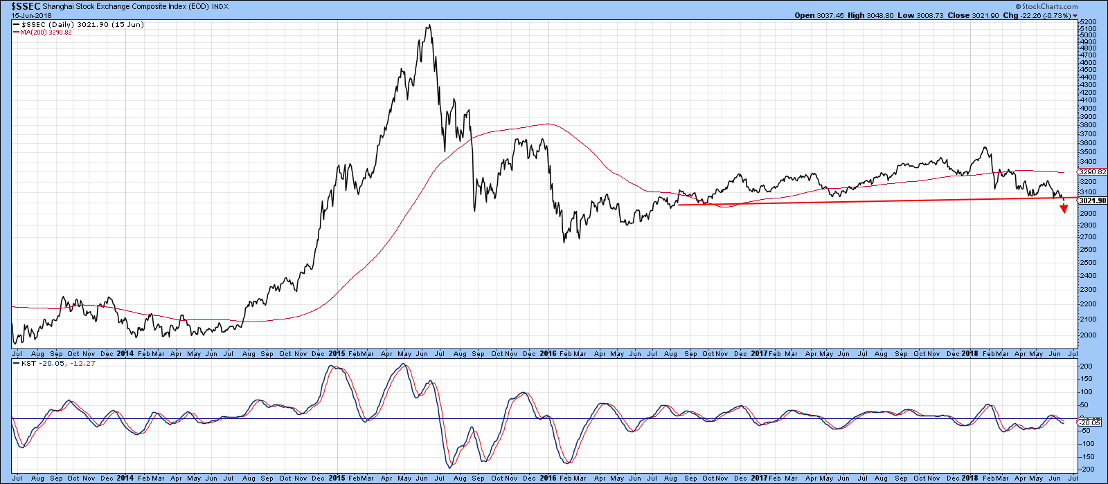
Chart 4
The MSCI Emerging Markets ETF, has also completed a large top formation. This is shown in Chart 5. It has also succeeded in violating its 2016-18 bull market trend line. Note the convergence of the two MA’s as a sign that the recent fine balance between buyers and sellers has been resolved in favor of the sellers. Right now, the price is very oversold, which suggests the possibility of some kind of a bounce. However, only a move back above the green down trend line and two MA’s could turn the chart into a bullish mode, and that would require a daily close above $47.50. Emerging markets are influenced by a confluence of factors, but arguably the two most important are the dollar and commodity prices. With the currency in a confirmed bull market and commodities starting to look a bit questionable, neither factor is in a good position to buoy emerging market ETF prices.
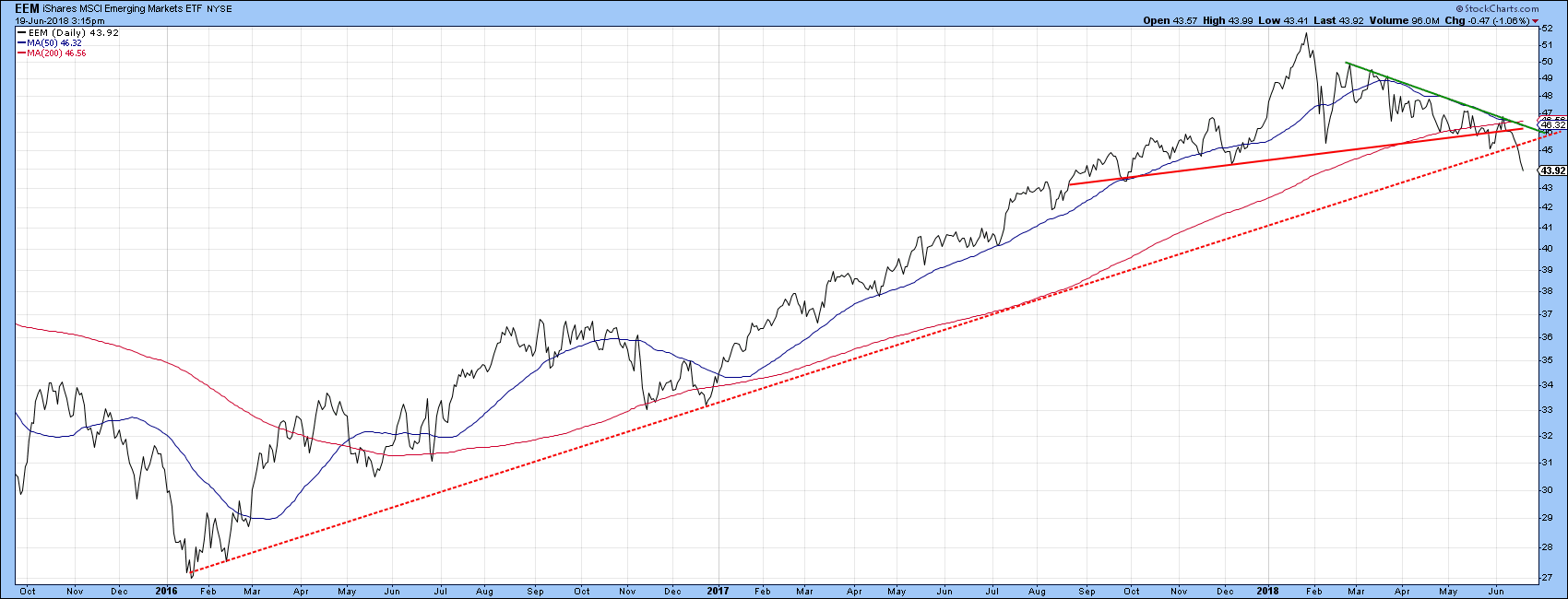
Chart 5
Chart 6 features the developed markets of Europe and Japan. Both are right at breakdown points of top formations. Japan is the relatively worse off, since it has already violated its 2016-18 bull market trendline, and that certainly indicates a serious loss of upside momentum. The EZU is one area whereby the latest low is above that established in mid-May. So far that drop is looking like a false move to the downside. However, as stated in a recent article, we need to see some confirmation, and that would take the form of a break above that solid green 2018 down trend line, currently around the $43 area.
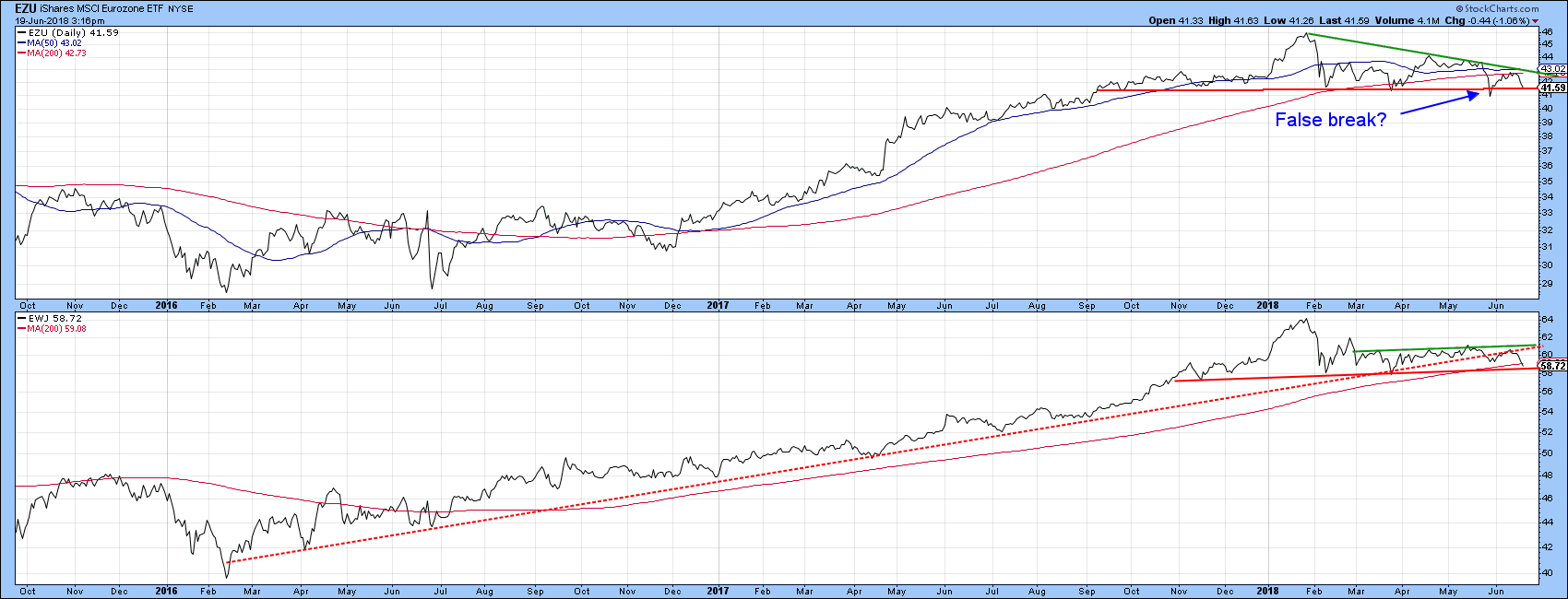
Chart 6
Commodities lose some upside momentum
Chart 7 features recent action for two commodity indexes, the CRB Composite ($CRB) and the DBC Commodity ETF (DBC). Since they have different weightings for different commodities these indexes do not always move together, as you can appreciate from the slanted action of most of the arrows. Recently though, both violated their 2017-18 up trend lines more or less simultaneously, which makes it a stronger signal. It’s important to add that a trend line violation implies a loss of upside momentum. It does not necessarily mean a bear market. That loss of momentum could, for example be followed by extended ranging action.
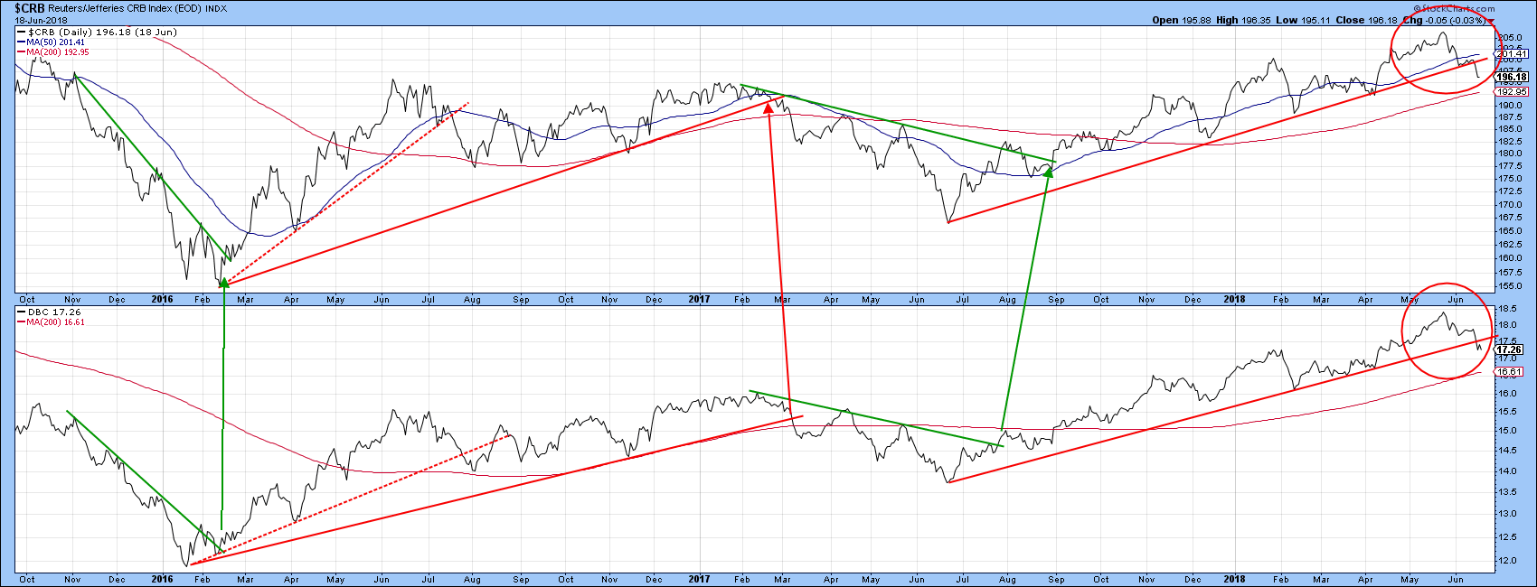
Chart 7
A lot will depend on Energy, as that has by far the highest weighting in both indexes. Chart 8 shows that the Invesco DB Energy Fund (DBE) has experienced a Special K up trend line violation. Most of the time, Special K trend line violations are followed by a worthwhile price move. However, it needs to be confirmed by the price, and that has not yet happened, as the recent bull market trend line has yet to be penetrated on the downside.
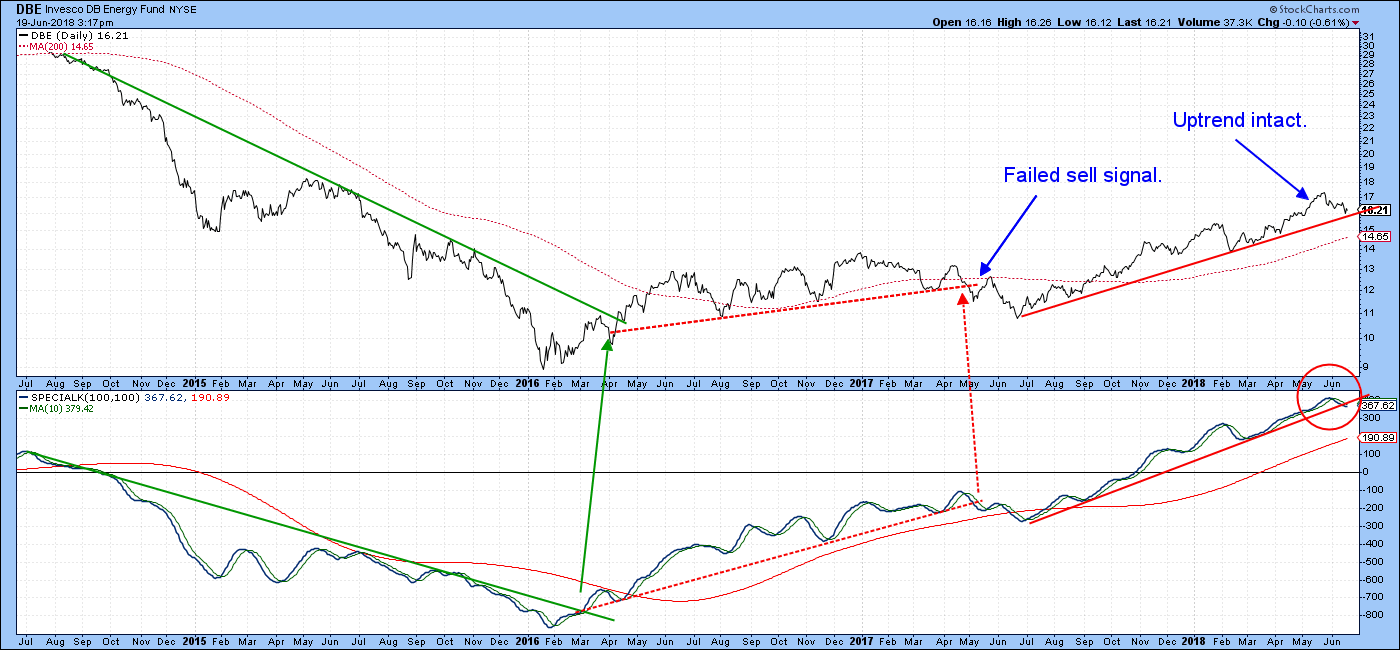
Chart 8
Chart 9 is a late edition as it shows that the MSCI World Stock ETF, and my Global A/D Line are both resting on critical trend lines. The ACWI has bounced off its line five times already, so a downside penetration is by no means guaranteed. However, given the weakening breadth momentum in the bottom window, it might be worth keeping an eye on this chart in the near future. You can do this by simply clicking on it.
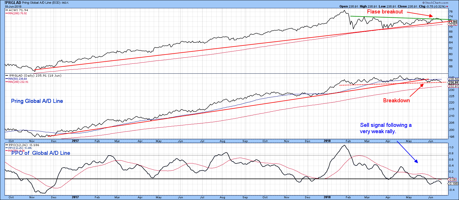
Chart 9
Good luck and good charting,
Martin J. Pring
The views expressed in this article are those of the author and do not necessarily reflect the position or opinion of Pring Turner Capital Group of Walnut Creek or its affiliates.


