What Would It Take For The Charts To Signal A Top In Oil?
- Technical picture is ripe for a turn, but the main trend is up right now
- Tuesday’s outside day could be the first domino
- Negative divergences between several energy components
Technical picture is ripe for a turn, but the main trend is up right now
The oil price remains in a confirmed uptrend, as we can see from the fact that it is comfortably above its 12-month MA at $62.09 and the long-term KST is in a rising mode, both of which are shown in Chart 1. Nevertheless, some interesting technical developments are starting to suggest that the near-term and possibly intermediate trends may be in the process of reversing, and that may be enough to tip over the primary trend in a kind of domino effect. Adding to the negative overhang is the fact that recent commitment of traders reports are showing a slight reversal from record net short positions by commercials. These are the people who usually get it right at major turning points. On the other hand, sentiment as reflected by less informed traders, who tend to be wrong, is quite bullish at the moment. Somewhere I read that politicians are lagging indicators, so President Trump’s letter to the Saudi King requesting more production and by implication lower prices, fits into this narrative nicely. These are just characteristics that tell us the market is ripe for a turn, but until prices respond with an actual indication we have to assume that the bull market is intact. My objective here, is to point out some of these discrepancies, as well as the kind of trend reversal signals we should be on the lookout for.
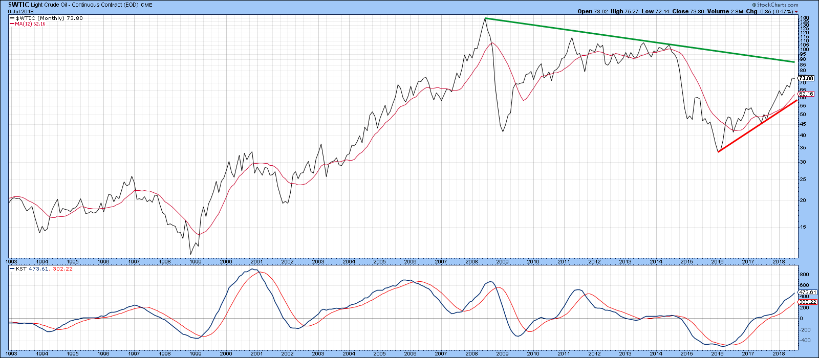
Chart 1
Bearing that in mind, let’s take a closer look. Charts 2, 3 and 4 feature the long-term trend of oil, gasoline and heating oil, together with a Special K (SPK) indicator, which you can read about here. Right now, there is no arguing with the fact that the main trend for crude is positive as the price and SPK are both above their respective up trend lines and MA’s.
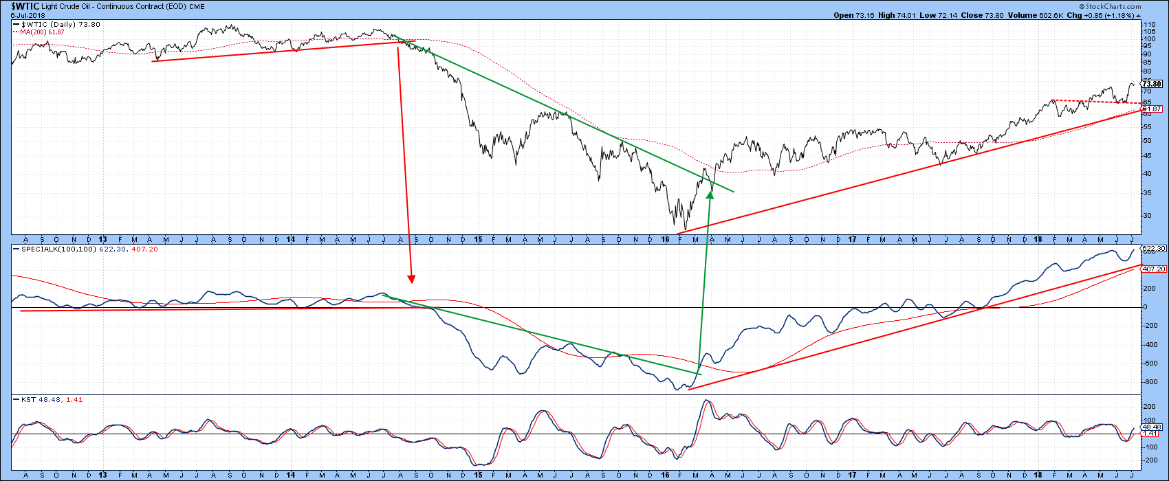
Chart 2
The same is true for the continuous contract for unleaded gasoline( $GASO) in Chart 3, though only a relatively small drop to the $2 range would be required to complete a small top.
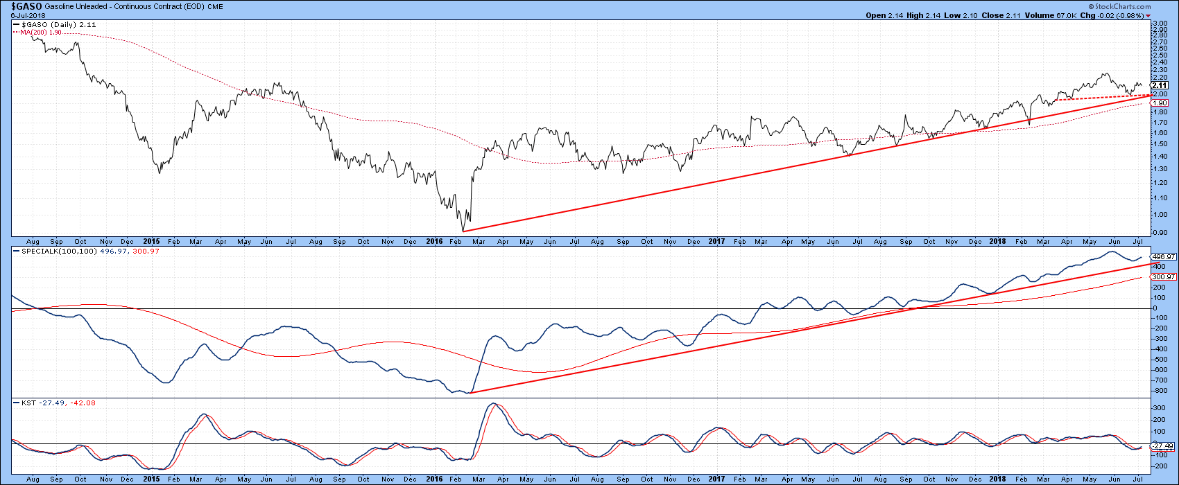
Chart 3
Heating Oil in Chart 4 is also in an uptrend. Note that in all three cases the short-term KST is in some kind of a positive mode.
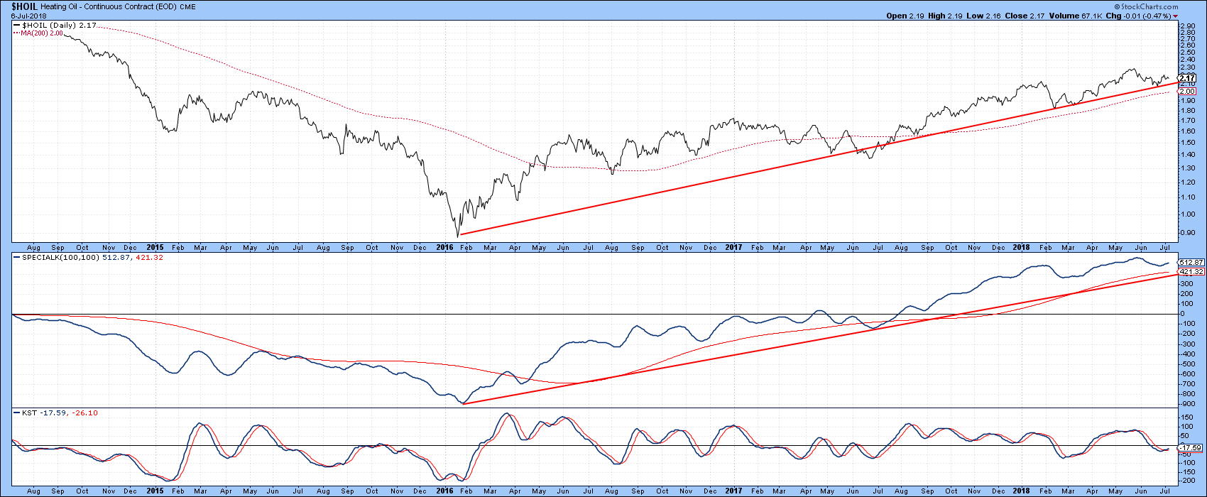
Chart 4
Tuesday’s outside day could be the first domino
Chart 5 shows that the short-term KST is also bullish for the US Oil Fund, the USO. However, it is not far from registering an overbought reading, which could be a problem. That’s because Tuesday’s action reflects an outside bar. Bearish outside bars develop after a rally, where the trading range of that session exceeds the range of its predecessor. It’s nice to have the close of the outside day develop near its low. That’s because it implies that by the end of the session control has been wrested from the buyers and is now firmly in the hand of sellers. Outside bars are expected to have a short-term effect ranging from 5-10 subsequent bars, but if strategically placed can be the first of a number of falling dominos.
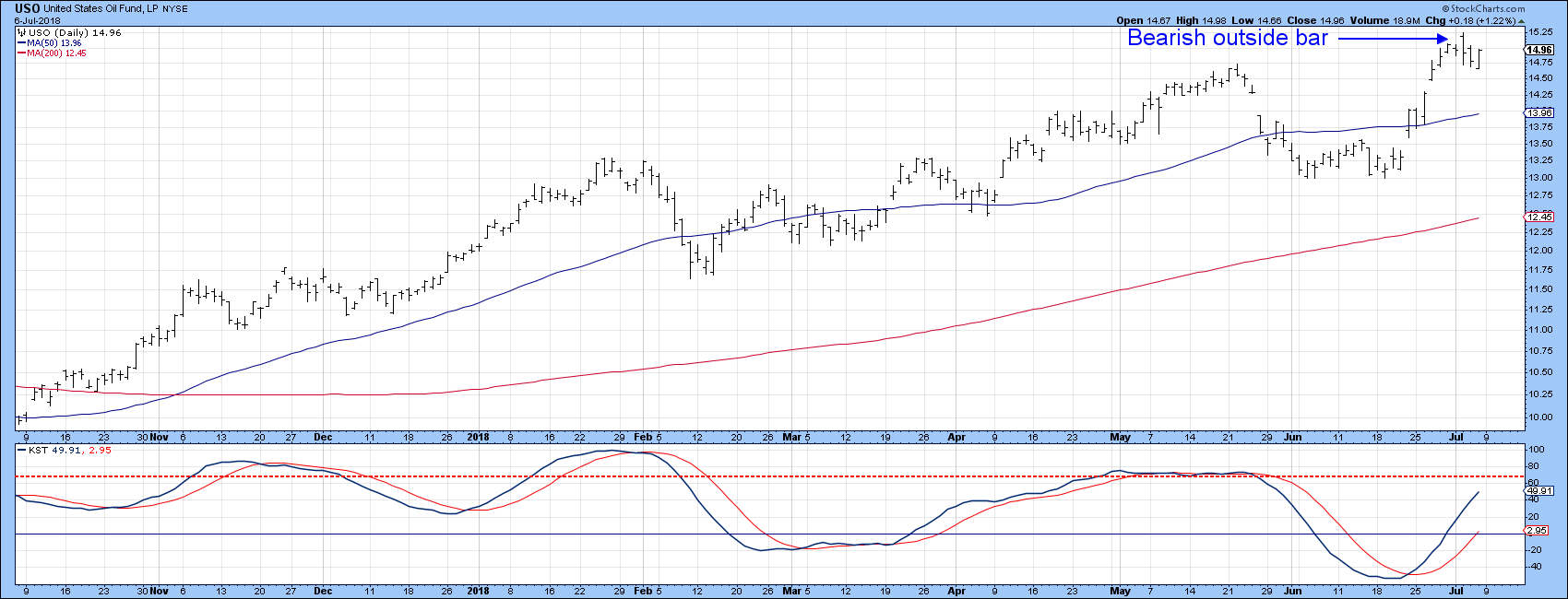
Chart 5
Chart 6 offers a great example of an outside bar at work for the SPDR Gold Trust (GLD) back in January of this year. The red arrow shows that the KST was beautifully positioned to trigger a sell signal as the outside bar was developing. This differs from the current USO outside bar, because the KST is still rising. Nevertheless, there are other factors that suggest oil may be vulnerable.
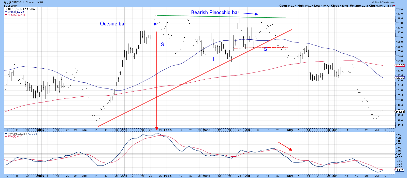
Chart 6
Negative divergences between several energy components
Chart 7, for instance, compares the performance of the oil price to the Invesco DB Energy ETF, the DBE. Both series typically move in sympathy as all four principal components, oil (50%), gas (22%), and heating oil (23%) tend to move closely together. It is when the two series diverge that a message is given. In this instance we see six divergences with a seventh being recently established as oil touched a new bull market high, but that event was not confirmed by the more broadly based DBE.
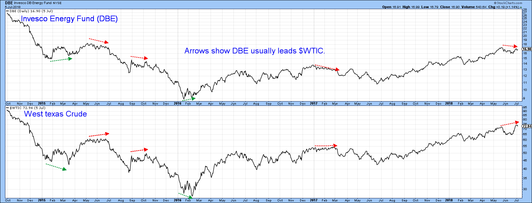
Chart 7
There is a similar discrepancy between the iShares Oil Equipment and Services ETF, the IEZ, with that of crude oil itself. Most of the time the two series move in tandem. It is when they diverge, that we get an indication of an impending trend reversal. Three examples are shown in Chart 8, two negative and one positive. A fourth negative one started to develop in Mid-May.
These are potential negative characteristics which could be cleared up. Consequently, we need to look at a suitable breaking point for the oil price. That would likely come with a violation of the up trendline and 200-day MA in Chart 8, at a level approximating $62. Until that happens it should be assumed that the primary uptrend remains intact.
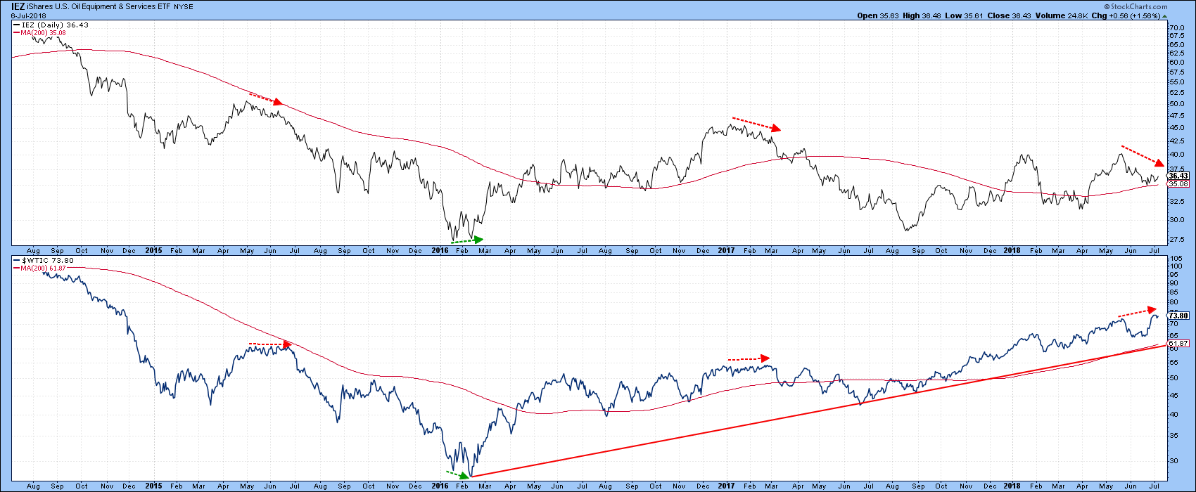
Chart 8
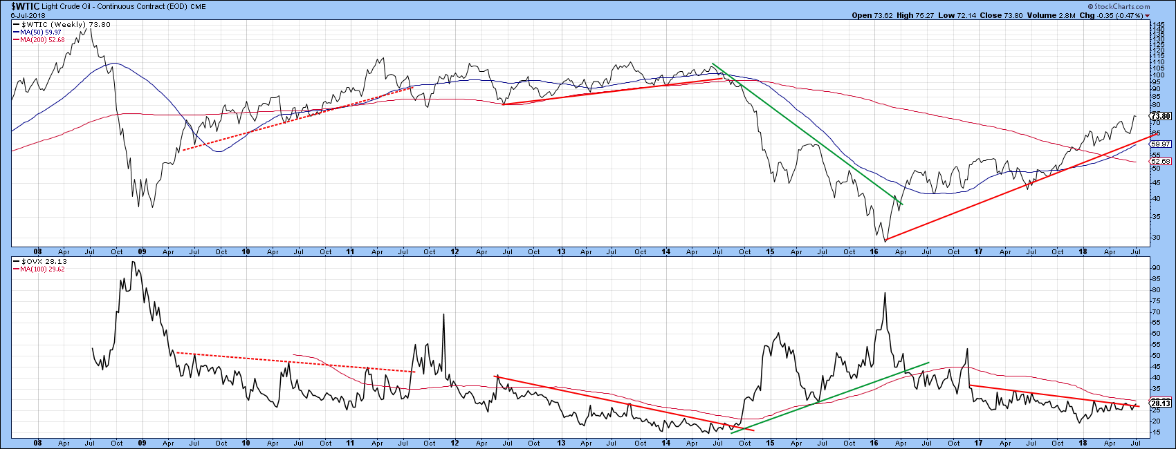
There is one other thing to watch, and that is the Oil VIX, the $OVX. Chart 9 shows that occasionally it is possible to construct a trendline for this very volatile series. When the line is violated and this is confirmed by a similar trendline penetration by the price, a useful indication of a basic reversal in trend is given. A rising oil VIX is bearish and a falling one bullish. It’s certainly not a perfect approach, as we can see from the failed 2011 signal. Also, with few data points we need to be careful. However, for the last 18-months the VIX has been uncharacteristically quiet, not unlike the mid-2014 signal, which was followed by a major decline. Should it decide to break out of the trading range, with a Friday closing low above, say $32, combined with a Friday close in the price itself under $60 that would be enough in my view, to signal that a primary bear market is underway, as that would also take the price below its 200-day MA.
Good luck and good charting,
Martin J. Pring