Facebook Does An About Face, But What About The Other FAANG Stocks?
- NASDAQ breadth data offers conflicting signals
- Bullish FAANG Stocks
- De-fanged stock
NASDAQ breadth data offering conflicting signals
We have seen some attention paid to tech stocks as they have corrected in the last week or so. The so called FAANG (Facebook, Apple, Amazon, Alphabet’s Google and Netflix) have been credited for most of the rise in the NASDAQ Composite due to their heavy weighting in the Index. It’s certainly true, as Chart 1 demonstrates, that only 58% of the NASDAQ stocks are currently in a bullish trend ($BPCOMPQ). That could prove troublesome if the index itself confirms with a break below that solid red up trend line. On the other hand, this indicator is still trading above its 20-day MA. There is a possibility of rallying above the dashed green trend line and completing a reverse head and shoulders pattern, so stay tuned.
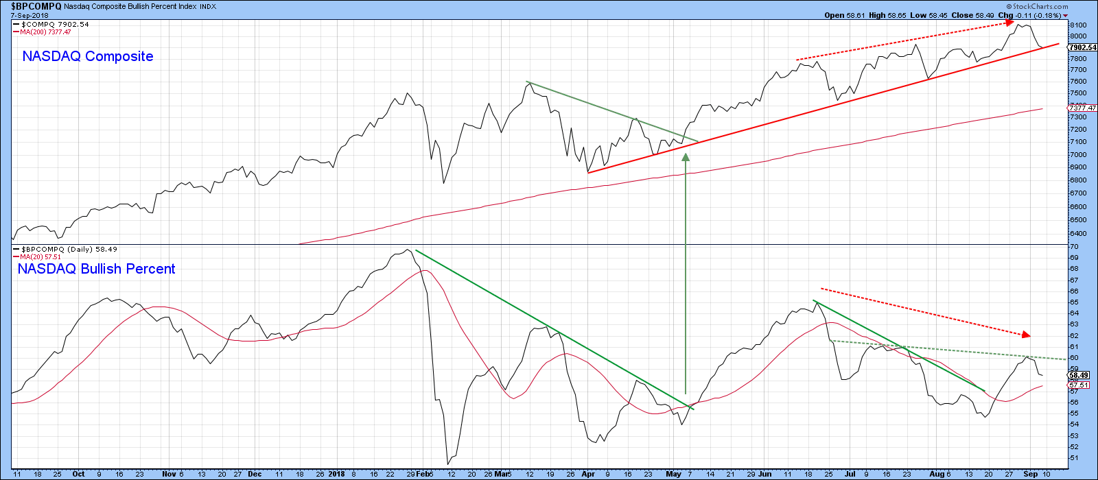
Chart 1
That same non-confirmation comes from the NASDAQ net new high indicator ($NAHLDJ) in Chart 2, which peaked back at the start of the year. The dashed red lines show that even though the Index registered several all-time new highs the number of stocks confirming these events did not. We do not know how many more negative divergences of this nature may evolve. However, if that 2016 red up trend line is violated that would confirm this underlying weakness.
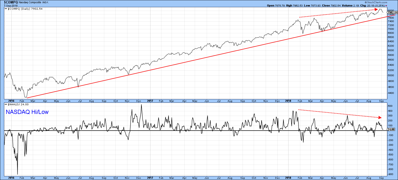
Chart 2
The only breadth indicators that have confirmed the NASDAQ have been the A/D Line ($NAAD), as featured in Chart 3, along with the NASDAQ upside/downside volume line. Overall the breadth indicators are offering a mixed picture with a slight edge to the downside. However, until the Index confirms with a daily close below the 2016-18 up trend line at 7,600 we should assume that the basic thrust is an upward one.
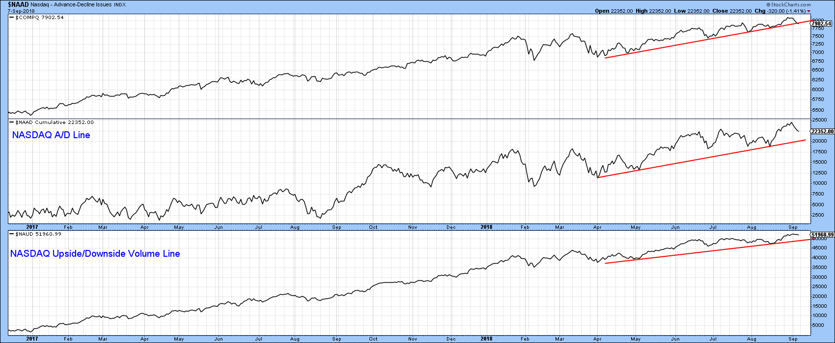
Chart 3
A lot, in terms of Index performance will likely depend on the NASDAQ heavyweights. Using 2017 data, let’s take a look at the top 5 stocks in the NASDAQ 100 Index.
Bullish FAANG stocks
Apple has the largest 12% weighting. Chart 4 shows that it is in a strong uptrend, having recently broken above the dashed red resistance trend line. The Special K, which you can read about here, is also at a multi-year high. The only negative on the chart lies in the fact that the short-term KST is very overstretched. However, the red arrows point out that none of the 2017/2018 bull market sell signals indicated by the KST, resulted in much of a correction, so the implied weakness is not likely to disrupt the positive major trend.
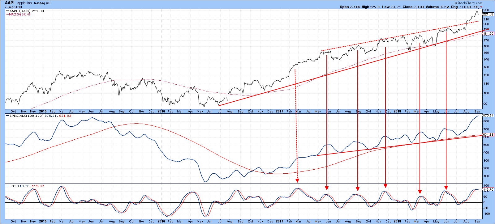
Chart 4
Alphabet’s Google (9%) is also in an uptrend, and is comfortably above its 200-day MA. The momentum picture is mixed, because the Special K is below its up trend line, but right at its red signal line.
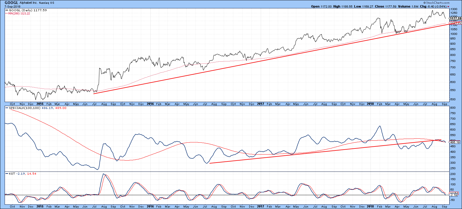
Chart 5
Chart 6 says that the momentum picture has a good chance of being resolved in a positive way. That’s because the long-term KST, in the second window, has just crossed above its 26-week EMA. Two similar events in 2016-17 both resulted in a temporary extension to the bull market. One aspect that distinguishes the current situation from the two previous ones, lies in the fact that it is now being supported by a similar upside break in the KST for relative action.
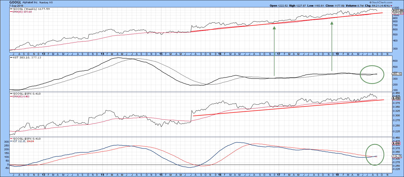
Chart 6
Chart 7 focuses on the short-term picture, where we can see that the price has completed a small top and violated its May/September up trend and 50-day line. Working on the assumption that the bull run is still intact, any downside damage is likely to be contained at the red 200-day MA, prior to the achievement of new highs.
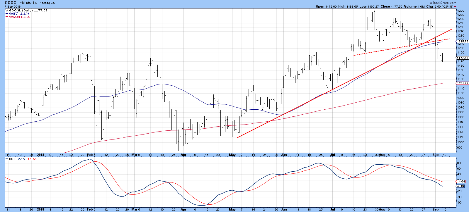
Chart 7
Microsoft (8%) is also in a corrective mode, but Chart 8 tells us that it is it is taking place under the context of a strong bull market. Note that the Special K is at a new marginal high and well above its signal line.
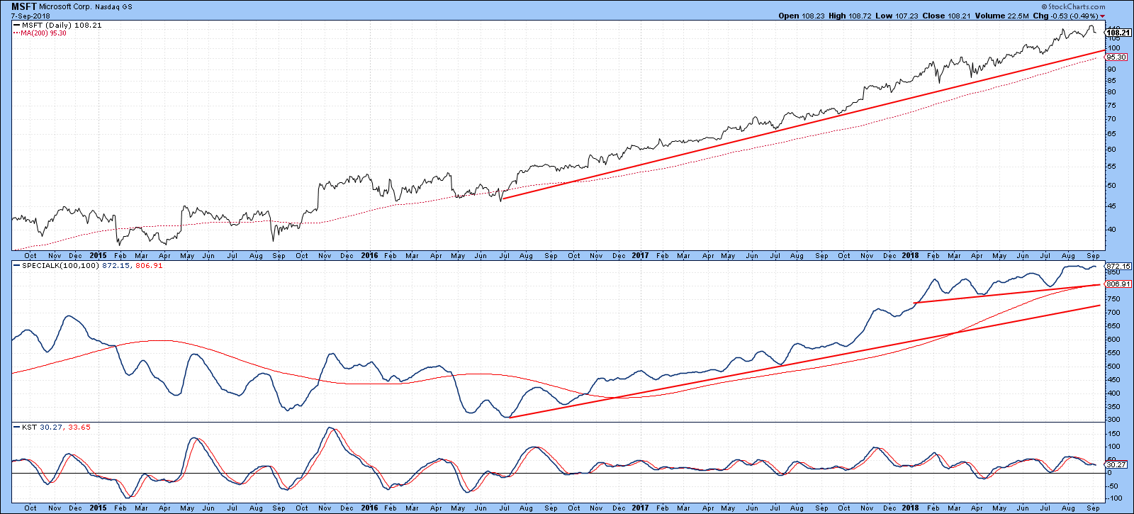
Chart 8
Short-term, the trend is also positive as far as the price is concerned. However, it’s not that far above the two converging trendlines and the 50-day line. That could be a problem, as the KST recently tried to cross above its MA from a moderately low level. Such failures are often followed by an above average move to the downside. Bottom line, there is a good chance that the recent correction will extend, but all under the context of an on-going bull trend.
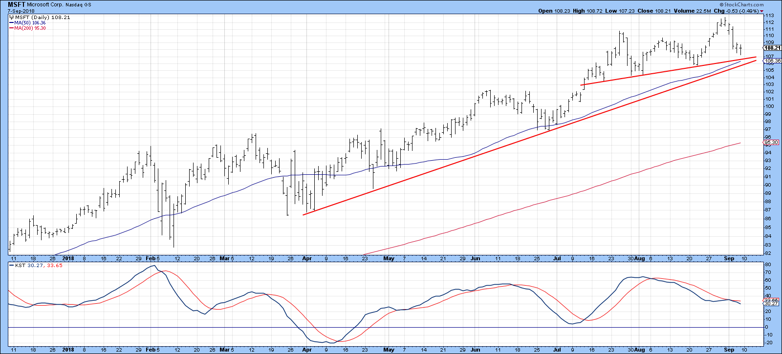
Chart 9
The same comments can be applied to Amazon (7%), where Chart 10 shows that the price is literally right at a 6-month up trendline. Overstretched KST action suggests that it will violate the line.
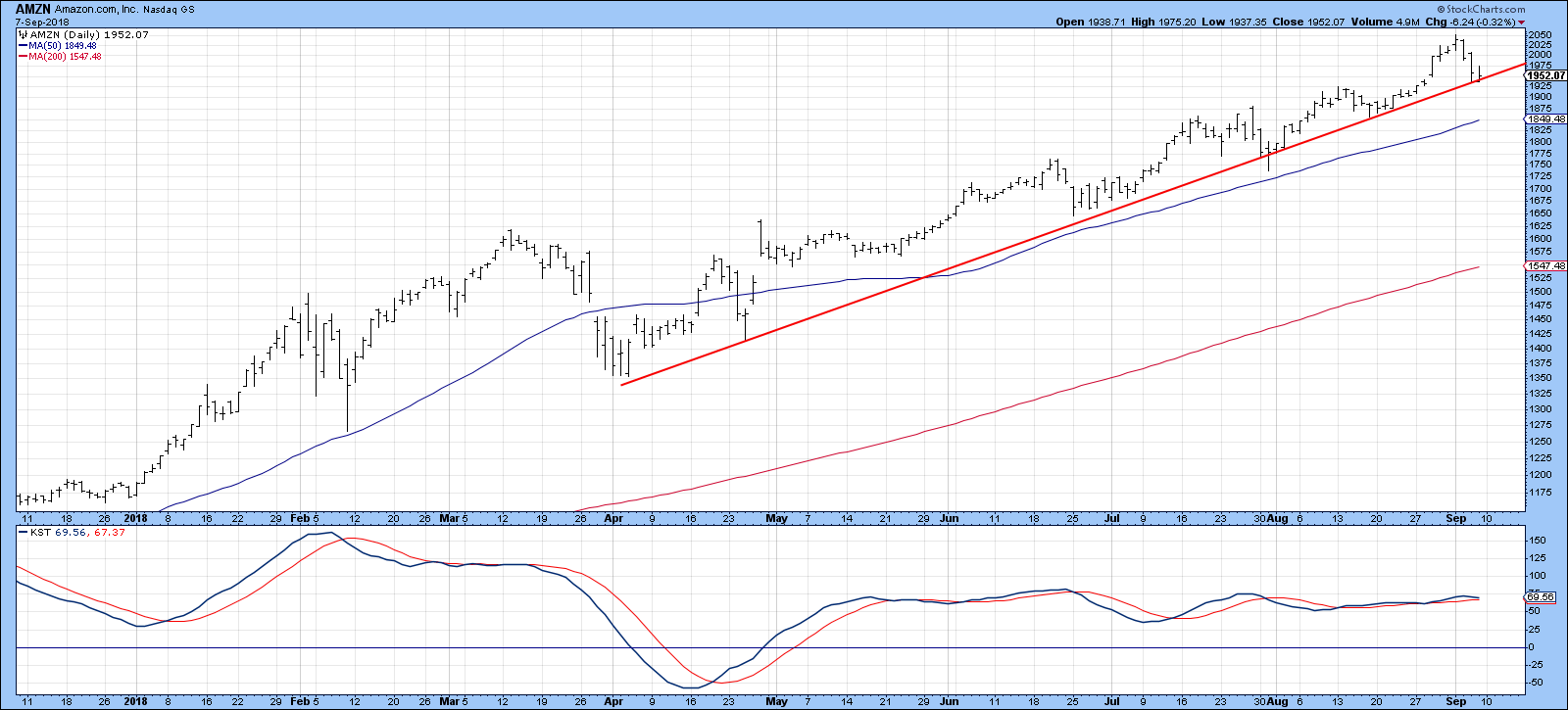
Chart 10
The good news though, is that the long-term uptrend is intact, as all four indicators in Chart 11 are in a positive albeit, extended mode.
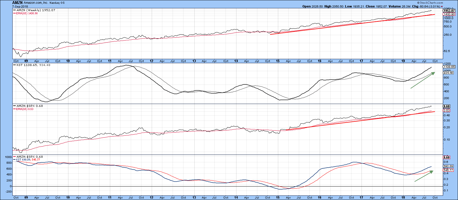
Chart 11
Netflix is also in a confirmed uptrend, but looks as though it may be in the process of completing a 2018 head and shoulders top. The 200-day MA is getting close to that potential neckline, so this is something worth watching. The short-term KST, in the bottom window, is currently in a bullish mode, so a test of last summer’s high is certainly a possibility. In these cases it’s usually wiser to assume that the prevailing trend is still in existence, so I am classifying the stock as bullish unless that potential neckline turns into a real one.
Chart 15
Good luck and good charting,
Martin J. Pring
The views expressed in this article are those of the author and do not necessarily reflect the position or opinion of Pring Turner Capital Group of Walnut Creek or its affiliates.


