Four Areas To Watch For A Possible Bear Market Trigger
- Internet bubble
- Credit spreads
- Rising interest rates
- Contagion from abroad
On Wednesday, I joined Tom and Erin on MarketWatchers LIVE and enjoyed a spirited discussion on what signs might foreshadow an extension to last week’s decline, or even signal a bear market. The four areas I cited were the internet bubble, credit problems, higher interest rates and international contagion, particularly from emerging market countries. Let’s consider them in turn.
Internet Bubble
The Dow Jones Internet Commerce Index ($DJECOM) has risen from just under $33 in 2002 to around $1300 at its August month-end peak. That’s a gain of slightly less than 40 times. Gold, by comparison, rose approximately 20 timesfrom the early 1970s until its bubble peak in 1980, while the NASDAQ during the 1990s tech boom rose 13 times and the 1920s stock market bubble just under 5 times, all measured on a month-end basis.
Whenever market advances take place over a long-period of time and experience huge gains, people become overconfident. This leads them to make the kind of careless decisions that would normally be unthinkable. When the tide eventually turns, these positions are exposed and a sharp downturn is unleashed. The decline in these market leaders is bad in itself. Unfortunately, the rest of the market follows suit, though to a lesser extent. Chart 1 features the $DJECOM. It is apparent that both the price and relative action are resting on key 2009-2018 uptrend lines and their respective 65-week EMAs.
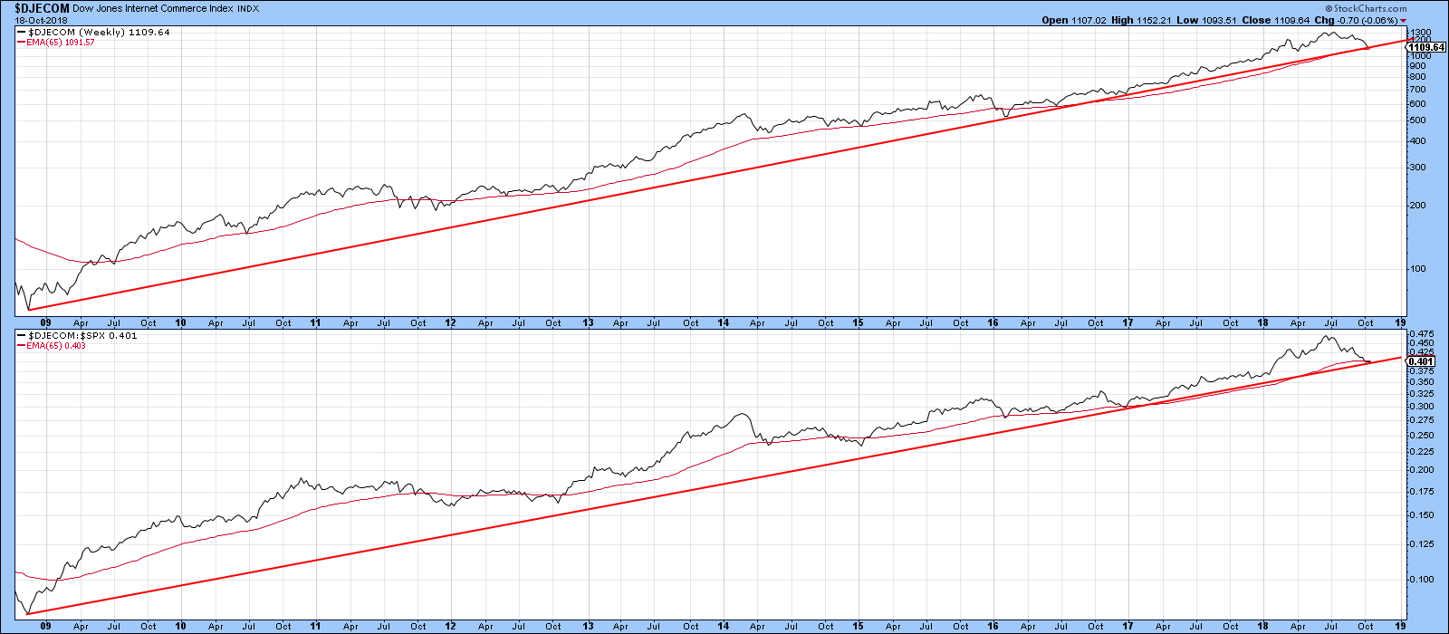
Chart 1
Chart 2 focuses on the last three years. The bad news is that both the absolute and relative lines have violated important trend lines. The good news is that the two KSTs are oversold, indicating that some form of bounce is likely.
The key takeaway is that the Index is very close to a downside breakout and needs to be watched very carefully. If it does break down, this flagship of the 2009-2018 bull market is likely to have a deleterious effect on the market as a whole.
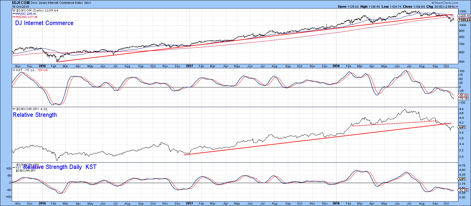
Chart 2
Credit Spreads
Chart 3 compares the S&P Composite to the ratio between the iBoxx High Yield ETF and that of the Barclays 7-10-year Government EYF (HYG/IEF). When the ratio is rising, it reflects a trend of growing confidence by bond investors. That’s because their preference is for the higher yield offered by junk bonds over the relatively risk-free treasuries. When these savvy investors sense potential weakness in the economy that is likely to lead to a greater number of defaults, they pull in their horns and embrace the greater liquidity and safety of the treasury market.
This change of heart shows up in the chart by a declining ratio in the face of a rising S&P Composite. These divergences have been flagged with the dashed arrows. If an expansion of defaults is a potential problem right now, it is certainly not showing up in the chart as was the case for the three previous declines. Nevertheless, this is certainly an area to monitor in case a negative divergence does develop down the road.
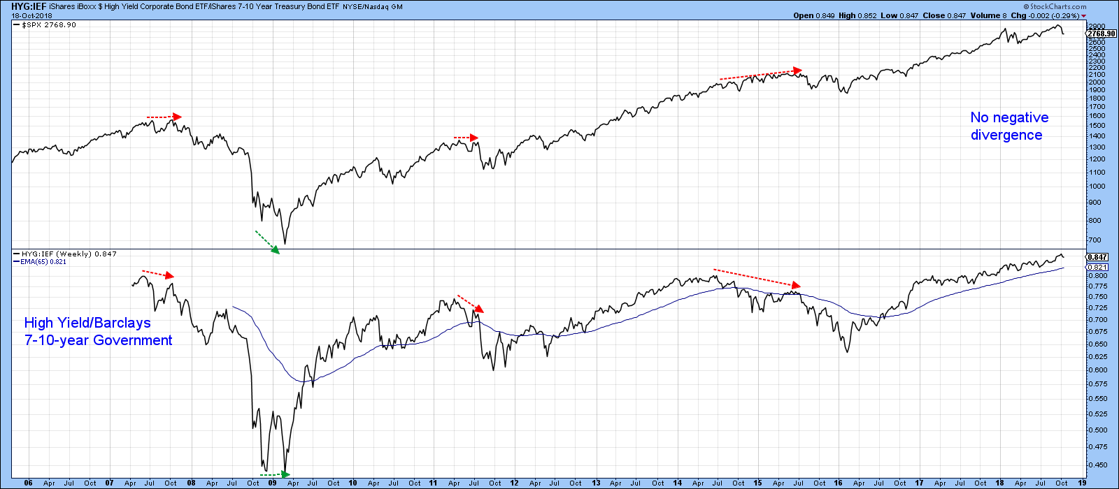
Chart 3
Rising Interest Rates
There have been a number of forecasters recently opining that the economy will buckle at this or that specific level of interest rates. The fact is that there is no known reliable technique for determining when higher rates will feed back into a weaker economy. Incorporating a rate-of-change of rates is a better technique, but even that has flaws. A more sensible approach is to look for actual evidence that rising interest rates are adversely affecting equity prices. Chart 4 does this by plotting the ratio between stocks and bonds and observing when it reverses to the downside. The first thing to notice is that the ratio broke out from a multi-year base in late 2016, which suggests the emergence of a powerful long-term uptrend. However, it’s fairly evident that it is currently overextended and in need of some corrective activity. The flattening long-term KST also hints at such a possibility. That’s important, as the red arrows show that this relationship usually leads the stock market lower.
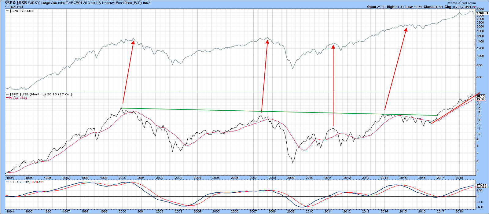
Chart 4
Chart 5 shows a more recent snapshot. Here we can see that the ratio recently bounced off the red 2016-18 bull market trend line and remains above its 200-day MA. However, if the currently bearish KST leads to a drop below the dashed-red support trend line at 2.33, that would likely signal a top. Please note that this is a relative relationship. It has recently been dropping because stocks have risen while bonds have fallen. It could also rise if bonds rise and stocks fall, as was the case at the 2007 peak.
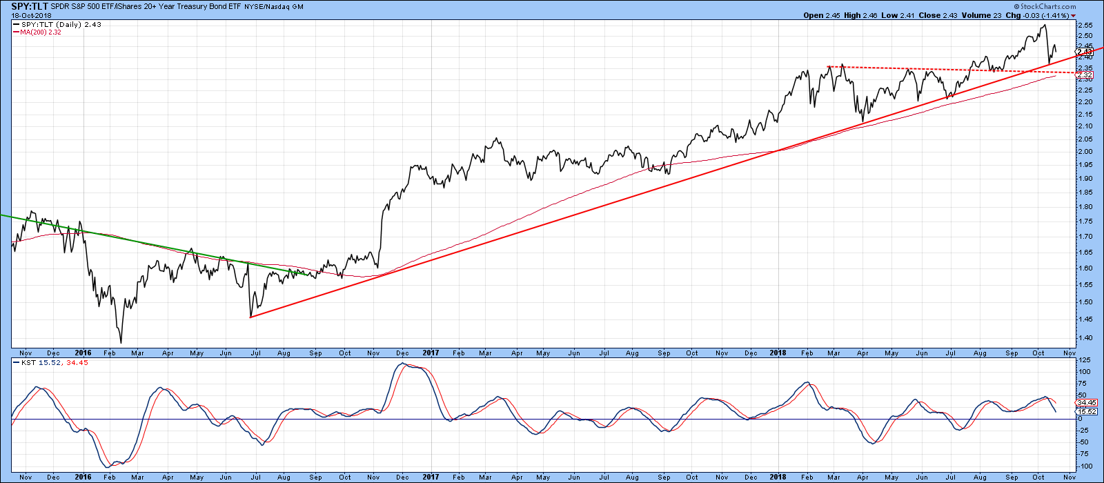
Chart 5
Contagion From Abroad
Our final potential triggering point comes from the dichotomy between the rising US and falling rest-of-the-world markets, as shown in Chart 6. Both peaked in January, and until October, moved in different directions. Now, they are both moving in the same downward direction.
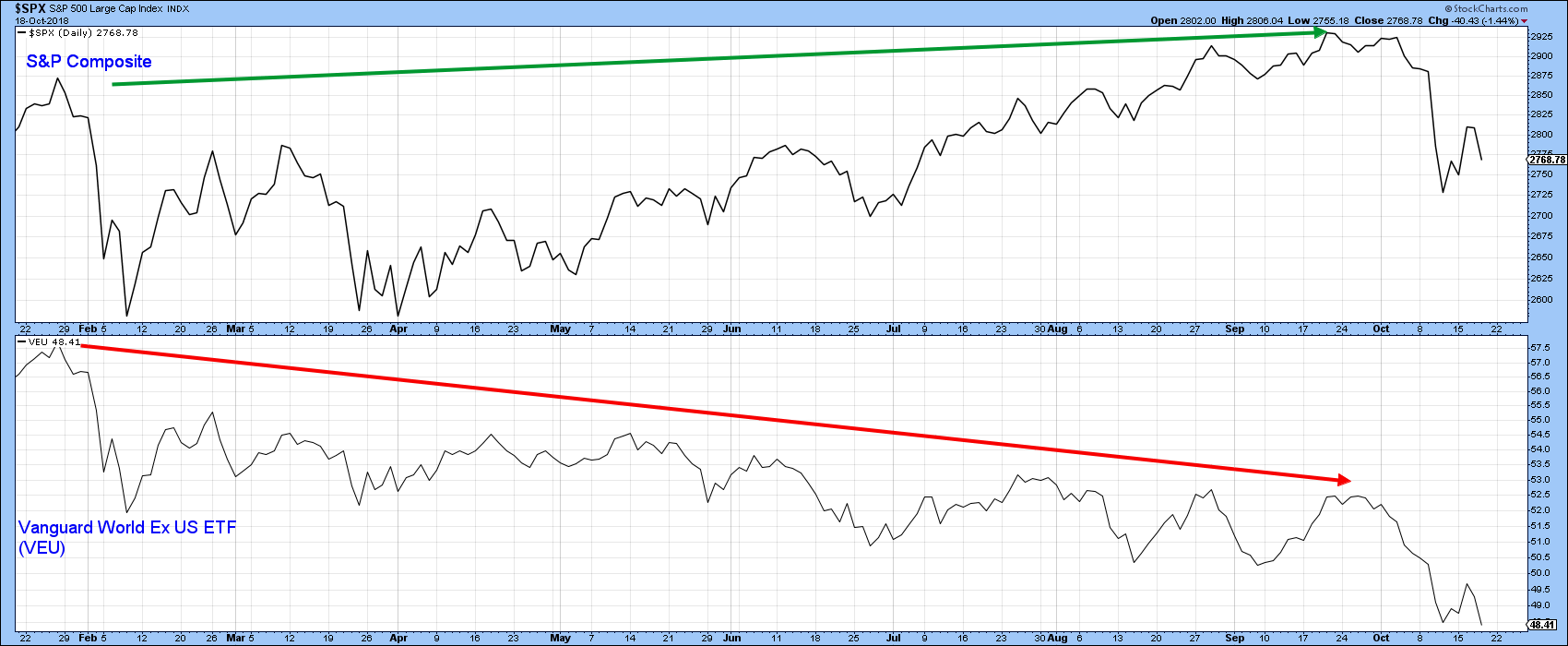
Chart 6
Weakness is certainly being reflected by the STOXX Europe 600 Index, which has just violated a 9-year uptrend line and appears on track to complete a head and shoulders top by the end of the month. To round out the bearish picture, it is also sporting a negative long-term KST.
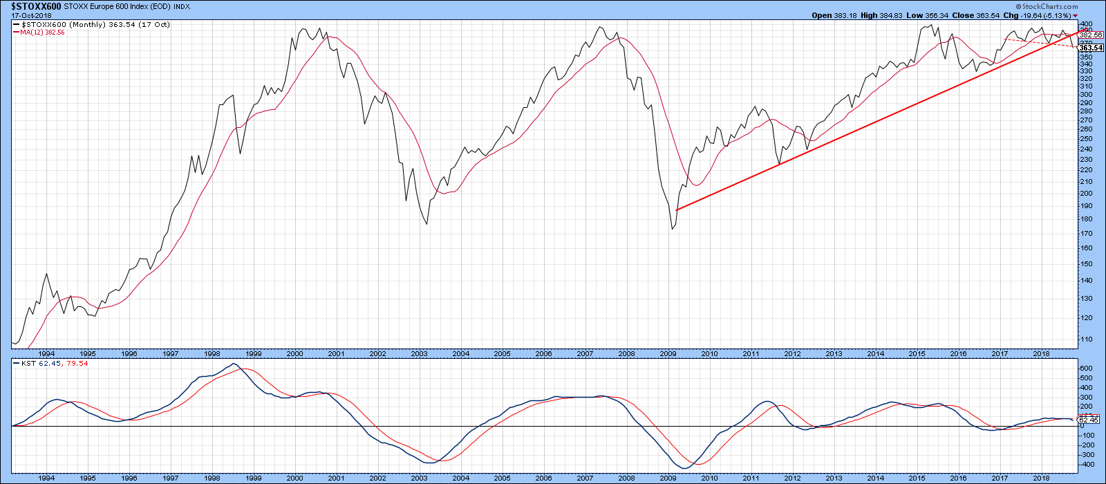
Chart 7
Finally, Chart 8 shows that the Shanghai Composite is building on its secular uptrend violation of last month, with a more decisive penetration occurring in October. The Indian market, in the form of the Bombay Stock Exchange Index, is close to a major violation of its own.
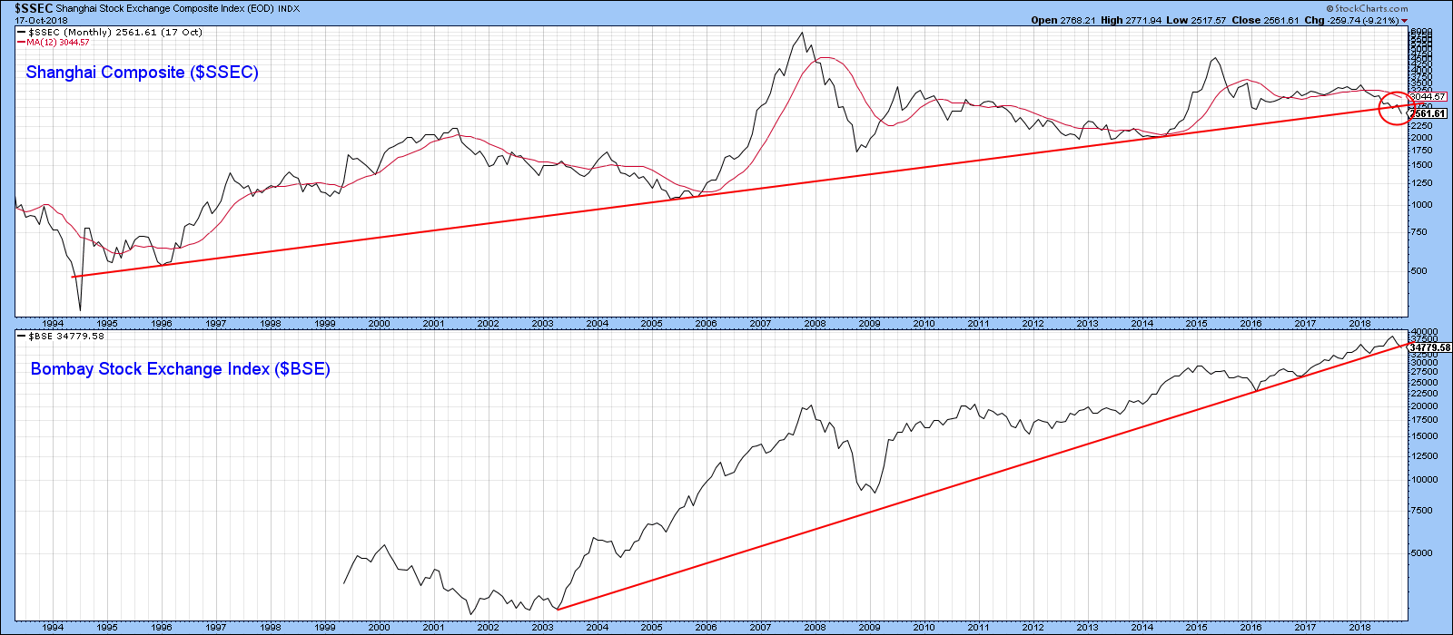
Chart 8
It seems to me that, if we see much more downside action in these markets, US equities will find it hard to buck the trend. Two examples of overseas markets resulting in US contagion are shown in Charts 9 and 10. Chart 9 features the Hong Kong ETF as symbolic of the 1998 Asian debt crisis.
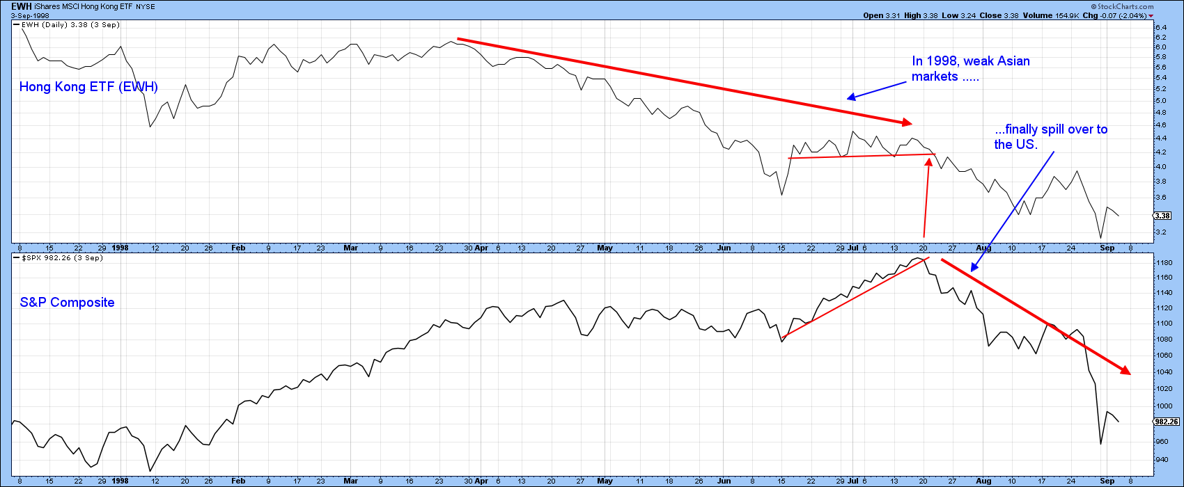
Chart 9
Chart 10, reflects Chinese contagion in 2015. In both instances, persistently weak prices contributed to an eventual sharp drop in the S&P Composite. Both examples also proved to be the beginning of the end of these downward trends. That could well be the case in the current situation, bearing in mind the strong US economy. On the other hand, the violation of the Shanghai and European mega-trend lines argues for a different directional outcome.
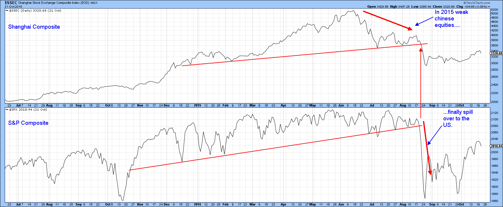
Chart 10
Good luck and good charting,
Martin J. Pring
The views expressed in this article are those of the author and do not necessarily reflect the position or opinion of Pring Turner Capital Group of Walnut Creek or its affiliates.


