Tentative Signs That Bond Yields May Be Peaking
- A few observations about the secular trend
- Short-term technical position
- Junk bonds peak out
- Credit spreads argue for lower government yields
A Few Observations About the Secular Trend
The 5-year yield, shown in Chart 1, has formed and broken out from a major base. It touched a low point in 2012 and has since experienced a series of rising primary trend peaks and troughs as flagged by the arrows. All of this suggests that the secular bear market in the 5-year maturity bottomed in 2012 and that a new upward one is now underway. Nevertheless, the long-term KST has started to kink to the downside, which hints that upside momentum may have dissipated for the time being.
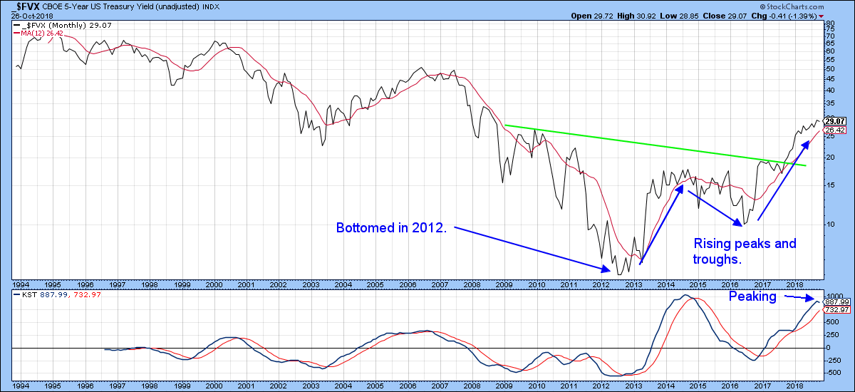
Chart 1
More evidence that yields are at an important crossroad comes from the 10-year maturity. It’s been plotted in in Chart 2. Right now, it looks poised to push through its secular down trend line. By the same token, the long-term KST, like the 5-year series, is very overstretched and starting to tick to the downside. That suggests it may have a problem pushing through the line. Since the 5-year series bottomed in 2012, chances are that the 2016 low will turn out to be the final bottom for the 10-year series. Consequently, any forthcoming yield weakness would merely extend the long-term base building process. In other words, a likely possibility for yields is down now and up later. Let’s take a closer look at the technical position to see whether that possibility holds water.
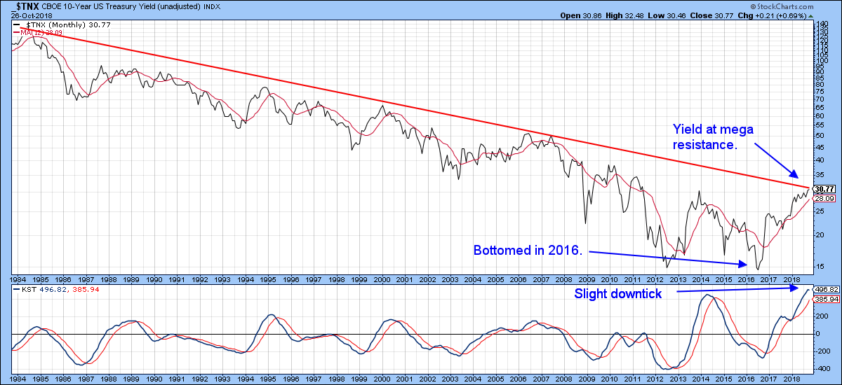
Chart 2
Short-Term Technical Position
Chart 3 features the 30-year yield, together with its Special K (SPK) indicator. Clearly, the yield has broken out from a very large base. That looks pretty positive on the face of it. However, the sentiment numbers I follow suggest that most people agree with that statement. From a contrarian perspective, that worries me. Another factor is that bond hedgers, who are usually correct at major turning points, are substantially positioned to take advantage of lower yields (higher bond prices). On the one hand, dumb money is positioned for higher yields while and smart money is positioned for lower ones. Putting that aside for one moment, there is little doubt that Chart 3 is bullish, because the SPK and yield are both in confirmed uptrends. However, the daily KST, in the bottom window, has just rolled over into a bearish mode and remains in an overbought condition. It certainly would not take much in the form of lower yields to result in a false upside breakout. Were that to happen and the yield subsequently drop below its 200-day MA and the 2016-18 uptrend line at 3.097%, we would have the ingredients for a more substantial drop in bond yields.
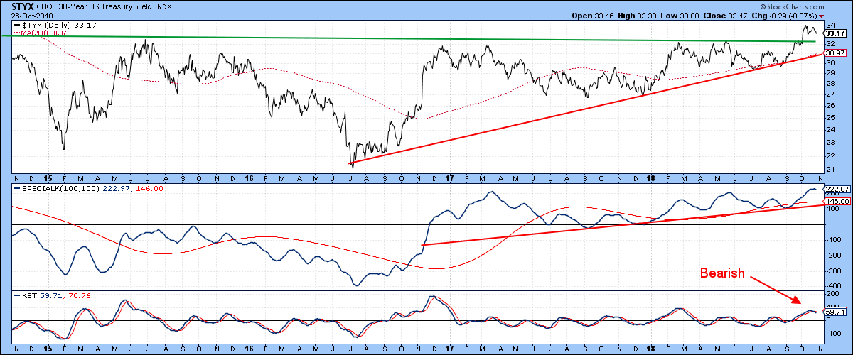
Chart 3
It looks as though Friday’s action at least supports some form of corrective action, since the yield has already violated its August/November uptrend line. To be sure, it’s not a super-important line, but its violation does suggest that the breakout above the green trend line in Chart 4 is unlikely to hold. Note that the PPO in the lower panel is also overstretched and in need of some corrective action.
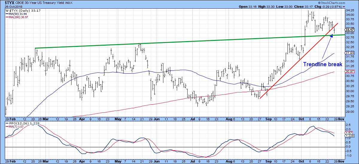
Chart 4
Junk Bonds Peak Out
The recent performance of junk bonds leaves a lot to be desired. For instance, Chart 5 shows that the iBoxx High Yield ETF, the HYG, has just completed a large 3-year head and shoulders top. The KST is slightly oversold, which throws a small question mark against the validity of the downside break. However, as things stand right now, it’s a valid break. If junk bonds are headed lower, that can only mean one thing: higher yields! Higher yields for junk can take place because of a general rally in rates. If that turns out to be the case, then it would be likely that the upside break in the 30-year yield will turn out to be valid and the secular downtrend in government yields reversed.
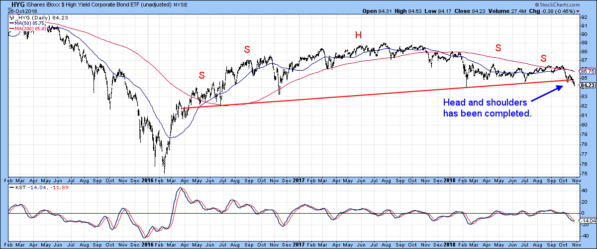
Chart 5
Credit Spreads Argue for Lower Government Yields
On the other hand, junk prices could be going down (yields up) because of fears of widespread defaults. That’s where Chart 6 comes in, as it features the spread between the HYG and the Barclays 7-10-year Treasury ETF (IEF). When that spread moves up, it indicates that bond investors are interested in the higher yield being offered by junk bonds over the relatively risk-free treasuries. A declining ratio, on the other hand, means that investors are worried about defaults in the junk market and wish to cling to the safety of treasuries.
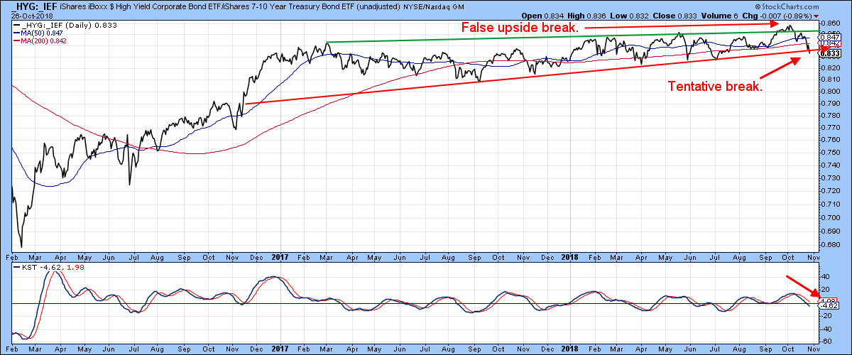
Chart 6
Chart 7 compares the ratio to the 30-year yield. We can see clearly that there is a close relationship between the two, whereby a rising ratio is associated with a growing confidence in the economy and rising yields. Alternatively, a lower ratio reflects shrinking confidence and government yields. Recently, both series experienced an upside breakout, but the ratio has since recanted and dropped below the red support trend line. That sharp reversal is quite a worrying factor, as it suggests confidence is deteriorating at a rapid rate, in which case government yields would likely be headed lower.
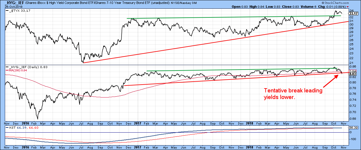
Chart 7
Good luck and good charting,
Martin J. Pring
The views expressed in this article are those of the author and do not necessarily reflect the position or opinion of Pring Turner Capital Group of Walnut Creek or its affiliates.


