Year-End Rally Here We Come?
- Pinocchio Lies
- Oversold Sentiment Indicators
- Oversold Oscillators
Pinocchio Lies
Monday’s action was what I call “scary bullish.” First, we saw prices sell-off sharply, only to then rebound as if nothing had happened. Well, something did happen - the formation of a bullish Pinocchio bar on several Indexes. Chart 1 shows this for the S&P, where the open and close developed above the red trend line, but the intraday action pushed it temporarily below, resulting in a false downside break at the end of the session.
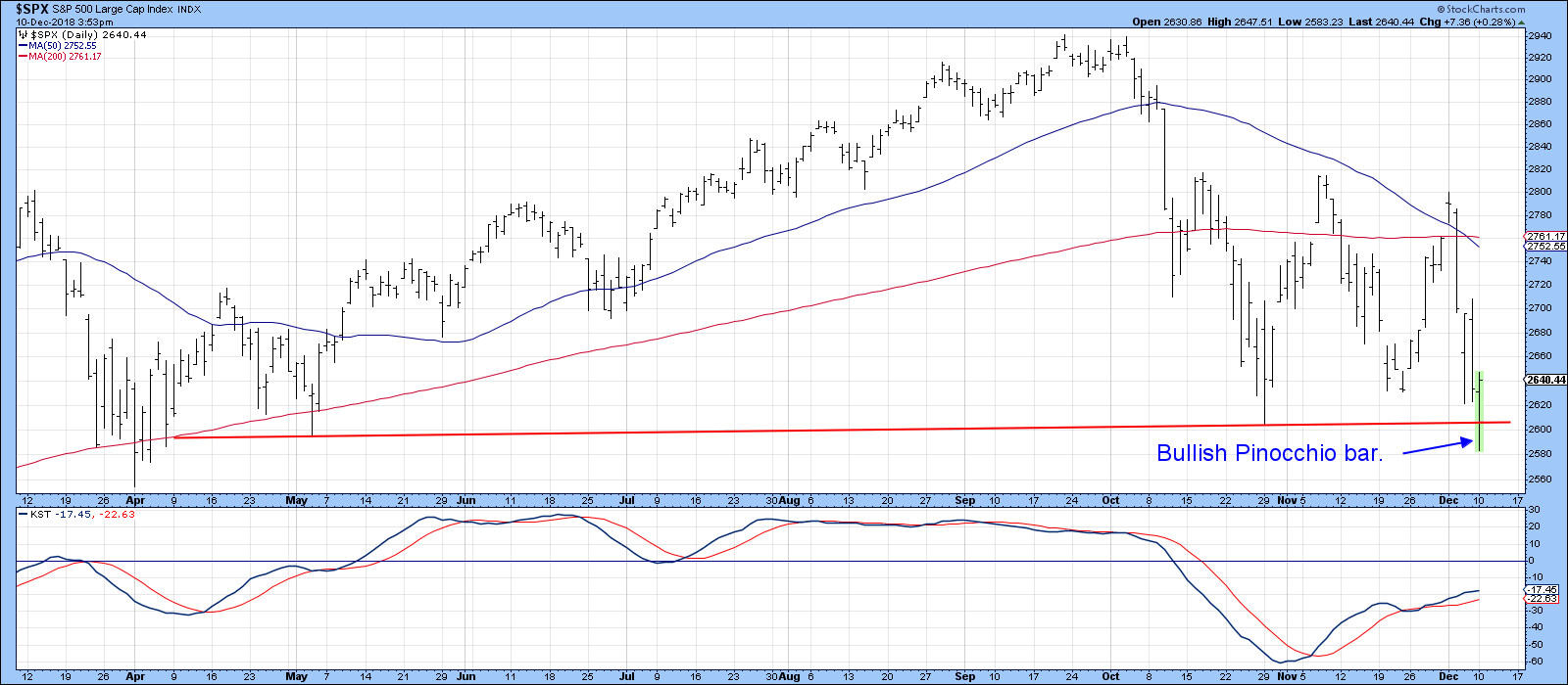
Chart 1
We see the same thing for the NYSE Composite in Chart 2. Notice how the February low was also characterized by Pinocchio-type behavior.
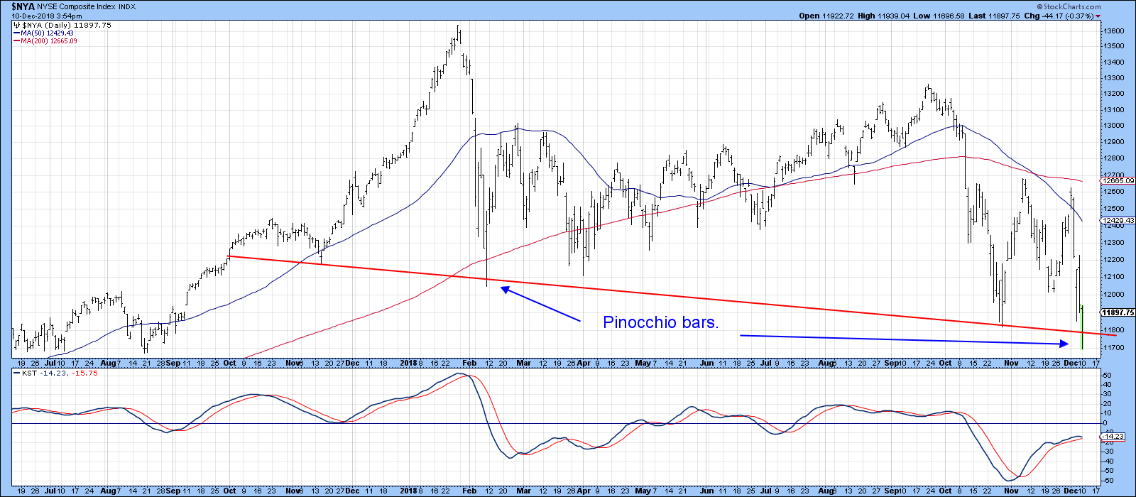
Chart 2
Additionally, Chart 3 indicates that the Dow was under the same influence, but the trend line was drawn in a slightly different way. In this instance, the pattern offered a double play, first as a Pinocchio and second as a bullish Japanese candlestick in the form of a hammer.
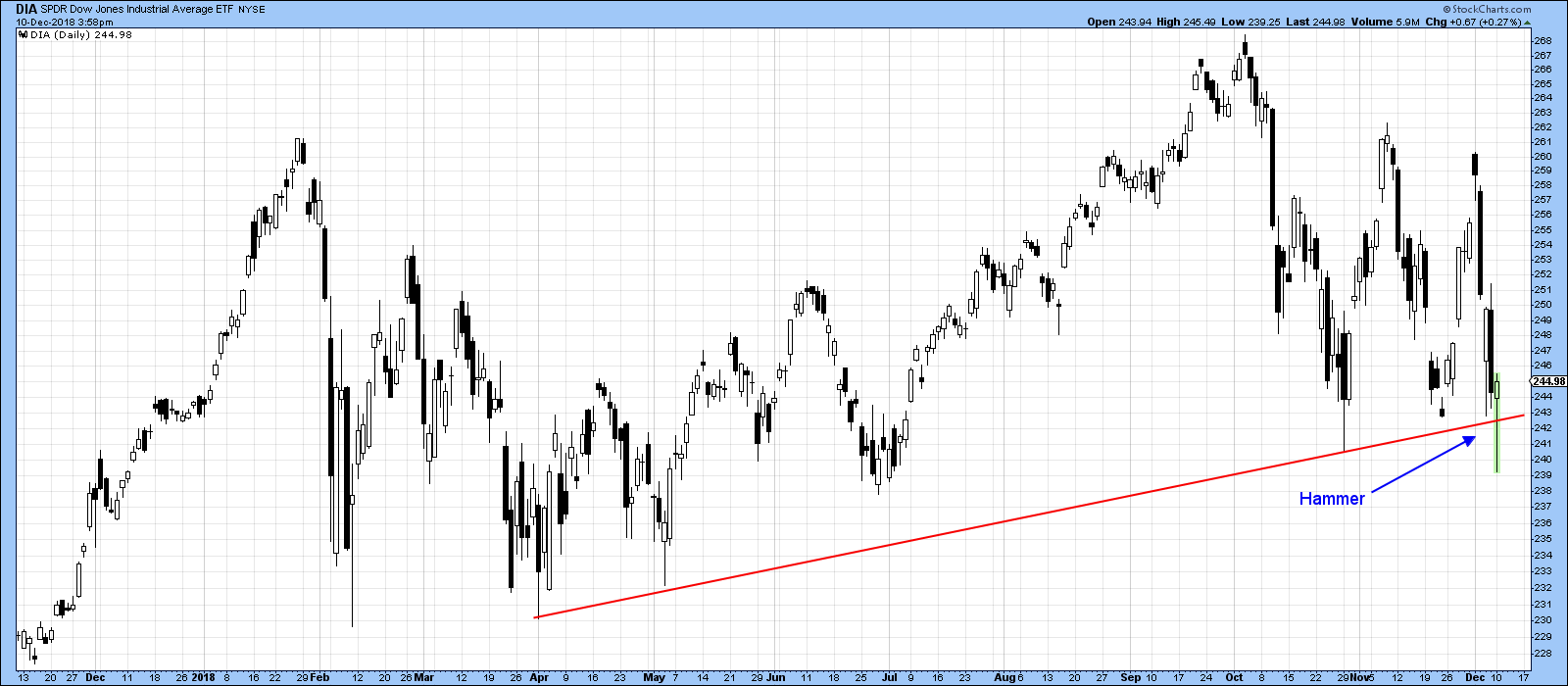
Chart 3
Officially, Pinocchios only have a short-term effect, lasting for roughly 5-10 sessions. However, some are so strategically placed that, in retrospect, it can be seen that they actually developed at major turning points. The vast majority of my long-term indicators remain in the bearish camp; since a lot of them are slow to turn, my belief that a primary bear market is underway remains unaltered. That said, there are a number of intermediate indicators that are bullish, so we may well see a nice rally develop from current levels. Add to that the bullish seasonals, the post mid-term election rally tendencies and a Chinese trade/Brexit/Fed wall of worry and it’s possible that we will see an extension of the trading range that has been building since late January. If my suspicion of a bear market is correct, that trading range will turn out to be a top.
Oversold Sentiment Indicators
Chart 4 features a 30-day MA of the CBOE Total Put/Call Ratio. High levels tell us when traders are excessively pessimistic. Since pessimism can morph into greater pessimism, it is when this indicator reverses trend that it triggers buy signals. Bearing this in mind, the green arrows show those periods when the oscillator reverses from, at or above the dashed green horizontal line. The most recent indication was given a couple of weeks ago. The pink-shaded area covers the most recent full-fledged primary bear market. You can see that the indicator still worked during this period, but the rallies it triggered were far more subdued than those generated in the bullish parts of the chart.
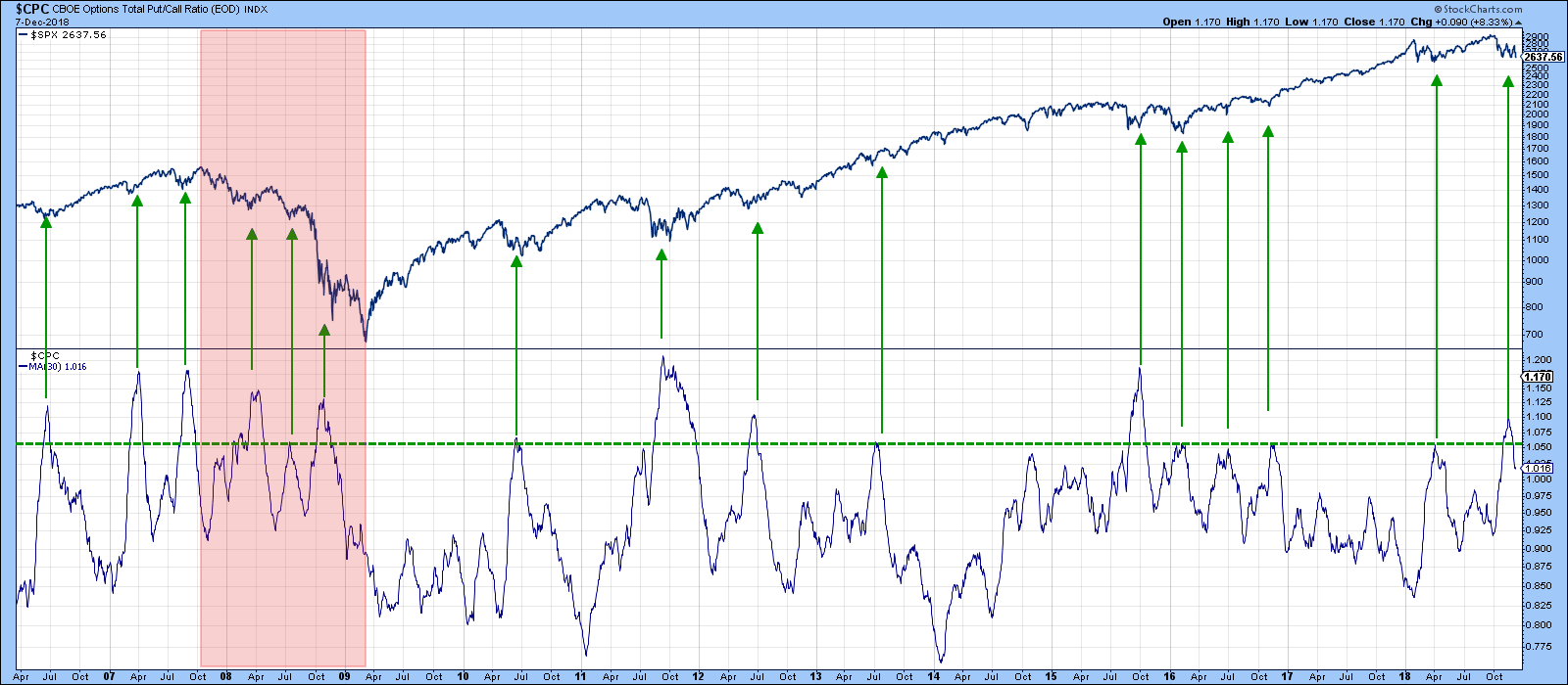
Chart 4
In Chart 5, the VIX is plotted inversely to correspond with price movements in the S&P. The black line represents a 10-day MA, while the red one represents a 15-day MA. Timely buy signals are triggered when these two series reverse direction from below the lower dashed horizontal line. The indicator is currently oversold but is still declining. However, if those Pinocchios are going to have their usual bullish effect, it’s a small leap to conclude that the VIX MA’s will soon reverse to the upside.
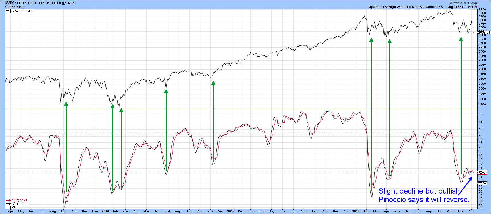
Chart 5
Oversold Oscillators
A favorite short/intermediate oscillator is my Dow Diffusion Indicator. It’s shown in Chart 6. This one monitors the Dow stocks that are classified as being in a positive trend. Once again, buy signals are generated from an oversold upside reversal, examples of which have been flagged by the green arrows. The dashed green arrows show that it has diverged positively with the Dow itself in the last few weeks, which means that it is situated to experience a positive take-off.
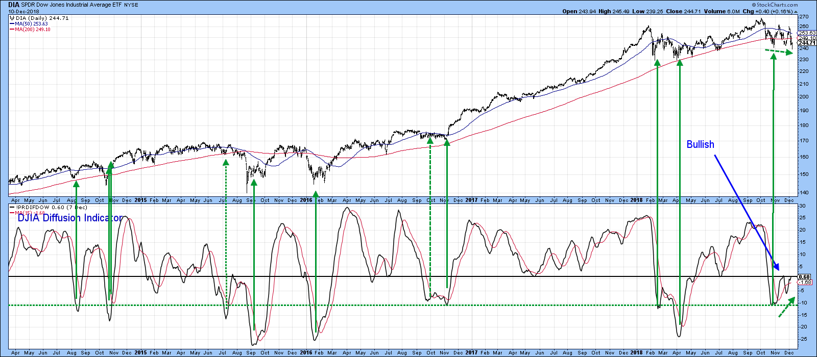
Chart 6
Another indicator that has been diverging positively with the S&P is the 10-day ratio of NYSE advancing versus declining issues. This discrepancy is not a signal to buy, but does argue for an improving under-the-surface technical structure.
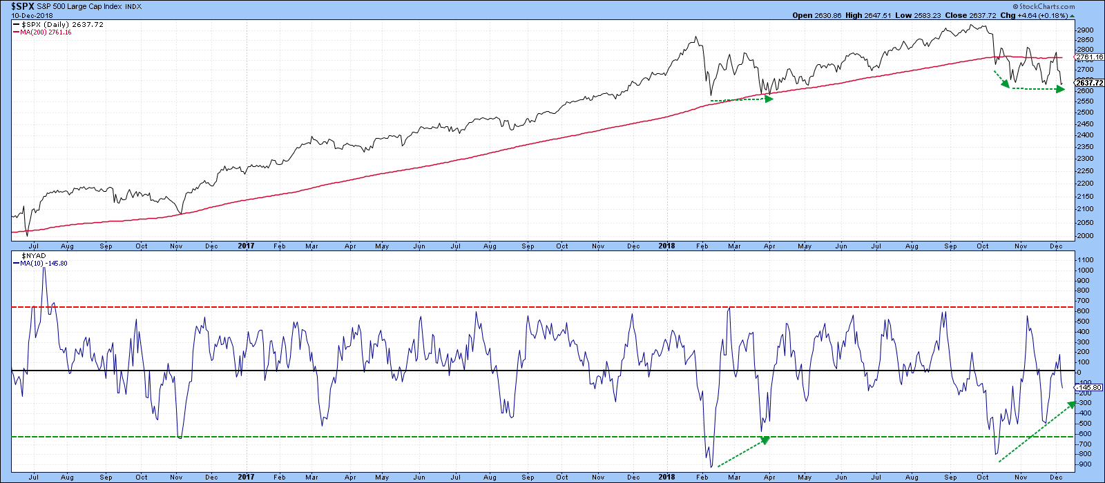
Chart 7
The vertical green lines in Chart 8 show when the percentage of NYSE stocks above their 50-day MA initially touches the red horizontal oversold line. The pink shaded area represents the 2007-2009 primary bear market, where you can see that buy signals did not have a lot of upside power. As I said earlier, the market is likely in a primary bear phase. If that view is correct, I would not expect any of the oscillators described here to perform any better than they did in the 2007-2009 period and I am, at best, looking for a failed test of the old highs. If you are of a different persuasion and are expecting the bull market to resume, this could represent a buying opportunity commensurate to that which developed in the spring of 2016.
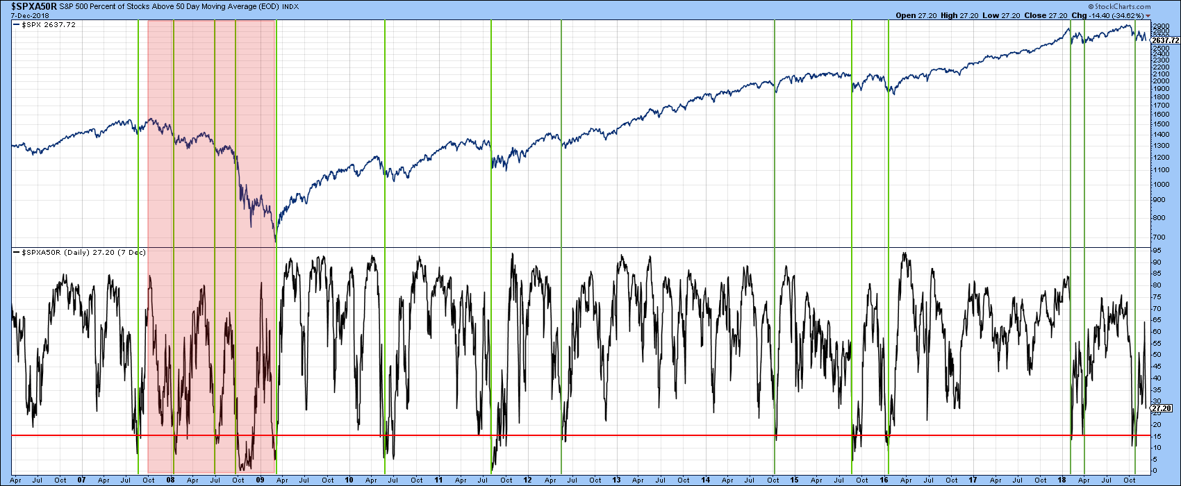
Chart 8
The NASDAQ was one of the strong downside leaders, but in the last couple of weeks it appears to have stabilized. Chart 9 shows us that, prior to the 2015 and 2018 tops, the number of 52-week new highs had been shrinking. In the last few weeks, though, the NASDAQ Composite has experienced lower lows, followed by a slightly higher one this week. However, the net new high data is sporting a positive divergence, as the 10-day MA bottomed in November, not unlike the positive divergence we saw in early 2016.
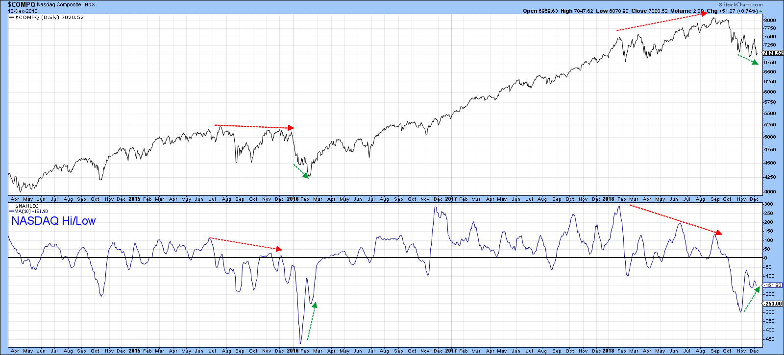
Chart 9
Good luck and good charting,
Martin J. Pring
The views expressed in this article are those of the author and do not necessarily reflect the position or opinion of Pring Turner Capital Group of Walnut Creek or its affiliates.


