Bond Prices Poised For A Major Breakout, But Will They?
- Adjusted vs. Unadjusted Prices
- Bonds Reflect the Fine Current Balance Between Inflationary and Deflationary Forces
Adjusted vs. Unadjusted Prices
Chart 1 shows that the iShares 20-year Trust ETF, the TLT, has been in a trading range since late 2014. Currently, the price is above its 12-month MA and the long-term KST is bullish, meaning there is a good chance of an upside breakout. That breakout would come with a move above the green resistance trend line; as the price is currently right at the line, a break could literally come at any time.
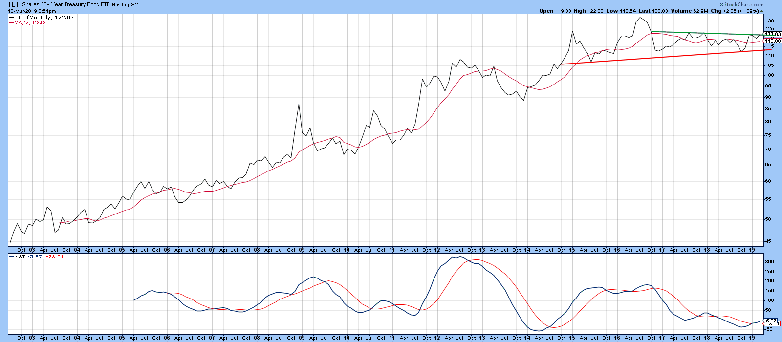
Chart 1
When a symbol such as TLT is selected, StockCharts plots the result on a total return basis, which includes dividends or interest payments. To obtain a pure price series, it is necessary to type in the underscore (_) key in front of the symbol, as is done in Chart 2. With low dividend-paying stocks plotted over short periods of time, this distinction does not make much difference to the overall chart. However, eliminating the income flow from relatively high-paying bonds or stocks returns a substantially different series with more of an obvious downward bias. Even so, the 2018-2019 part of Chart 1’s trading range is still apparent. The principal difference is that this ranging action did not extend back as far as 2014. From a purely long-term technical perspective, I prefer the unadjusted approach, but when comparing bonds with other asset classes, total return offers a truer picture. The reason I am distinguishing between the two approaches in this situation is that, right now, they are both at important crossroads in terms of resistance trend lines.
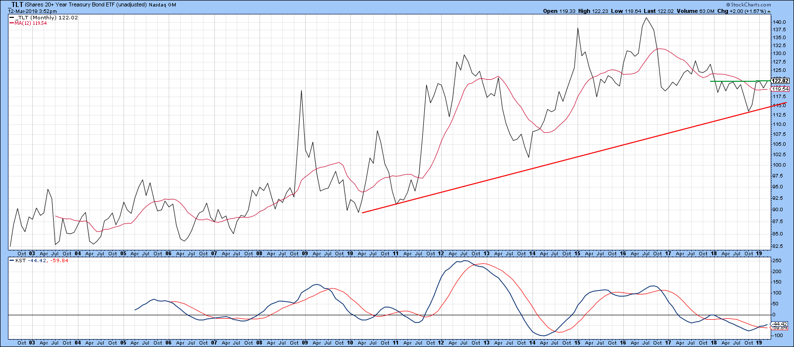
Chart 2
A comparison between the TLT and the Special K (SPK) indicator also shows the price to be at an important technical juncture point. You can read about the Special K here. In fact, the SPK has just started to nudge above the top of a 2-year base. Even the daily KST, shown in the bottom window, has started to turn to the upside. Note how the three previous Special K/price trend line breaks were each followed by worthwhile moves. A joint break has not yet taken place, but, given the size of this potential technical event, it is definitely worth monitoring.
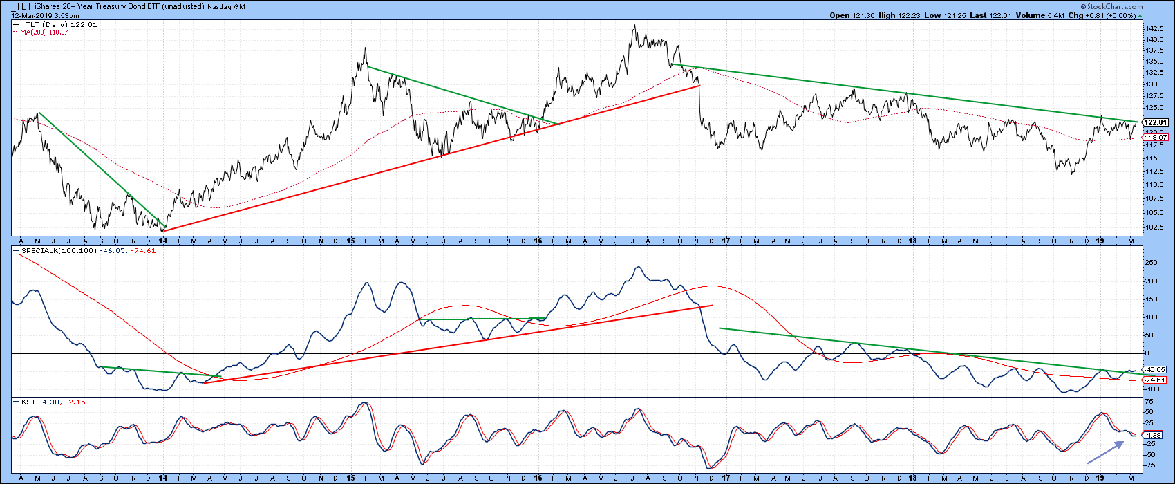
Chart 3
Charts 4 and 5 tell us that 7-10- and 5-year maturities are also close to a breakout. Chart 4 features the iShares 7-10-year Treasury, the IEF, where we see the price nudging above the green downtrend line, accompanied by a daily KST that has just joined its intermediate and long-term counterparts in the bullish camp.
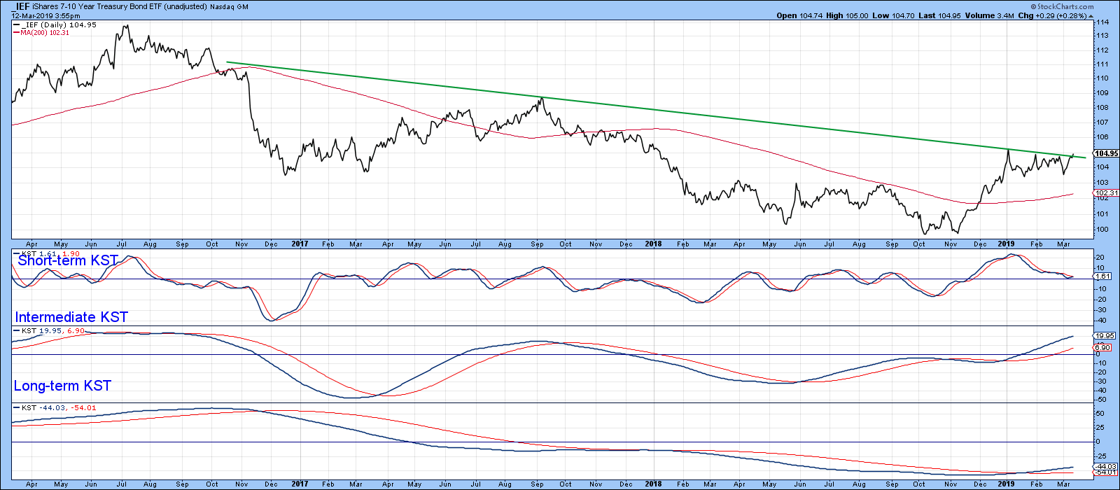
Chart 4
Chart 5 examines the 5-year yield, which shows that a downside break will result in an upside one for prices. In this instance, our potential top takes the form of a bearish head and shoulders. Note that the SPK has already violated its bull market trend line, as has the yield itself.
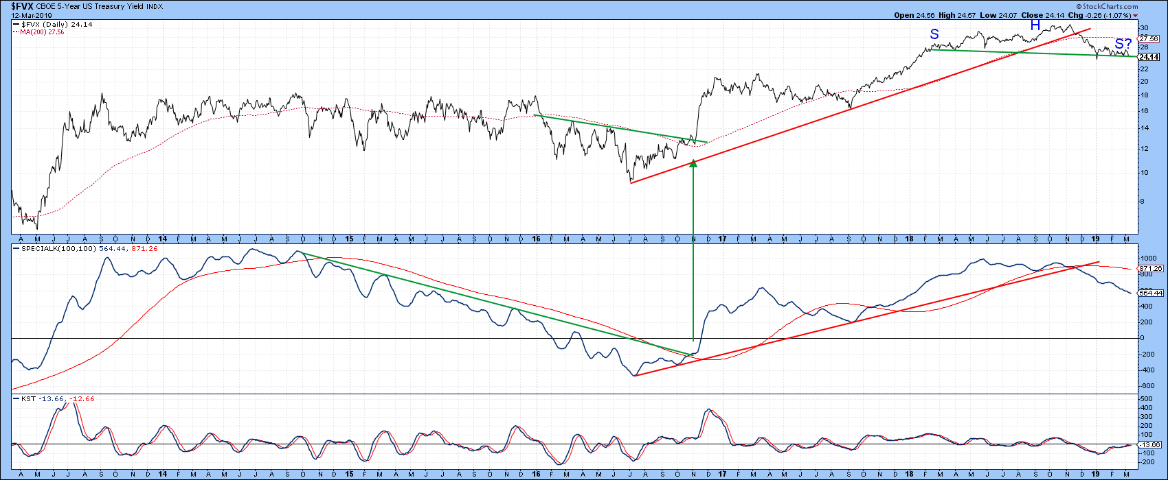
Chart 5
Bonds Reflect the Fine Current Balance Between Inflationary and Deflationary Forces
Perhaps one of the reasons for hesitancy in the bond pits lies with the current delicate balance between inflation and deflationary forces. Chart 6 compares the CRB Composite with a ratio of inflation-sensitive stock market sectors (!PRII) to one of early cycle leaders and deflation-sensitive issues (!PRDI). As you can see, the stock market, in the form of the ratio, generally leads the commodity market. Remember that bond yields are very sensitive to changes in commodity prices. The KST for the ratio is in a deflationary mode. In addition, the latest plot for the ratio itself pushed it to a marginal new post-2016 low. That suggests that it might once again be reverting to its leading role, as the CRB has not yet started to show weakness. If this inflation/deflation relationship weakness extends, that would imply that bond yields themselves will move in that direction, resulting in an upside break for bond prices.
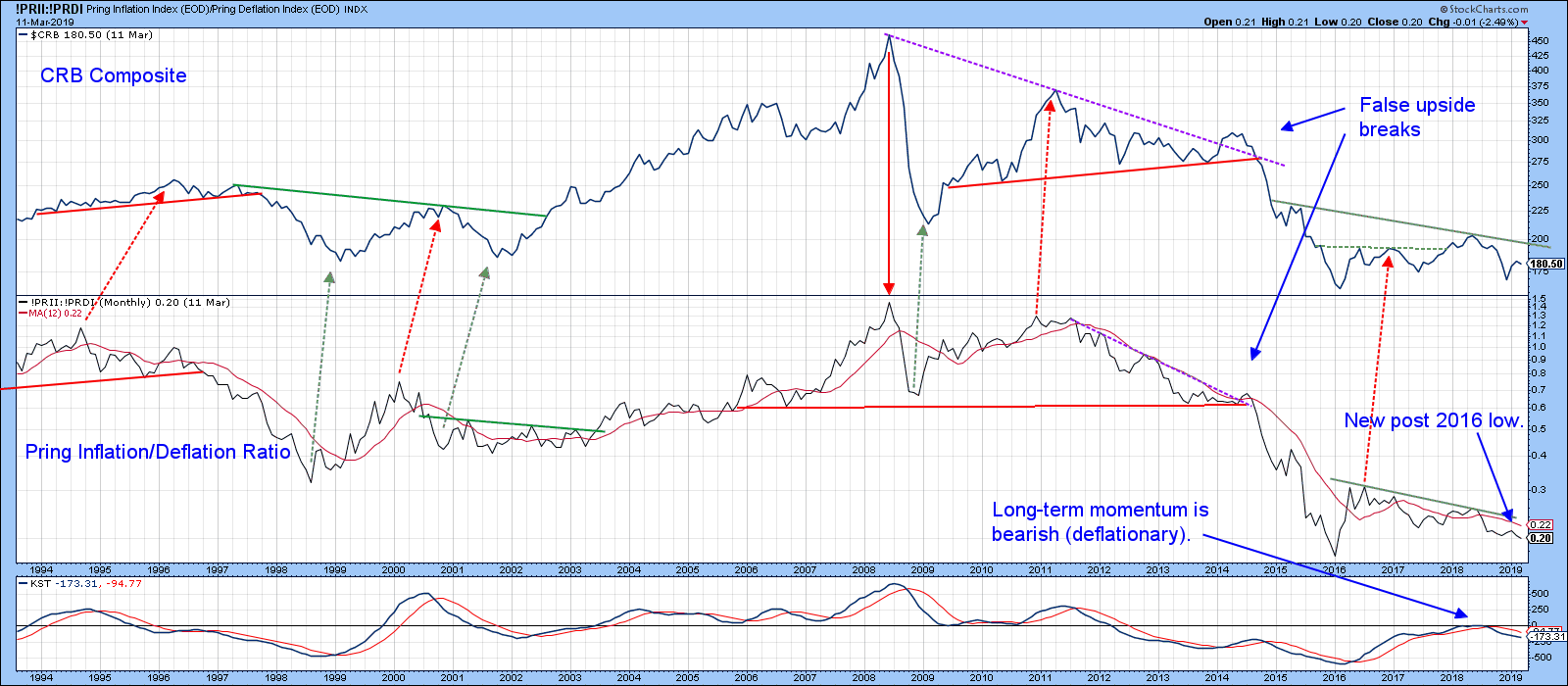
Chart 6
Chart 7 really sets the picture, reflecting on the fact that the inflation/deflation ratio has been finely balanced to an unusual degree since the middle of last year. You can also see that the SPK is resting on its 2016-2019 support trend line. Right now, it looks as if this relationship is going to break to the downside. However, the term “finely balanced” means that an upside, inflationary outcome is also possible. That would occur with a move first through the dashed green line and subsequently above its solid 2014-19 counterpart.
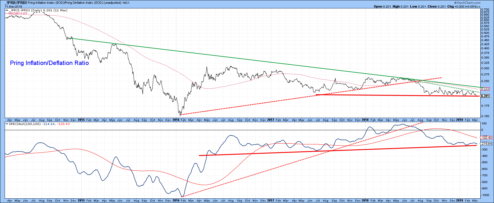
Chart 7
We see a similar setup in Chart 8. This one features the ultimate inflation/deflation relationship, that between commodities and bonds ($CRB/_TLT). That, too, looks vulnerable, as the two solid red trend lines have been decisively violated and the ratio has twice attempted to unsuccessfully cross back above the extended line.
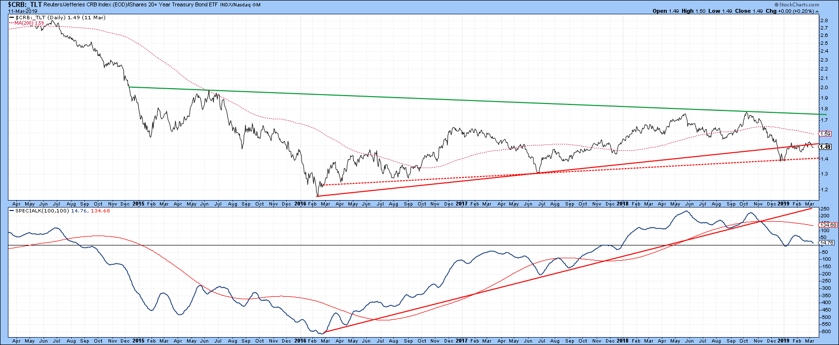
Chart 8
Please remember that any of the charts here can be updated by clicking on them. At that point, they can either be discarded or saved in a chartlist for future study.
Good luck and good charting,
Martin J. Pring
The views expressed in this article are those of the author and do not necessarily reflect the position or opinion of Pring Turner Capital Group of Walnut Creek or its affiliates.


