More Range-Bound Activity Ahead For US Equities?
- Short-Term Indicators Behave Differently in Bull and Bear Markets
- Three Charts to Watch for a Potential Bearish Scenario
Short-Term Indicators Behave Differently in Bull and Bear Markets
Short-term oscillators behave differently depending on the direction of the primary trend. In bull markets, prices are very sensitive to oversold conditions and quickly bounce. We see the opposite in bear markets, whereby overstretched readings on the downside do not have anywhere near the generative power they would in a bull trend. I bring this up because the majority of the long-term indicators I follow remain in the bullish camp. Take Chart 1, for instance, which shows that the S&P is above its 12-month MA and that the two momentum indicators are also in a positive trajectory. None of these series are in what we might call a decisively positive mode, so a complacently bullish stance is uncalled for, especially as the three charts I wrote about last monthfailed to break out on the upside. Nonetheless, the evidence, as I see it, remains bullish until proven otherwise. That means that we should expect to see the market respond to oversold short-term indicators in a positive way.
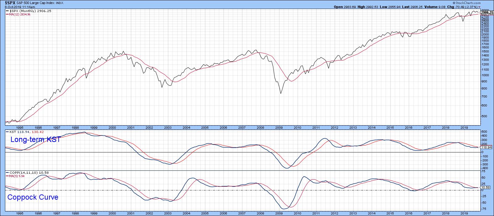
Chart 1
In this respect, Chart 2 features a 10-day EMA for the McClellan Volume Oscillator based on S&P components. The green arrows show when this series reverses to the upside from a position at or below the -50% level. Generally speaking, the S&P was very responsive to such conditions. One exception developed in October 2018, when all that followed was a 2-3-month trading range. Another challenged signal developed earlier this year at the dashed arrow. A reversal does not necessarily mean that prices will immediately take off on the upside, though that is often the case. What it often does, though, is signal that the market is tired of going down and probably needs a week or two to stabilize before moving higher. Currently, the oscillator is close to the oversold condition. Working on the assumption that the bull market is still alive, that probably means some range-bound activity, or even a probing of last week's low. If a contained correction does materialize and long-term sell signals are avoided, that would be very positive. Firstly, it would indicate that the bull market is still with us. Second, once October is out of the way, the market enters the seasonally bullish November/April period, not to mention the upcoming bullish fourth quarter of the pre-election year and a bullish fourth year of the Presidential Cycle.
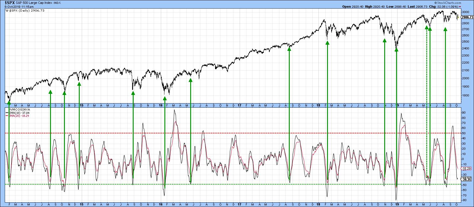
Chart 2
The stakes are high, as both the NYSE Common Stock A/D Line and its more broadly based counterpart in Chart 3 are very close to rupturing some important uptrend lines. The S&P is similarly positioned. Their violation would not signify a bear market, but, given the narrow margin between the S&P and its 12-month MA, it's possible that such weak action could eventually feed back to tip the primary trend balance to the bearish side.
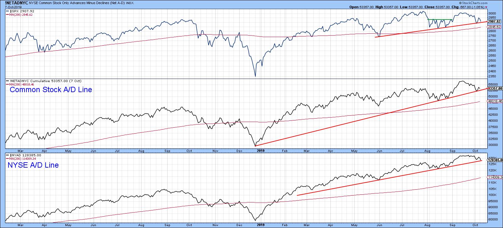
Chart 3
One set of indicators that often warn of subtle underlying strength or weakness are those based on net new data, featured in Chart 4 for several market sectors. Note that all series recently sported a small number of new highs and no new lows. This compares to last week, when each sector experienced a smattering of new lows, highlighted in red. This discrepancy could easily be cleared up, but, at the moment, new high data is a positive factor.
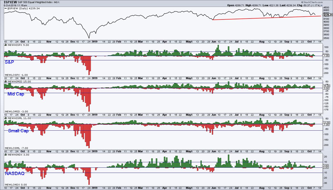
Chart 4
Three Charts to Watch for a Potential Bearish Scenario
Since the margin between bull and bear is quite narrow, it's worth mentioning three charts that might signal a more negative market environment.
First, Chart 5 features the ratio between junk bonds and treasuries. A rising ratio reflects growing confidence, as traders avoid safety and go for yield (and vice versa). The ratio has been diverging negatively with the S&P for some time, which sets off a bit of a cloud. That's important because it is now approaching major support in the form of the red trend line. Note that the short-term KST is at a neutral reading but in a declining trend. If the ratio drops below the red trend line, that would be quite a serious negative development for equities. On the other hand, its not that far below the green trend line and 200-day MA, the penetration of which would be quite positive.

Chart 5
Our second chart features the ratio between the S&P and the 20-year plus Treasury Bond ETF, the TLT. Once again, this relationship is very close to a downside penetration of the 2017-19 support trend line. A drop through it would not only signify that stocks are likely to underperform bonds for a while, but the implication would be for them to decline in their own right. Once again, the Special K tells us that a short-term decline is underway, implying that a likely test of the red line is imminent. Once again, a break above the green downtrend line would be positive. For the moment, though, we need to focus on the red line.

Chart 6
Finally, the ratio between stocks and gold is featured in Chart 7. Once again, this relationship could be forming a giant top favoring gold. However, that top has not yet been completed with a penetration of the red trend line. Until it is, I am assuming that the trading range will continue. If, however, the line is violated, that won't necessarily mean that stocks will decline. Even so, it is certainly true to say that, when the ratio is falling, stocks are at their most vulnerable. Remember, you can click on any of these charts if you want to update them.

Chart 7
Good luck and good charting
Martin J. Pring
The views expressed in this article are those of the author and do not necessarily reflect the position or opinion of Pring Turner Capital Groupof Walnut Creek or its affiliates.


