Two Recent Breakouts Say Equities Are Headed Significantly Higher In The Next Six Months
- Two Meaningful Breakouts
- One Chart Still to Break Out
Back in mid-September, I wrote an article on US equitiesthat pointed out how several short-term indicators had reached extreme overbought levels, a sign of strong underlying momentum that historically had been followed by higher prices. However, since overbought conditions are typically followed by short-term corrections even during the strongest bull markets, I stated that I was looking for confirmation from three key indicators. If they went bullish, my thought was that this would signal a meaningful extension to the rally. We finally got that confirmation for two of those charts last week and the third is right at its breakout point. Even though we do not have a "full house," so to speak, there is enough other evidence that suggests that both US and global equities are set to move significantly higher.
Two Meaningful Breakouts
Our first chart features the NASDAQ bullish percentage. You can see how it gradually worked its way lower from a heady reading of 70% in 2018 to a more modest 40% earlier this year. The barrier I was really interested in was that green downtrend line, which is quite lengthy and had been touched on numerous occasions. Its penetration, I felt, would represent a powerful signal of market strength. Such a break would suggest two things: first, that the number of stocks in a positive trend would expand, and second, that this broadening in participation would also translate into a higher NASDAQ. That break has now materialized. In addition, the indicator has begun a series of rising peaks and troughs. Finally, even after the sharp recent rally, it remains at a relatively modest 55%, which leaves plenty of upside before it becomes overbought.
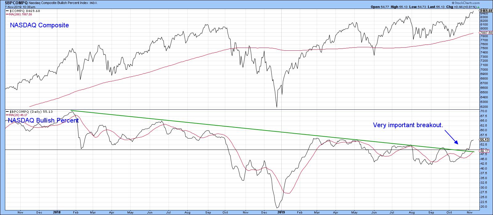
Chart 1
Chart 2 shows that a similar measure for the NYSE has completed a reverse head-and-shoulders. Also, note that the NYSE failed to complete a head-and-shoulders top, an event that is often followed by an above-average move, as those believing that prices were headed lower scramble to get on the right side of the market.
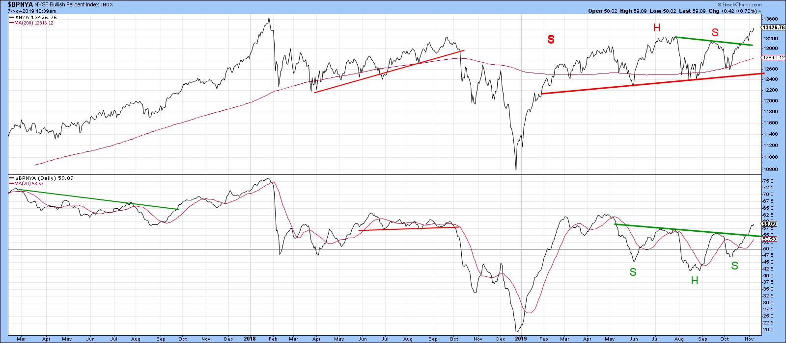
Chart 2
The second chart we were monitoring is the ratio between the SPDR Technology and Consumer Staples (XLK/XLP). It's essentially a proxy for identifying swings in investor sentiment. A rising indicator tells us that traders are becoming more confident, bidding up the more speculative technology stocks against their defensive consumer staple counterparts.
When this relationship is rising, the overall market is usually stronger as well. Using the benefit of hindsight, the green-shaded areas represent the major rallies in the ratio. You can see that such periods were generally pretty positive for the S&P Composite. Note also that it broke out of a huge base some time ago and has yet to achieve the upside objective called for by that pattern. More recently, this relationship has been moving in a narrowing trading range, bounded by the two converging trend lines. It has now broken out. The unrealized upside objective from the giant base suggests that the recent break will be valid.
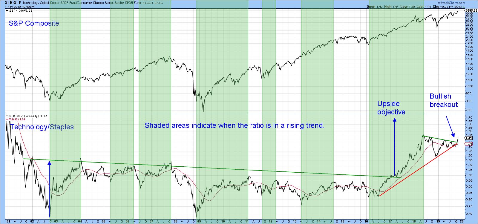
Chart 3
So too does the rising trend of the short-term KST in Chart 4. The fact that the intermediate series has only just gone bullish is also a favorable factor. Previous bullish signals by this indicator have been flagged by the green arrows.
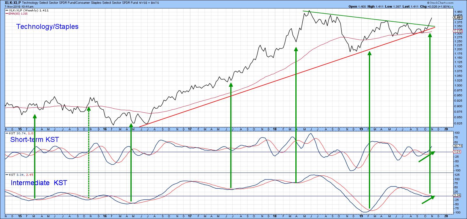
Chart 4
One Chart Still to Break Out
Our third chart is more of a global one, as it compares the Dow Jones World Index to a global ratio between junk and government-issued paper. A rising relationship indicates growing confidence amongst global bond market participants, which usually translates into stronger equity prices. The green arrows point up the fact that lows in the ratio often correspond with equity lows. That means that, if it can experience an upward breakout above the green resistance line, it ought to generate a spurt of confidence sufficient to propel the index significantly higher. In the meantime, notwithstanding the occasional short-term correction along the way, there is enough evidence elsewhere to expect higher prices all round.
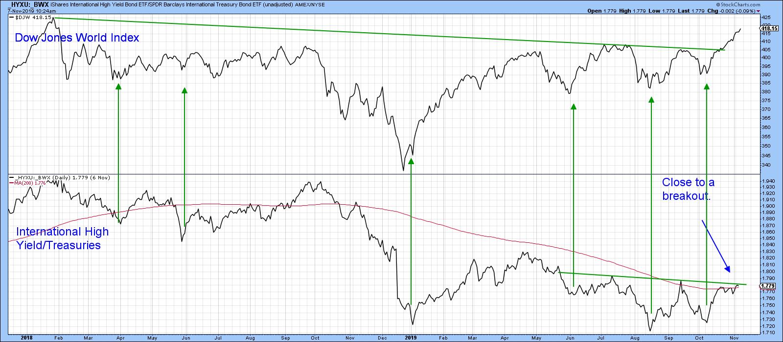
Chart 5
Good luck and good charting,
Martin J. Pring
The views expressed in this article are those of the author and do not necessarily reflect the position or opinion of Pring Turner Capital Groupof Walnut Creek or its affiliates.


