Market Tries to Hammer Out a Bottom As COVID-19 Tries to Hammer Out a Top
- Revisiting the February 29 Hammer
- Hammering a Top for COVID-19
Revisiting the February 29 Hammer
On Friday, 29 February, I pointed out that the Wilshire 5,000 had formed a bullish hammer at a time when a couple of other short-term indicators had reached extreme levels, thereby suggesting a rally. My conclusion was that "These indicators tell us nothing about the long-term trend; they merely show that, based on historical precedent, we should expect to see an end to the recent short-term decline. That could take the form of an immediate rally or, more likely, an extended trading range as prices probe for a more durable bottom."
This week, we got the probing as the market began to test the February 29 low and, son of a candlestick, the Wilshire 5,000, along with several other averages, formed another hammer. It looks like we're seeing the possibility of a classic double bottom, as the previous week's sell-off was accompanied by very heavy volume and this week's test by a little less. In order to complete the pattern, though, we need some confirmation. That would take the form of a rally that surpasses the highs established during the opening week in March. While such action would set up a series of rising short-term peaks and troughs, it would probably not be followed by a blow-out rally but would, more likely, see increased range-bound activity around the breakout point.
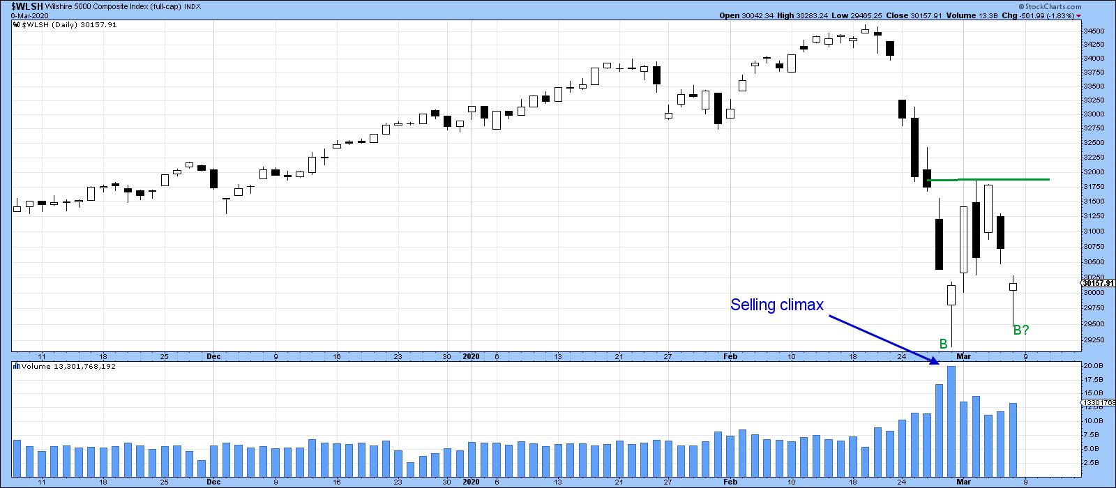
Chart 1
Chart 2 shows a classic selling climax, which also supports the idea of some kind of a bottom.
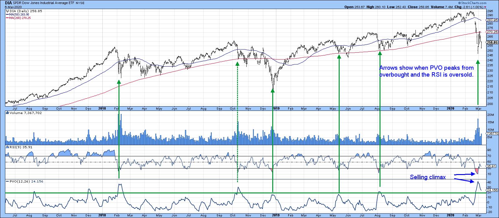
Chart 2
Chart 3 shows my Dow Diffusion Indicator, which monitors the Dow stocks in a positive trend. The green arrows indicate that a rally usually follows when it reverses from an oversold level. The only exceptions, flagged by the dashed arrows, were all bear market rallies. None of them were associated with a selling climax, as is currently the case. This series is still declining, which opens up the possibility of a move in the averages to new lows, but when it does reverse, it is likely to confirm that a rally is underway.
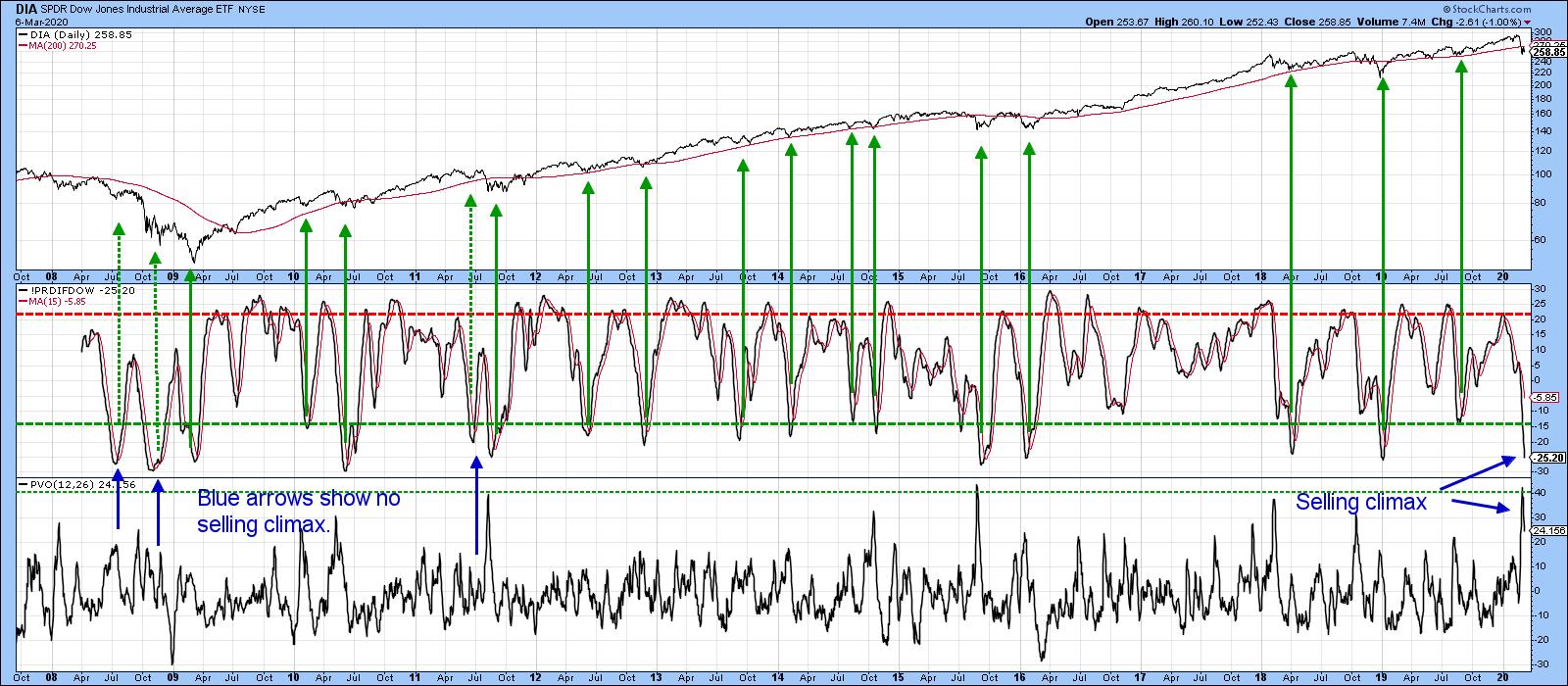
Chart 3
While there is clearly a good chance of an advance, we have to be careful, because the S&P is currently trading below its 12-month MA, a condition that has often signaled a primary bear market. That means that it is of paramount importance for the Index to re-group and move back above the MA by the end of the month. Given the current deeply oversold reading and selling climax, if the market cannot manage that, we could be in trouble.
Hammering a Top for COVID-19
As a keen chart watcher, I have been looking around for some timely visual data on the spread of the coronavirus. After a quick Google search, I came up with https://thewuhanvirus.com/, which updates global data on a daily basis. I have no way of checking their total accuracy, except by the way it is presented and the fact that it appears to confirm official statistics so far as trend is concerned. I started with two ideas that I wanted to investigate: first, that new Chinese infections were declining, and second, that the virus was slowly spreading around the world from east to west.
Chart 4 shows that new cases outside China have been stabilizing in recent days, but without any sign of a peak.
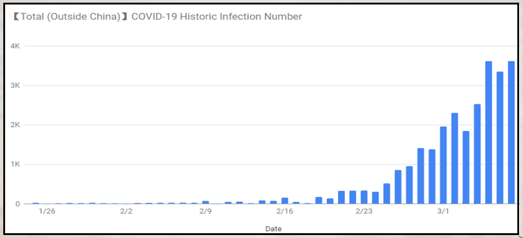
Chart 4
However, when we break it down by relatively highly-infected countries, we can see from Chart 5 that the number of Chinese cases looks like it peaked around mid-February. These are official numbers, which could be suspicious. However, two anecdotal pieces of evidence support this possibility. First, the Chinese market is almost back to its pre-coronavirus highs, and the NASDAQ-like Chinext Index is actually higher. Second, I write a monthly letter on Chinese equities and my colleague in Shanghai volunteered last week that China is getting back to normal.
Continuing along, we can see that there was a short period after February 16 when South Korea experienced a rapid increase in cases. That country also looks as if it may have peaked. Japan, which is not featured, is not yet showing signs of a peak. Moving further west, we see a longer lead in Iran before cases accelerated. They have been declining for the last three days, so that's encouraging. Italy, in the bottom right corner, is showing no sign of a top yet. A similar pattern is reflected in Germany, France and Spain.
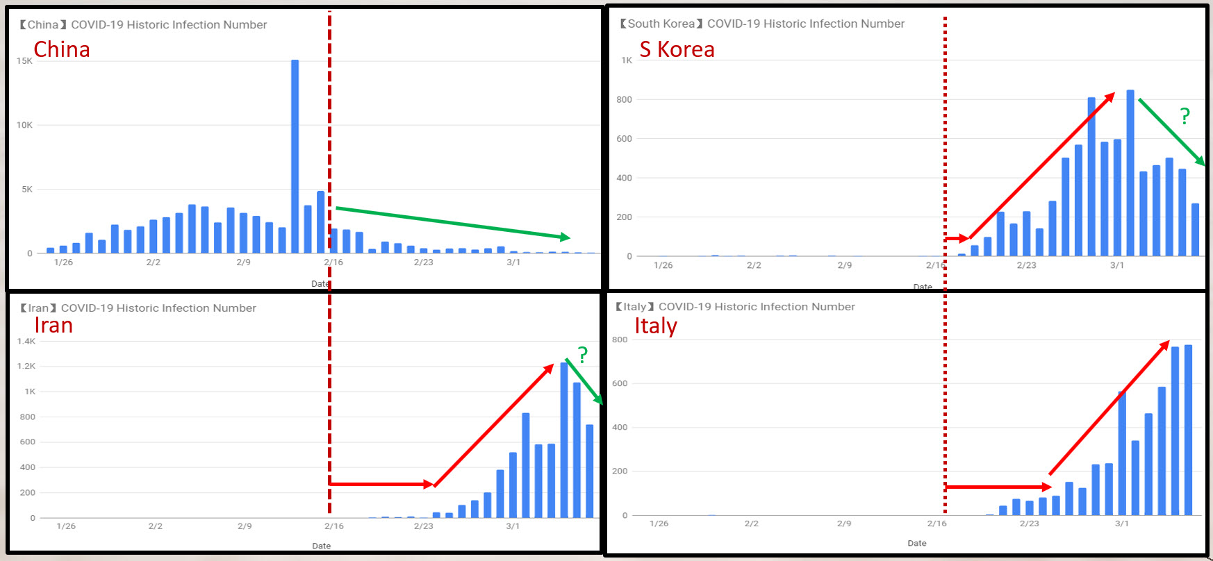
Chart 5
Finally, the US, in Chart 6, is a lagging indicator and has just begun to accelerate. Given the sensitivity of the US equity market to new cases, the possibility of an acceleration could jeopardize the prospects of the rally.
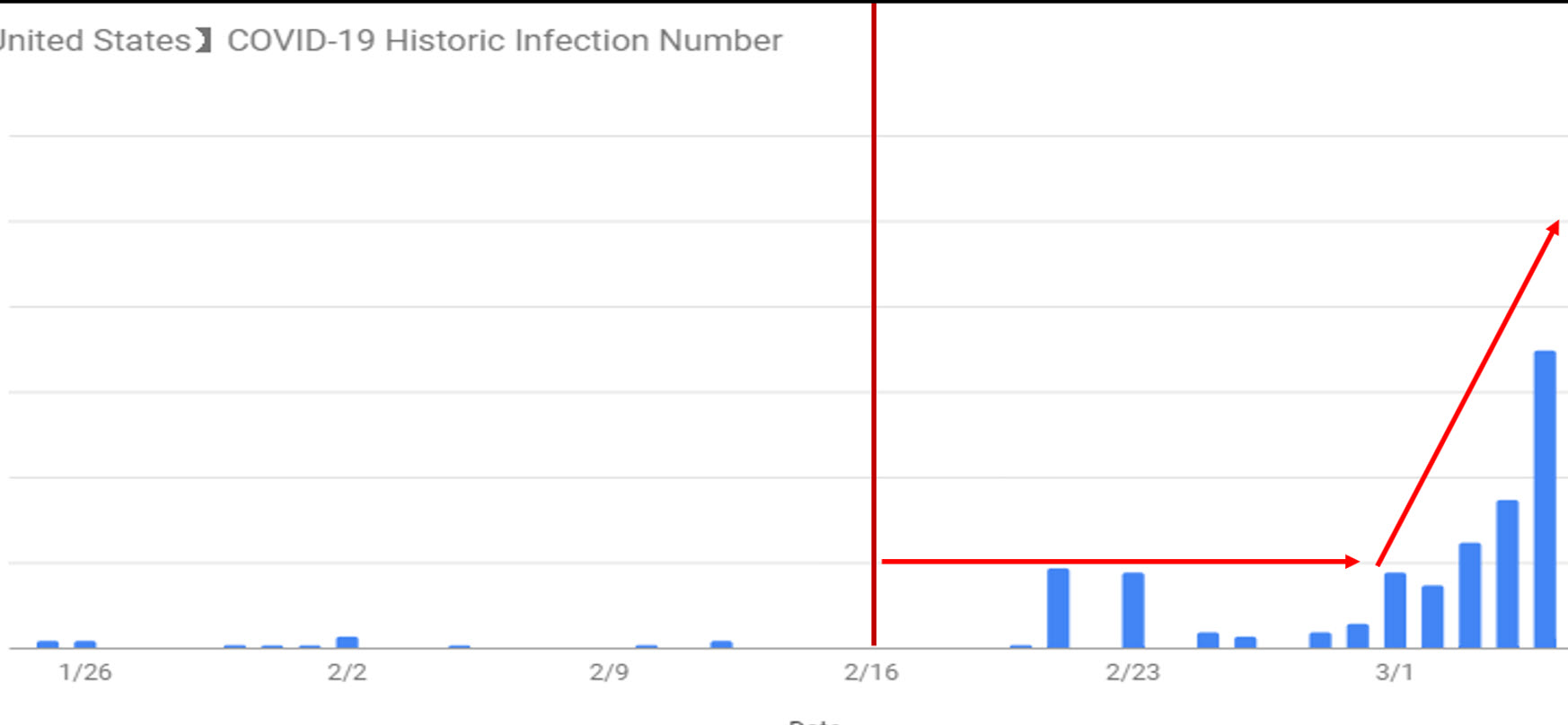
Chart 6
This is obviously a very cursory analysis based on very little data. However, it does suggest that there is a rotational nature to this crisis, starting in the east and working its way west. It also looks as though the US has yet to see its ultimate peak in new daily infections.
Good luck and good charting,
Martin J. Pring


