Gold is Breaking to the Upside - What Does That Mean for the Stock Market?
Chart 1 shows that last week, based on daily data, the gold price quietly broke out from a reverse head-and-shoulders pattern. It's certainly a little overstretched on a short-term basis and may need to pause for a couple of sessions or so, but the longer-term indicators are pointing to significantly higher prices. Certainly, the RSI has been behaving as if it's a bull market. That's because its recent overbought conditions have not been followed by much of a decline. Moreover, the price has responded very quickly on the upside to both oversold readings and even, in the case of last October, to a moderately oversold condition. Both are bull market characteristics.
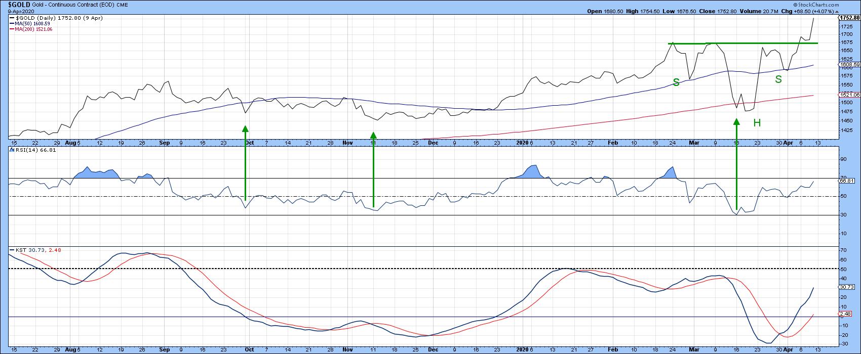
Chart 1
Chart 2 also supports the idea of higher prices, since the three KSTs measuring different trends are each in a rising mode. None have yet reached an overstretched condition.
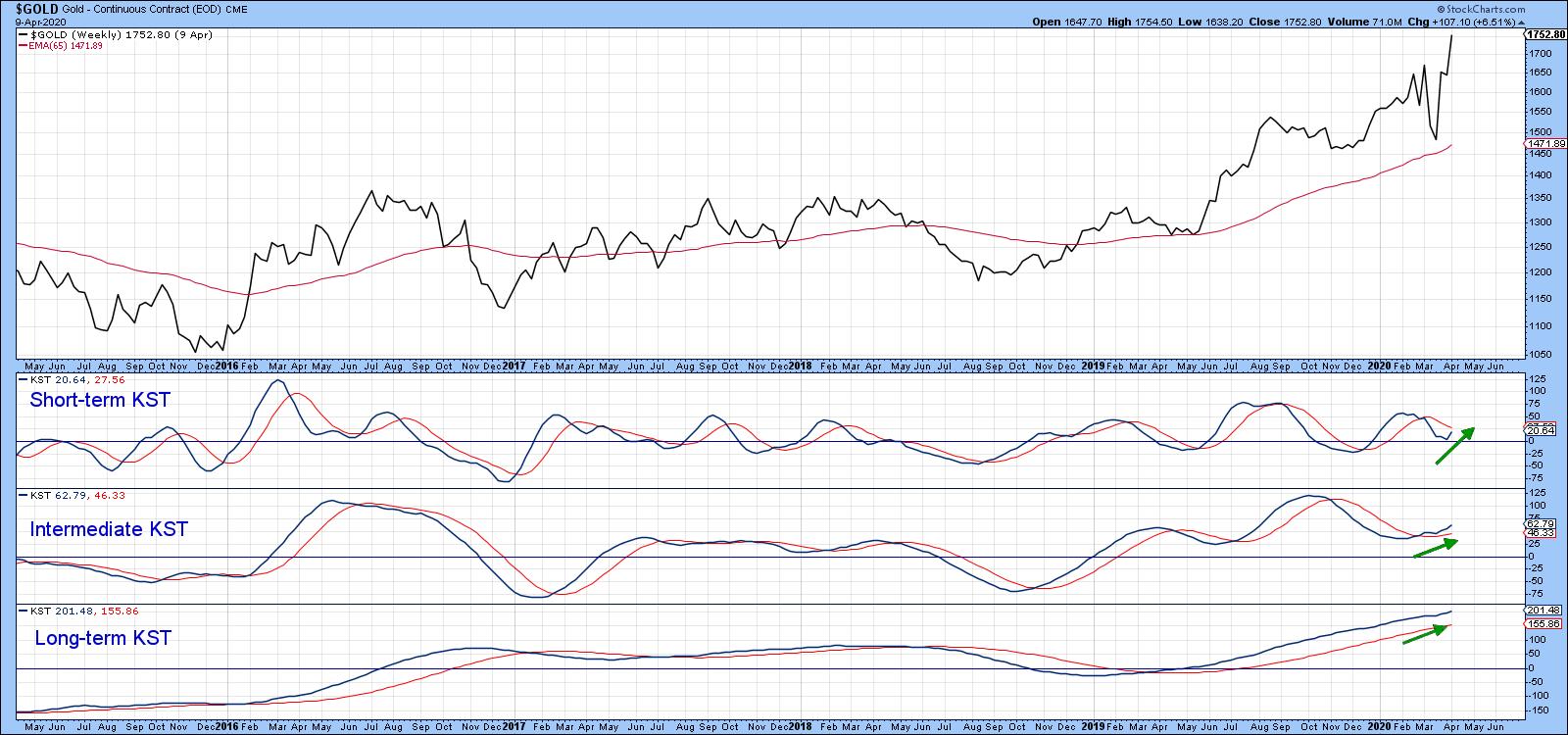
Chart 2
Gold Shares Lagging, But....
Traditionally, there has always been a strong relationship between gold and gold shares. Consequently, it's always nice to see the shares either lead or, later, confirm upside breakouts in the price of the yellow metal.
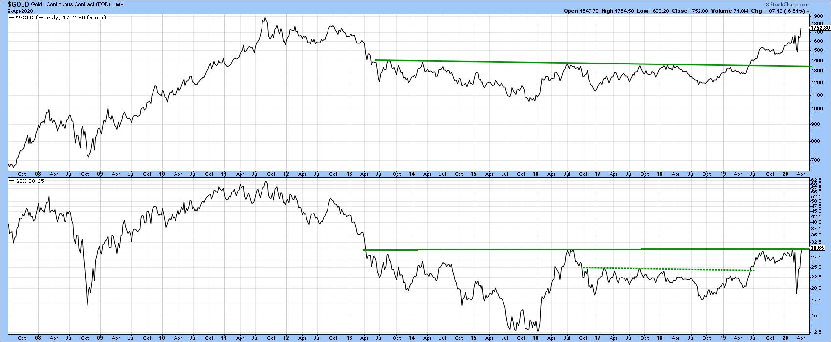
Chart 3
Chart 3 shows that the early initial 2019 breakout by the metal was more or less simultaneously confirmed by the shares in the form of the Van Eck Vectors Gold Mining ETF (GDX), moving above their 2016-19 dashed resistance trendline. However, the GDX has so far not been held back by the solid 2013-20 line at around $31. There are two reasons for suspecting that it will likely soon confirm what's already occurred in the gold pits.
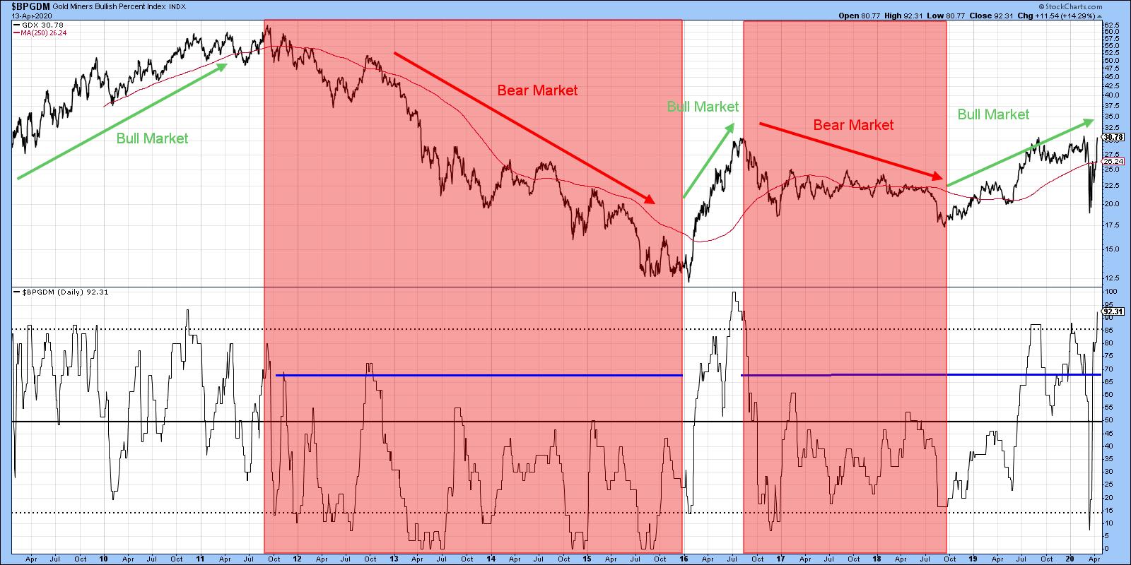
Chart 4
First, Chart 4 compares the GDX with the gold mining shares bullish percent ($BPGDM). The pink-shaded areas flag bear markets, while the unshaded ones flag bull markets. Note that, during the bull phases, the indicator was able to record readings at or above the dashed horizontal overbought line at 85%, thereby indicating strong and broad underlying momentum. During the pink-shaded bear market environments, it has basically been confined below the blue horizontal lines. The latest rally has managed to push the bullish percent back to that overbought 85% level again. It's always possible that the current advance could turn out to be the final one in this bull market, as was the case in June of 2016, but the sharp move from the 15 oversold level to close to 85% last week suggests otherwise.
Chart 5 agrees. It compares the gold price to the ratio between the Gold Bugs ($HUI) and Arca Gold and Silver Share Index ($XAU). The significance of this relationship is that the $HUI consists of companies that do not hedge their gold production, whereas the $XAU consists of companies that largely do. When the ratio is rising, it indicates that the non-hedgers are outperforming the hedgers. A rising trend, therefore, tells us that investors are expecting the gold price to rally, since they are more aggressively bidding up those companies that will benefit relatively more from higher prices. The arrows show that the ratio has a strong tendency to lead the gold price. Consequently, its breakout above a major resistance trendline and 12-month MA is a positive sign. Note that the green-shaded areas represent periods when the KST for the ratio is above its 9-month MA. Generally speaking, this has represented a positive environment for the gold price. It's clearly well into the "green" zone, which is a definite positive, and again suggests that the GDX will break above that overhead resistance at $31.
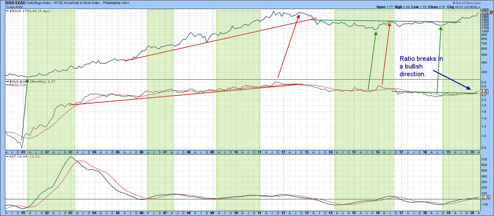
Chart 5
Gold vs. Equities
Chart 6 compares the performance of the S&P Composite with that of the ratio between stocks and gold. A rising ratio indicates that stocks are out performing gold and vice versa. The arrows show that when both series eventually violate their respective trendlines a reversal in trend for both the ratio and stocks takes place. Last year, the dashed bull market 2011-2019 up trendline was violated. This has now been joined by a drop below the solid red head-and-shoulders neckline and a break below the extended green breakout trendline. This latter penetration, as long as it remains in force, is very serious, as it confirms that the 2017 upside break was false. Remember, false breakouts are often followed by an above-average move in the opposite direction from the break. That does not tell us that stocks will go down, nor gold up; it merely signals that gold is likely to out perform equities for an extended period.
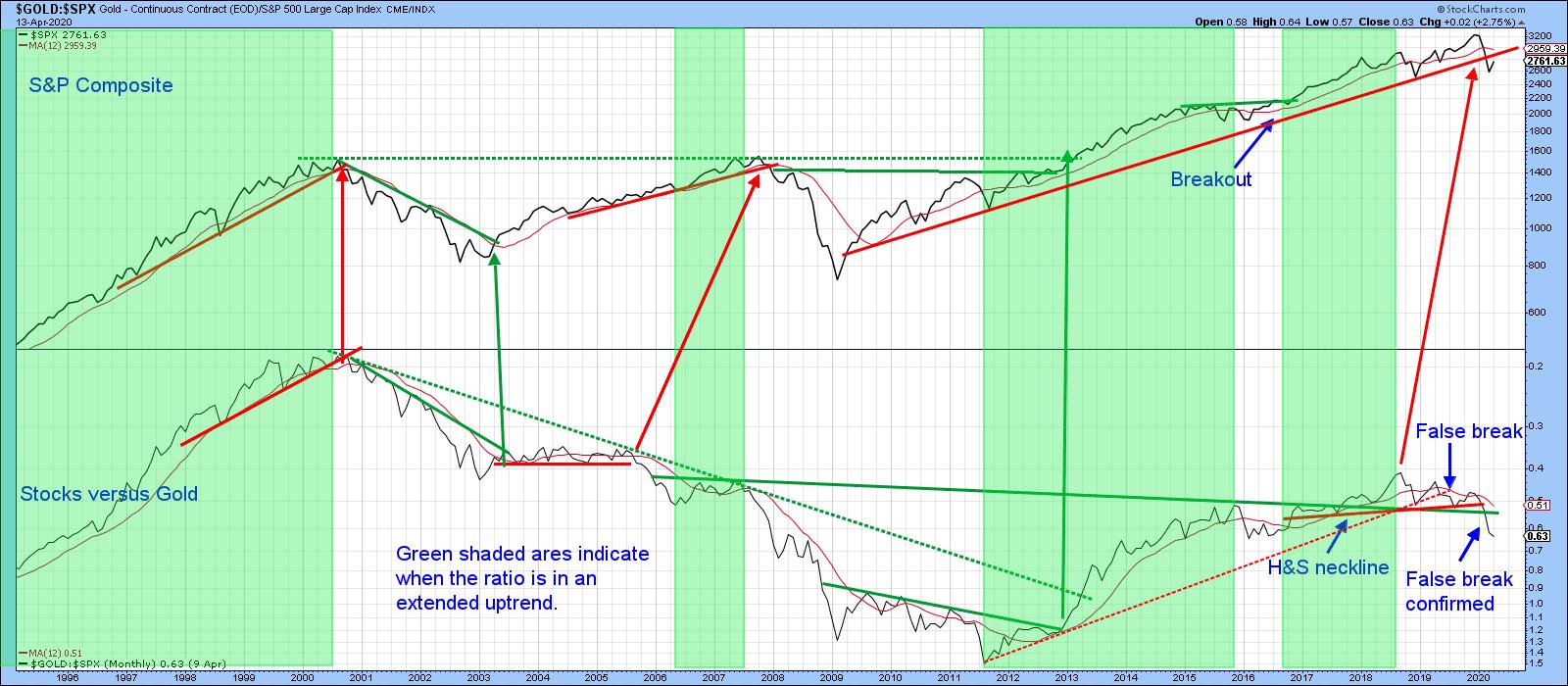
Chart 6
Using the benefit of hindsight, the green-shaded areas flag periods when the ratio was in an extended up trend. There have been a few periods, such as the 1998 shakeout, when the market has suffered a setback. Generally speaking, though, buoyant ratio has translated into a period of rising equities. On the other hand, the white (unshaded) areas have pointed up that if stocks are going to be vulnerable, periods of superior gold performance are when vulnerability is likely to show. The fact that the ratio is currently in a declining mode is certainly not the kiss of death, as the 2009-2011 and 2018-2019 periods testify. However, it does suggest a more cautious stance than normal until the ratio can show some signs of life.
Finally, Chart 7 shows the ratio between gold and the Dow Jones Internet Commerce Index ($DJECOM). Internet commerce has been one of the strongest areas of the market since the financial crisis. However, gold has now managed to violate its 6-year dashed down trendline and the solid line marking the top of a base. All of this suggests that the relationship between these two items has reversed in favor of gold.
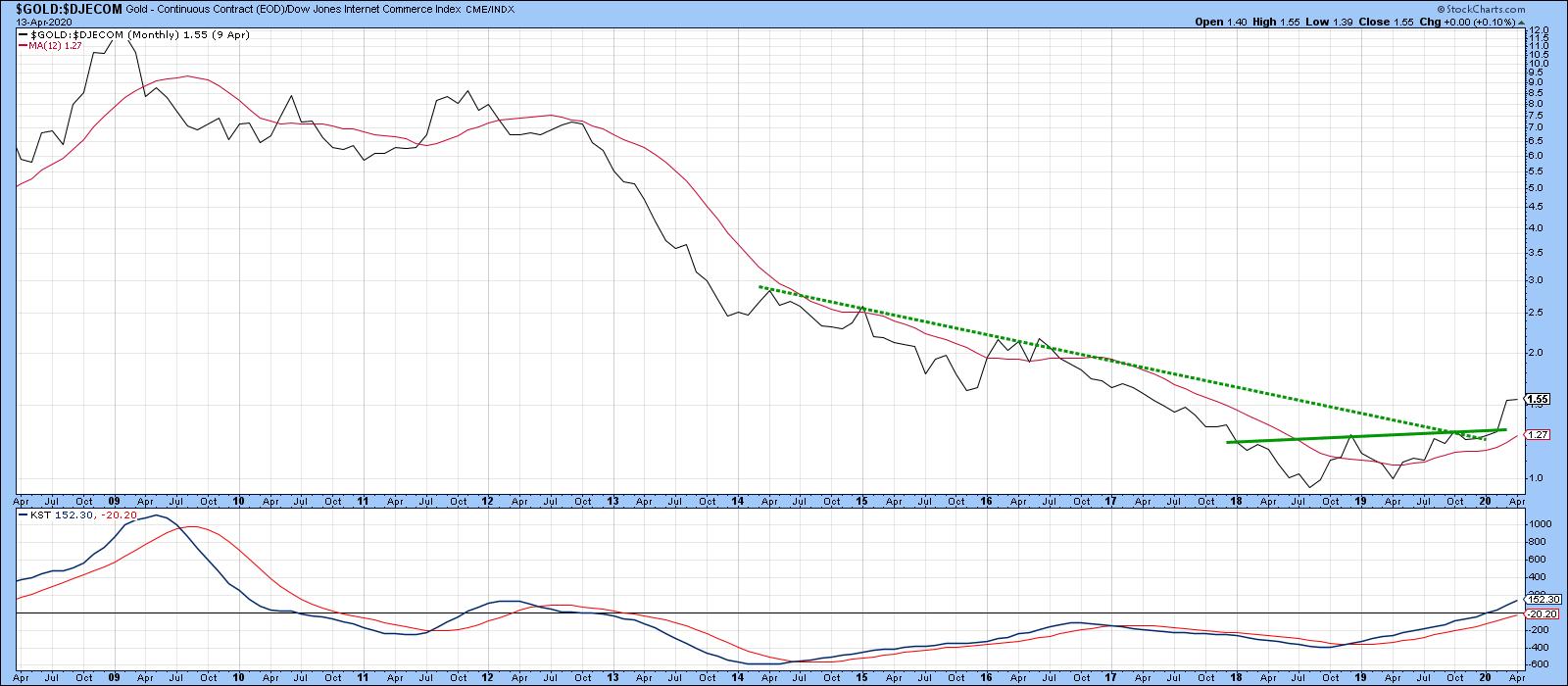
Chart 7
Good luck and good charting,
Martin J. Pring
The views expressed in this article are those of the author and do not necessarily reflect the position or opinion of Pring Turner Capital Groupof Walnut Creek or its affiliates.


