September 3, 1929 was the Peak; September 3, 2020 sees the NASDAQ Lose Almost 5%
I don't think there is a connection between 1929 and 2020, but the headline seemed too good to pass up. Late last week, I mentioned that September is the weakest month of the year for stocks while October is prone to crashes. "Welcome to the bearish season," I said. This week, we can remove another prop in the form of the bullish seasonal end-of-the month effect. That one is in force between the last two trading days of the month and the first three of the new month.
Bearing all that in mind, I drew your attention to several charts worth watching from the point of view of identifying the start of a correction. Not to get carried away on the downside, I stressed the fact that many primary trend indicators were bullish and likely to remain that way. Thursday's decline was sharper than I expected, but it has been enough to tip those short-term charts firmly into a bearish mode. Generally speaking, counter-cyclical corrections in a bull market tend to be sharp and random affairs. They catch the complacent by surprise and are very believable at the time. Indeed, I would say that the sharper the correction, the stronger its characteristic as a counter-cyclical one.
Chart 1 shows that the NYSE Common Stock A/D Line, after being in gear with the S&P for the course of the post March rally, started to diverge negatively a few weeks ago. That divergence has now been confirmed with a trendline violation by both series.
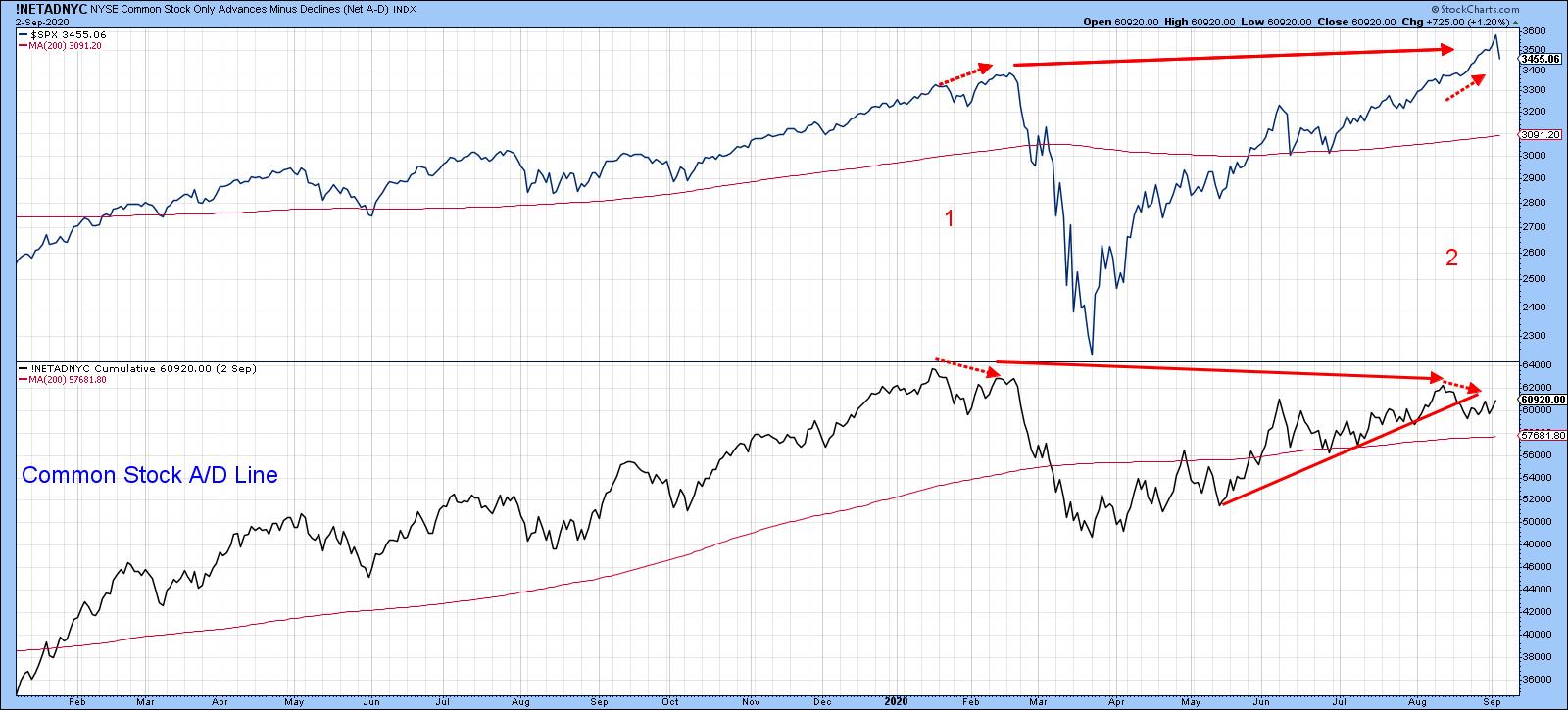
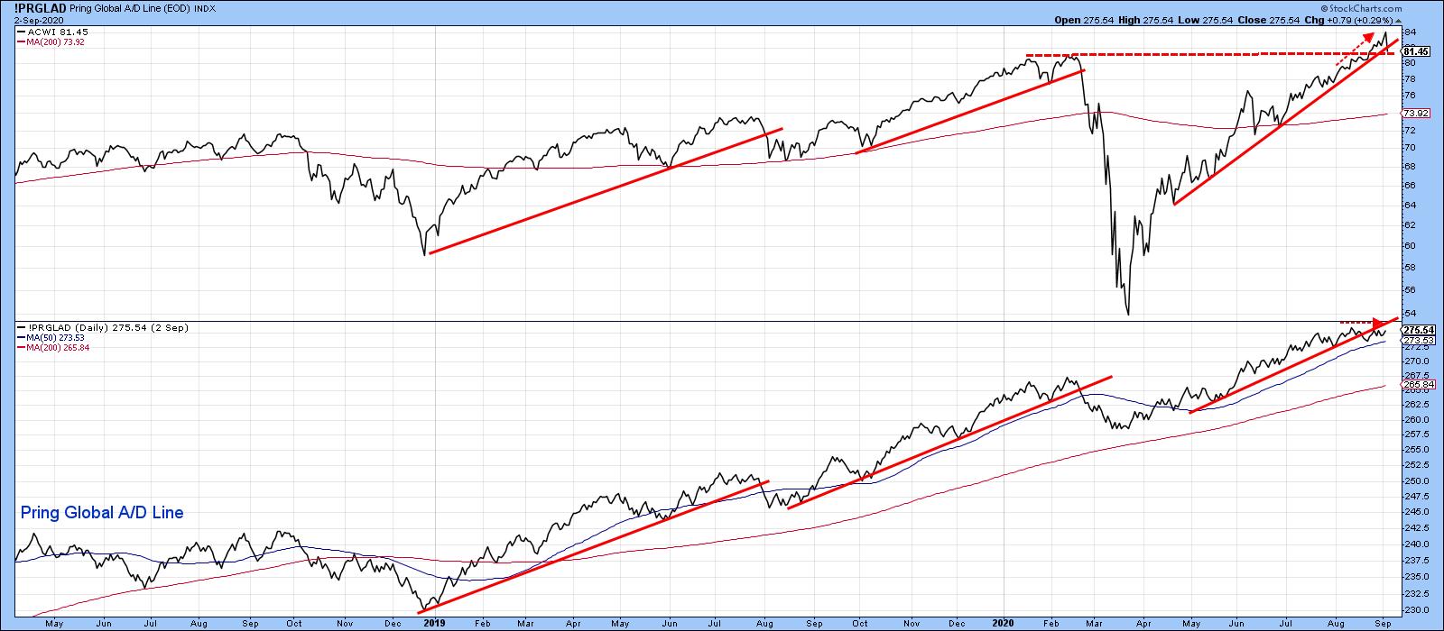
Chart 2 compares the MSCI World Stock ETF with my Global A/D Line. The A/D Line, by the way, is calculated from the daily plurality of a universe of individual country ETFs. Like its NYSE counterpart, this breadth indicator failed to confirm this week's high. The discrepancy has been flagged by the two small dashed arrows. The line has also violated its uptrend, demonstrating that the rally in global breadth is taking a temporary time out. The Index itself has not quite broken down in terms of dropping below its February peak. However, Thursday's sell-off did push it marginally below its April/August secondary up trendline, which indicates a loss of upside momentum.
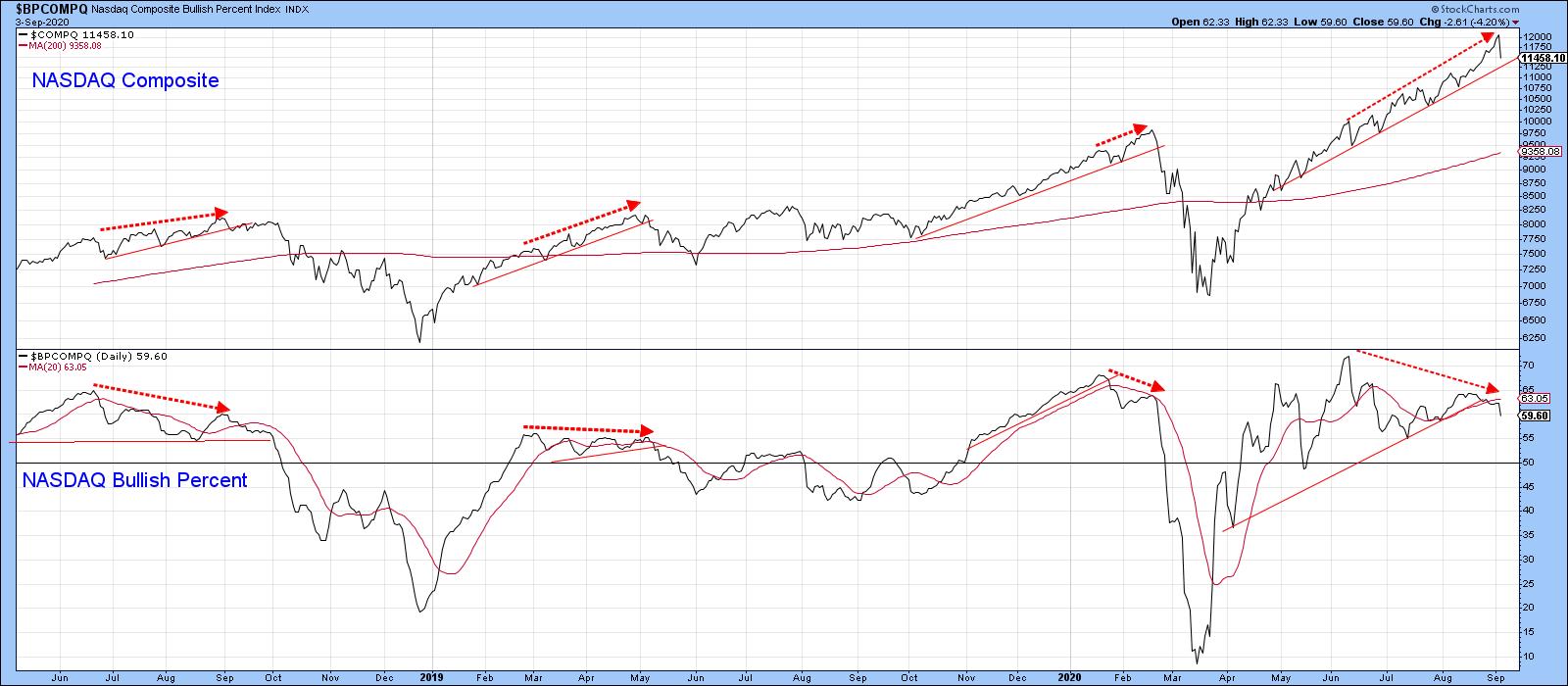
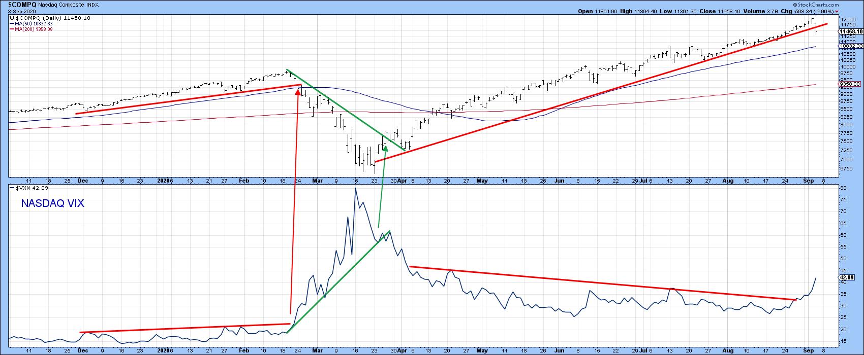
The NASDAQ bullish percent indicator also lends itself to trendline construction. The violation of those lines has often indicated potential weakness, as Chart 3 demonstrates. Furthermore, the dashed arrows point up previous negative divergences. Each one preceded a market sell-off. You can see that it has been diverging negatively with the Index since the spring, but this week violated an important secondary up trendline. It has not yet been confirmed by a trendline break for this close-only plot. However, the negative position of other indicators, combined with the fact that open-high-low-close data NASDAQ (Chart 5) already did so, suggests that the close-only series in Chart 3 will.
Whenever it's possible to construct a down trendline for the VIX and observe its violation, it's usually a time to expect some vulnerability. That's exactly what we see from Chart 4. Last week, when I first presented it, a violation had already transpired, but confirmation from the S&P Composite with a similar break of its own was still needed. Thursday's drop has now resulted in that confirmation. I am not looking for anything close to a February/March type decline, which followed a similar joint break earlier this year, but some near-term weakness by all means.
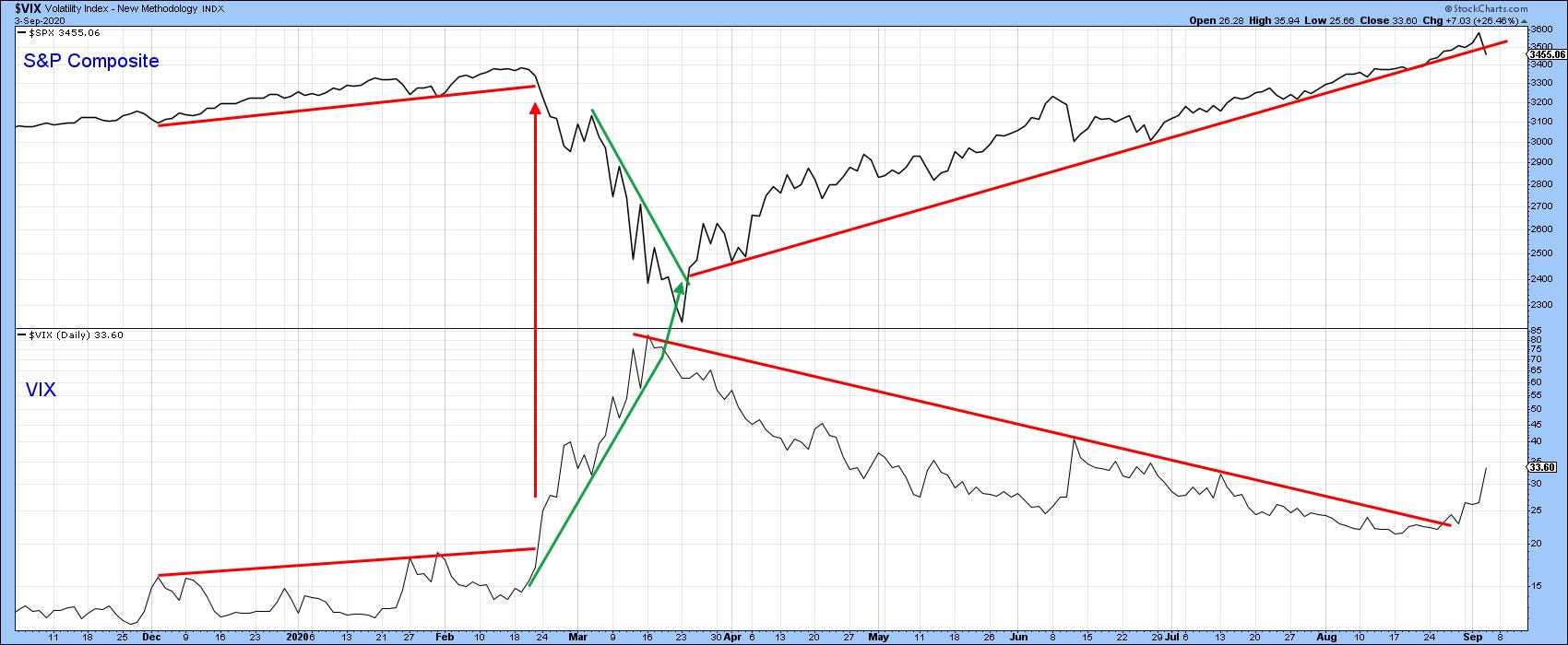
Chart 5 repeats the same comparison, but this time for the NASDAQ and NASDAQ VIX. Two decisive breaks have now developed, which is not encouraging. That contrasts with the sharply rising VIX. The speed with which it is advancing is reflecting an indicator rapidly approaching exhaustion. It's unlikely to reach the historic 80 level set in mid-March, but something in the 45-60 area would probably be sufficient to correspond with a bottom in the Index itself.
The odds of a correction have increased, but since it is likely to be a correction in a bull market, it should be viewed as an opportunity to buy rather than an excuse to sell.
Good luck and good charting,
Martin J. Pring
The views expressed in this article are those of the author and do not necessarily reflect the position or opinion of Pring Turner Capital Groupof Walnut Creek or its affiliates.


