Bullish Commodities Run Into Resistance
The global business cycle is nothing more than a chronological sequence of economic and financial market turning points. One of these involves a bottoming of commodity prices, as a new bull market gets underway. That reversal occurred several months ago and has recently been confirmed by numerous long-term indicators. That said, key indexes and some individual commodities are running into overhead resistance. That reality, in combination with a short-term overbought situation, hints at a near-term correction. In bull markets, overbought conditions are typically followed by brief, deceptive and all too often non-existent corrections. That's why any corrective activity should be viewed as a buying opportunity rather than an excuse to liquidate.
Chart 1, featuring the CRB Composite, sets the scene, as the Index peaked in 2008 and has been zig zagging down ever since in three distinct down legs. That secular or very long-term trend is now in its twelfth year. It's too soon to conclude that the bottom established earlier this year was the secular low. What we can say, is that the bullish action of the long-term KST, combined with the Index's ability to climb above its 24-month MA, and breakouts by several key commodities argue in favor of a primary bull market. Additional evidence in this direction comes from recent performance in commodity sensitive equity sectors and long-term buy signals for the commodity sensitive Canadian and Australian dollars.
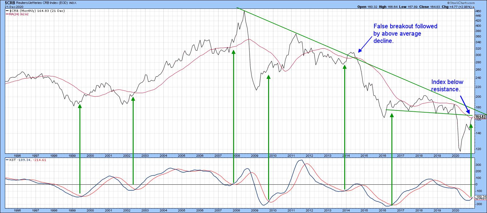
That said, Chart 1 also shows that the Index is running into resistance in the area of the two converging trendlines. Bear in mind that this is a monthly chart and it's not the end of the month yet. Before we leave the chart, note the false upside breakout that took place in 2014. As so often happens with whipsaws, this one was followed by an above average move on the downside. No doubt that this kind of action emanated from previously bullish traders rushing to get back to the right side of the market.
Chart 2 also points up the fact that the Index is trading below resistance. We can see this from the fact that the secular down trendline and the 41-month MA are in the same vicinity. The green and red arrows point up that this time span has turned back numerous rallies and reactions in the last decade and therefore represents an important dynamic level of support and resistance in its own right. One reason it probably works so effectively is that recessions and economic growth slowdowns have averaged 41-42-months between troughs, thereby confirming the 41-month cycle discovered by Joseph Kitchen in 1924.
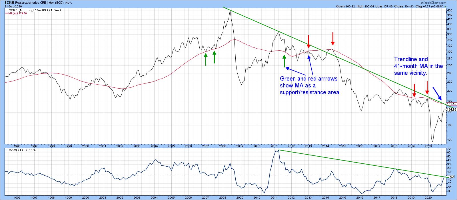
Finally, Chart 2 also shows that the 24-month ROC is at resistance in the form of its 2011-2020 down trendline and equilibrium level.
Individual Commodity Sectors
Charts 3,4 and 5 show that three key commodity sectors are all in primary bull markets but are at or just below resistance. Chart 3, for instance features copper, a key representative of the industrial metals sector. It recently broke out from a giant reverse head and shoulders, just as the long-term KST turned bullish. The latest plot shows it bumping up against the solid green resistance trendline.
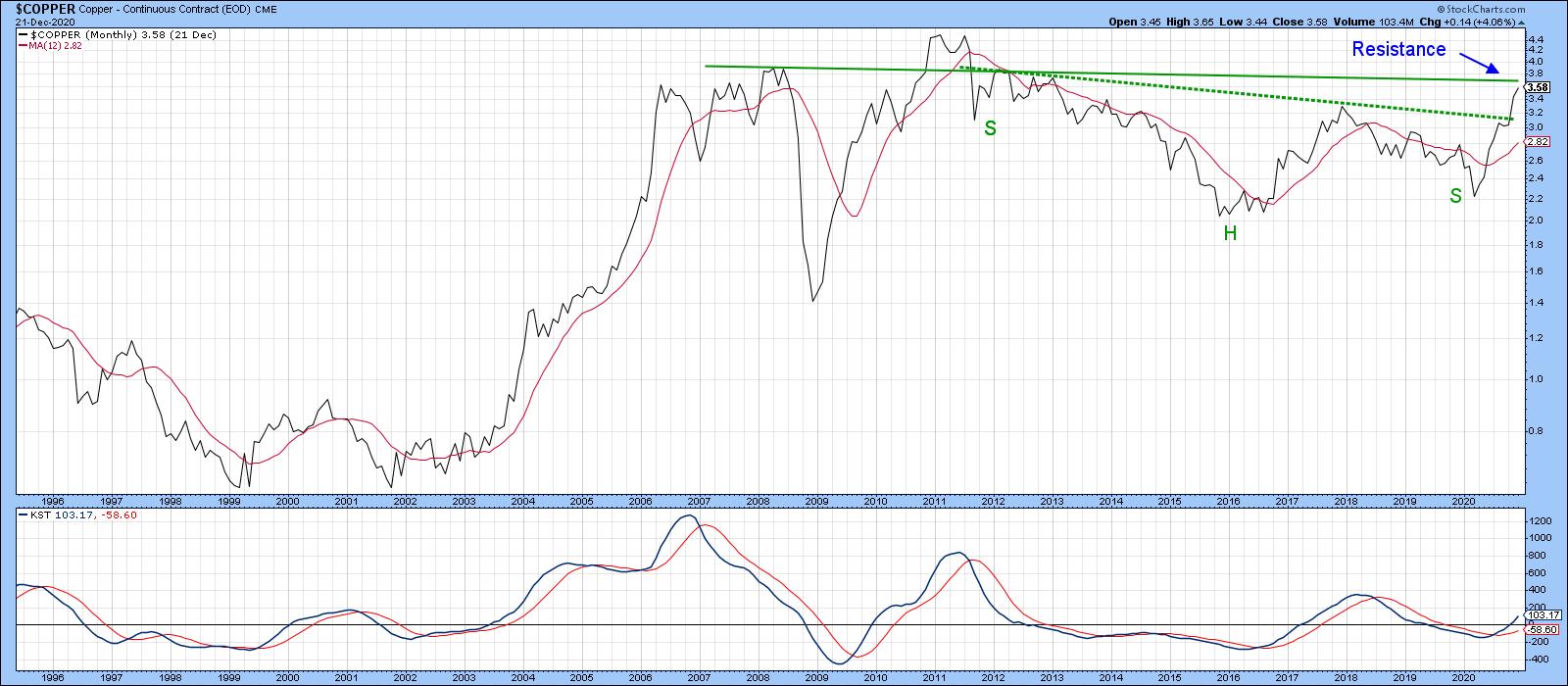
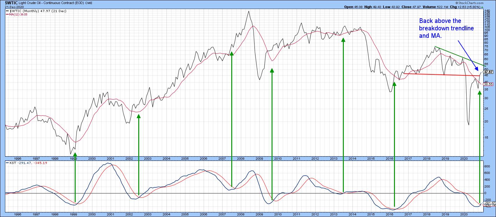
Chart 4 tracks the continuous light crude contract, where we can see the price back above its 12-month MA and the red breakdown trendline. The KST is positive, but the price will soon be running into the green resistance down trendline.
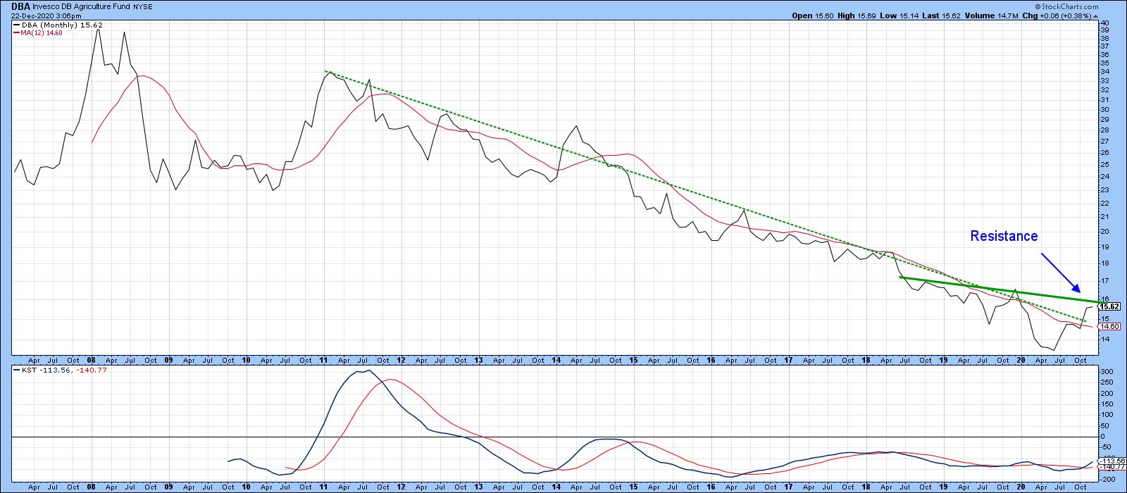
Finally, the DB Agriculture ETF is starting to emerge from a multi-year persistent down trend. It has already experienced a breakout above the dashed 2011-2020 down trendline and its 12-month MA. However, it too is running into resistance in the form of that solid green 2018-2020 down trendline. The KST is also bullish but we have to discount that somewhat in view of its multiple failed signals during the secular bear market.
All these commodity charts are reflecting a primary bull market but are showing signs of overhead resistance. History tells us that it is usually better to focus on the main trend rather than trying to anticipate counter-cyclical moves that may or may not take place. However, if that overhead resistance proves to be overpowering, any weakness is likely to represent a great buying opportunity.
Tech versus Energy: Is the Bubble Bursting?
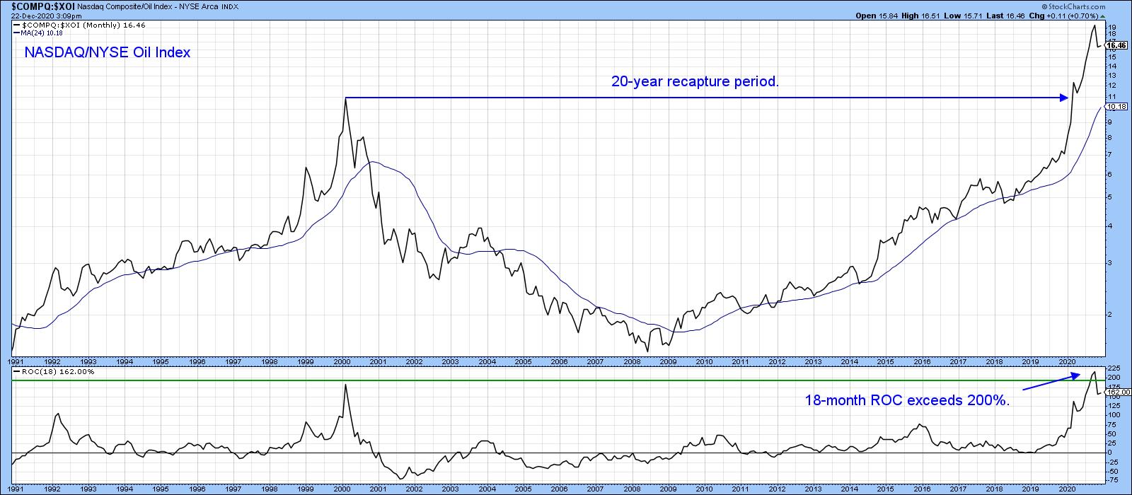
Sometimes trends overshoot in a fairly dramatic fashion. In comparing the NASDAQ Composite with the NYSE Oil and Gas Index, Chart 6 reflects such a distortion, as the NASDAQ has outperformed by a factor in excess of 12-times over the last decade. Some years ago, I researched markets that had doubled in an 18-month period, working on the idea that a reversal from above a +200% reading in an 18-month ROC represented the bursting of a bubble. Those bubbles could be large, as in the case of the 542% gain for silver in 1980 and the 31-years required to get back to the that peak. Alternatively, it was relatively small, like the 2017% 1953 peak in the NIKKEI. That one just required, a 3-year to recapture period. I was able to identify 30-such instances, the average recapture period being 15-years. Note the 20-year hiatus in Chart 6 following the 2000 peak in the ratio. It looks to me as if the 18-month ROC for the NASDAQ/Oil ratio recently peaked again. If so, it would strongly suggest that the much despised energy sector has begun a long period of superior performance against much-lauded tech dominated NASDAQ. That's something to bear in mind going forward.
Good luck and good charting
Martin J. Pring
The views expressed in this article are those of the author and do not necessarily reflect the position or opinion of Pring Turner Capital Groupof Walnut Creek or its affiliates.


