Five Charts that are Pointing to Higher Stocks and Bond Yields
Two Stock Market Relationships That Have Just Turned Positive
A few weeks ago, I wrote about some intermarket relationships pointing in the direction of higher stock prices. Picking through my StockCharts chart lists earlier in the week, I noticed a couple more that have only just moved into the bullish camp.
Chart 1, for instance, compares the Fidelity Capital and Income Fund (FAGIX) to the Vanguard Long-term Treasury mutual fund (VUSTX). A rising ratio indicates that investors are prepared to overlook the safety of treasuries for the higher-risk (and higher-yielding) Capital and Income Fund. In other words, a rising relationship tells us that market participants are gaining confidence, which generally translates to higher stock prices. Using the benefit of hindsight, the green-shaded areas highlight periods when the ratio has been in a protracted rising trend. Such conditions have been positive for equities the vast majority of the time. Indeed, we can go so far as to say that all of the bear trends, in the 30 years covered by the chart, developed when this relationship was in a declining trend.
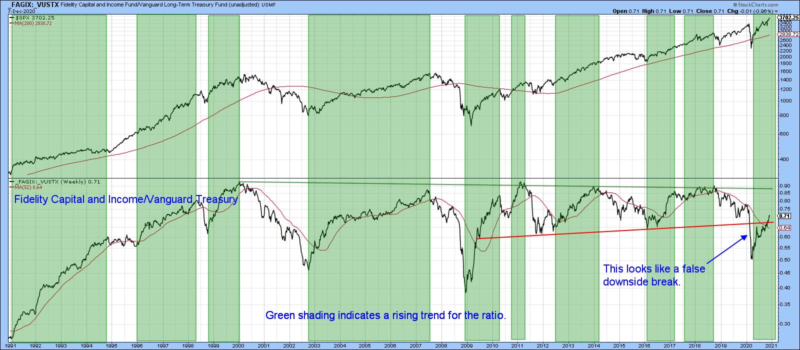
Of course, it's easy to look back and identify previous peaks and troughs and quantify bullish and bearish periods. But where do we stand today? To begin with, this relationship broke below the red 2009-2020 support trendline earlier in the year and is now back above it. That suggests the break was false. Such whipsaws are typically followed by above-average moves in the opposite direction to the break, suggesting higher prices. The rationale for such action is that weak holders are flushed out by the negative break, while stronger, more savvy investors take their place. In turn, the sharp rally is fueled by traders who are forced to cover short positions, no matter what the cost, once prices move against them.
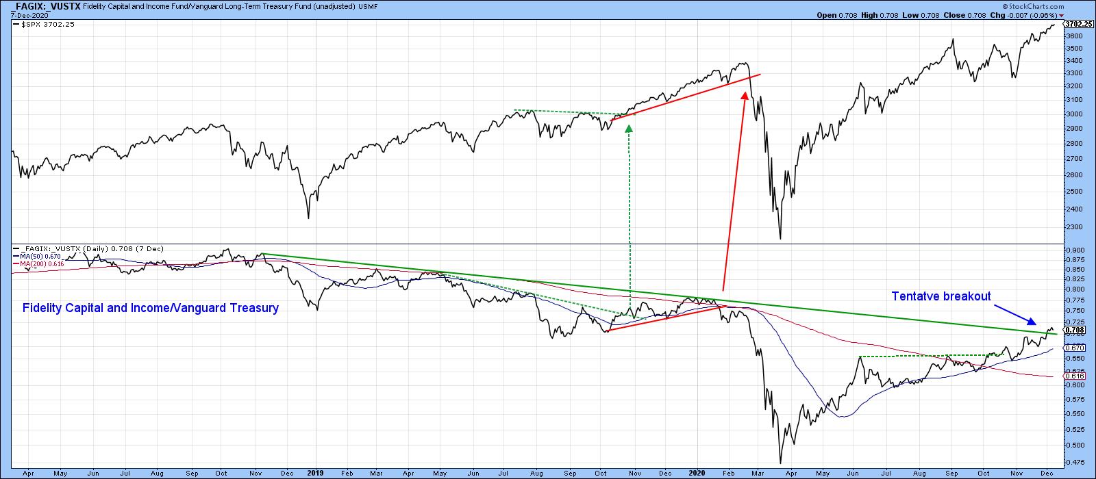
The ratio has tentatively broken above its 2018-2020 down trendline in Chart 2, so a big test of this probable outcome is now underway. It's already above its 50- and 200-day MAs, and the long-term KST (not shown) has gone bullish, so the odds favor a more decisive break and (subsequently) higher prices.
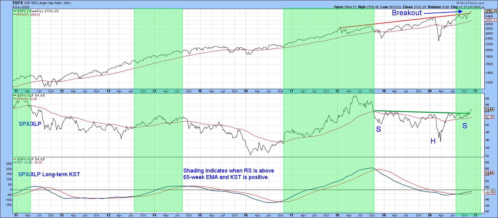
Another relationship that is firming up is the ratio between the S&P and the SPDR Consumer Staples. An article substituting foods for staples, in a slightly different approach but with a 40-year history, can be found here. A rising ratio in Chart 3 indicates that investors are gaining in confidence. That's because of their preference for therelativelymore speculative and tech-laden market average over the defensive and predictable consumer staple companies. A declining relationship is not necessarily bearish for the market, but a rising one is generally bullish.
In that respect, the shaded areas flag periods when the KST for the ratio is above its 26-week EMA, and the RS line itself confirms by trading north of its 65-week week EMA. Those conditions are currently being met, so this technique is bullish for the market. The long-term KST has only just turned up. Moreover, December has seen the RS line break out from a reverse head-and-shoulders pattern. That strongly suggests that this relationship is likely to move much higher in the coming months, thereby providing a bullish undertone for stocks in general. Note also that the S&P has cleared its extended red resistance trendline. That's a sign that the trend may be in the process of re-accelerating on the upside. The trendline also provides a benchmark for potential downside action, as an imminent breach would result in a false breakout. For reasons cited above, that would not be a good outcome.
Two Indicators Forecasting Higher Bond Yields
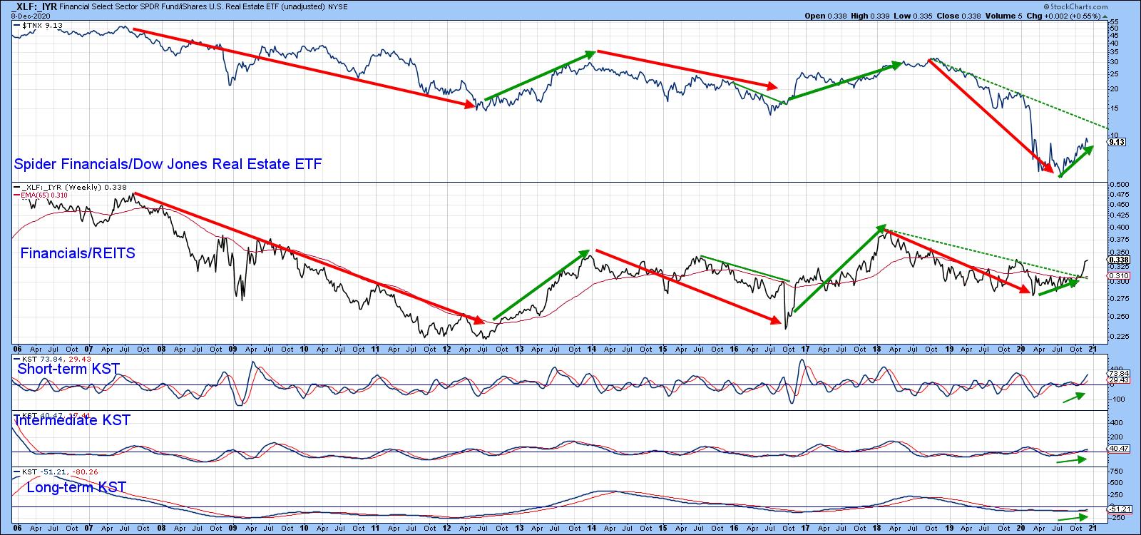
Chart 4 compares the 10-year yield to a ratio between the SPDR Financials and the Dow Jones US Real Estate ETF ($TNX/IYR). An advancing ratio means that the more speculative financial stocks are outperforming the defensive and higher-yielding REITS and vice versa. The green and red arrows indicate that swings in this relationship are very similar to those in the 10-year yield. That's significant because the ratio has just broken its dashed 2018-2020 down trendline. Equally as important, all three KSTs are in a bullish mode, which suggests at least a test of the down trendline for the yield itself is in the cards.
Another useful bond market relationship compares the price of inflation-protected bonds (TIP) to nominal bonds (TLT). A rising line indicates that the inflation-protected vehicle is outperforming its nominal counterpart. In other words, it reflects the fact that investors are looking for protection against inflation and are prepared to sacrifice some of the extra current yield provided by regular bonds. As a corollary, those inflationary expectations result in higher bond yields. That explains why swings in both series, whilst not identical, are usually sympathetic with each other.
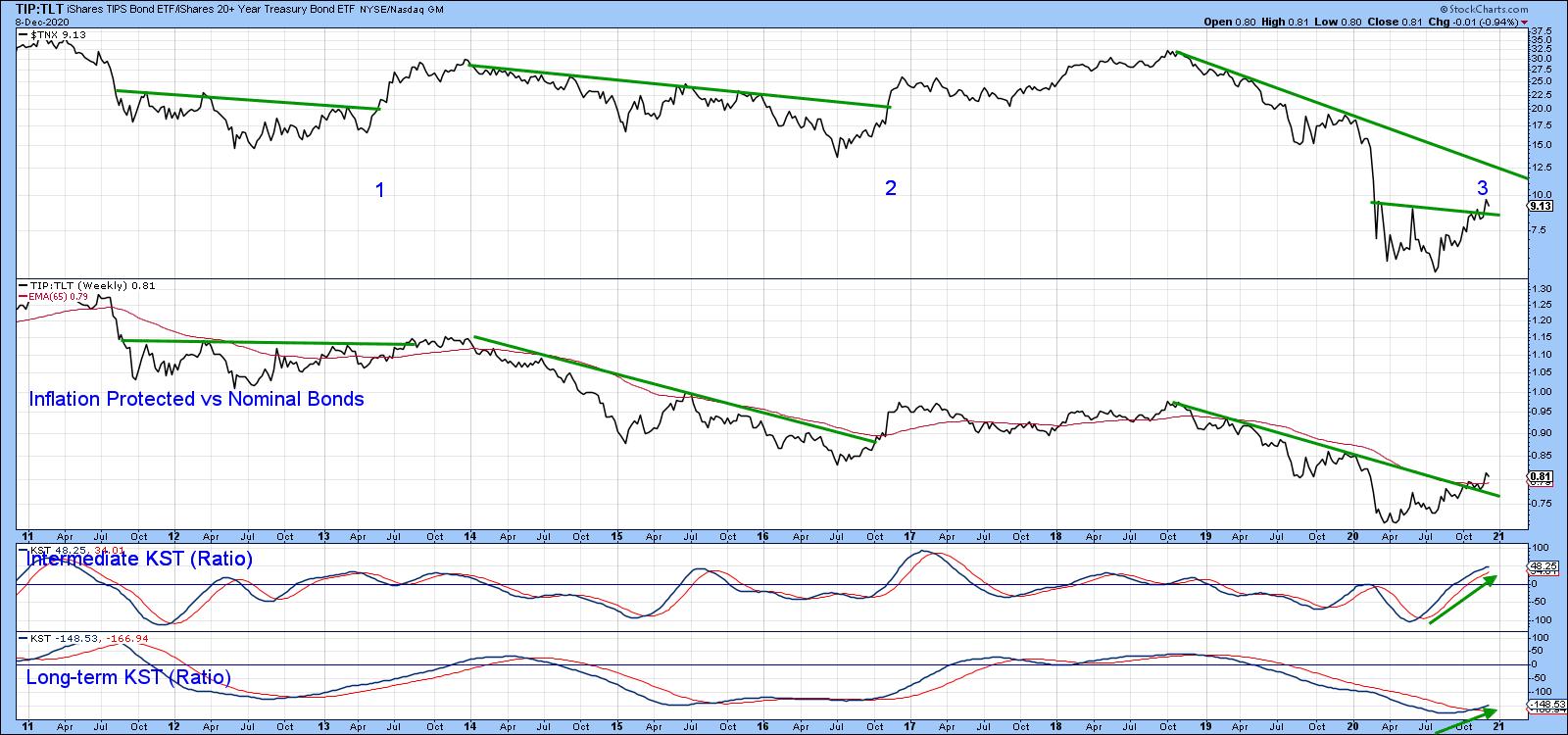
In the last couple of weeks, the ratio has crossed its 65-week EMA and 2018-2020 down trendline. Both KSTs are in a bullish mode, which again suggests that the move is genuine. The yield, for its part, has also broken out from a small base. In the last 10 years, that combination has presented itself twice, in 2013 and 2016. Neither situation was followed by what we could call a huge yield rally, which may again prove to be the case. Nevertheless, the joint breakout and support from the KSTs certainly suggests that some form of yield rally is in the cards.
Good luck and good charting,
Martin J. Pring
The views expressed in this article are those of the author and do not necessarily reflect the position or opinion of Pring Turner Capital Groupof Walnut Creek or its affiliates.


