Green Light Still Flashing for Higher Bond Yields, Stock & Commodity Prices
Back in early November, I wrote an article entitled,Confidence is Breaking Out all Over, Which is Bullish for Stocks/Commodities and Bond Yields, where I examined several intermarket relationships that monitor confidence. Since then, all three markets have rallied, but a further review of some of these relationships presents an even more bullish long-term view due to some major upside breakouts that have recently materialized.
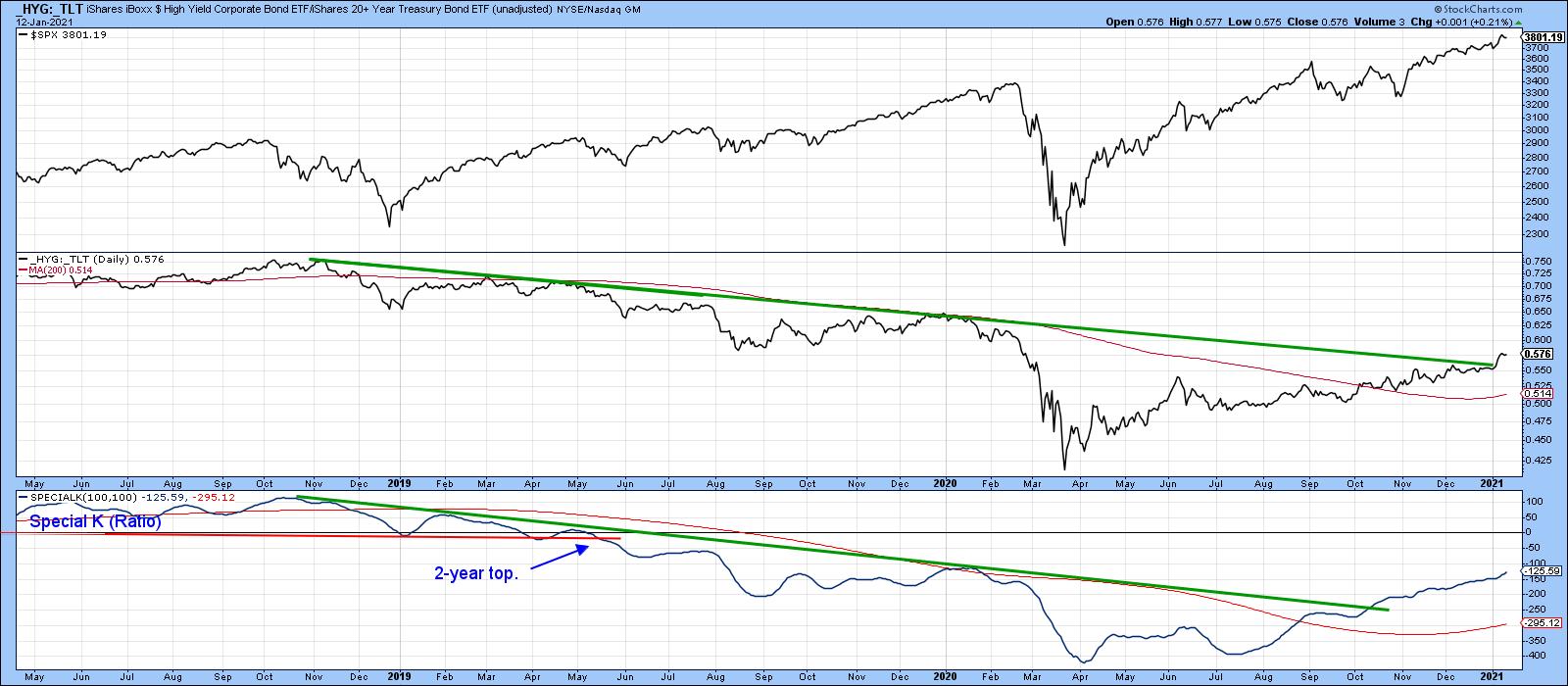
We can start our journey by examining the current position of several credit spreads or, rather, ETF relationships that accomplish the same goal. A credit spread is a bond market relationship that compares the price of a relatively low quality to a higher quality bond instrument. Take Chart 1, for instance, where the adjusted prices of the iBoxx high yield (low quality) ETF is being compared to that for iShares 20-year+ Treasury (_HYG:_TLT). When rising, it indicates that bond investors, generally a savvy lot, are growing in confidence, generally reflected in higher stock prices. Note how this ETF relationship, along with its Special K indicator, has just broken above a major down trendline. This strongly suggests that the trend of improving confidence is still relatively young. After all, the Special K, which you can read about here, is still way below its equilibrium level.
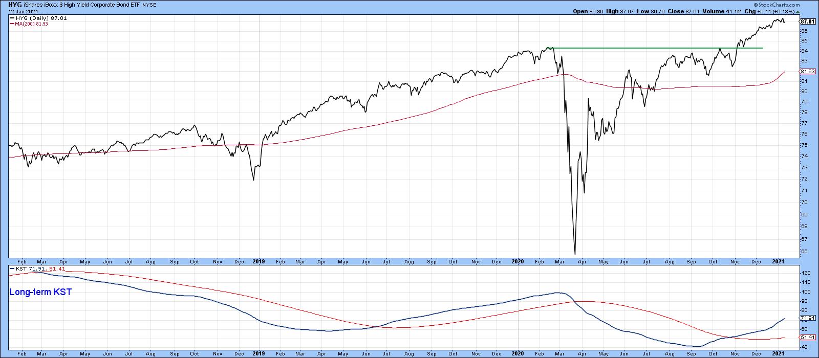
More to the point, when we examine the two components individually on an unadjusted basis, we find that the HYG has broken to the upside and is experiencing a rising long-term KST.
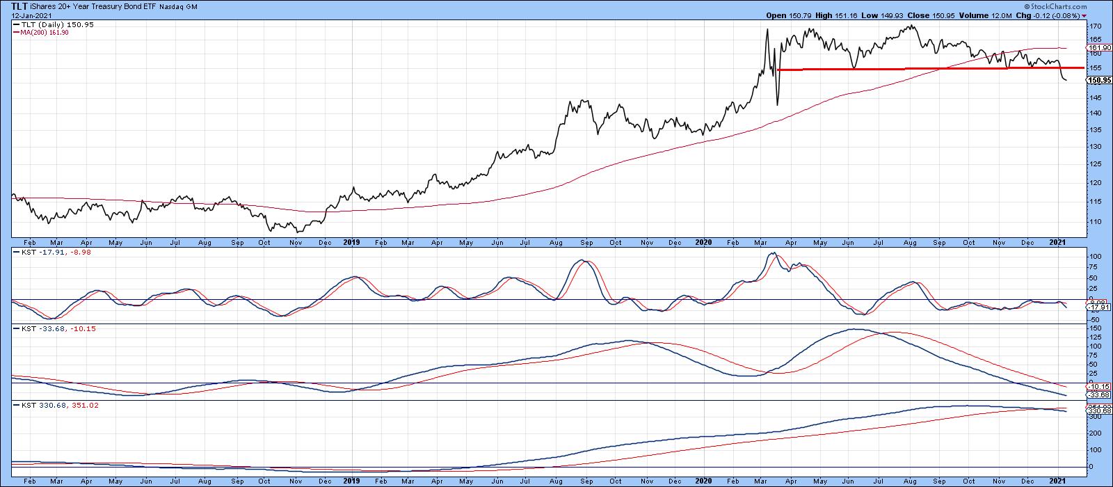
By the same token, the TLT in Chart 3 has completed a top, which is accompanied by three negative KSTs. All indications therefore point to further gains in the ratio and equity prices.
Charts 4 and 5 also support that conclusion. First, the S&P High Beta ETF originally broke out against its High Quality counterpart (SPHB/SPHQ) in late November. Now, it is edging through a 5-year resistance trendline, further enhancing the odds of an expanding trend of confidence.
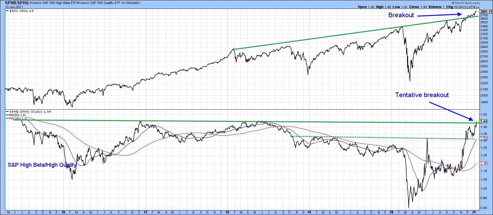
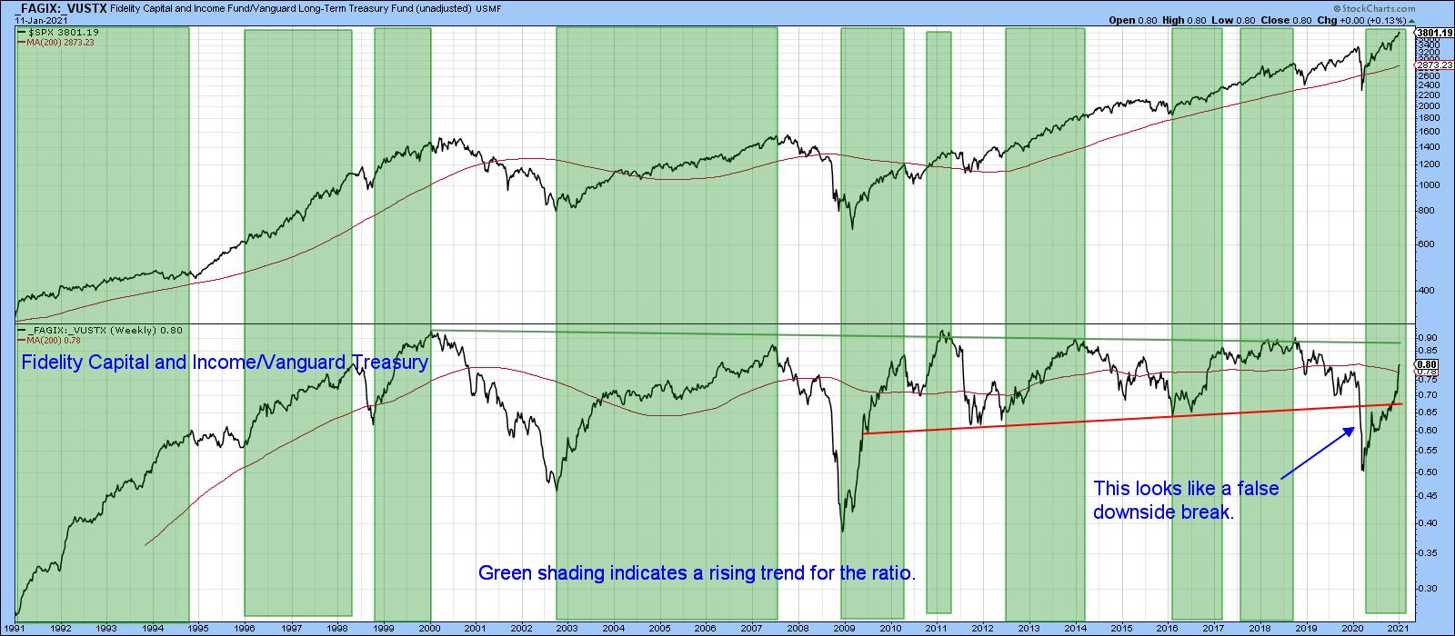
Chart 5 features a relationship first drawn to my attention by Jim Kopas, one of my partners at Pring Turner Capital. He calculated that, between 1990 and 2015, when the ratio between the Fidelity Capital and Income Fund and the Vanguard Long-term Treasury Fund (_FAGIX/_VUSTX) was above its 13-week MA, the S&P Composite returned an annualized monthly return of 13.3%. That compared to 9.33% for the buy hold approach over the same period. Risk (standard deviation) was approximately 25% lower using the ratio. Chart 5 shows that this relationship broke above its (dashed) 2018-2020 down trendline some time ago and is now back above its 2020 high, suggesting that further gains lie ahead.
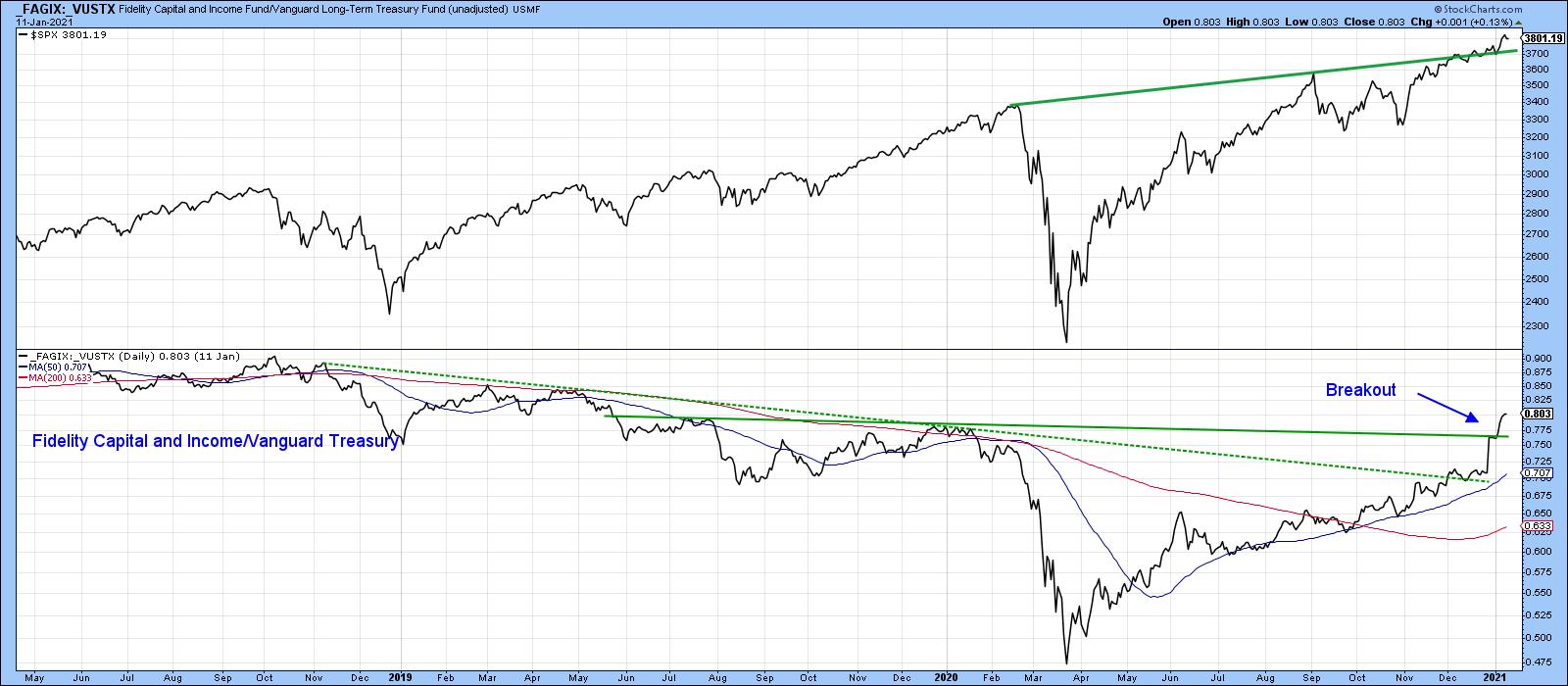
Chart 6 tells us that's important because this confidence indicator is rapidly closing in on to a 20-year resistance trendline.
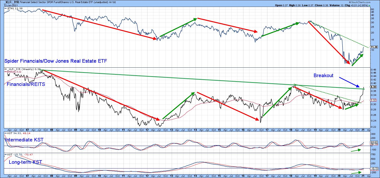
A confidence ratio of a different sort is provided by the relationship between financial stocks and REITS (Chart 7). The red and green arrows, which approximate the waves of the ratio and the 10-year bond yield, demonstrate that the two series are very closely connected. When equity market investors are bidding up the price of financials over REITS, they really voting for capital gain over the generally higher-yielding and defensive REITS, and vice versa. The message I get from this chart is that both the intermediate- and long-term KSTs are bullish, which should enable the ratio itself to more decisively break above that 2008-2021 down trendline. In turn, that suggests that the 10-year bond yield has only just started on its path to higher levels.
Stocks vs. Commodities
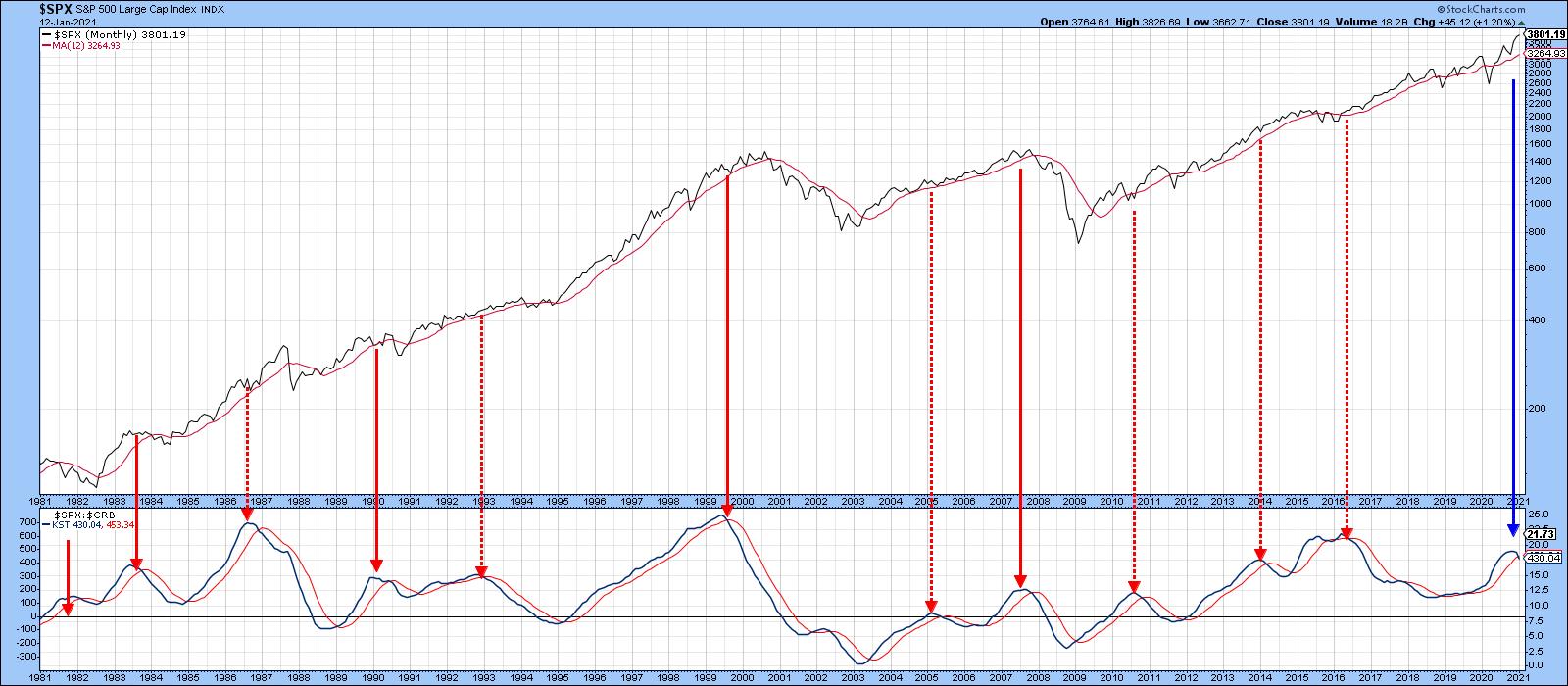
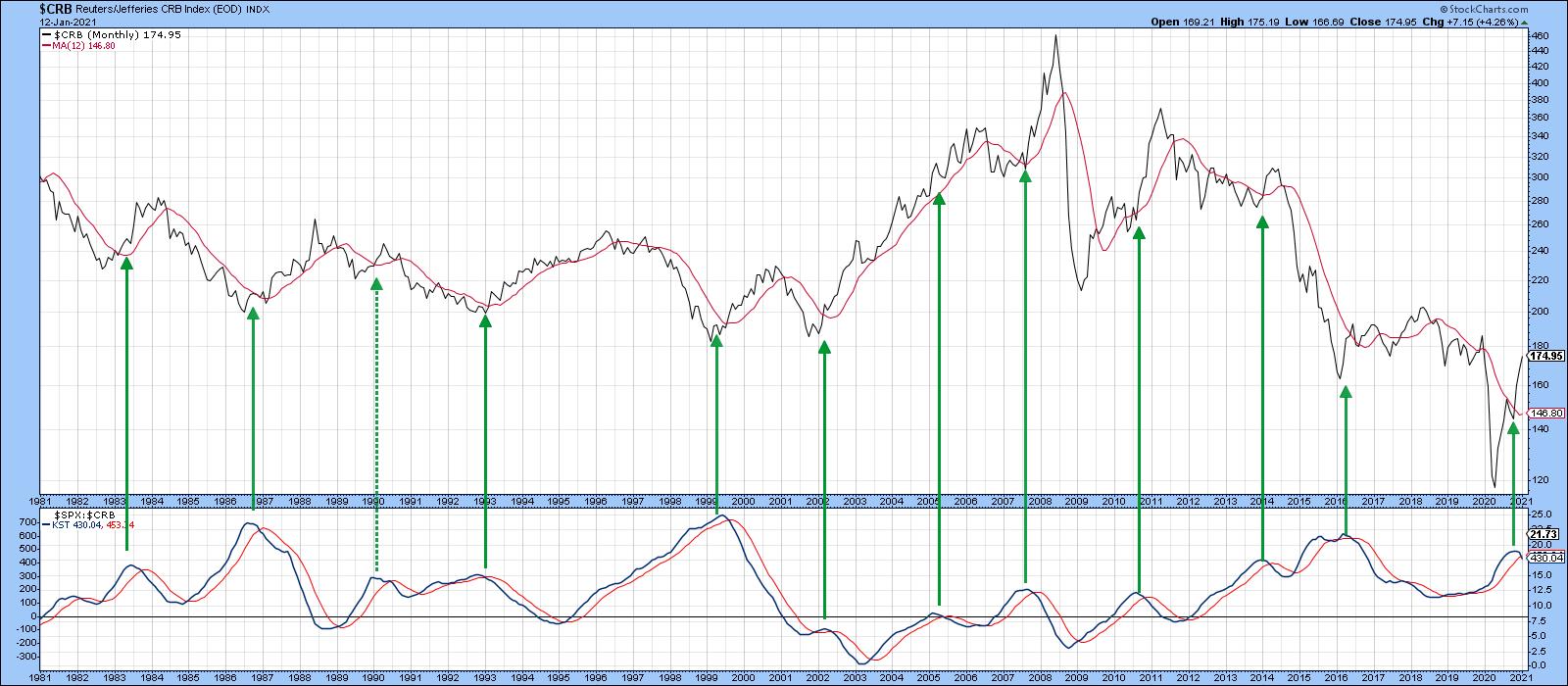
The final four charts are concerned with the ratio between stocks and commodities and the possibility of a reversal favoring commodities. Chart 8, for instance shows that this relationship has been in a persistent uptrend since the early 1990s, but has just given a KST sell signal. You might think that that's bearish for stocks, but the even split between the solid red arrows (bearish for stocks) and the dashed ones (false negatives) tells us that these signals have no forecasting ability in that regard.
On the other hand, Chart 9 tells us that a peak in the KST pretty consistently results in higher commodity prices.
When we substitute the Invesco DB Commodity Tracking ETF (DBC) for the CRB, we can see how close a downside trend break break favoring commodities really is, as this relationship has also triggered a KST sell signal and is literally right at its 12-month MA and secular up trendline.
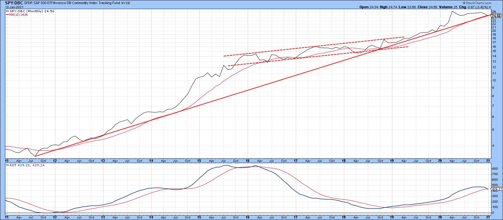
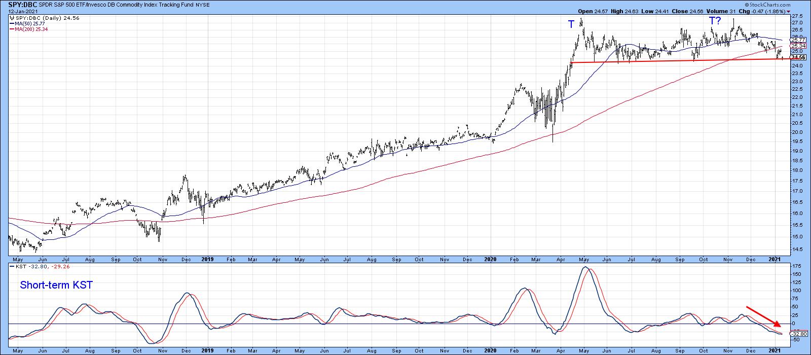
Chart 11 indicates that it is below its 200-day MA and right at the neckline of a potential double top formation, indicating the likelihood of higher commodity prices.
The message is the same as that given in early November. Notwithstanding corrections along the way, expect firmer bond yields, along with higher stock and commodity prices in early 2021.
Good luck and good charting,
Martin J. Pring
The views expressed in this article are those of the author and do not necessarily reflect the position or opinion of Pring Turner Capital Groupof Walnut Creek or its affiliates.


