Dollar Index Breakout Trick or Treat?
Back in June, I wroteabout the possibility that a major reversal in the dollar could be underway, but that certain things had to happen before we could come to a firm conclusion. One of those conditions was a Dollar Index daily close above 93.5, as that would complete what wasthena potential inverse head-and-shoulders pattern. Some may interpret that pattern as a double bottom due to the very low positioning of the right shoulder. I don't think it's important either way, because it still represents a battle between buyers and sellers, which was resolved in favor of the buyers -- or was it?
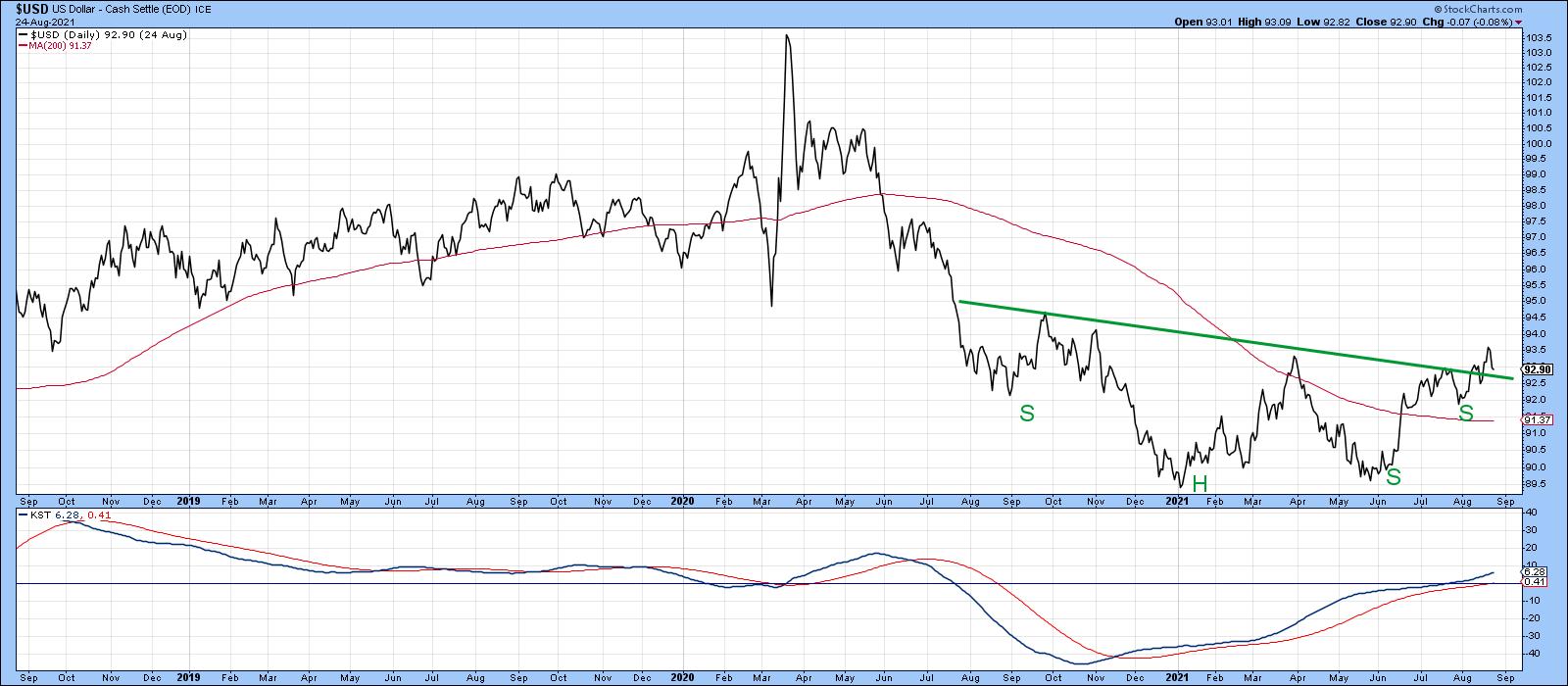
Chart 2 indicates that, when looked at from a bar chart aspect, the breakout did not hold. There is a chance, then, that it will turn out to be false. For the bulls, the breakout could turn out to be a trick rather than a treat!
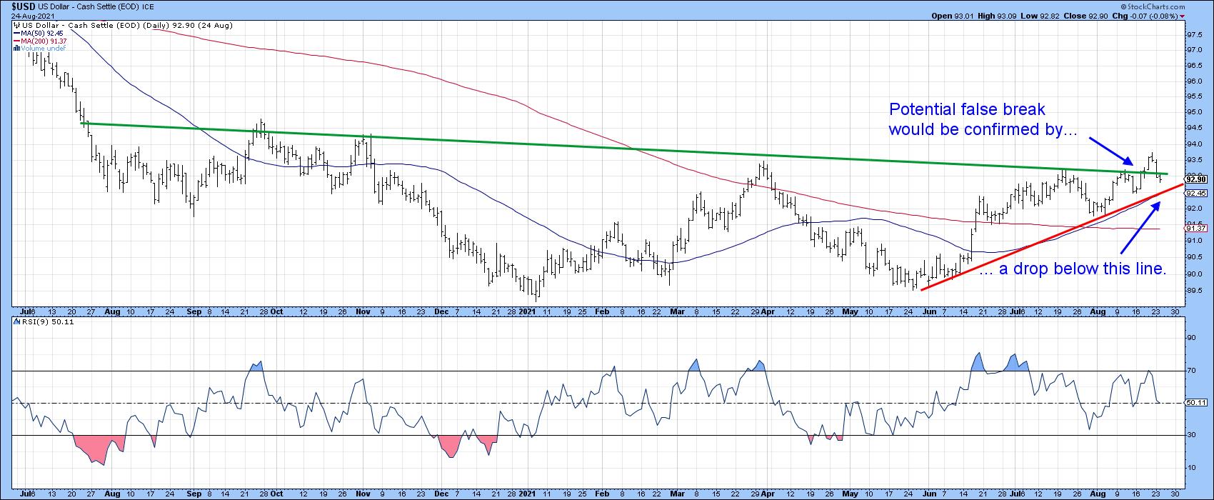
While that's definitely a possibility, in technical analysis it's important to look at the weight of the evidence rather than basing decisions on one event or indicator. In that respect, I have a rule that states that a valid false breakout needs to be confirmed before the odds favor it being valid. In that way, the potential false breakout represents one piece of evidence, the other being provided by some form of trend confirmation, such as a trendline violation or reliable moving average crossover. In the current situation, that confirmation would come from a break below the red trendline. That line takes on greater significance as a support level since it is intersecting with the 50-day MA, which is why you can't see the latest plots. The average is currently at 92.45.
The Long-Term Picture Reversing
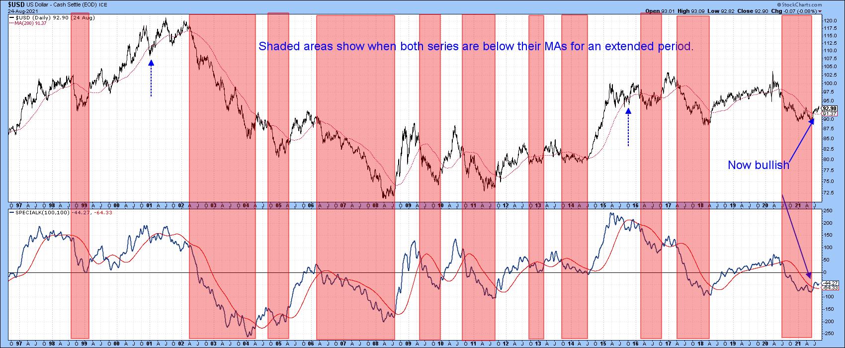
Taking a longer view, several indicators have gone bullish since my mid-June piece on the dollar. One of those is the position of the Index relative to its 12-month MA. Chart 3 shows that it has been bullish for a couple of months, though the crossover is not yet decisive. The shaded areas demonstrate those periods when both series are above their respective moving averages. A bullish signal looks to be pretty close, as the KST has already been rising and reversals of this nature usually offer a firm indication of a change in trend.
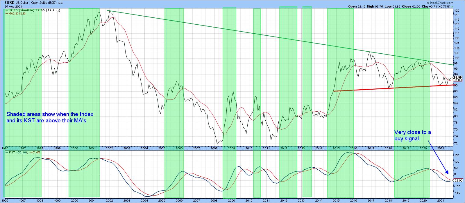
Chart 4 features a long-term weekly stochastic using the 12, 15 and 10 parameters. The dashed green arrows show positive divergences that have taken place over the last 15 or so years. When confirmed by a trendline break in the Index, these setups have resulted in some nice dollar rallies. Another positive divergence developed at late last year. That was immediately followed by a break above the sharp 2020 down trendline and a subsequent test of last October's low. As that was happening, the stochastic diverged positively again and the Index broke to the upside. Note that there was very little downside stochastic momentum at the 2021 May/June low, which is a positive sign going forwards.
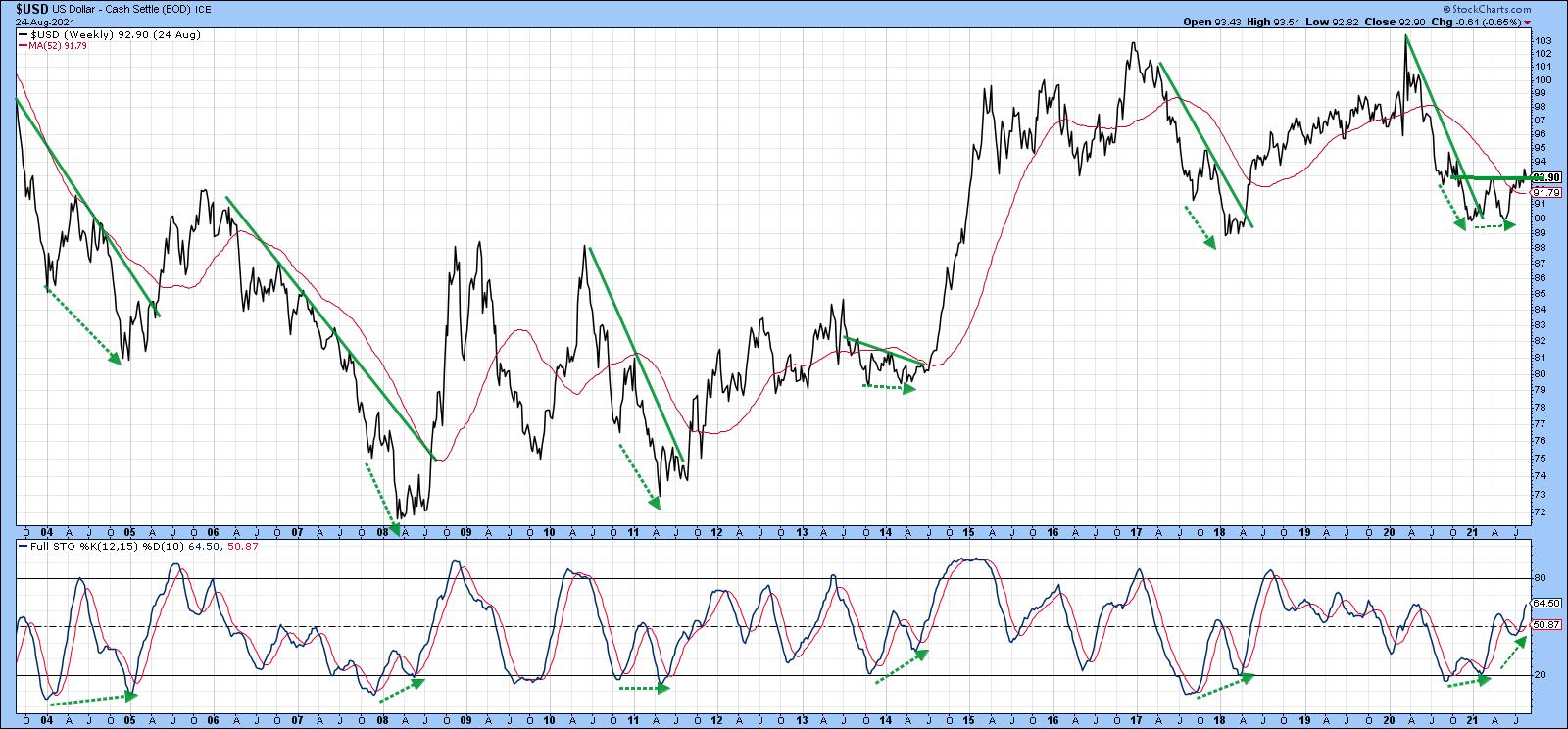
Chart 5 compares the Dollar Index to the Special K indicator (SPK), which you can read about here. The pink shadings flag periods when the Index is below its 200-day MA and the SPK is under red signal line. The two dashed blue arrows tell us that, occasionally, this approach results in whipsaw signals. By and large, though, the shaded periods catch the majority of the declines and the unshaded ones the rallies. In the last few days, both series have decisively surpassed their moving averages, thereby triggering an intermediate-to-long-term buy signal.Remember, these Special K signal line crossovers do not happen that often, so they are usually a big deal. By way of example, there has only been one positive crossover since 2017.
The Dollar vs. Dollar Sympathy Relationships
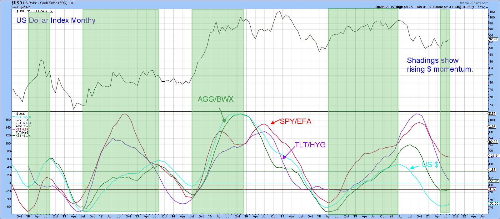
Finally, it's often a good idea to compare the performance of the dollar to various intermarket relationships that typically move in sympathy with swings in the Index. If the majority do not, then this throws some doubt on the trend being signaled by the Index itself. These relationships include US versus foreign stocks and bonds, as well as US credit spreads and inverted commodities. Three of those four relationships are featured in Chart 5 in long-term KST format.
The green shadings indicate when the (turquoise) KST for the dollar is in a rising mode. Note that it is normal for these sympathy relationships to move with it. That's exactly what began to happen in the last month.
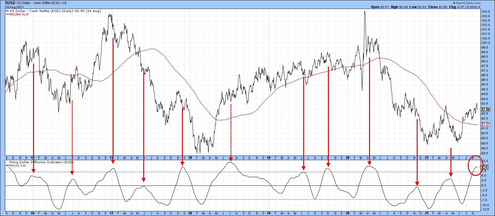
Dollar Diffusion a Problem
So far, the charts featured in this article look as if they are in the process of turning to the upside. That said, Chart 6 could be a problem. It features a diffusion indicator monitoring a universe of cross-dollar relationships in a positive trend. The solid red arrows tell us that, when it reverses from a position at or above zero, the risks of a correction, and in this case a false breakout, increase. The dashed arrow was an exception because it developed at the beginning of a mini-bull market. Given the emergingly bullish trend of the long-term indicators already described, that could well apply to the current situation. Consequently, I'm expecting the bull market scenario. However, if that breakout fails to hold in any serious way, the likelihood of a further test of the 2020 and 2021 lows would increase.
Remember, you can update any of these charts going forwards simply by clicking on them. StockCharts will do the rest!
Good luck and good charting,
Martin J. Pring
The views expressed in this article are those of the author and do not necessarily reflect the position or opinion of Pring Turner Capital Groupof Walnut Creek or its affiliates.


