Several Indicators are Shaping Up for a Counter-Cyclical Correction
Most of the time, the charts I plot are constructed from daily data. As a result, the necessary perspective provided by weekly ones often gets overlooked. By way of a remedy, I decided, some time ago, to create chartlists for key markets featuring weekly high low close and candlestick arrangements. Most of the time, they haven't got a lot to say, which means they don't get monitored as much as they ought.
I wasn't planning on reviewing them last weekend, but was struck by an excellent ChartWatchers article on September seasonality written by Tom Bowley, truly a must-read for any technician. Tom is bullish going into the year-end period and is by no means looking for a crash. However, he points out that, since 1950, the second half of September has consistently been one of the weakest seasonal periods of the year. Add that to options expiration at the end of the week and you have some ingredients for exciting times. Armed with this information, I thought it would make sense to check some of those weekly chartlists to see if they were consistent with that potential seasonal weakness.
Weekly Charts Showing Potential Weakness
In that respect, Chart 1 shows the S&P Composite forming a bearish "evening star". The words "evening star" have been placed in quotes because the third real body in the pattern should, strictly speaking, gap down from the spinning top plotted in the middle of the red rectangle. The way I look at it is that this was a battle between buyers and sellers, which, by the close of the third candle, was resolved soundly in favor of the sellers, gap or no gap. More negative evidence comes from the 9-week RSI, which has just dropped below its overbought zone for the first time since late June.
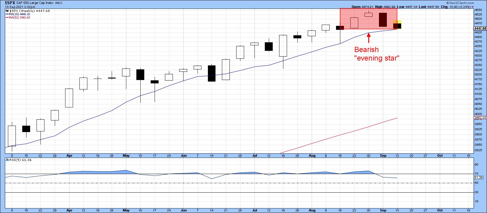
These candle patterns are only expected to have an effect for between 5-10 bars, which, in this case, would be weeks. That would take us into the late-October/early-November period. Moreover, they should be confirmed by additional price action.
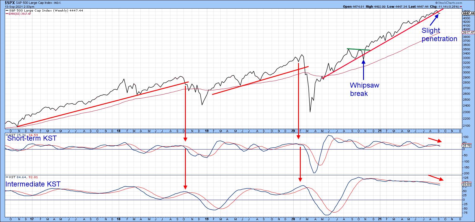
In that respect, Chart 2 shows that the S&P has experienced a slight violation of its 2020-2021 up trendline. I admit that this line could have been drawn differently, but it does seem to have the best fit as a dynamic support zone, since it has turned back numerous declines. The one time it was penetrated proved to be a false signal, which reinforces the idea of the line as a support zone as the Index was unable to remain below it for very long. Also worth noting is the fact that both KSTs have begun to turn lower in a similar pattern to that established in October 2019 and February 2020.
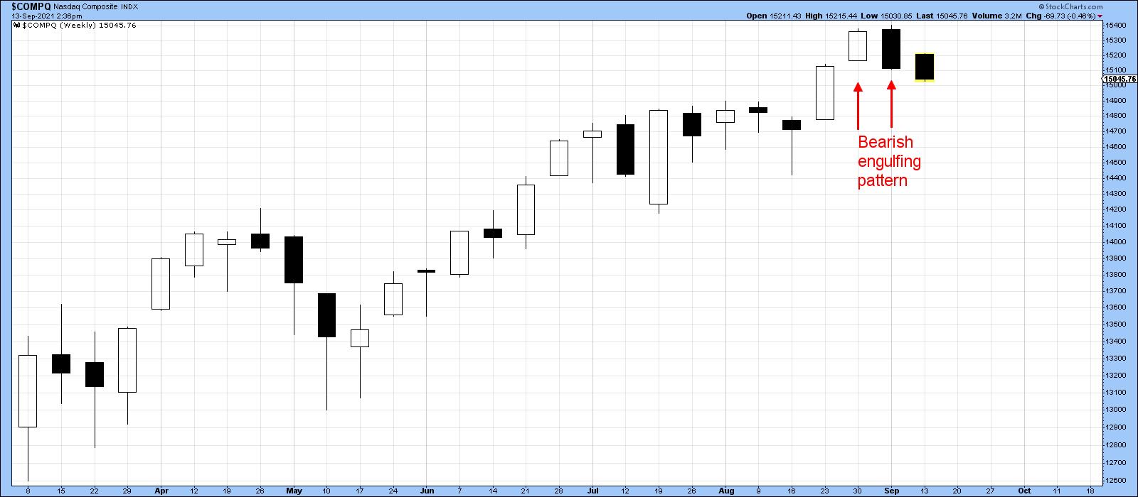
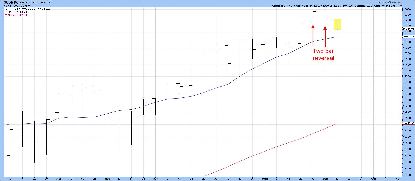
Over at the NASDAQ, my weekly chartlist returned a bearish engulfing pattern (Chart 3). When considered as a western bar chart, Chart 4 reveals a bearish two-bar reversal. Not the greatest of examples, as a stronger signal would have come from a wider trading range, but a battle nonetheless that was won by the sellers.
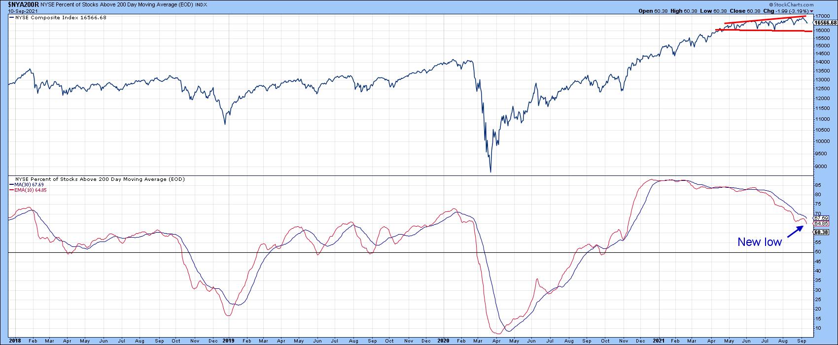
Weakening Internal Measures
Chart 5 tells us that as the NYSE Composite has been working its way higher more as more stocks have been dropping below their 200-day moving averages. There is no rule that says that this discrepancy cannot extend further, but history tells us that, the longer the deterioration, the greater the potential for tears.
Watch That VIX
Chart 6 plots the 10-day MA of the VIX inversely. That way, it corresponds to swings in the S&P Composite. Occasionally, it is possible to construct trendlines. When those lines are violated, and the violation is confirmed by a trendline break in the S&P, prices typically reverse to the downside. Two previous setups of this nature developed in 2010 and 2018. A third recently developed, as the (inverse) VIX recently dropped below its bull market trendline. Not much followed as the VIX experienced some rangebound action and the S&P worked its way higher.
Now, the Index has tentatively violated its secondary bull market up trendline. If that break becomes more decisive and 10-day MA of the inverted VIX drops below its August low, that would likely trigger some form of shakeout.
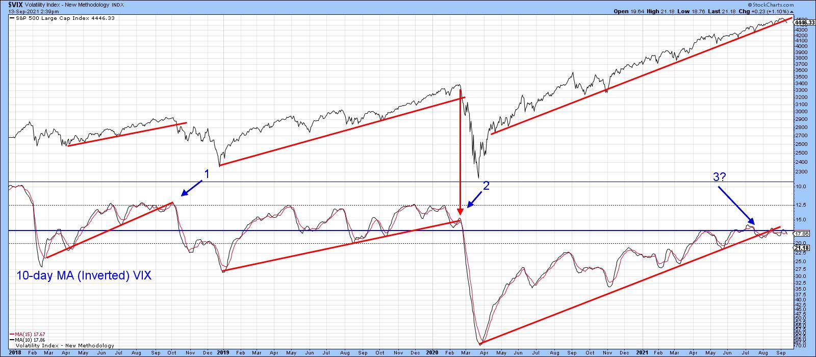
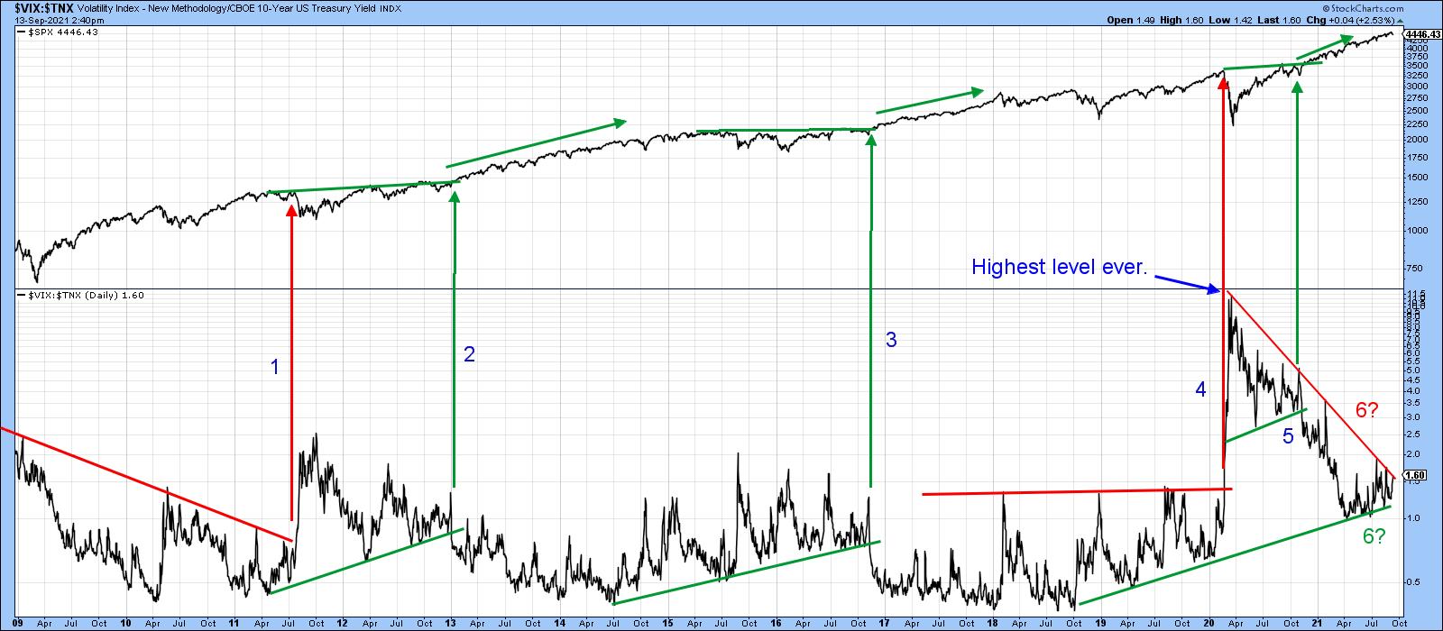
Chart 7 features a ratio between the VIX and the yield on the 10-year bond. When rising, the ratio reflects investors' growing level of fear, because it implies that the VIX is rising and the yield falling. Since 2009, there have been three instances where up trendlines in the ratio have been violated, meaning the trend of improving confidence was likely to extend. All were confirmed by the Index breaking to the upside and followed by an advance. Admittedly, this indicator is pretty volatile, so we have to be careful in making sure that breakouts are valid. Right now, it is caught between two converging trendlines. Both have been touched on numerous occasions and are fairly lengthy. That could well mean that the ultimate breakout will signal the direction of the next important market move. Please remember that these charts are live, which means that, as new data becomes available, they can be updated with a simple click.
Conclusion
Price action and some internals are warning of potential trouble going into a seasonally weak period of the year. However, pretty well all of the longer-term technicals at this time continue to point to ultimately higher prices.
Good luck and good charting,
Martin J. Pring
The views expressed in this article are those of the author and do not necessarily reflect the position or opinion of Pring Turner Capital Groupof Walnut Creek or its affiliates.


