Using the Special K to Analyze the Dollar
One of my favorite indicators is the Special K. It does not speak to us very often, but when it does, it's usually pretty reliable. I'll outline a few principles below, but for further reading, look hereandhere.
The Special K, or SPK, recognizes the fact that price at any one time is determined by the interaction of several different time cycles. TheKSTalso does this by combining four of them in one indicator. The Special K, though, goes one step further by combining the KST for the three principal trends, short- (3-6 weeks), intermediate- (6 weeks to 9 months) and long-term (9 months to 2 years). The result is a jagged indicator that experiences primary trend peaks and troughs that turn more or less simultaneously with the price. I conservatively say that it happens about 70% of the time, but the actual number is probably a tad higher. The time parameters used in the SPK calculation assume the post-1960 average of a 41-month cycle in the recovery-slowdown/recession rotation. Consequently, anything substantially more or less than the norm will cause the SPK, on a few occasions, to peak or trough out of sync with the price series being monitored.
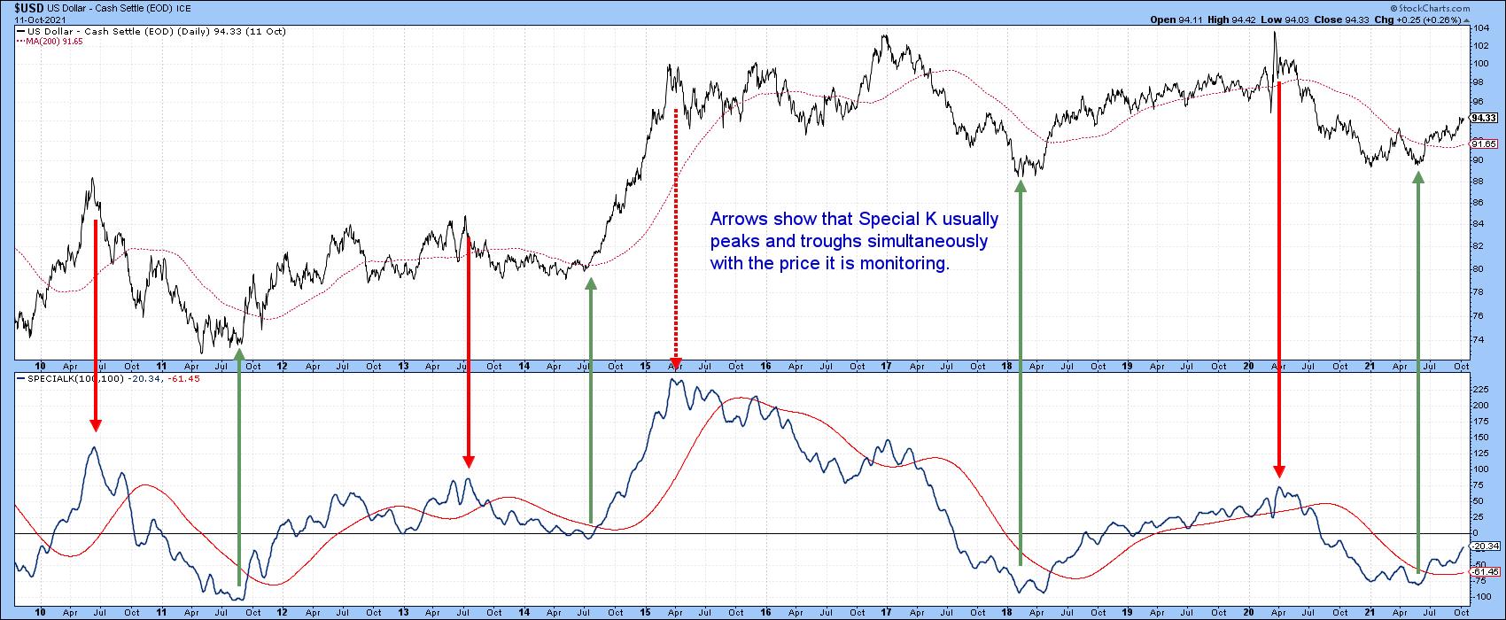
The arrows in Chart 1 demonstrate the normal peak/trough relationship between the Dollar Index and its SPK over the last 12-years. Note the dashed arrow in early 2015, which signaled a top but not the top; that occurred in January 2017.
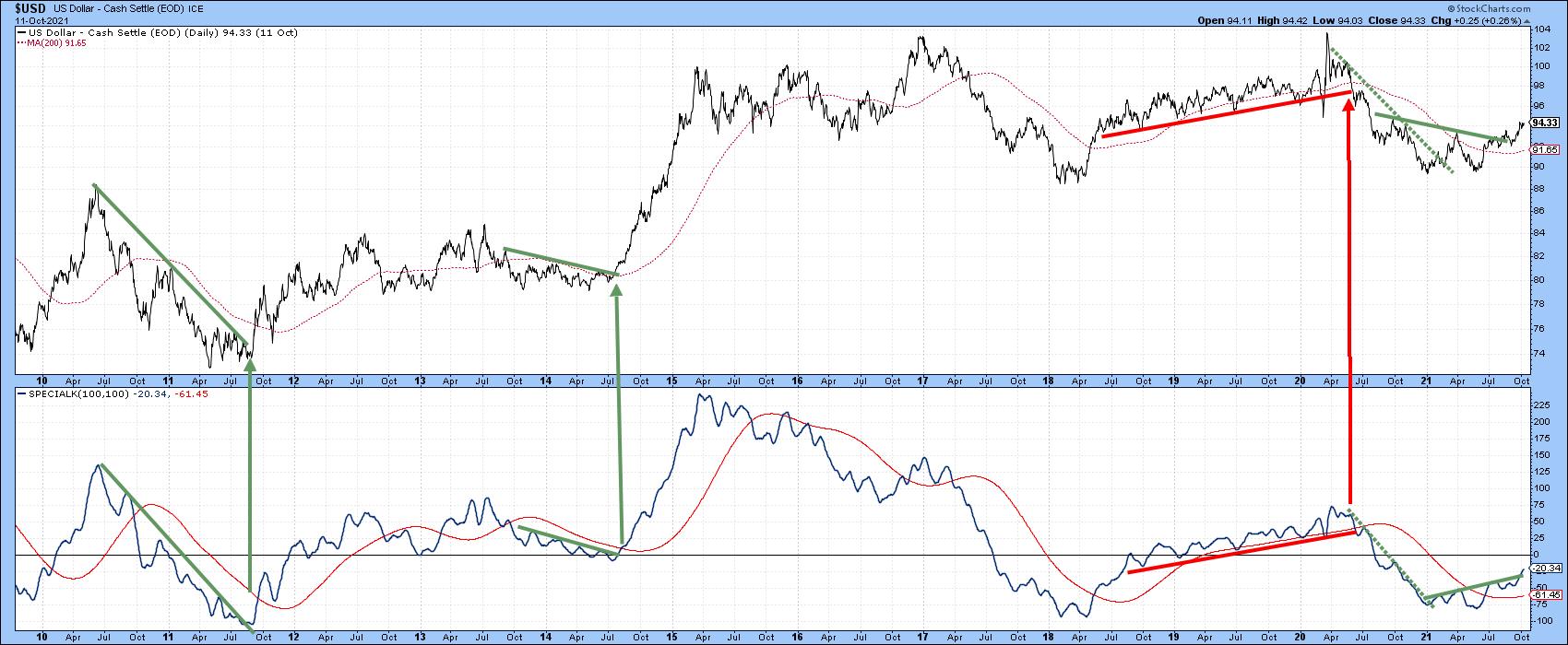
It's easy, of course, to spot these reversals using the benefit of hindsight, but in the real world we do not have that luxury and need to develop some technical tools to help. There are three that seem to work most effectively. The first is a signal line, which is calculated from a 100-day MA smoothed by another 100-day MA. It sometimes works remarkably well, but, at other times, this approach triggers false signals. That's why it's helpful to supplement the analysis with a meaningful trendline violation. Since we are trying to identify primary trend reversals, it makes sense for them to be at least 9 months in length. As additional evidence, it's nice to see the establishment of a series of rising or falling peaks and troughs.
Finally, the SPK only measures momentum, and all momentum signals should be backed up with some kind of reversal in the price itself. That could take the form of it a trendline violation, reliable MA crossover or price pattern completion.
Chart 2 shows some recent examples of trendline penetration combinations for the Dollar Index. Occasionally, such as the 2015-2017 tops, it is not possible to construct realistic trendlines, so the moral of the story is don't force it and examine other indicators instead. Recently, a solid combination of bullish factors has formed.
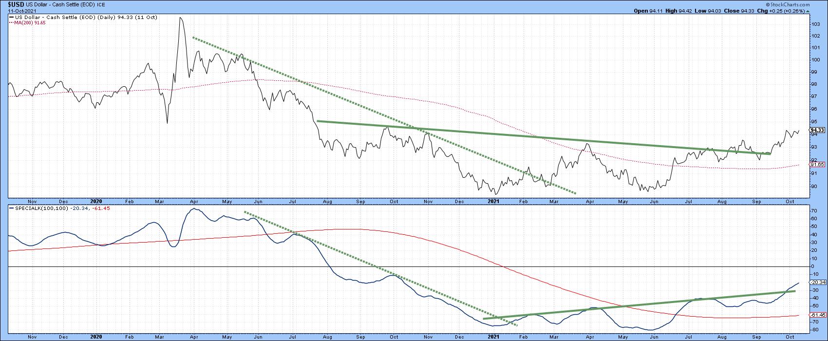
This is shown in greater detail in Chart 3. The dollar reversal was initially signaled by a combination of two dashed trendline penetrations. They were pretty steep and neither was even close to a negative MA crossover. Consequently, all we could conclude at that time was that downside momentum had begun to dissipate. Now, the bullish evidence is a lot stronger, as the SPK has crossed its signal line and set up a series of rising peaks and troughs. Most important of all, it has completed a 9-month reverse head-and-shoulder formation. The Index itself has crossed its 200-day MA, which is now rising, and completed a base of its own. Now, we will take a look at some of the cross-dollar relationships to see if they are in agreement.
Euro
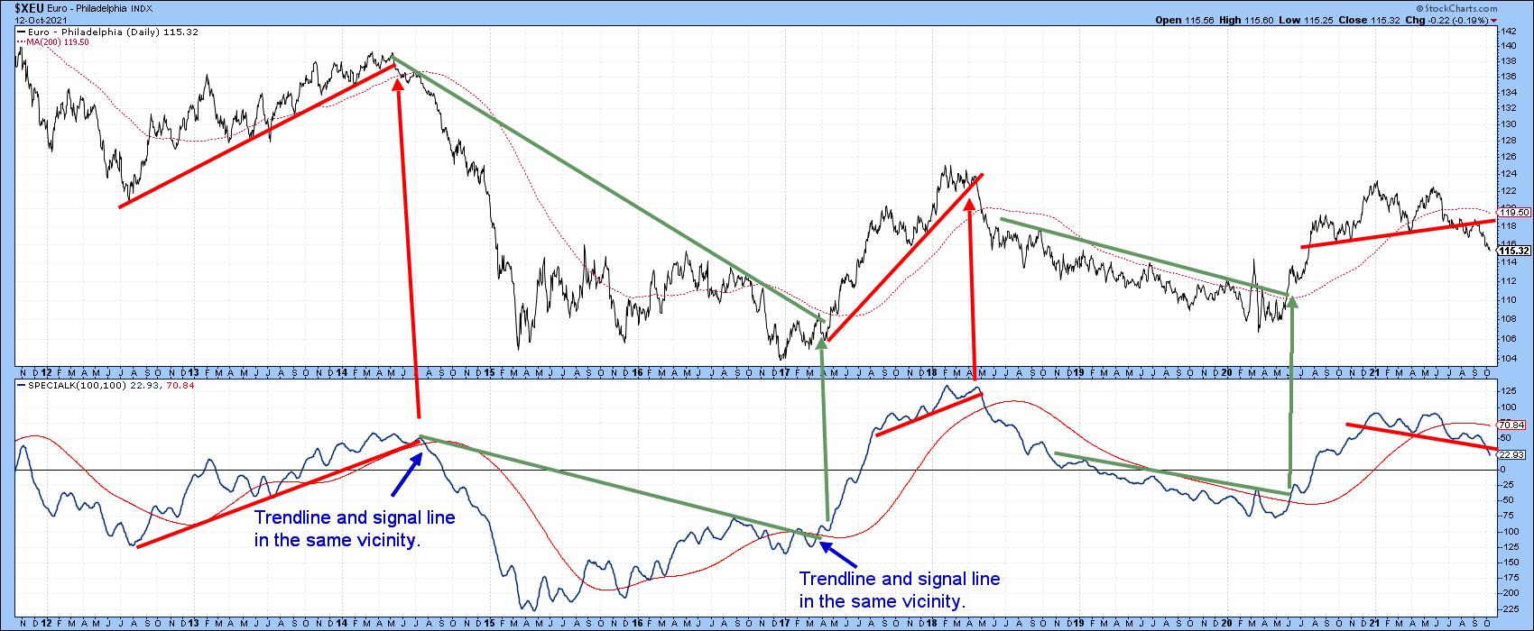
The Euro has an approximate 57% weighting in the Dollar Index, so it is not surprising that its chart is not far off from a mirror image. Several trendline combos have been highlighted in Chart 4. Note the strong response from those signals where the SPK signal line crossover and trendline penetration were very close together. The recent head-and-shoulders top completion in both series is consistent with the idea of a bottom in the Dollar Index.
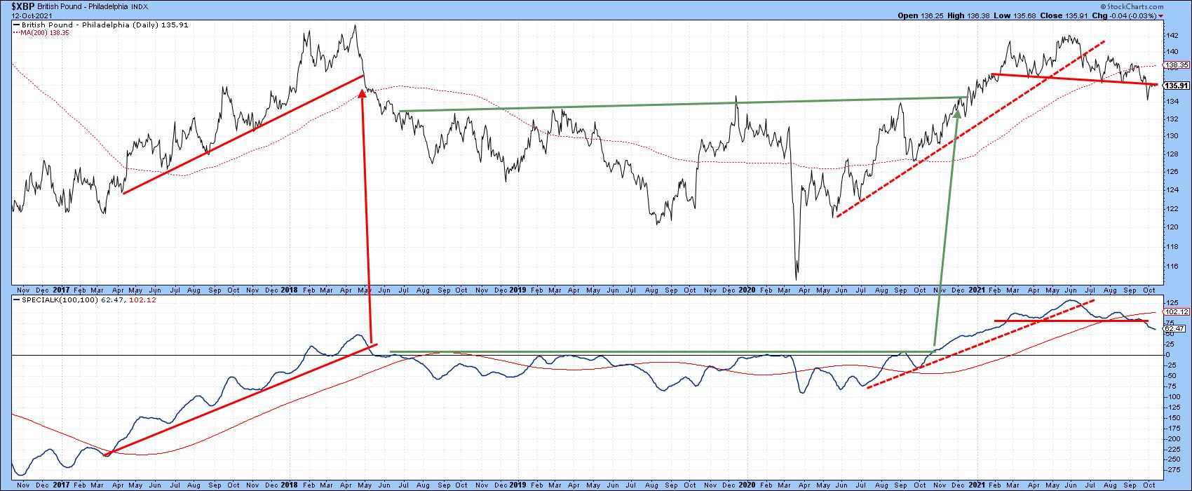
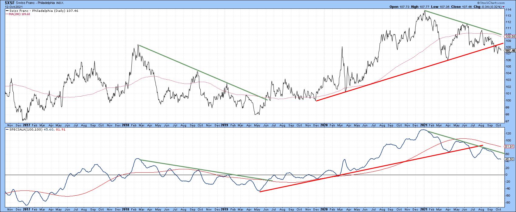
Pound and Swiss Franc
Charts 5 and 6 feature the pound and Swiss franc, respectively. The pound looks similar to the euro, but the franc takes on a slightly different flavor in that the recent head-and-shoulders is not present. However, the 2019-2021 trendline break is more pronounced in both the SPK and the currency itself. Note also that both series could be in the position of reversing trend, as that would merely require a rally above the two (green) down trendlines. Right now, though, this is a bearish chart.
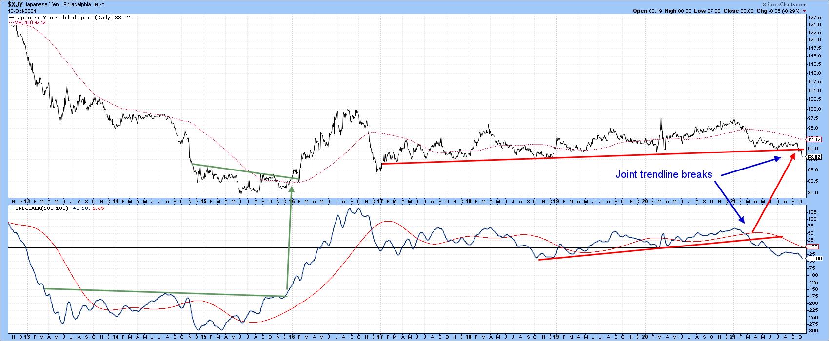
Japanese Yen
Price action for the yen has been very different, as both the currency and its SPK have been in an extended trading range since 2017. The momentum indicator broke down some time ago and has now been joined by the yen itself. The currency could always rally back above the red breakdown trendline; however, as things stand with the picture as we know it today, the chart should be interpreted in a negative way.
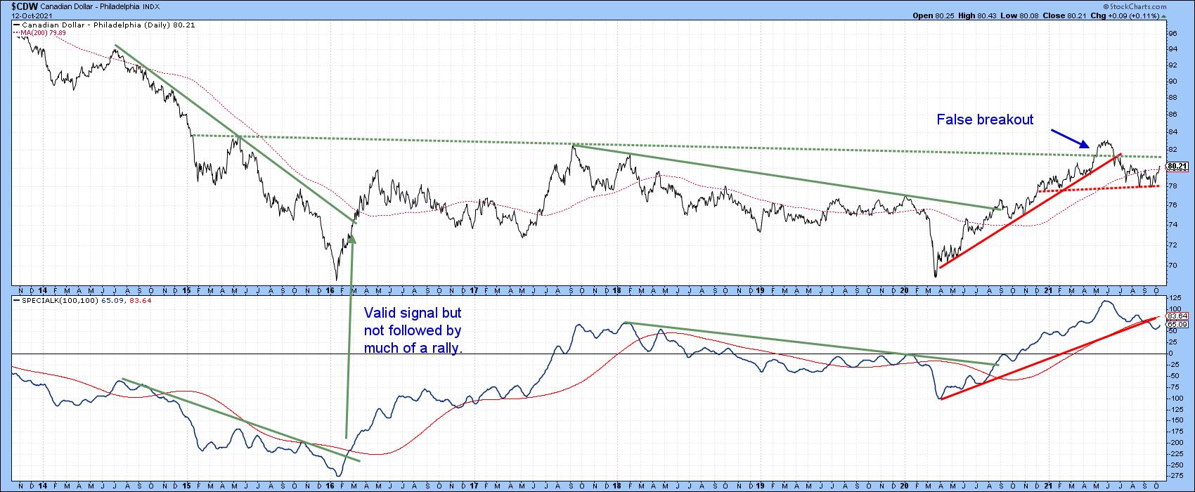
Canadian Dollar
The Special K for the Canadian dollar recently gave a strong sell signal, since it crossed its signal line and up trendline simultaneously. That should have confirmed the June trendline violation in the currency itself. I would have expected to see a stronger decline than the one that followed, especially as a false breakout above the green trendline had previously taken place. Now, the currency has managed to retake its 200-day MA, which clouds the situation. Since commodities are in a primary bull market, its possible that this commodity-sensitive currency could also move above its dashed green resistance trendline. However, the currently negative SPK suggests that a drop below the neckline of a potential head-and-shoulders at 78c is more likely.
Good luck and good charting,
Martin J. Pring
The views expressed in this article are those of the author and do not necessarily reflect the position or opinion ofPring Turner Capital Groupof Walnut Creek or its affiliates.


