Does Last Week's Bitcoin Sell-Off Signal a Bear Market?
According to CoinGecko, total crypto market capitalization, which came from almost nothing 10 years ago, stood at $3 trillion in early November. To put that in perspective, total US GDP currently stands at $23 trillion, so, at its recent high, global crypto was worth 13% of US GDP and more than the total GDP of either the UK or India, both of which are around at $2.6 trillion.
According to the StockCharts database, Bitcoin, the leading crypto, moved from a 2015 low of around $164 to a recent $68,000. That's an awful amount of asset creation in such a short period of time. By any standard this indicates extreme bubble territory to me. Does that mean sell everything? No, because bubbles have a habit of overshooting, and this one is no exception. That's not to say that the November high in Bitcoin does not leave something to be desired, because it does. My read is that there are definitely some cracks appearing, but a shrinking consensus of evidence continues to point to an uptrend.
Bitcoin Momentum
Chart 1 shows the sharp run-up between 2015 and 2017, the subsequent consolidation and the 2020 breakout. Most striking is the 18-month ROC at the 2017 peak as it registered a reading close to 2,000%. To put that in perspective, the highest number for an 18-month ROC for any market (not individual stock) going back multiple decades is 500% for silver in 1980. My studies, based on 30 historic examples of an 18-month ROC reading above 200%, show that, once the indicator peaks, it takes an average of 15 years to recapture the bubble high. The 2017 peak in Bitcoin was one for the record books and only took 3 years to recapture.
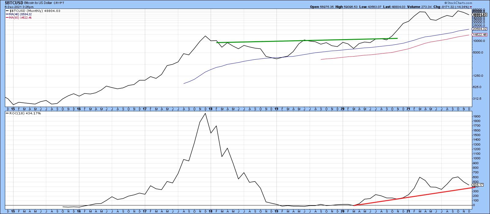
The ROC has been in an uptrend since its early 2020 low. The two 2021 highs, which clocked in at a remarkable 600%, are still high compared to the 1980 silver record. They just look low in comparison with the 2017 Bitcoin peak. This may be a negative divergence, but it's too early to conclude that the ROC has topped out as it remains above its red support trendline.
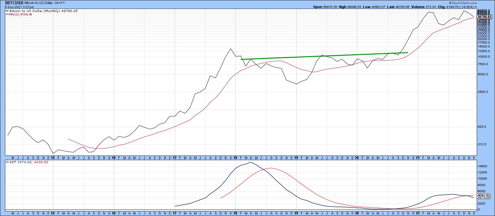
Charts 2, 3 and 4 show that the quality of the rally is also lacking in some other areas. For instance, the breakout from the 2017-2020 basing period gave rise to a KST buy signal, but Chart 2 shows that recent weakness has caused it to cross below its 9-month MA for a sell indication.
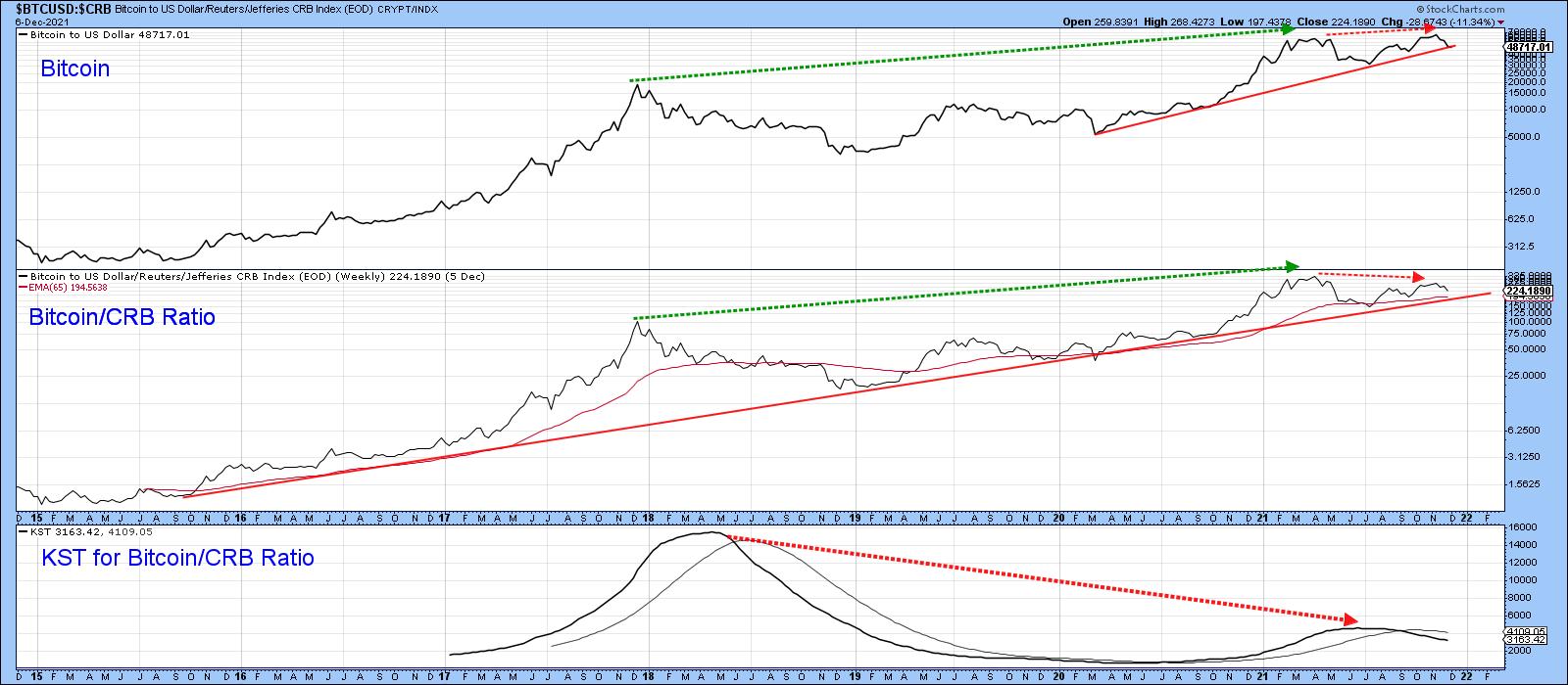
Bitcoin Relative Action
Up until the early 2021 peak, Bitcoin was surpassing just about every other asset class. Something changed later in the year. Chart 3 shows its performance against commodities, where it is evident that the RS line between it and the CRB Composite began to diverge negatively, as flagged by the two dashed red arrows. The KST for the ratio has also gone negative, though the ratio itself remains in an uptrend above both its 2015-2021 bull market trendline and 65-week EMA.
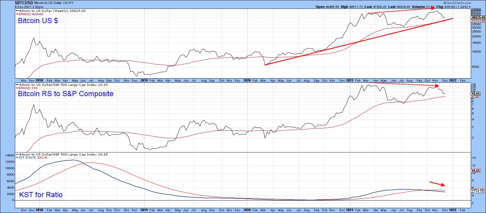
The story of its relationship with the S&P (Chart 4) is similar, in that the November Bitcoin peak is the first in which its RS line did not confirm a new Bitcoin high. The long-term KST has also gone bearish.
The Trend is your Friend -- Until it Isn't
The bubble-type conditions in the crypto arena and the momentum and relative strength discrepancies may give sustenance to those who want to be bearish. However, just as actions speak louder than words, trend is more important than negative divergences and, at this point, there is little sign of a reversal. Until there is, we should assume that prices will continue to work their way higher.
For example, Chart 5 shows that the series of rising peaks and troughs that began in 2019 is still intact.
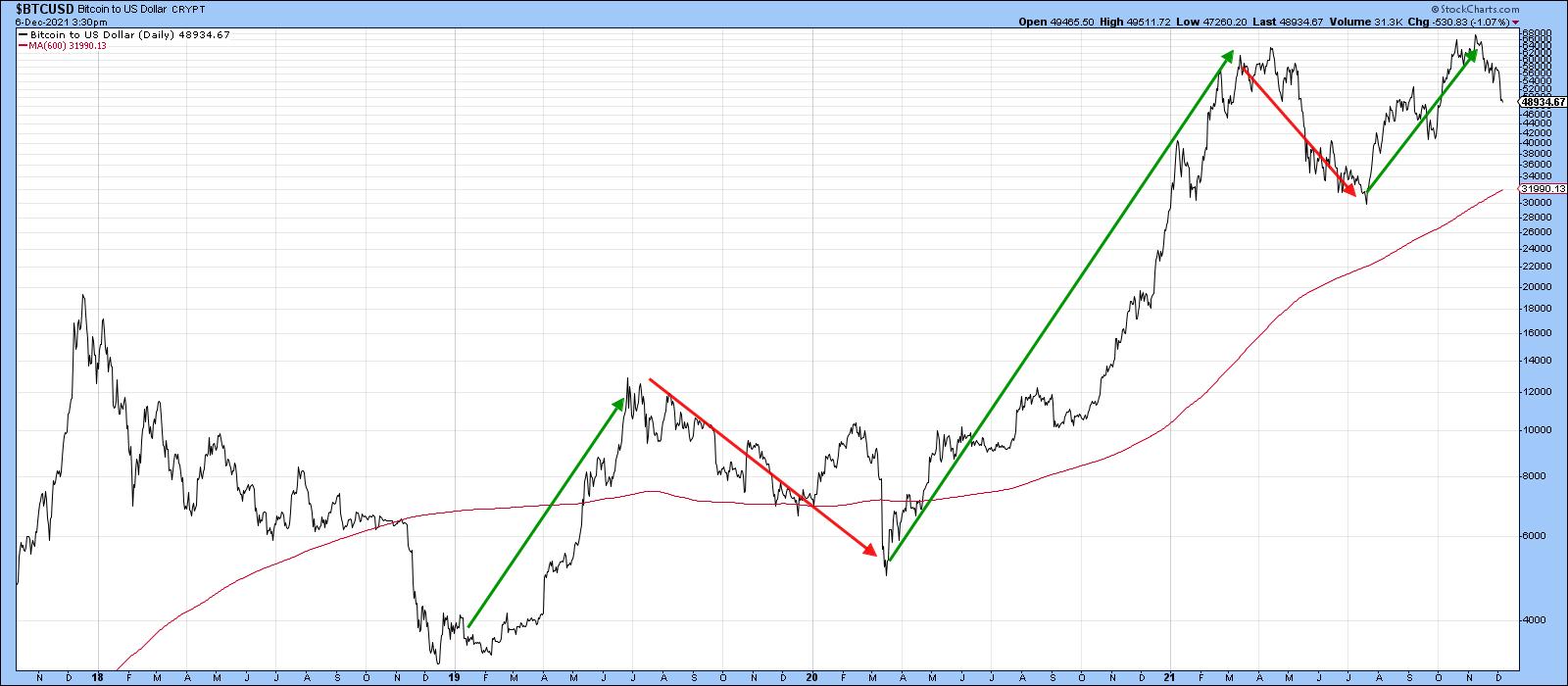
Chart 6 demonstrates the fact that Bitcoin lends itself to trendline construction and the formation of price patterns quite well. At this point, there is no evidence of a top forming, as was the case in July 2019 and March of this year. However, the 2020-2021 up trendline started to give way last week, but the the 200-day MA remains intact.
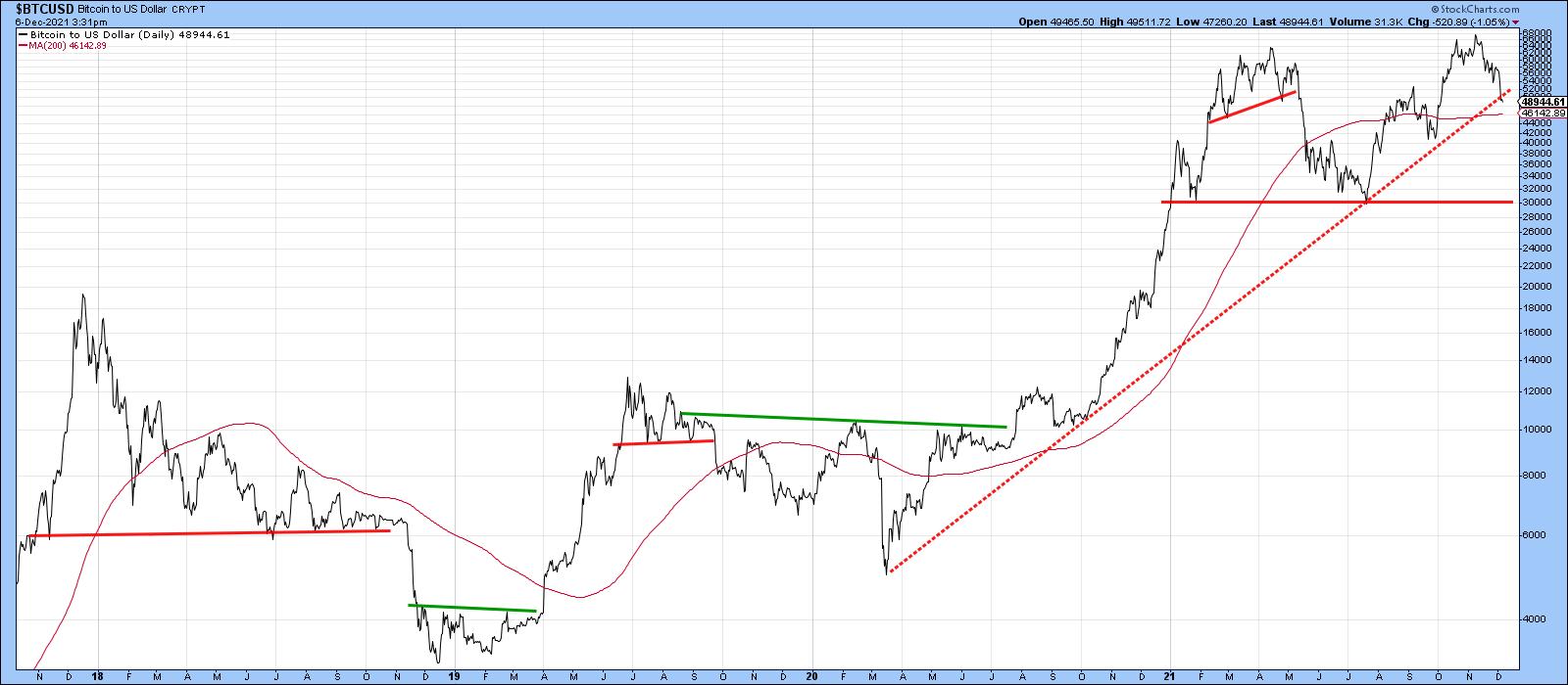
The $30,000 level could turn out to be the key, since it's possible that it could later be classified as the neckline of a head-and-shoulders top. That, of course, is highly speculative.
In the meantime, Chart 7 shows that the possibility of a rally to new highs is real, as the KST monitoring intermediate trends is in a bullish mode. It also underscores the $41,000 area as one of Friday close support, as that is where the up trendline and 65-week EMA are currently residing. Obviously, the price is comfortably above this area.
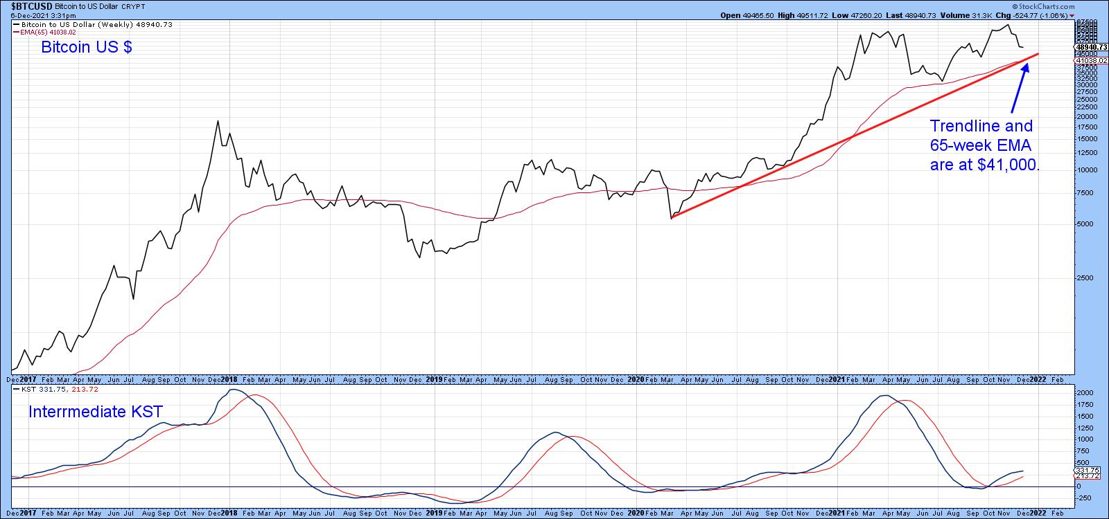
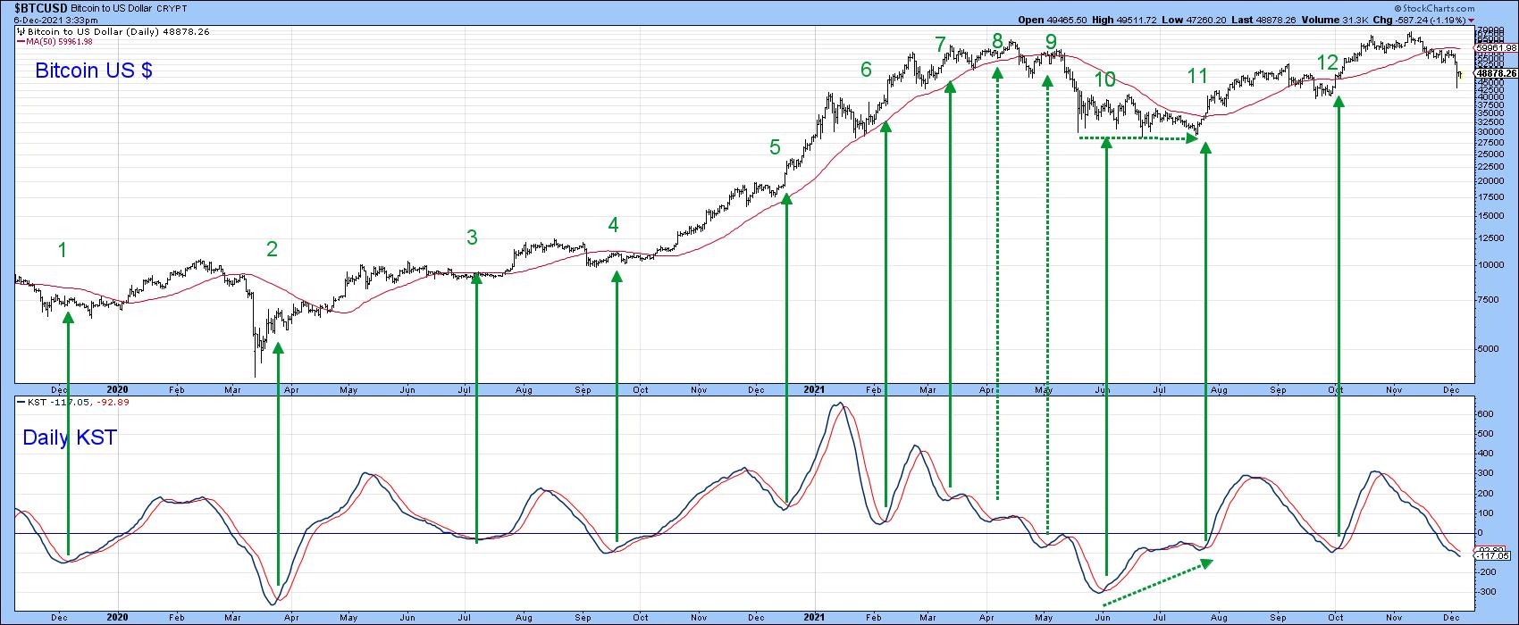
Chart 8 indicates that the price has generally responded well to daily KST buy signals. Currently, it's in a bearish mode under its 10-day MA, but is moderately oversold. If it does turn to the upside, given its recent track record, Bitcoin itself is likely do the same.
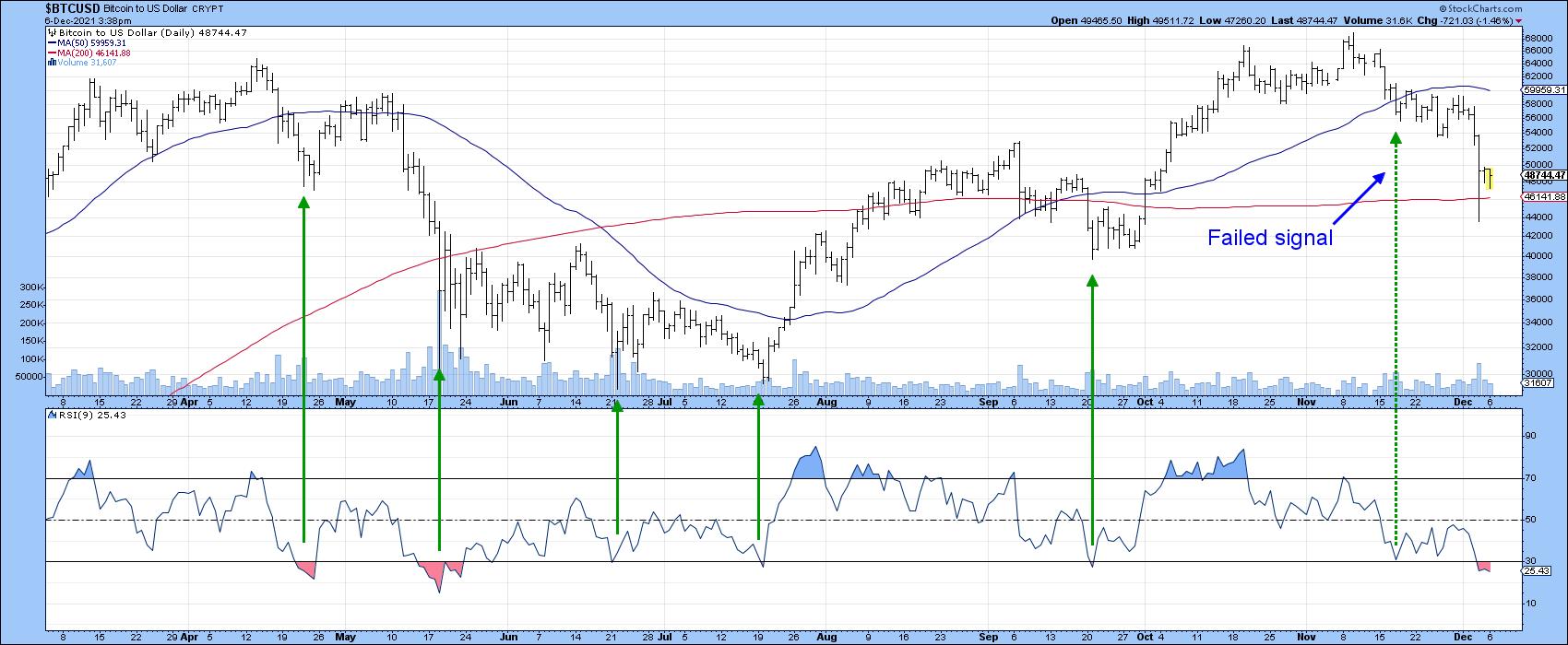
Some hope in this direction is being offered by Chart 9, which indicates that an oversold RSI has typically been followed by a nice rally. If it fails to do so in this case, that would be one sign of a bear market characteristic, especially as it would be the second failed signal in a row.
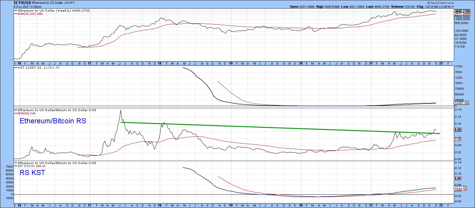
Finally, whatever Bitcoin does, Ethereum is likely to do better, since Chart 10 points out that its relative strength line against Bitcoin has broken out from a giant consolidation pattern. The RS long-term KST is also rising.
Conclusion
Bitcoin is starting to lose some of its long-term relative strength and momentum mojo, which could be an initial warning shot of potential trouble. That said, trend trumps everything and at this point there are few signs of a major reversal.
Good luck and good charting,
Martin J. Pring
The views expressed in this article are those of the author and do not necessarily reflect the position or opinion of Pring Turner Capital Groupof Walnut Creek or its affiliates.


