Three Charts That Suggests This Rally Has Legs.... For the Time Being
A lot of indicators, such as the percentage of NYSE stocks above their 200-day MA and the NYSE bullish percentage, remain in confirmed downtrends that will take time to reverse. However, some of the shorter-term charts that have proved reliable in the past have just begun to offer some bullish vibes.
Three Bullish Charts
Chart 1 features my Bottom Fisher, an indicator that tries to smell out short-term lows. You can read about it here, but, to make it brief, it monitors a universe of Dow stocks whose daily KST bottoms out from a position below zero. This indicator only picks bottoms and is not intended to identify peaks. The arrows flag periods when it reverses to the upside from a position at or below the solid green horizontal line. Earlier in the week, it generated another signal and is now officially bullish.
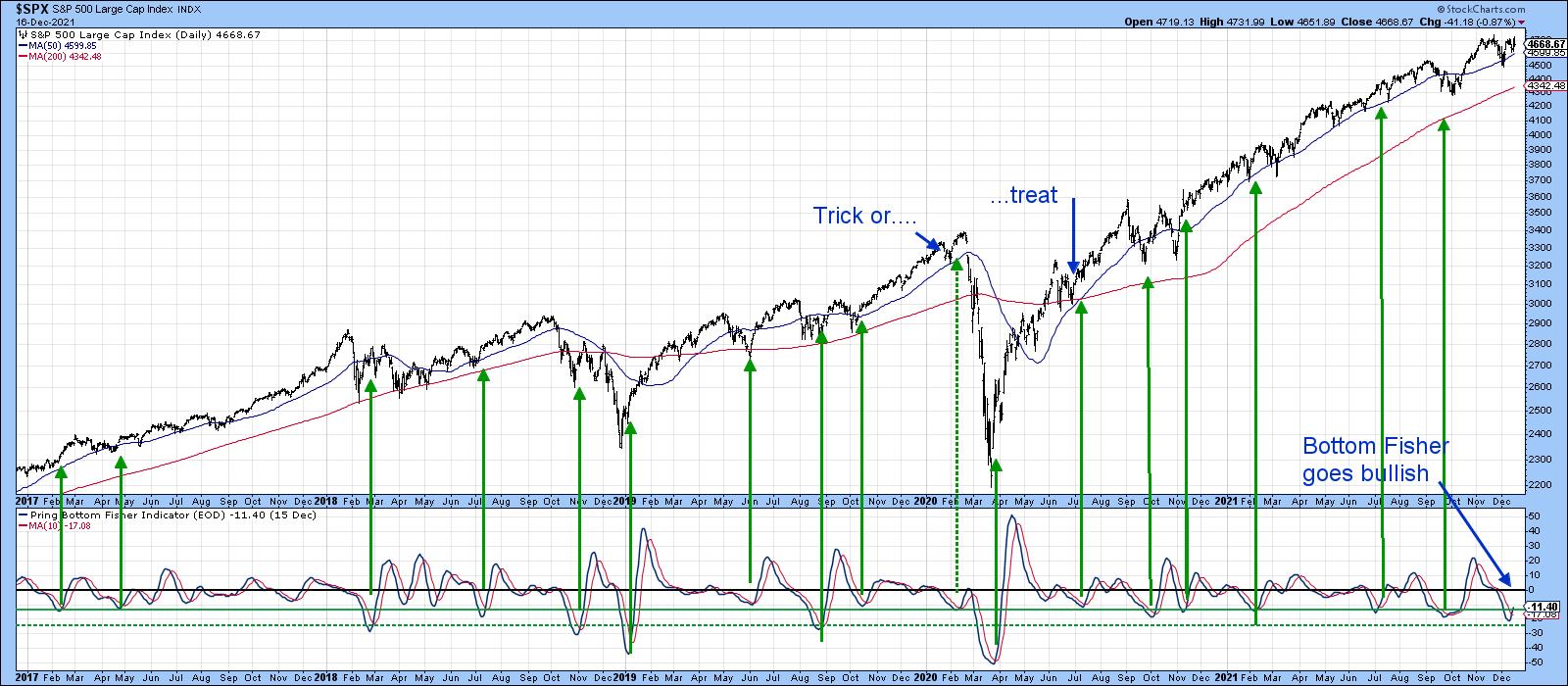
Chart 2 compares the S&P to the CBOE Total Put/call ratio, or, rather, its daily KST. Buy signals are generated when pessimism amongst traders drives the KST above the blue horizontal line, which subsequently reverses to the downside. The reversal indicates a change in sentiment that is usually associated with a bottom of some kind. The dashed arrows flag peaks that develop above the blue line but below the green-dashed one. The solid lines reflect reversals from above the dashed line.
The indicator is higher than it's been in the post-March 2020 period and has ever-so-slightly begun to tip to the downside. Whilst we really need to wait for a more decisive reversal, the overstretched nature of the current reading suggests that the pessimistic elastic has pretty-well run its course.
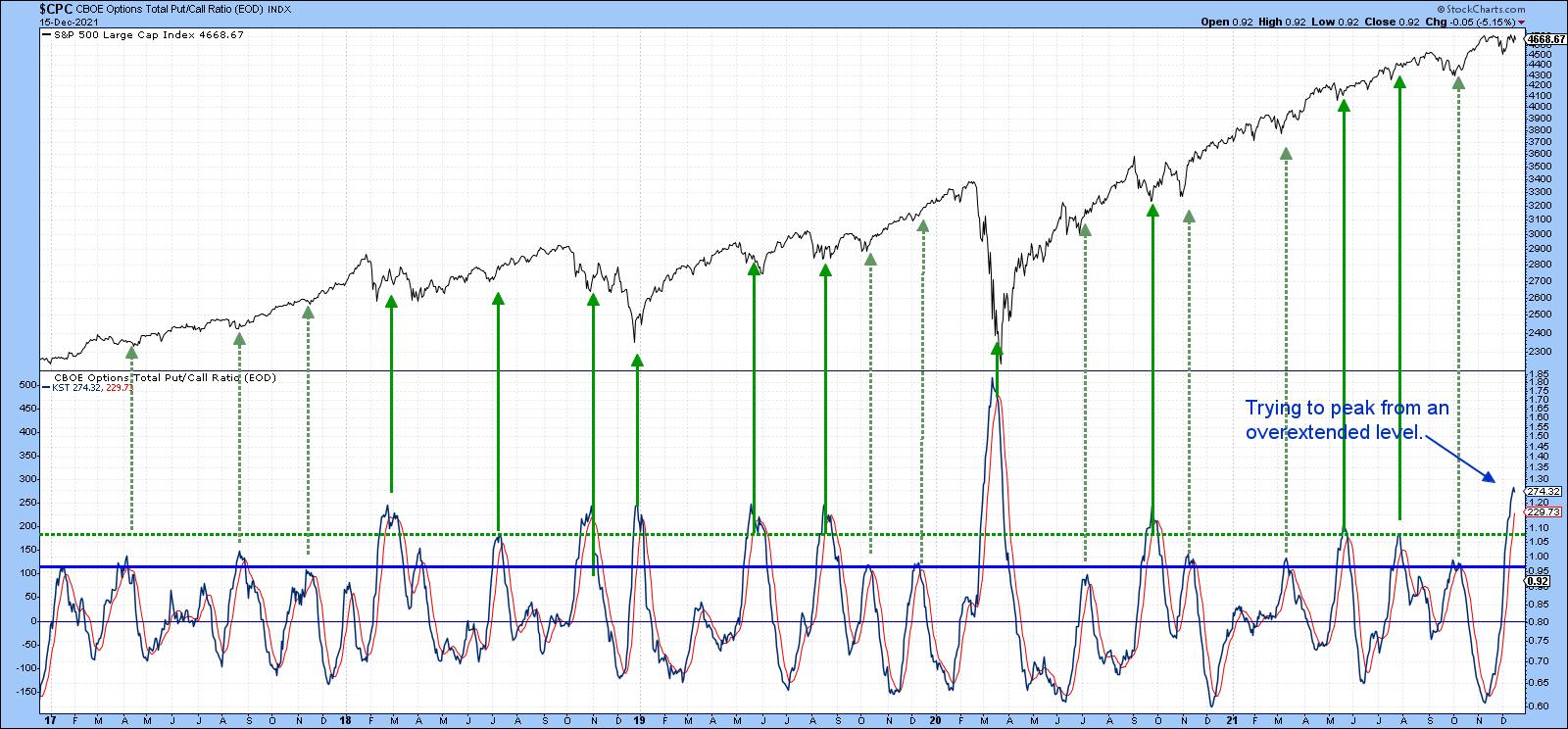
Chart 3 also features a daily KST, but this time it reflects momentum for the VIX. In this instance, buy signals are generated when the fear level, indicated by the KST, reaches an extreme and then starts to reverse. Such periods are again identified with the green arrows, with pretty consistent results. This week has seen the generation of the sixth signal since 2016.

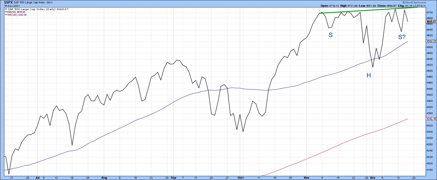
S&P Ready to Confirm?
If the bullish tone being suggested by these indicators is valid, I would expect to see it being reflected very soon, with a decisive breakout by the S&P above the green neckline of the potential inverse head-and-shoulders featured in Chart 4. That would indicate that the market had begun to respond to the constructive internals contained in the first three charts. Failure not to do so would be a worrying sign.
Longer-Term Aspects
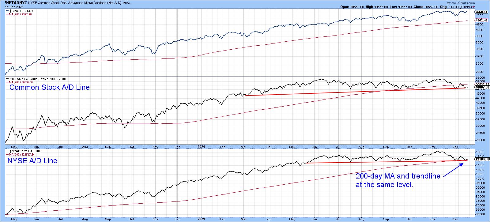
It's important to bear in mind that these indicators are short-term in nature and, in and of themselves, are only likely to have an effect between 2-4 weeks. That's why it is also important to monitor Chart 5, which shows that both the NYSE common stock and regular A/D Lines have recently been lagging the S&P itself. Despite this week's bounce, they are both closer to breaking down than up. These things can always be cleared up, of course, but if the S&P breaks to new highs, it makes sense to see whether these two indicators participate. On the other hand, there is a lot of support for the regular A/D line at the trendline and 200-day MA. If that were to give way to any great degree, it would likely signal a high degree of vulnerability going into 2022, especially as that would suggest that our three indicators had not responded in their usual positive manner.
Good luck and good charting,
Martin J. Pring
The views expressed in this article are those of the author and do not necessarily reflect the position or opinion of Pring Turner Capital Groupof Walnut Creek or its affiliates.


