Gold: Either in a Hard Place or a Sweet Spot
The long-term technical position of gold is extremely finely balanced and could easily tip into a full-fledged bear market, or start a new secular up leg to the bull trend that began in the opening years of this century.
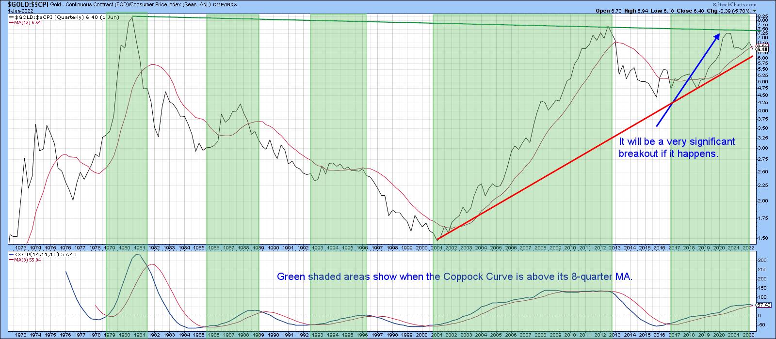
Chart 1 really says it all. First, it expresses gold adjusted by the CPI, so we can easily see whether the yellow metal is acting as a hedge against inflation. Second, the price is trading just below its 12-quarter moving average. That's not an official print, though, because the end of the quarter does not occur until the close of June trading. We still have some way to go. Third, the Coppock Curve, in the bottom window, is just about to cross below its MA. The green shading shows that previous periods when it has been trading above its 8-quarter MA have generally been bullish. A double negative crossover by the price and momentum would imply a bear market, previous examples of which can be observed from the unshaded areas on the chart. Finally, if a sell signal is avoided and gold rallies above the green resistance trendline, it will have experienced a massive upside breakout, with substantial upside potential. Don't forget that's a 40-year resistance trendline. Since gold has a habit of anticipating inflation or disinflation, the eventual outcome will have significant implications for both.
Gold vs. Commodities
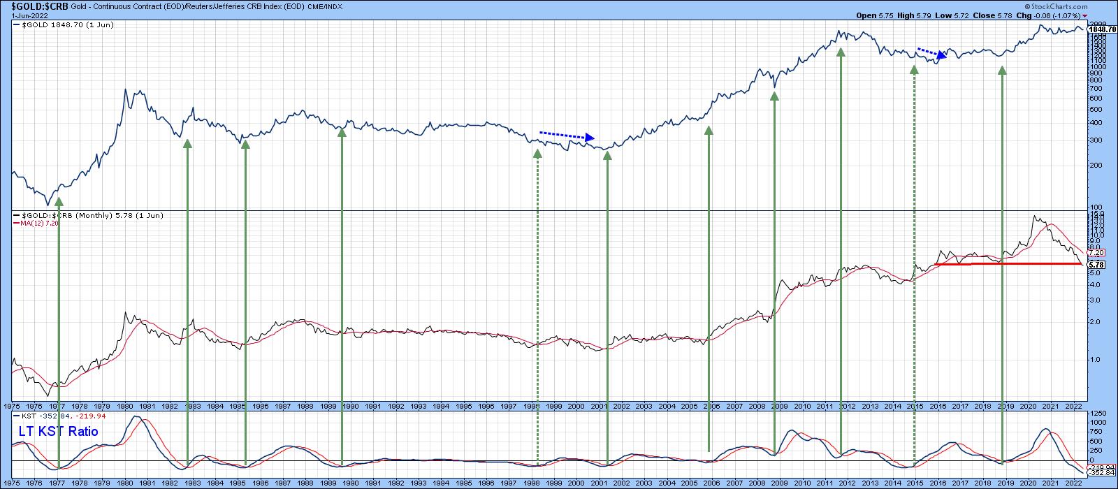
Chart 2 tells us that gold has a habit of anticipating commodity price moves. The center window compares its price to the CRB Composite. A rising relationship means that gold is outperforming commodities, and vice versa. It seems that, when gold is doing better than the CRB, the price of the yellow metal itself moves up, as it is discounting higher commodity prices. When that discounting process has run its course and the yellow metal begins to underperform commodities, gold itself declines. The ratio has been declining since the summer of 2020 and has now reached support in the form of the red trendline. The green arrows approximate the points when the KST of this relationship crosses above its MA. Usually, such action is followed by a gold rally. At the moment, the KST is declining. However, it has reached its most oversold reading in the history covered by the chart, so a reversal could take place at any time. Until it does, this relationship remains a bearish factor.
Gold Speculators vs Gold Hedgers
One characteristic of a healthy gold bull market is when it can rely on support from gold shares. That's because the shares tend to discount the average future price, as opposed to the price itself. As a result, gold shares often lead the metal when prices for both are in a bull market. That said, there are differences in the performance of gold miners that hedge all or part of their profits in the futures market and those that do not. Companies that do not generally outperform hedgers during a gold bull market because they are naturally more leveraged on a rising price.
It's possible to pick up that differential in a limited way by comparing the Gold Bugs Index ($HUI) (non-hedgers) with the Vectors Gold Miners Fund (GDX). This relationship is shown in the center panel of Chart 3. Using the benefit of hindsight, the shaded areas represent periods when the ratio was rising. Note that the price of the Gold Trust Gold Fund (GLD) has a consistent habit of rising sharply under such conditions. The trend of that relationship is currently negative, but you can see that its long-term KST, in the bottom window, has gone completely flat, a possible sweet spot for gold itself.
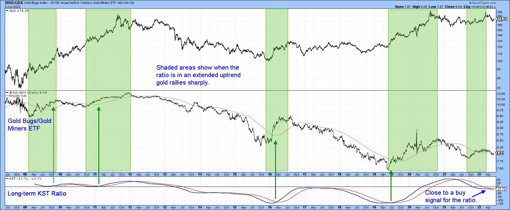
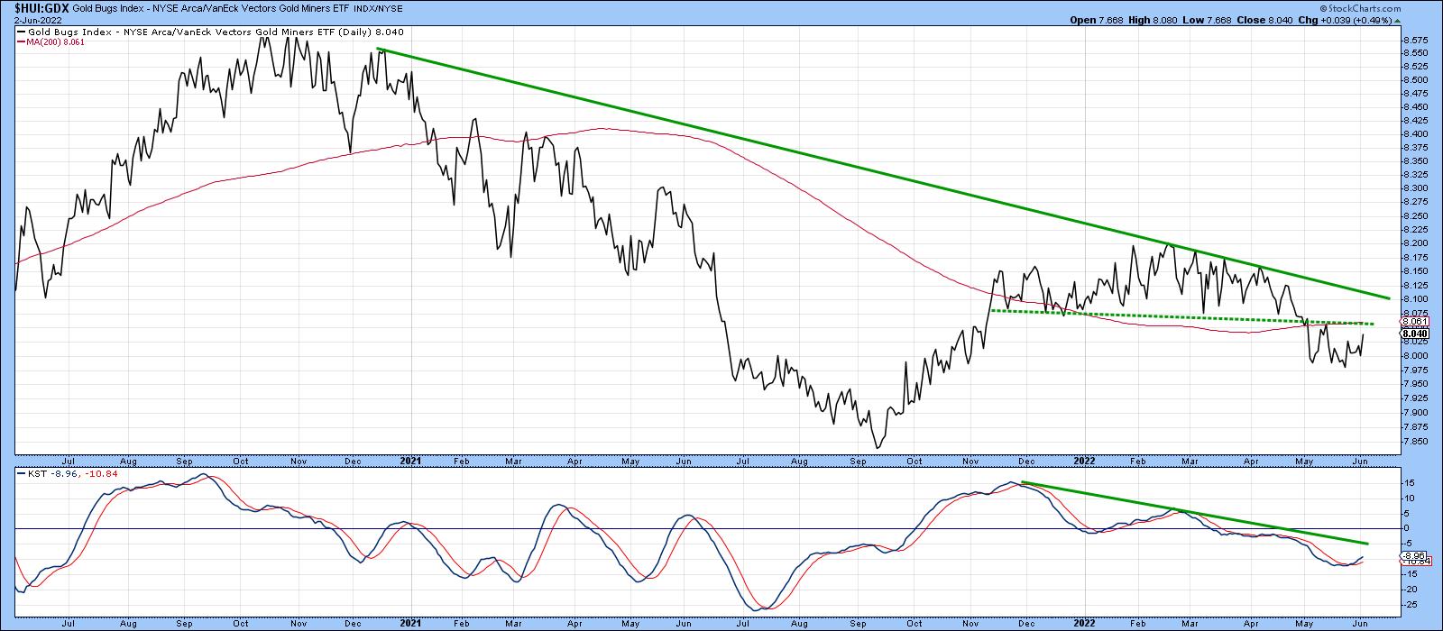
Chart 4 takes us on a deeper dive, where we can see that the short-term KST for this relationship has just gone bullish. The ratio itself is trying to form a base, the completion of which would result in a positive 200-day MA crossover.
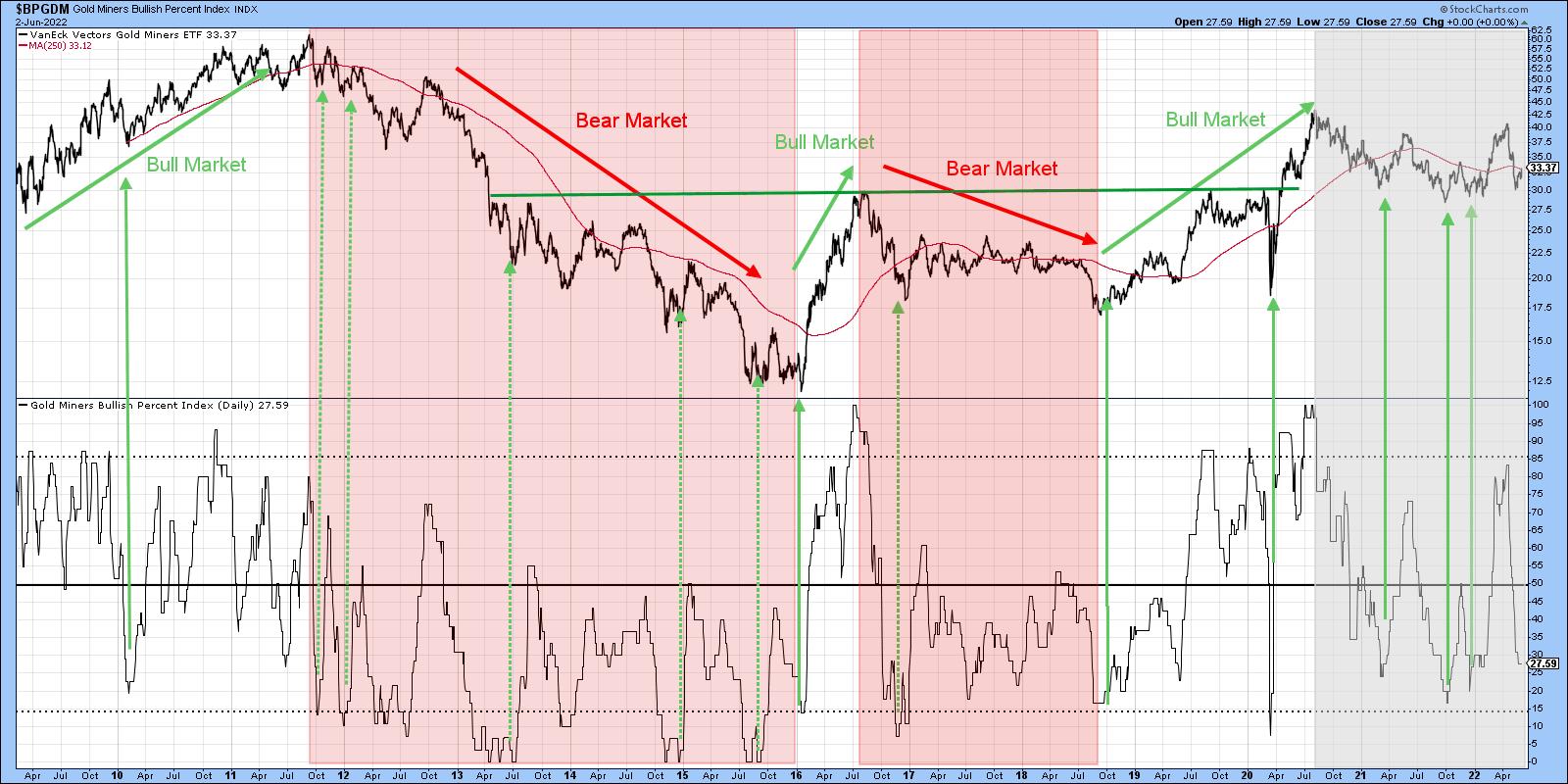
Gold Miners Bullish Percentage is Oversold
Based on the perspective of hindsight, the pink-shaded and white (unshaded) areas in Chart 5 flag bullish and bearish markets. Note how the price is so much more sensitive to oversold conditions in a bull market, often failing to reach the actual 15% level. By the same token, the pink-shaded bear markets fail to experience a truly overbought condition at 85%.
The period since the end of 2020 is shaded in gray since it truly is a gray area, having touched both 15% and 85%. The oscillator is still in a declining mode but, if this is a bull market, it is at the kind of level where we might expect to see a quick turnaround.
Gold and Gold Shares KSTs Start to Turn Up
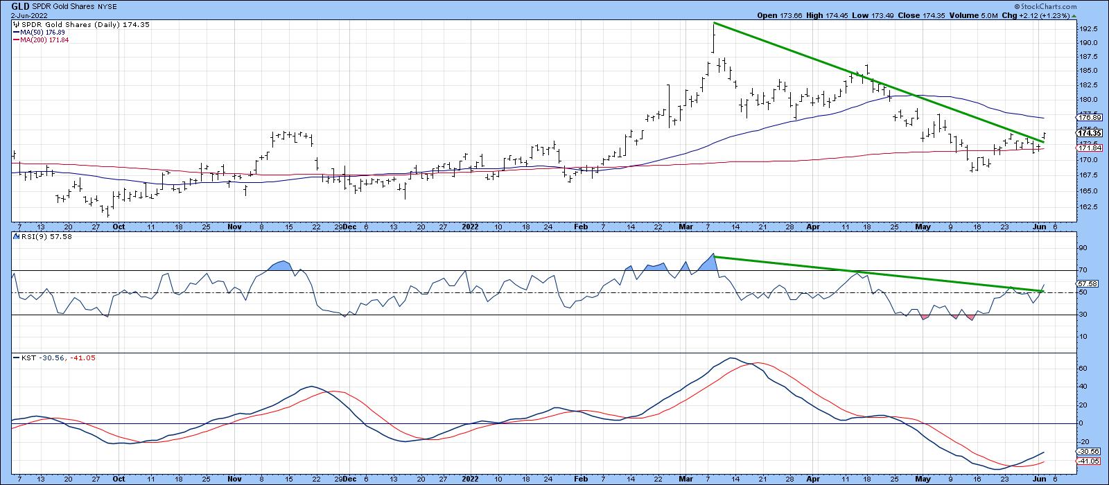
Finally, Charts 6 and 7 show that both the metal and shares have experienced some short-term upside breakouts. In terms of the metal, they take the form of the April/June down trendline for both the price and the 9-day RSI, as well as a positive 200-day MA crossover and short-term KST buy signal.
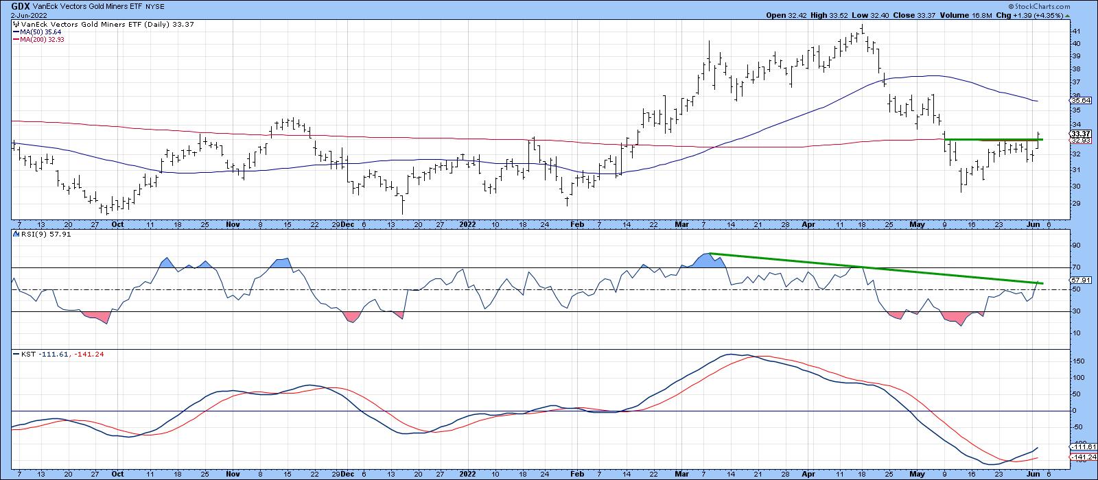
In the case of the GDX, a small base has been completed and a positive 200-day MA crossover achieved. The KST is bullish, but the RSI has not quite cleared its down trendline.
Conclusion
The next few weeks will probably decide whether the gold price is in a hard place or a sweet spot. The distinction is super important, not just for the price of the yellow metal, but for the long-term outlook for inflation or disinflation.
Good luck and good charting,
Martin J. Pring
The views expressed in this article are those of the author and do not necessarily reflect the position or opinion of Pring Turner Capital Groupof Walnut Creek or its affiliates.


