Credit Spreads May be the Canary in the Financial Mine
Waterfall declines leading to capitulation are easy to observe and understand when we have the benefit of hindsight. However, they are almost impossible to identify ahead of time.
One characteristic often associated with such uncomfortable price moves is an unexpected weakening of economic activity, where confidence literally falls off a cliff. Very few individuals have the ability to anticipate these moves ahead of time, simply because they are so unexpected. It's certainly well above my pay grade! That said, bond investors, when taken as a group, have a great track record in nailing such liquidations. That tends to happen when they begin to lose their thirst for high yielding risky instruments, replacing it with a rush to quality in the form of lower-yielding, but far less risky, treasury paper.
The reason I bring this up is because several credit spread relationships have either begun to deteriorate or look as though they may be on the verge of doing so. Chart 1, for instance, features the ratio between the Fidelity Capital and Income and the Vanguard Treasury funds (_FAGIX/_VUSTX). The former is essentially a high-yield bond fund, the latter a purely government vehicle. Note the underscore sign before the two symbols, which excludes dividends, thereby limiting the comparison to price.
A rising ratio reflects improving confidence; a declining one reflects a growing risk of defaults emanating from a weakening economy. Normally, this relationship moves ahead of the equity market at market peaks. Consequently, its March/May rally in the face of a declining S&P Composite looked, at the time, to be a favorable factor. Now, though, it has broken to the downside and has violated its 2020-2022 up trendline. That's not a good sign.

Chart 2, using the benefit of hindsight, takes this a step further by shading the periods when the ratio was in an extended rising trend. Note that equities were almost invariably positive during those periods. Unshaded ones were not always negative, but equities are certainly at their most vulnerable when confidence is in a declining trend. The chart also shows the trendline violation originally featured in Chart 1. Using the benefit of a long-term perspective though, it is also apparent that this break confirmed a false multi-year upside breakout. False breakouts are usually followed by above-average moves in the opposite direction to the breakout, as traders and investors scramble to get on the right side of an unexpectedly weak market.
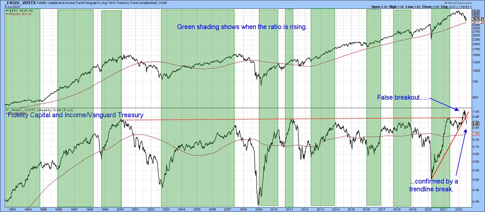
Chart 3 features another credit spread by comparing the iBoxx High Yield to the iShares 7-10-year Treasury Fund _HYG/_IEF). This relationship also experienced a whipsaw signal. In this instance, it took the form of a temporary break above its secular down trendline, dating from 2007.
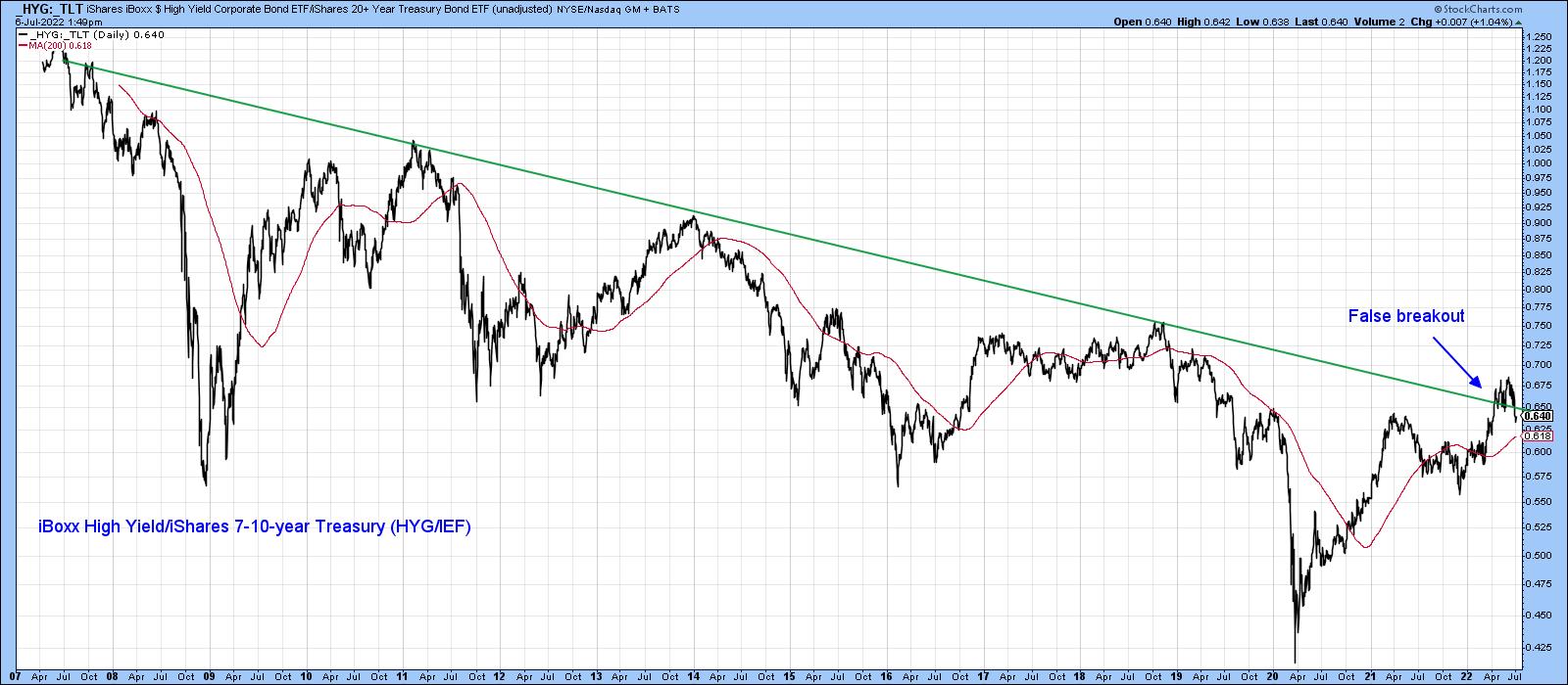
Chart 4 indicates that this false move was confirmed by the ratio completing a head-and-shoulders top. Its Special Kindicator is poised to do the same thing.
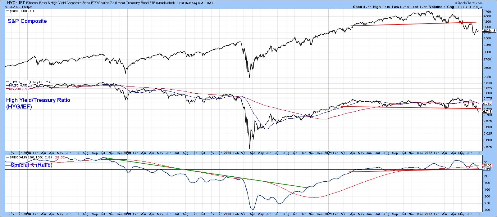
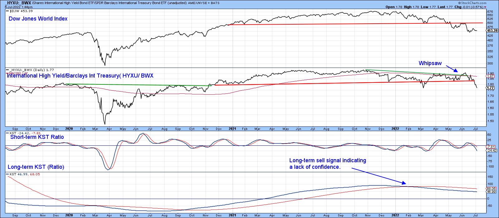
Chart 5 considers this deterioration in credit spreads as a world-wide phenomenon. It compares the price of the iShares International High Yield to the SPDR International Treasury Bond ETF (_HYXU/_BWX). This global confidence relationship has also completed a top formation and experienced a false upside breakout. The bearish nature of the short- and long-term KSTs suggest that further downside action is likely.
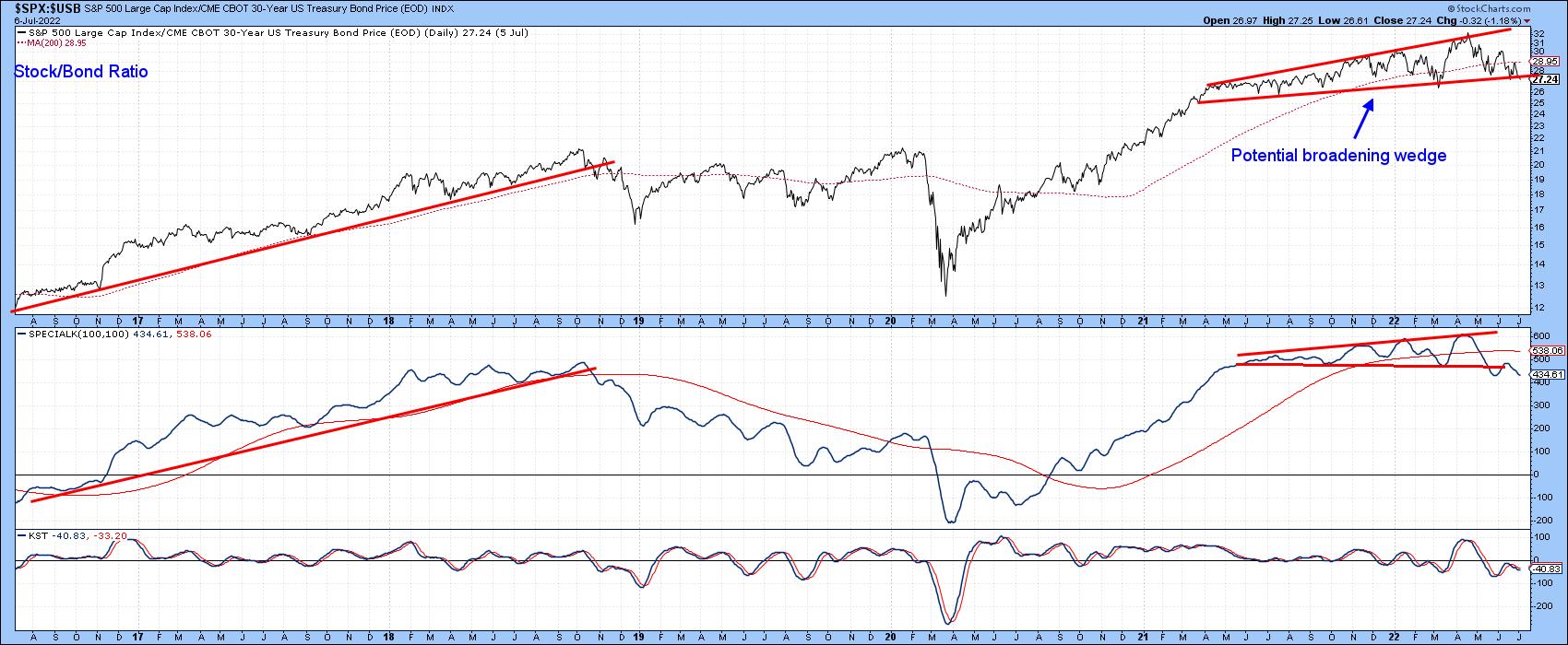
Stock/Bond Ratio at a Critical Juncture
The ratio between stocks and bonds is not exactly a credit spread, but often moves in the opposite direction to stocks themselves. Chart 6 shows it to have been in a trading range for over a year. If a downward penetration of the lower part of the range takes place, the pattern would qualify as a broadening wedge, a formation whose volatility is often the precursor of an above average decline. Note that the Special K has already broken down from a top and crossed below its signal line.
One might also call the pattern an upward-sloping head-and-shoulders top. The name does not really matter, because it represents a battle between buyers and sellers. If it breaks to the downside, sellers gain the upper hand.
As I pointed out at the beginning of this piece, there is no consistent way in which waterfall decline can be predicted. That said, it's worth monitoring these credit spreads, because they are in the kind of technical position where further deterioration could warn of some serious trouble ahead.
Good luck and good charting,
Martin J. Pring
The views expressed in this article are those of the author and do not necessarily reflect the position or opinion of Pring Turner Capital Groupof Walnut Creek or its affiliates.