Will the Bond Market Surprise Us?
In late April, I wrote that bond yields had run into resistance and a pause in the on-going uptrend was likely. Yields on longer-dated maturities initially moved slightly higher, but are now at approximately the same level as that April article. However, more corrective activity appears likely, as commodities (e.g. the energy sector) have since retreated.
Commodity price inflation is usually the sworn enemy of bond prices. Part of the reason for commodity weakness lies in a slowdown in the growth rate of the economy. If that weakness morphs into a recession, you can be sure that yields on longer=dated maturities will tumble. However, with the R word on everyone's lips and a resilient labor market, a business contraction is no slam dunk for the immediate future.
The Longer-Term Picture
Chart 1 sets the scene for the longer-term picture for the 10-year yield. It opens with some pink shading, reflecting the fact that secular or very long-term reversals since the mid-nineteenth century have been characterized with an extensive trading range. If 2020 marks the low point of the secular bear that began in 1981, it would be reasonable to expect more basing action in the current situation, as flagged by the blue shading. If so, a likely candidate for the upper part of the range would be the green resistance zone, where the three previous highs reside.
The violation of the green down trendline and positive 96-month MA already argue for a secular reversal. Further evidence comes from the swing in the 18-month ROC from a record low to a record high. That kind of action, by definition, is extremely rare and indicates a change in sentiment consistent with a change in the secular trend. However, the record high still represents an overbought situation, where the odds favor some form of corrective activity. In that respect, support certainly lies at the 96-month MA, around 2%. That's not a forecast, but would not be an unreasonable expectation.

Near-Term Possibilities
My Bond Net New High Indicator (!PRNNHBND) monitors the number of Net New Highs registered over a 40-period time span. It is derived from a basket of bond ETFs, both US and international. For instance, daily charts would calculate the indicator based on a 40-day time span, hourly by hours, weekly by weeks and so forth. Since the raw series is quite jagged, it has been smoothed with a 40-period moving average. In this instance, it has been plotted using daily parameters.
The indicator has reached an oversold condition three times since 2012. Each was followed by a base building period and rally. The fact that it has fallen to a record oversold level offers two possibilities. The first is that this is a sign of weakness not seen in 10 years of trading under the context of a secular bull market. As such, it offers one piece of evidence that the secular trend has reversed. Second, some form of rally is likely to follow the indicator's upside reversal.
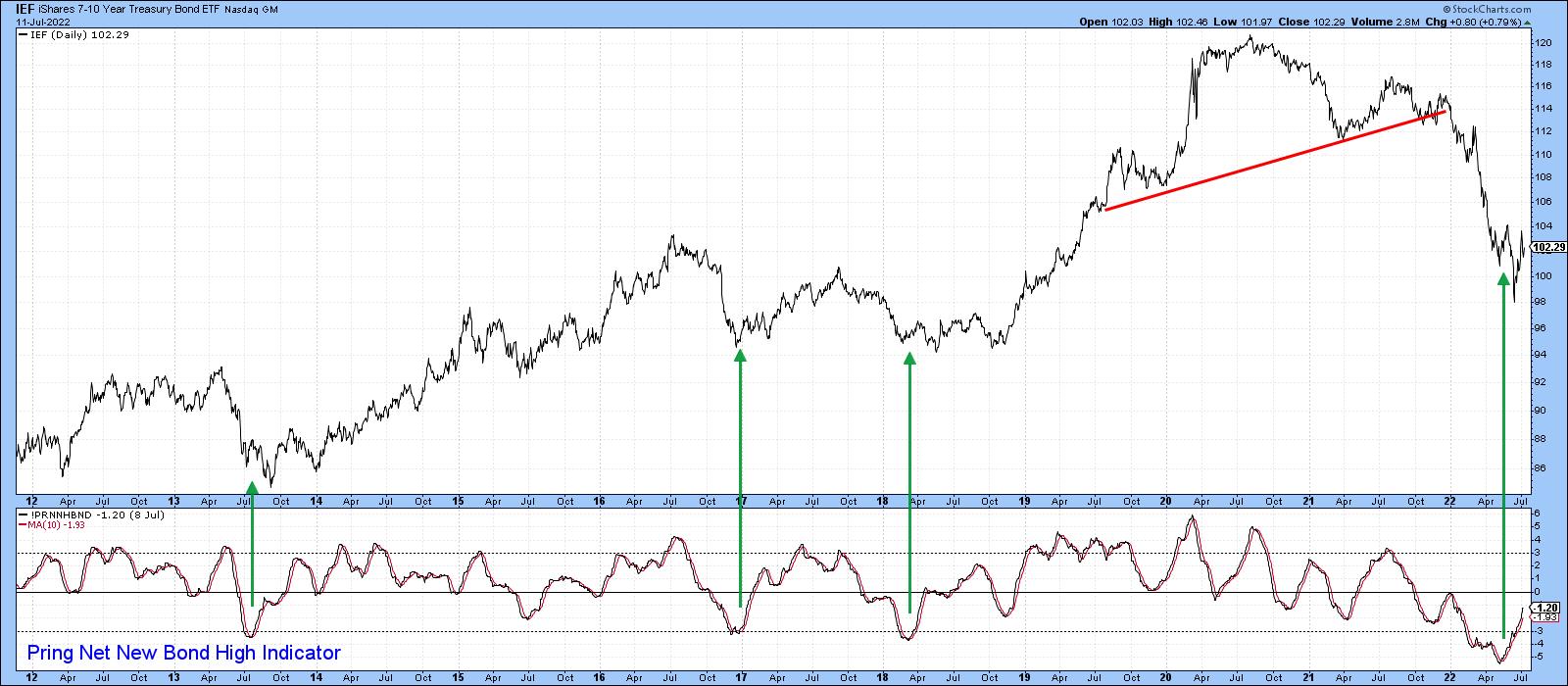
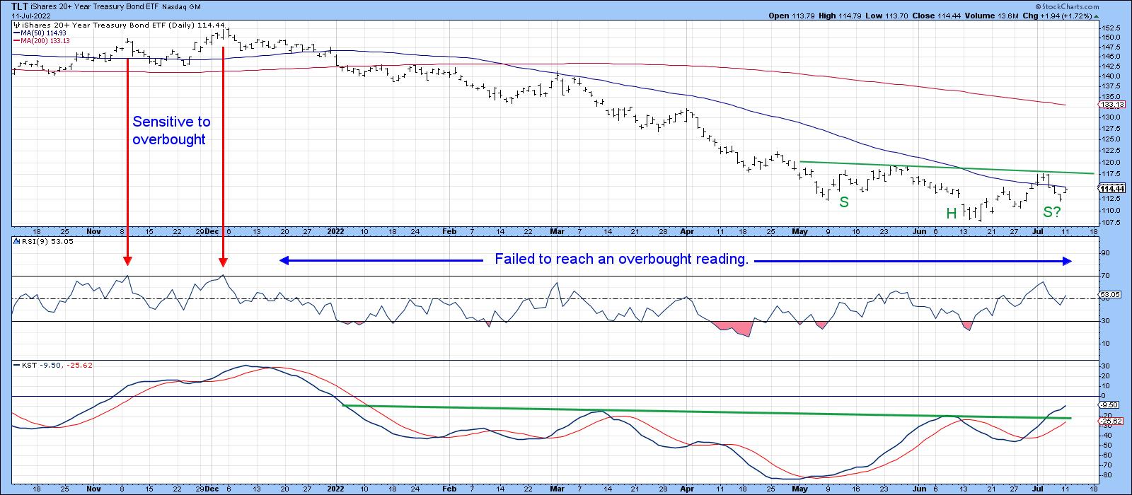
Chart 3 shows that a break above the green trendline, at around $118, would complete an inverse head-and-shoulders pattern. The rising short-term KST offers support for this possibility. This momentum indicator has also completed a reverse head-and-shoulders, which is another positive.
That said, the 9-day RSI has exhibited bear market characteristics throughout the history of the chart. They include extreme sensitivity to an overbought condition, as flagged by the two red arrows. Equally important, the RSI has failed to reach that level since early December of last year. Finally, multiple oversold conditions have been unable to trigger a meaningful rally. That can all change, of course, but, as of this moment, RSI action is typical of a primary bear market.
I don't get into hourly charts very often. Sometimes, though, they can be quite revealing. Our fourth offering compares the iShares 7-10-year Trust to a Special K (SPK) indicator, which you can read about here. Normally, it is calculated from daily data by combining the short-, intermediate- and long-term KSTs into one series. The resulting indicator is used to help identify primary trend reversals. The SPK in Chart 4, though, is constructed from hourly data as it tries to monitor intermediate reversals and, occasionally, very small primary trends.
The potential reverse head and shoulders also shows up in this maturity, but what is intriguing is the fact that the SPK recently violated its down trendline, moved above its signal line and started to trace out a series of rising peaks and troughs. The next challenge is to break above the 600-hour MA and potential neckline at $104.
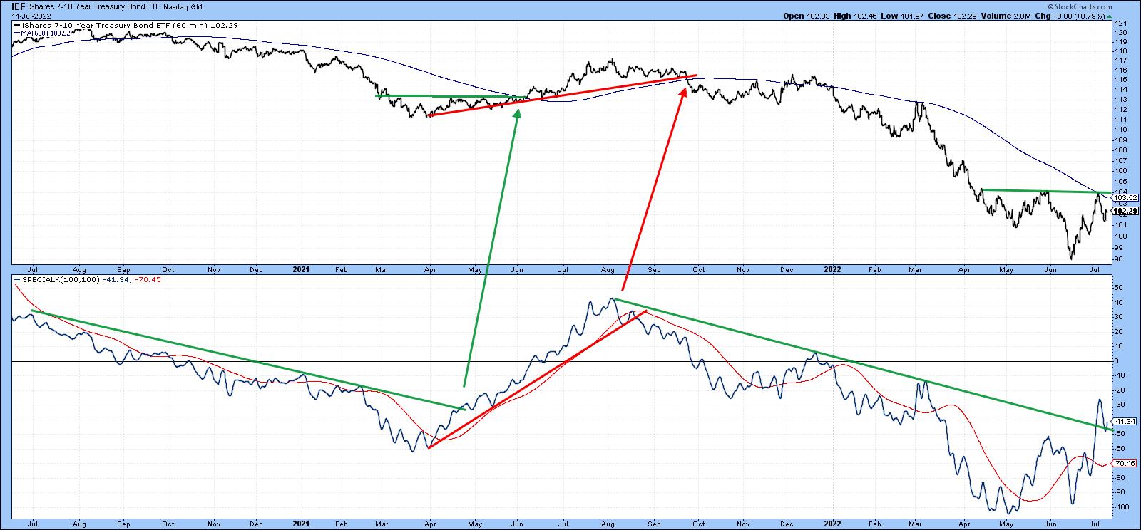
Since bonds are in a confirmed bear market, it will be of paramount importance to make sure that any break above those potential necklines for the IEF and TLT hold. That's because bear markets are notorious for their deceptive contra trend breakouts. Failed inverse head-and-shoulders are often followed by above-average moves on the downside. We will know this in the event that the breakouts materialize and prices are unable to hold above those inverse right shoulders.
Good luck and good charting,
Martin J. Pring
The views expressed in this article are those of the author and do not necessarily reflect the position or opinion of Pring Turner Capital Groupof Walnut Creek or its affiliates.


