Dollar Bull Market Due for an Intermediate Correction, But It's Not an Easy Call
It's a Primary Bull Market for the Dollar
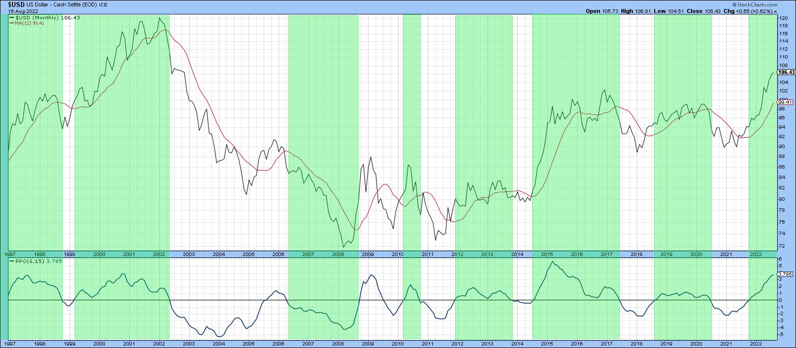
Chart 1 shows that the US Dollar Index is very much in a primary bull market, having violated a (dashed) secular down trendline a few months ago and, more recently, completed a 7-year rectangle formation. The green-shaded areas identify those periods when the long-term KST has been in a rising trend and the Index itself trading above its 12-month MA. This momentum indicator is moderately overbought, but leaves room for further upside before it reaches an extreme overstretched reading marking the top of the rally, as it did in 1998, 2001 and 2015.

Another useful approach, which can be applied to many different markets, is to compare a 6-month EMA with its 15-month counterpart. When the 6-month crosses above the 15-month time span, it shows up as a positive zero crossover by the oscillator in the lower window. Positive readings have been highlighted once again with green shading. It's not a perfect approach, but it does capture most of the major advances, the 2004-06 rally being an exception. Right now, the oscillator is rising and a long way from triggering a sell signal. Steady as she goes.
Euro and Yen
Chart 3 features a long-term chart for the euro. This currency has a 57% weighting in the Dollar Index, so it's not surprising that it is a bit of a mirror image.
The euro has experienced two major breakdowns this century. First, we see one at AB in 2014; another one happened more recently at CD, around the turn of the year. Interestingly, those patterns call for a similar downside objective of between .975 and .95, basis month-end close. That's not so far from a recent 1.01 and change, but remember, in technical folklore, it is interpreted as a minimum ultimate objective, so it could go much further.
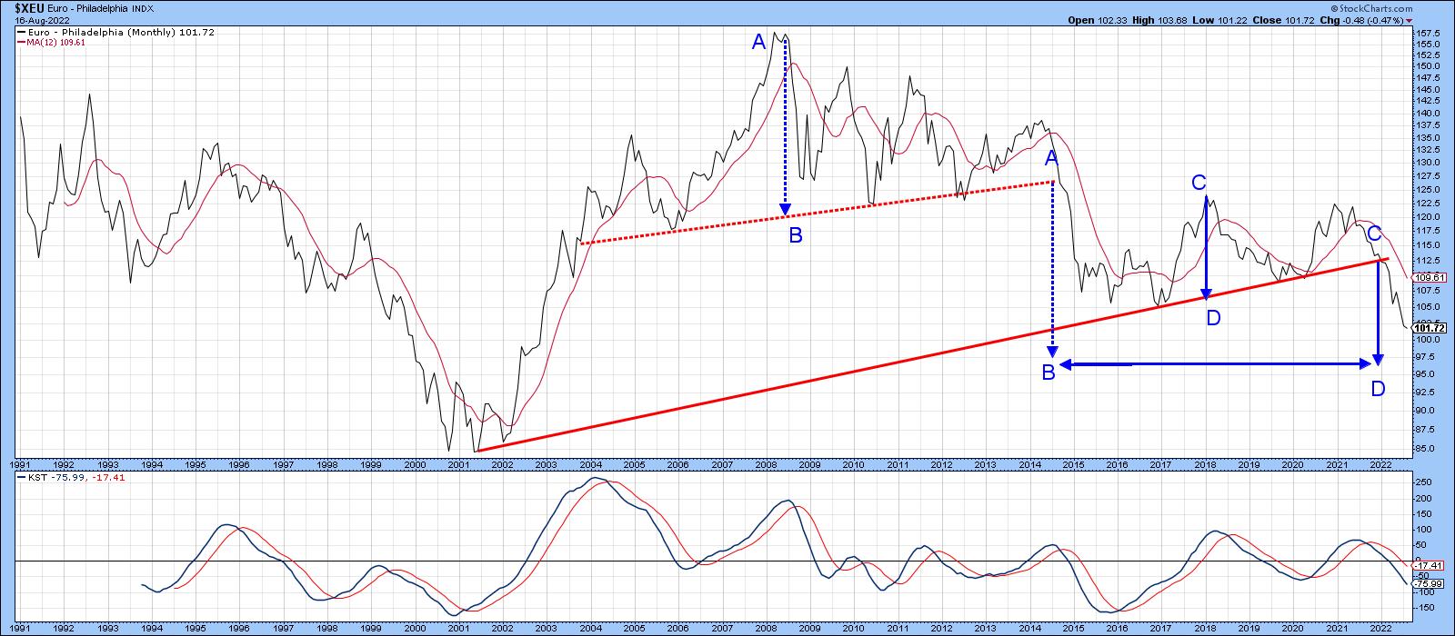
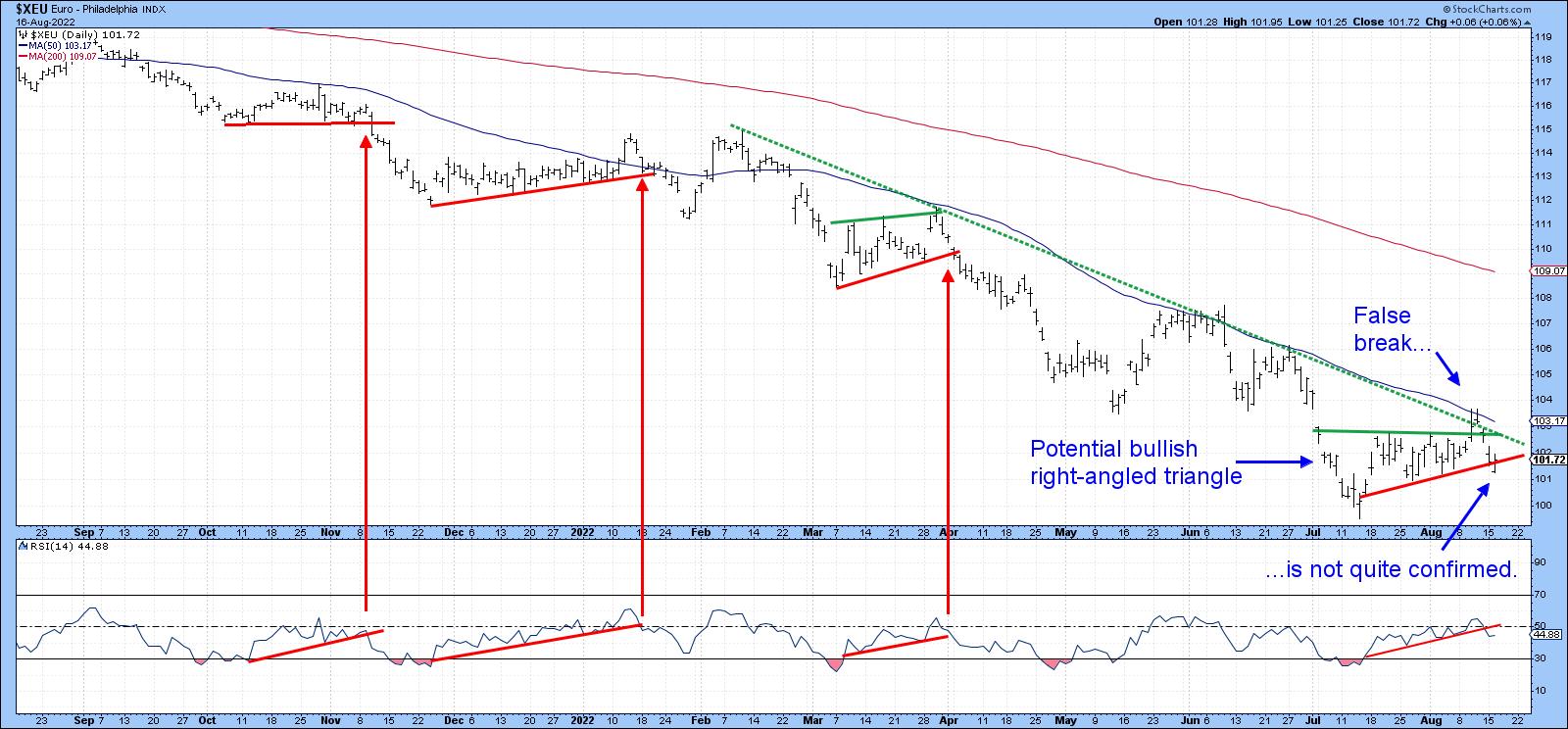
The euro is clearly oversold on an intermediate basis and, certainly, an intermediate counter-cyclical move would not be unexpected; it's been trying to achieve that goal since its widely-publicized drop to par in mid-July. However, the situation has become quite tricky, since the currency managed to break above its 2022 dashed down trendline and the top of a bullish right-angled triangle. Unfortunately, it could not hold the breakout, which is a problem.
Before concluding without a reasonable doubt that a false break has actually taken place, it's usually a good idea to wait for some confirmation. We got that on an intraday basis on Tuesday. However, by the end of the session, the price had clawed its way back to the red confirmation line, leaving some doubt. One event that tips the expectations to a downside break comes from the RSI. That's because it has violated an up trendline in a similar way to three previous similar setups indicated in Chart 4.
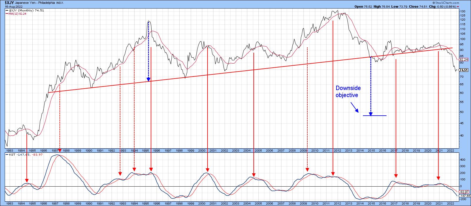
The yen, in Chart 5, looks to have an even bleaker prospect in view of its 2022 multi-decade trendline violation. The downside objective in the 50-area may look to be unrealistic, but it was trading at even lower prices in the 1990s. Moreover, if this level is touched again, it is not likely to happen soon, as the yen is likely to zigzag lower in the opposite way to its progress between 1998 and 2012.
The Dollar Index Intermediate Trend
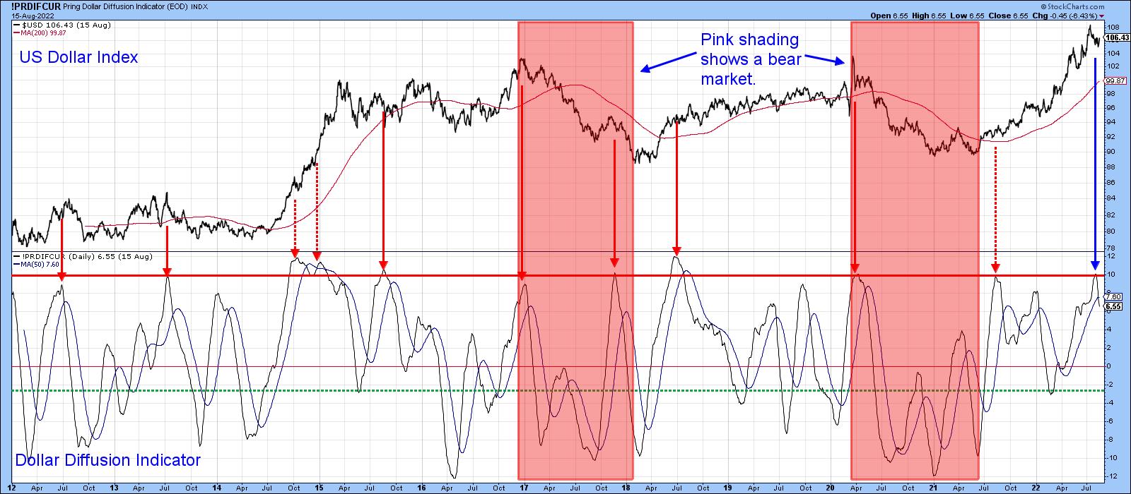
Chart 6 features my Dollar Diffusion indicator. This one monitors a universe of cross dollar rates that are in a positive trend. The pink shadings use the benefit of hindsight to identify the bearish environments. Red arrows indicate when the oscillator peaks from at or around its overbought zone. Solid arrows reflect valid signals; dashed ones, false negatives. Note that each of the failed signals developed under the context of a bull market and were counter-cyclical in nature. That's what makes the most recent reversal somewhat problematic.
The conclusion from Chart 7 is similar, since the weekly stochastic using the 12,10 10 parameters has also peaked. If our assumption of an ongoing bull market is correct, this latest sell signal is likely to be limited in its downside magnitude.
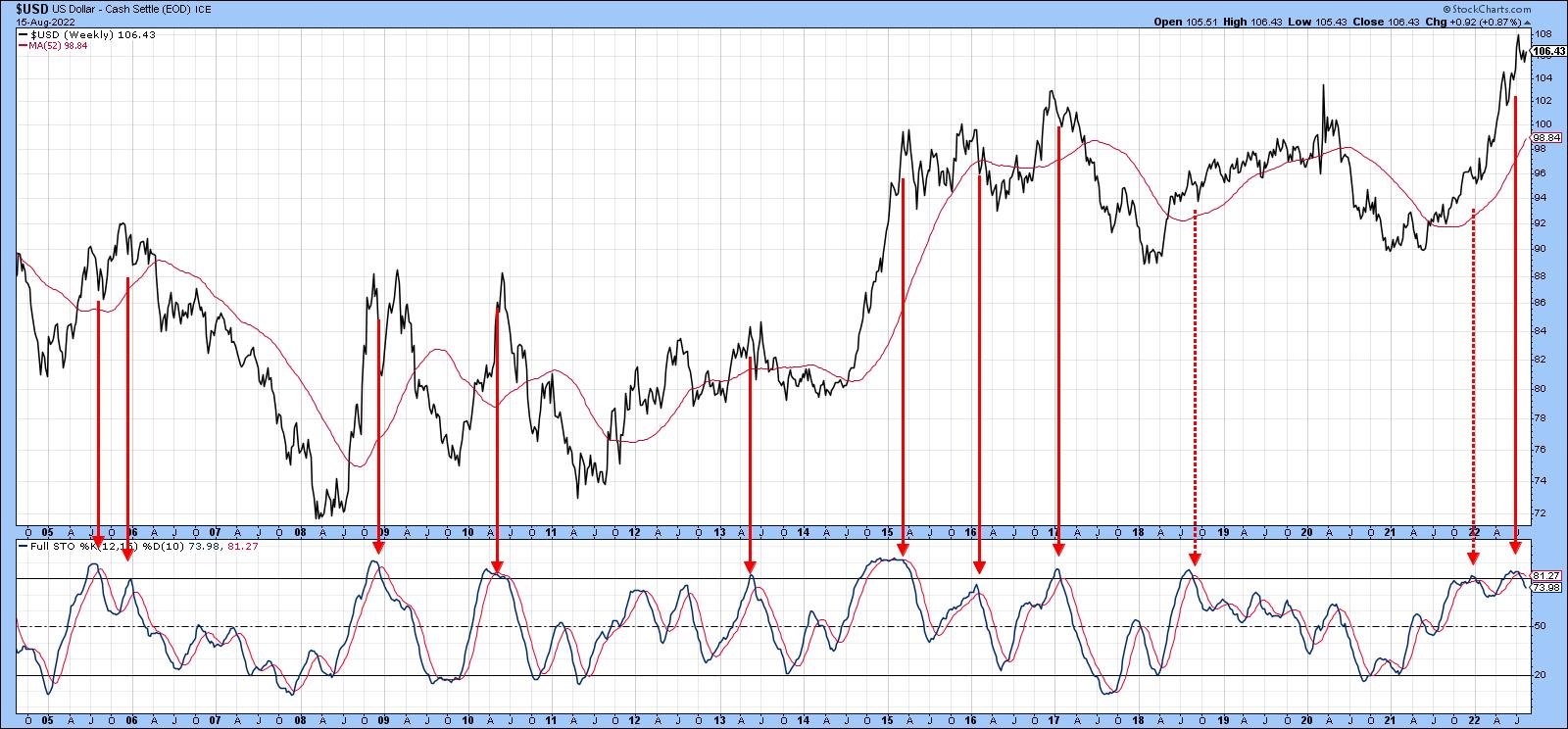
Chart 8 compares the Dollar Index to a ratio between the iShares Aggregate Bond and the SPDR International Bond ETF's (AGG/BWX). Note how closely the ratio tracks the Index. In 2017 and 2020, both series experienced a false breakout above their respective green dashed trendlines. This was followed by a dollar retreat, as flagged by the red dashed arrows. It looks as if another such false breakout began a few days ago.
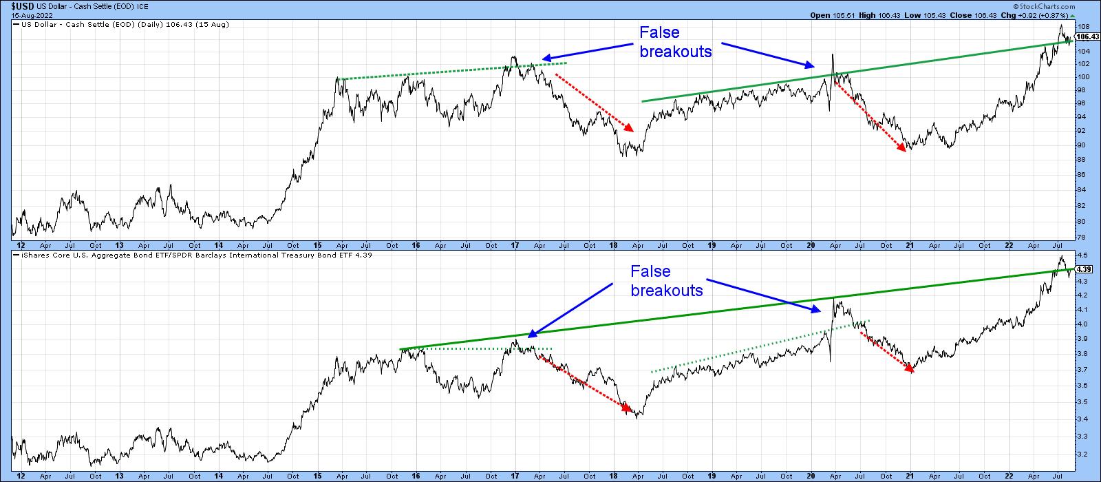
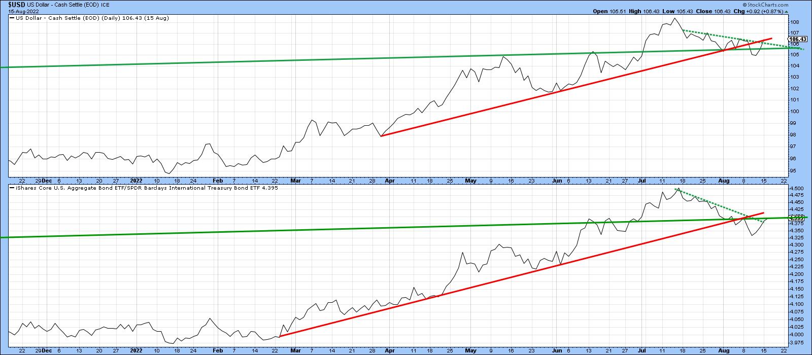
However, the action is far from decisive, so our final chart reproduces the two long-term trendlines from Chart 8, but in greater detail. The chart reveals a very finely balanced technical picture. We see a negative violation of the original solid green up trendline for the Index that did not hold, as well as one for the ratio that (so far) did. A joint break in the red 2022 up trendlines and a possible break above the two July/August dashed green corrective trendlines is also apparent.
False breaks are often followed by above-average price moves, so, if the Dollar Index closes below its recent low of 105, it seems likely that the overbought diffusion and stochastic indicators will result in a negative intermediate outcome. On the other hand, a break above the extended red trendline at 107 would signal that the Index is likely to extend its bull market. Remember, you can update any of these charts by simply clicking on them, and don't forget Chart 4 featuring the euro that's at a pivotal level as well.
Good luck and good charting,
Martin J. Pring
The views expressed in this article are those of the author and do not necessarily reflect the position or opinion of Pring Turner Capital Groupof Walnut Creek or its affiliates.


