The Direction of the Secular Trend Will Determine Whether the June Low Holds
The big daddy of all market trends is the secular or very long-term one, and it's about to have a big influence as to whether the June low will hold, meaning prices are about to reach new all-time highs, or if we are going to return to a 1970s type of environment, dominated by negativity.
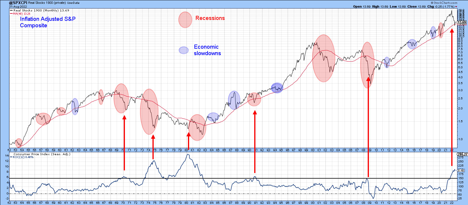
Chart 1 features the S&P Composite adjusted for inflation. The ellipses reflect economic events, which either represent recessions (in pink) or economic slowdowns (in blue). The purpose is to demonstrate first and foremost that the state of the economy has a huge influence on stock prices. Slowdowns and mild recessions result in a temporary blip in an on-going uptrend -- a mini-bear market, if you like. I call these "burglars" because they do relatively little damage to portfolios. On the other hand, deep and prolonged recessions do far more damage to inflation-adjusted prices and are represented by the large ellipses. These are termed "bank robbers", because they do much more serious damage to portfolios, which take years to recover. In all cases of recession-induced bears since the 1950s, the low point for equity prices were seen after the recession in question had begun.
The second point Chart 1 illustrates is that bank robbers develop during secular bear markets. The ups and downs of the secular trend are expressed in the chart through the direction of the PPO, using the 60- and 360-month parameters. This indicator also demonstrates that burglars tend to congregate during periods when the oscillator is in a rising trend, and is regularly followed in my monthly Intermarket Review. Note the four burglars, 2011, 2015, 2018 and 2020, that have transpired since the financial crash of 2008. The $64,000 question is whether the current bear is the fifth in that series or the first bank robber in a new secular downtrend.
Right now, the PPO is in a rising trend, but has begun to roll over. It's also at a very high reading only exceeded once before, when the tech bubble was bursting. If the trend is still up, the recent selloff has created a great buying opportunity, especially as the late August decline has already retraced half the gains from the post-June low. Alternatively, if the secular direction has turned to the downside, and that dangerous-looking rolling over action turns into an actual reversal, the recent 6-month drop will be more likely to morph into a bank robber.

Chart 2 compares the inflation-adjusted S&P to the annualized CPI. It shows that an inflation rate north of 5.5% enhances the risk of a of a bank robber developing. Indeed, every bank robber since the 1950s has been caused by inflation, the exception being the 2000-2002 bubble-bursting bear market. I should also note that the relatively brief 1990 recession had burglar characteristics. At that time, though, the PPO in Chart 1 was positive and only half-way up its secular trajectory. It was not overextended as it is today. You can read more about the secular trend here.
Examining Recent Price Action
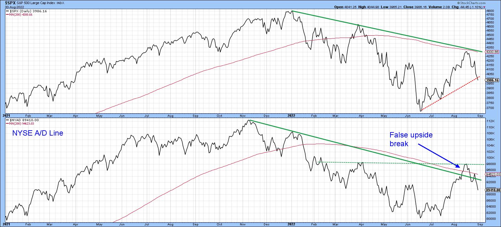
One of the characteristics of a primary bear market is false upside breakouts, as such trends are noticeably deceptive. Chart 3, featuring the S&P and the NYSE A/D line, shows that the Index failed at its 200-day MA and 2022 down trendline and is now struggling to remain above its June/August up trendline. More serious is the position of the NYSE A/D Line, as it experienced a false break above its 200-day MA and its bear market trendline. False breaks are typically followed by above-average moves in the opposite direction to the break, and that certainly appears to be happening at present. The A/D Line could save itself by rallying above the dashed horizontal trendline, but, as it stands right now, a test of the June low appears more likely.
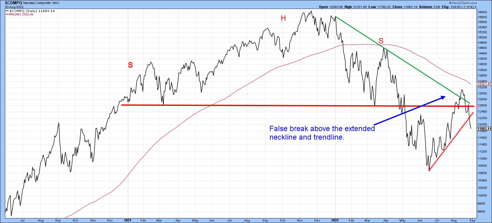
That's also the impression we get from the NASDAQ in Chart 4, which managed to pull itself back above the extended head-and-shoulders neckline but failed to hold that position. The break was confirmed with a drop below the dashed up trendline. It looks very similar to the 1946 top that I referenced a few weeks ago.
Market Has Retraced 50% of the Advance, But is Still Overbought
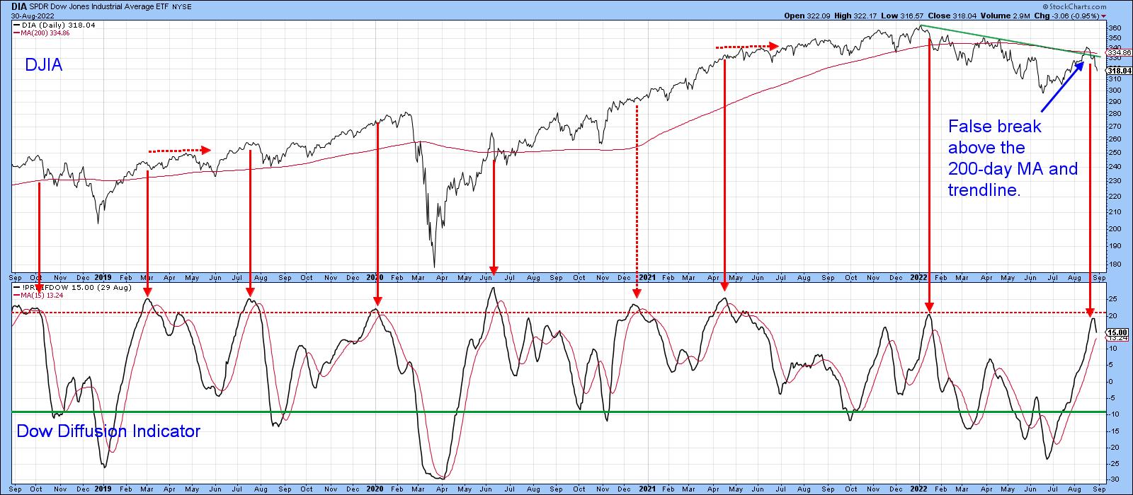
Our final two charts demonstrate that the market remains short-/intermediate-term overbought despite a 50% retracement. Chart 5, for instance, shows that my Dow Diffusion indicator, monitoring DJIA components in a positive trend, has just triggered a sell signal from an overbought reading. You can also see a false breakout by the NYSE itself above the 200-day MA.
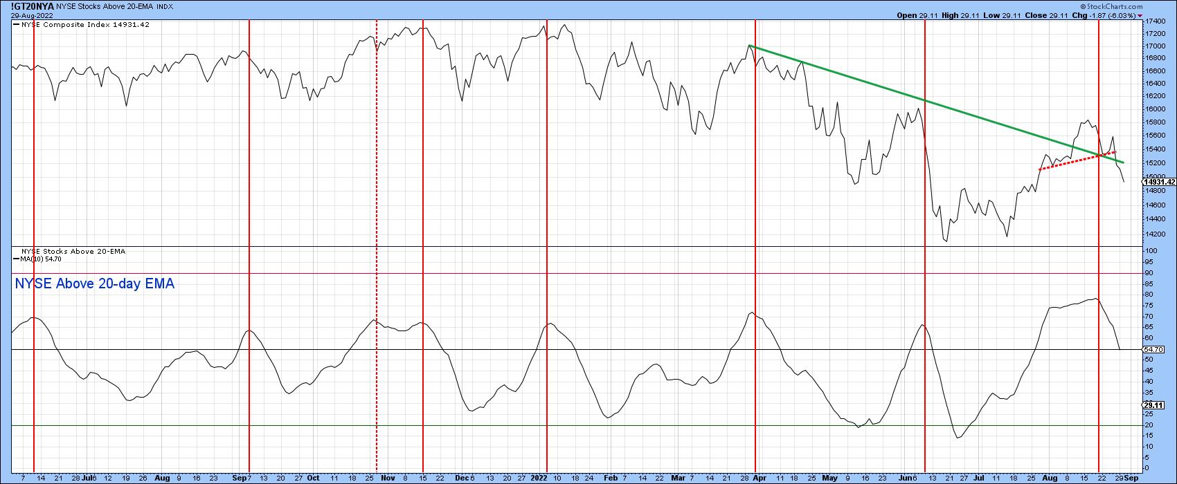
One of my favorite short-term indicators is the percentage of stocks above their 20-day EMA, as featured in Chart 6. It too has triggered a sell signal and, despite the recent decline, remains slightly above the neutral zone. Once again, we see a false breakout by the NYSE Composite above the secondary bear market trendline and the completion of a small head-and-shoulder top.
Good luck and good charting,
Martin J. Pring
The views expressed in this article are those of the author and do not necessarily reflect the position or opinion of Pring Turner Capital Groupof Walnut Creek or its affiliates.


