Preparing for an Upcoming Bond Mini-Bull Market
This may seem like a foolish title, given that the Fed could be about to raise short-term interest rates by as much as 75 basis points in September with further, but smaller, hikes following that. However, bonds revolve around the business cycle in a chronological sequence, as do stocks and commodities. All is revealed, at least in theory in Figure 1. For a more complete explanation, read this.
The green and red arrows show the cyclical lows and highs, respectively, for the three markets as they are expected to materialize in a typical business cycle. We estimate that the current one has reached a point somewhere in the pink shading. That's because our Pring Turner models have all three markets locked in a bearish mode. In addition, all three, using the CRB Spot Raw Industrials rather than the CRB Composite for commodities, are below their 12-month moving averages. If that is a correct assumption, and the markets follow the usual chronological script, the bond market should present itself as the next important buying opportunity.
Before considering the primary trend aspects in detail, a few words on the state of the secular trend are in order, since that will set the context for any buying signal that may develop in the period ahead.

The Secular Trend
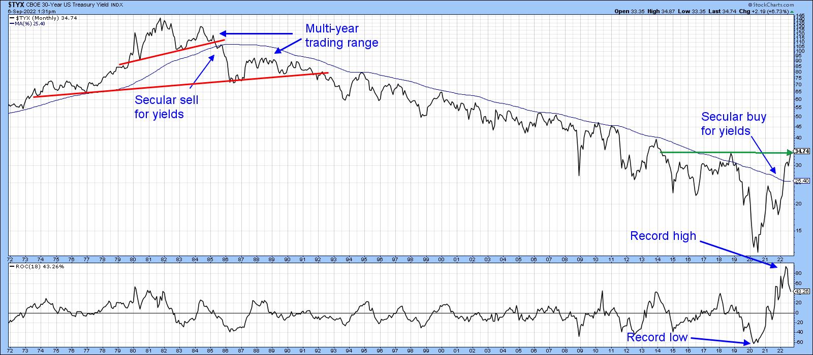
It's important to understand the direction of the secular trend, because that's what determines the characteristics of the primary trends that fall below it. Chart 1 shows that there are grounds for suspecting that the post-1981 trend of declining yields is over. First, the 30-year yield has experienced a positive 96-month MA crossover. Ignoring the 2018 whipsaw, that's the first time the MA has been ruptured since 1985. Second, the 18-month ROC recently experienced a record high. That's bullish in its own right, because it indicates huge underlying upside momentum. Furthermore, this record high was preceded by a record low following a multi-decade decline to represent what I call a bullish "extreme swing."
It's also worth noting that secular reversals since the mid-nineteenth century have been characterized by multi-year trading ranges prior to the new trend getting underway in earnest. For example, the chart shows that the reversal of the post-WWII secular decline experienced a multi-year top as part of its reversal process. If past is prologue, the impending buying opportunity that we see could well turn out to be part of a secular topping-out process for prices (as in Chart 3) or basing action for yields (Chart 1).
Interasset Relationships are Close to a Buy Signal for Bond Prices
One of the ways we can use the knowledge embodied in Figure 1 and identify the prevailing stage in the current cycle is to calculate ratios between the relevant asset classes, which act as a cross reference. Usually, this analysis is more helpful when these relationships are expressed in smoothed long-term momentum format. I use the long-term KST for this purpose, but there is no reason why a slowed stochastic with the right parameters or the MACD cannot be substituted.
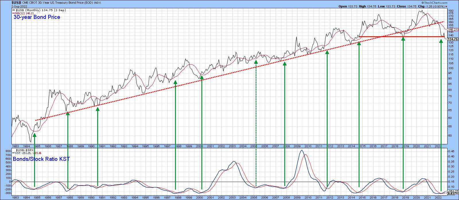
Chart 2 relates a long-term KST, derived from the stock/bond ratio to bond prices themselves. When momentum bottoms, it indicates we have reached a point in the cycle when bonds should be expected to outperform stocks. That usually means the all-clear for bonds to move up in their own right. The KST reversals show there is a consistent relationship between an improving performance for bonds over stocks and a buying opportunity for bonds. Out of the 10 identifiable positive KST reversals, only one (flagged by a dashed arrow) can be said to have been a false positive. An eleventh signal was triggered recently, suggesting that bond prices may soon be headed higher as part of that secular topping-out process.
A more intuitive interasset relationship for bonds themselves comes from the ratio between bonds and their sworn enemy, commodity prices (Chart 3). If you refer back to Figure 1, you can see that, by the time the cycle reaches the pink-shaded area, bond prices have already gone through most of their bear market, whereas commodities are in the early stages of one. That means that bond prices are getting ready to base out since the downward pressure on them from rising commodity prices has dissipated. One way of timing that transitional process is to observe when bonds have begun to outperform commodities. That inflection point seems to develop when the KST of the bond/commodity relationship crosses above its 9-month MA from a sub-zero position, hence the arrows. At present, the KST is in a declining mode, so a bullish signal has not yet been given. However, it has reached an overstretched reading on the downside, which makes an imminent reversal more likely.
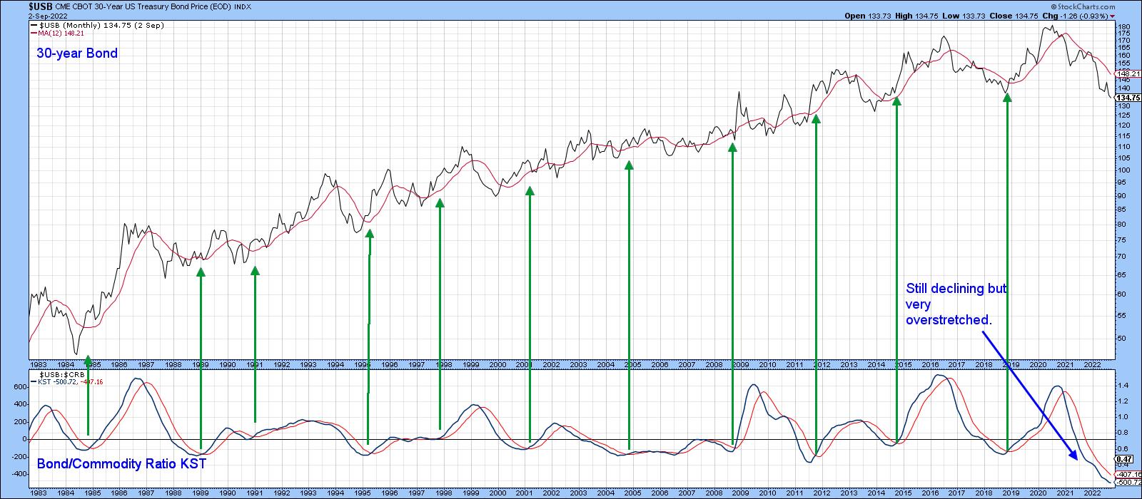
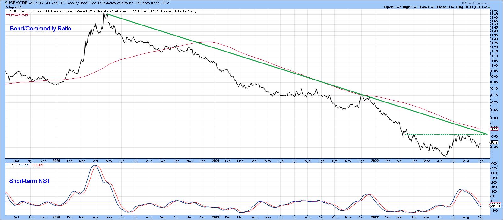
Chart 4 features the ratio itself together with a short-term KST. It looks like the ratio is trying to form a small base. Its completion and the violation of the down trendline would probably be sufficient to reverse the long-term KST in the previous chart. Remember, it's possible to update any of the charts in this article by simply clicking on them.
Conclusion
There are some encouraging signs that bonds may be getting ready for a rally. The bad news is that it would likely represent a large retracement move as part of an overall secular topping-out process. Hence the use of the word mini-bull in the title.
Good luck and good charting,
Martin J. Pring
The views expressed in this article are those of the author and do not necessarily reflect the position or opinion of Pring Turner Capital Groupof Walnut Creek or its affiliates.