Dollar and Commodities Poised at Possible Inflection Points
The Dollar Index has had a good run to the upside, but is starting to show some possible signs of fatigue. That potential weakness could take the form of an actual reversal in its primary uptrend, or an intermediate counter-correction. At the same time, commodities, which often (but certainly not always) move in the opposite direction to the dollar, appear to be in the process of retracing some lost ground. Let's consider both markets in turn.
Dollar Index is Overstretched
Chart 1 compares the Dollar Index to its long-term KST. Note that this momentum indicator has reached the overstretched red horizontal line. It has achieved that feat five times since 1976; each was followed by a primary trend reversal or a multi-month trading range, aside from one exception that developed during the very powerful 1980-1985 run up. The game is not yet over, as the KST is still climbing. However, there can be no disputing that the level of risk for the bulls is elevated.

Chart 2 tells us that the Index has reached a crucial support level in the form of its 2022 up trendline. Also, the 14-week RSI has recently penetrated its 2021-2022 up trendline, indicating a loss of upside momentum. Momentum reversals should, of course, be confirmed by some kind of trend break. In this instance, that would occur with a violation of the up trendline at around the 109 area.
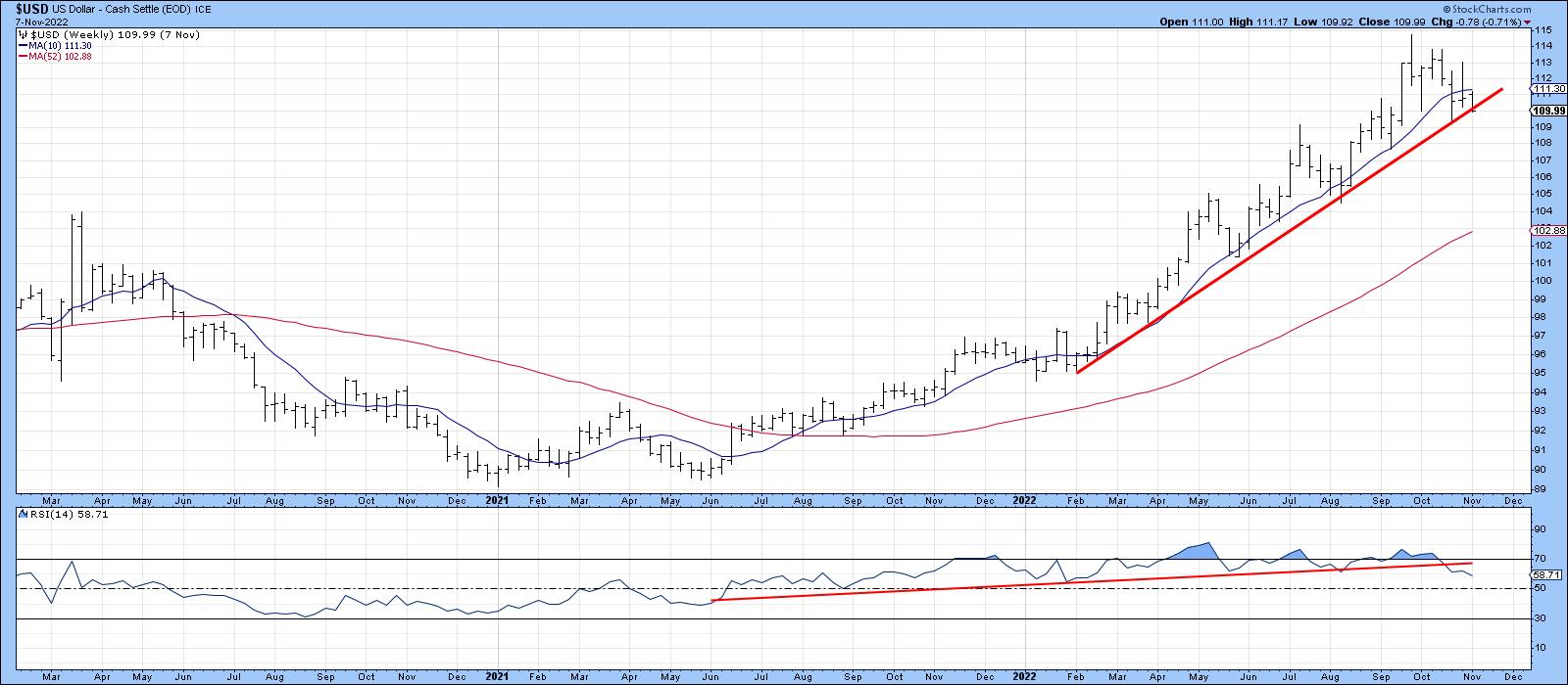
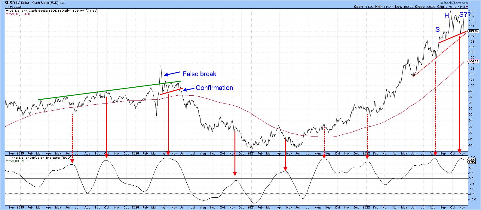
Chart 3, featuring daily data, offers another benchmark. This time, it's the neckline of a small potential head-and-shoulders top in the vicinity of 109.50 and a 5-month support trendline at approximately in the same area. Note also that the Dollar Diffusion Indicator has just begun to reverse to the downside. Recent sell signals such as this have not been very effective, since they were triggered against the backdrop of a strong rally. The same may also be true for the latest signal. However, if that 109-109.5 area is violated, the odds of a valid diffusion sell signal being effective will increase substantially.
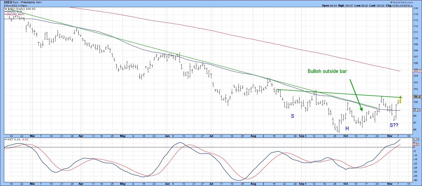
Finally, Chart 4 checks the euro's progress. Here, we see a mirror image of the Dollar Index. That's not surprising since the euro has a 57% weighting. In this instance, the currency has already violated its 2022 down trendline and 10-week MA, both of which proved to be overwhelming resistance on the way down. It is now in the process of testing the neckline of a potential inverse head-and-shoulders pattern and is being supported by a rising short-term KST.
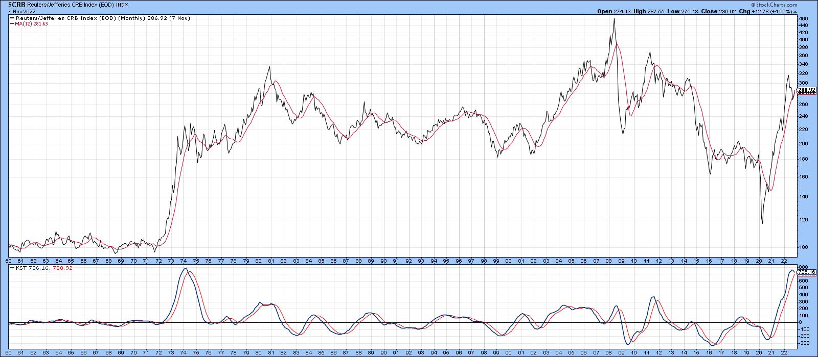
CRB Composite Attempting a Retracement Rally
I am using the word "retracement" rally because the CRB Composite, like most other commodity indexes, is very overstretched on the upside. Indeed, the long-term KST has only reached its current level once before, in 1974. That does not preclude a new high, but make it that much more problematic. The 1974 experience, for example, was followed by a multi-year trading range.
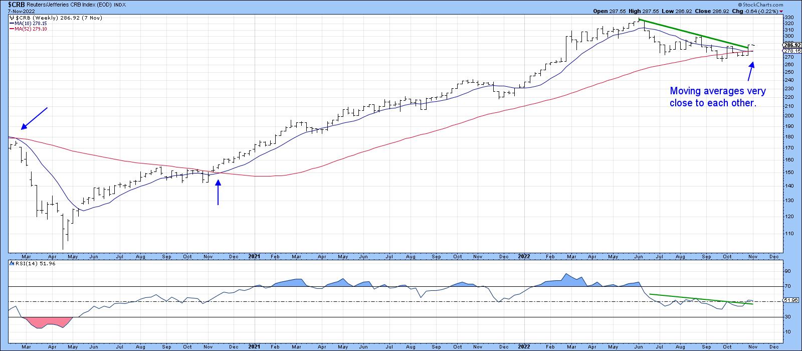
That said, Chart 6 tells us that the intermediate picture is far more balanced, as evidenced by the fact that the 10- and 52-week MAs are literally overlaying themselves. The two blue arrows in 2020 show that, when these averages came close to each other, a subsequent widening of the gap between them was followed by a significant price move. In the current situation, it seems as though the price wants to break above its 2022 down trendline, though the break is not yet decisive. The RSI is already hinting at a similar outcome, as this oscillator has tentatively broken out from a reverse head-and-shoulders of its own.
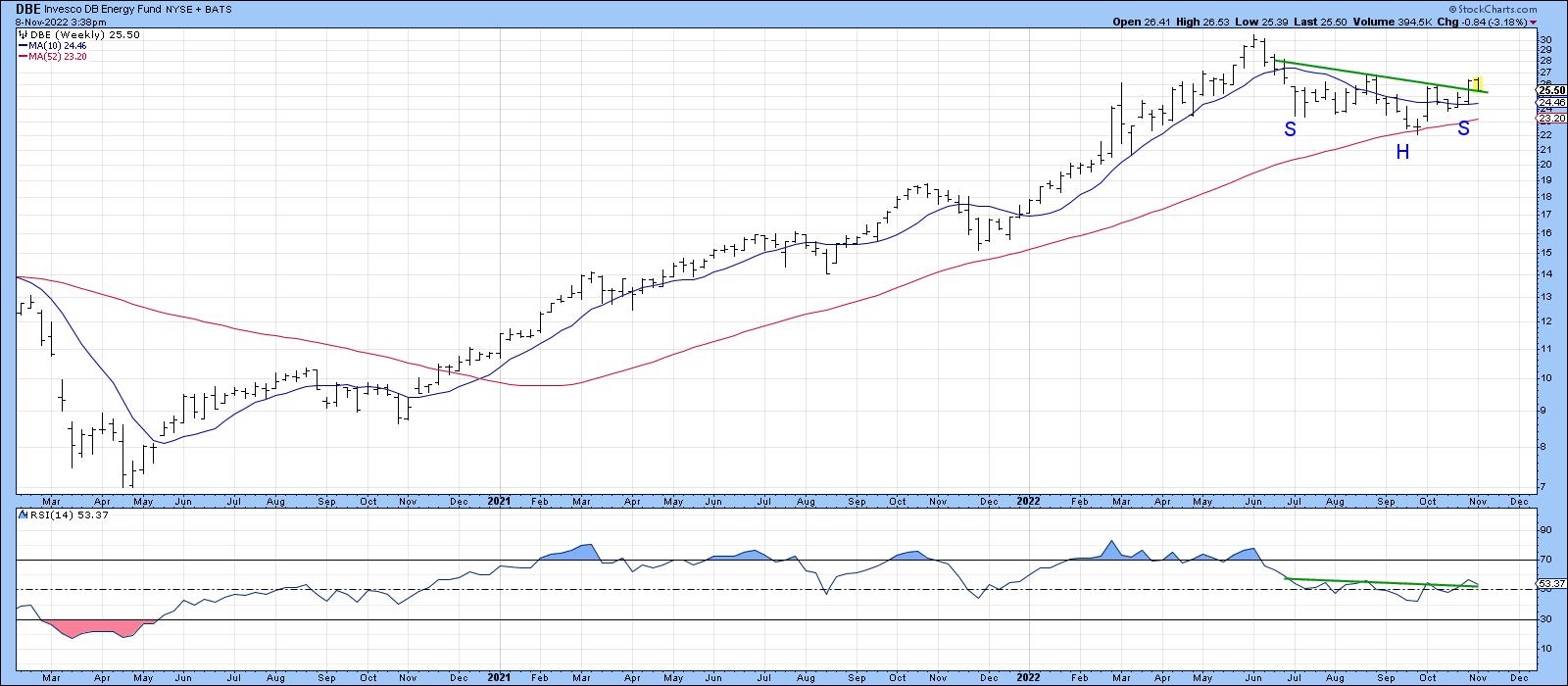
Energy is the largest component of the Index. It is represented in Chart 7 by the DB Energy Fund (DBE). In this instance, both moving averages are in a rising trend, and the price has started to move above the neckline of a reverse head-and-shoulders formation. The RSI has completed a similar pattern, all of which suggests a test of the June highs is likely.
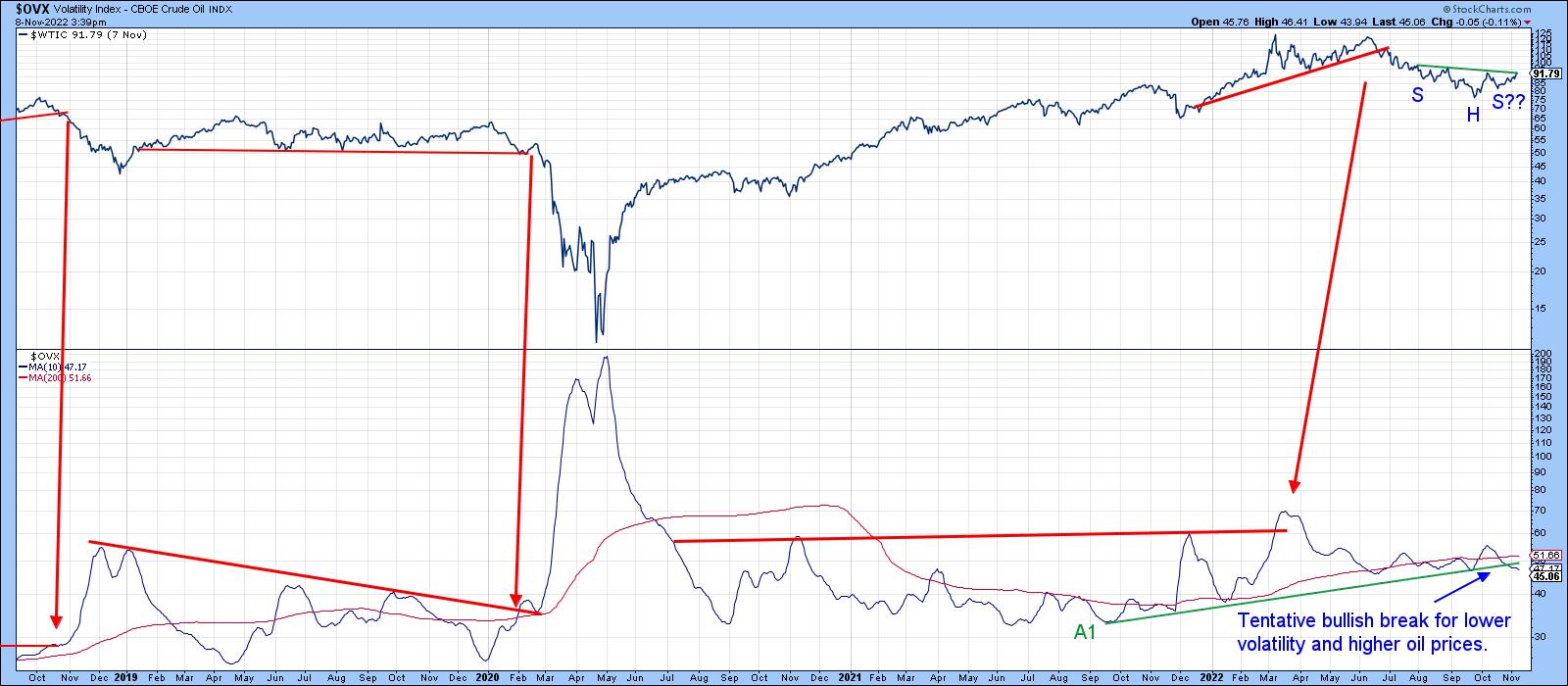
One thing to watch in this regard is the Oil Volatility Index ($OVX), shown in Chart 8 along with West Texas Intermediate. The various trendlines and arrows demonstrate that, when confirmed with a trendline break, rising volatility is usually negative for the price and vice versa. It doesn't always work out, though, as we can see from the spurious sell signal in 2011.
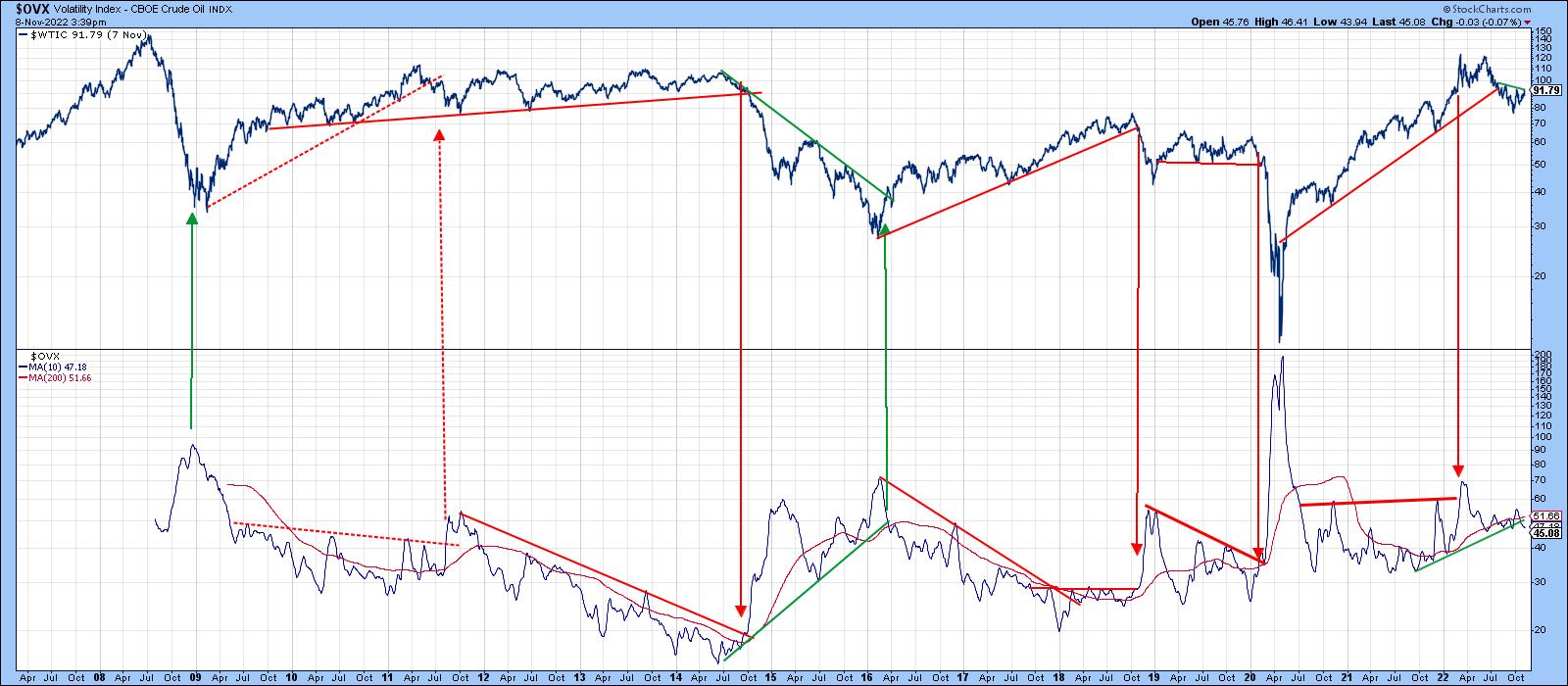
Chart 9 focuses on a more recent rendition of the same arrangement. Here, we see the price poised to complete a 5-month inverse head-and-shoulders and the $OVX edging below its 2021-22 up trendline (A1). It's not yet triggered a buy signal, but is certainly worth monitoring in the period directly ahead in case one does develop.
Good luck and good charting,
Martin J. Pring
The views expressed in this article are those of the author and do not necessarily reflect the position or opinion of Pring Turner Capital Groupof Walnut Creek or its affiliates.