What Does the Wall-to-Wall Media Coverage of the FTX Collapse Mean?
Last May, I wrote an article entitled "Bitcoin Bubble Finally Bursts", where I laid out the technical case for substantially lower prices. It was partially based on the fact that the 18-month ROC had peaked from a level in excess of 200%. My research, featuring 26 case studies of markets(not individual stocks)spread over hundreds of years, indicated that, whenever the 18-month ROC peaked from a reading in excess of 200%following several years of advance, that was enough to kill the bull market in question. Indeed, the average decline following such action was 67%, requiring an average of 20 years to recapture all those losses.
Chart 1 shows that the Bitcoin ROC hit a record-shattering 2,400% in 2017. Remarkably, it only took three years to recapture the subsequent 80% decline. In 2021, the Bitcoin ROC reached a more modest, but still significant, 750%. The previous record in excess of 500% had been held by silver in 1980. The loss has so far approximated 75%, so the drop is definitely in the ballpark of downside activity for burst bubbles.

One of the characteristics of an unwinding of a bubble is the exposure of over-leveraged players. Indeed, I concluded the article by saying "with easy money no longer available, watch out below, as there are likely to be a substantial number of Warren Buffet's naked and fraudulent swimmers yet to be exposed." That brings us to the recent wall-to-wall coverage of the FTX collapse, resulting in cover stories for The Economist, Businessweek and Forbes. When such events grab the attention of the general-purpose media and public, in addition to regular market participants, it is often a good time to examine the charts for a possible reversal. After all, if everyone is aware of a problem, it's likely that it has already been factored into the price. From a contrarian aspect, then, it's a good idea to take a second look at the technical position to see what, if anything, has changed.
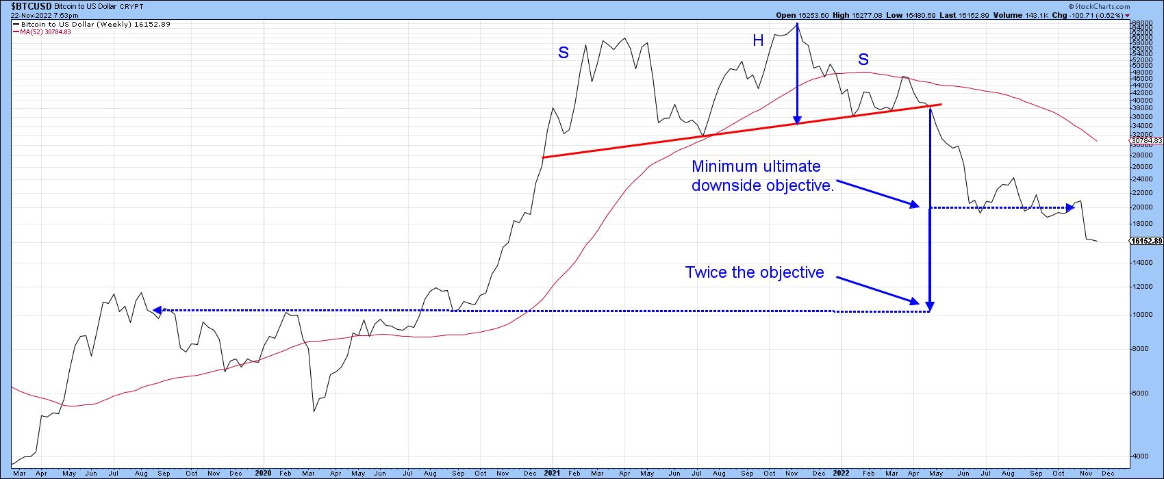
Chart 2 indicates the price recently completed a head-and-shoulders top and exceeded its minimum ultimate downside objective of around $20,000. Prices often move in multiples of the objective. Interestingly, a double count indicates a move to the $10,000-$12,000 zone, where there is substantial support as flagged by in the vicinity of the 2019 and 2020 rally highs. To be clear, this is not meant as a prediction, but more as a statement of possibilities.
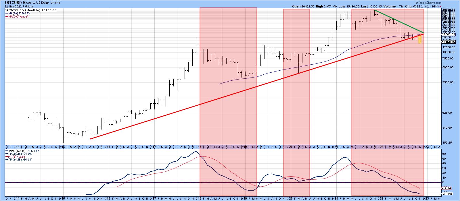
The pink shadings in Chart 3 point up when the 6-month EMA of the price is below its 15-month counterpart. This indicates a current bearish environment, especially as the price just violated its secular up trendline and 50-month MA in a fairly decisive manner. Markets reflect people in action; people can and do change their minds, so it's always possible that the break could turn out to be a whipsaw. The FTX collapse and publicity offers potential justification for such an outcome. However, it's never a wise policy to bet on a false signal until suspicion is outweighed by actual evidence.
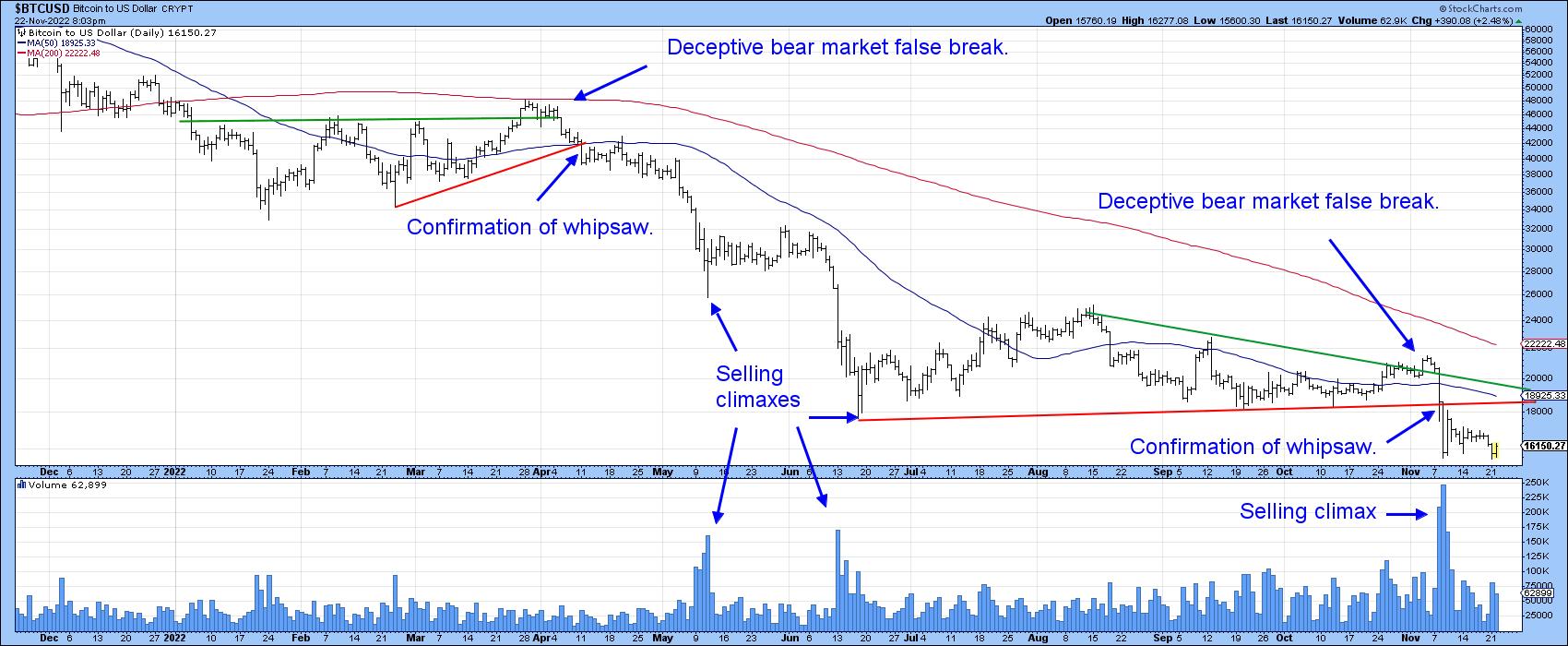
At first glance the break (Chart 4) looks valid, as the price traces out and subsequently completes a bearish consolidation head-and-shoulders. That's perfectly right and proper. However, there is one thing, apart from contrary thinking, which worries me about the validity of the break, and that lies with giant bullish selling climax immediately following the breakout.
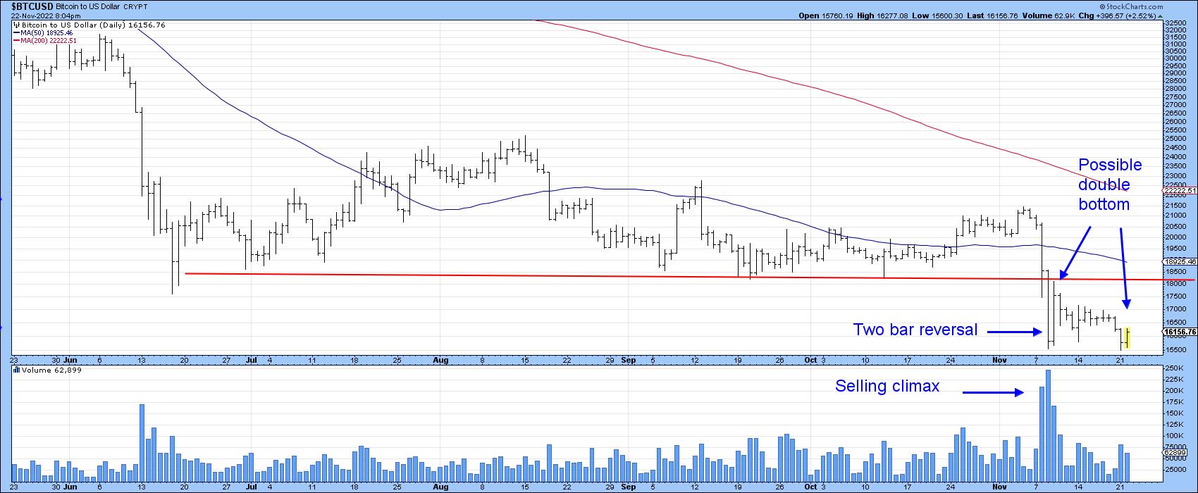
Drilling down to more recent activity in Chart 5, we see the possibility that the climax represents the first low in a double bottom formation. It certainly has the characteristics of one, with heavy volume accompanying the first bottom and substantially less on the second. A decisive drop below this trading range would, of course, invalidate the double bottom scenario. Double bottoms, though, must be confirmed, with the price experiencing an upside breakout. That's an event that has obviously not happened yet. A starting point would be a rally that takes the price north of its red breakdown trendline and 50-day MA at around the 18,000-18,500 zone. However, we need to be very careful, as the likelihood of one of history's largest bubbles taking less than a year to unwind seems a little optimistic.
Good luck and good charting,
Martin J. Pring
The views expressed in this article are those of the author and do not necessarily reflect the position or opinion of Pring Turner Capital Groupof Walnut Creek or its affiliates.


