Is Gold a Buy or a Sell?
The price of gold has been on a tear recently, bouncing sharply from its October low. It could be a good time to see whether this is the start of a new bull market or just a flash in the pan. Let's begin with the big picture and work our way down to the short-term aspects.
The first chart plots the price of gold on a quarterly basis. It's been deflated by the CPI in order to appreciate gold's ability to act as an inflation hedge. It all depends on where you buy it, of course, but by and large, unless gold was purchased close to any of the three highs in 1980, 2012, and late 2020, it would have provided an acceptable hedge. A break above the green resistance trendline would, of course, have been super bullish. However, a break beneath the 2000–2022 secular up trendline has taken place first. That penetration was confirmed by the quarterly Coppock Indicator crossing below its eight-quarter moving average (MA), thereby pushing the chart into a long-term bearish mode. The white areas, where the indicator is below its MA, tell you that price is at its most vulnerable under such an environment.

CHART 1: QUARTERLY CHART OF GOLD.
Chart source: StockCharts.com. For illustrative purposes only.
Chart 2 features the price in nominal terms and offers a more optimistic note since the latest rally has enabled it to move back above the extended secular up trendline and the 48-month MA, which had also previously been breached. That throws open the possibility the downside break will turn out to be a whipsaw. False breaks are typically followed by above-average price moves in the opposite direction, as traders scramble to get back to the right side of the market and the capitulation caused by the downside break leaves prices clear of serious overhead resistance.
One thing the price will have to overcome is the bearish status of the percentage price oscillator (PPO) in the bottom window. The oscillator goes bullish for prices when it moves above zero. Extended periods when this has been the case have been flagged by the green shading. If you look carefully, you can see three small arrows which denote whipsaw crossovers by the oscillator. These, however, are few and far between, given the chart's 40-year history. At the moment, the model is in a bearish mode, as the oscillator is slightly below zero. However, it would not take much to reverse that position.
One aspect that should be respected is that the PPO arrived in a sub-zero position following the rupture of its 2014–2022 up trendline. The ability to construct trendlines for this indicator has been rare. The arrows joining the PPO to the price, though, indicate that previous PPO trendline violations have been followed by important price moves. That does not mean that the 2000–2022 break is guaranteed to be valid, but it does raise the bar for forecasting a whipsaw a tad higher.
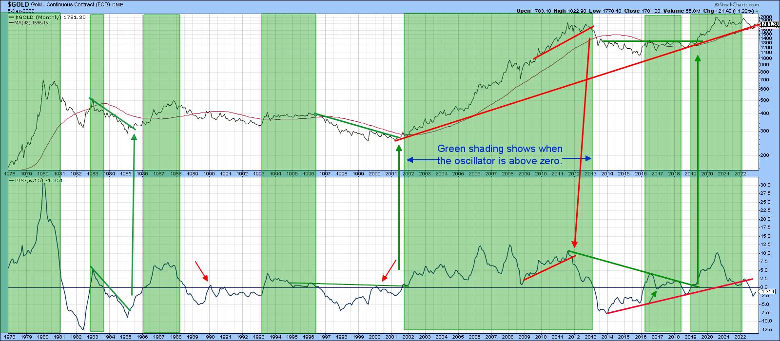
CHART 2: GOLD AND THE PERCENTAGE PRICE OSCILLATOR. The PPO is slightly below zero but it would be worth keeping an eye on to see if there's a reversal.
Chart source: StockCharts.com. For illustrative purposes only.
In order to prove a false move beyond a reasonable doubt, we have to make sure that price confirms with some kind of a trend break. So, let's take a look at the post-2020 price activity more closely. Bear in mind that markets reflect people in action, and people can and do change their minds. That means that markets can as well.
In the chart of SPDR Gold Shares (GLD) in chart 3, you see that in early 2022, price broke out from a downward-sloping reverse head-and-shoulders. Ultimately, this proved to be an invalid move, which was confirmed when the price dropped below both trendlines and the 65-week exponential moving average (EMA). That should have been a signal for an above-average decline, especially because of the breakdowns featured in charts 1 and 2. That did not prove to be the case, as the late November rally replaced what should have been more follow-through on the downside.
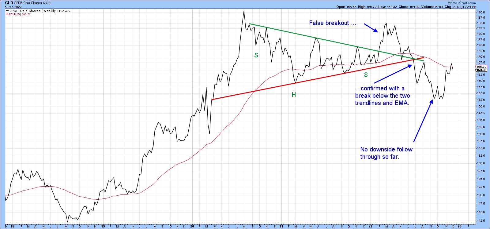
CHART 3: WILL THE LATE NOVEMBER RALLY FOLLOW THROUGH? So far, there has been no downside follow through. All the more reason to keep an eye on the yellow metal.
Chart source: StockCharts.com. For illustrative purposes only.
At this point, nothing has fundamentally changed from the original breakdown, except that the nominal price is back above the extended secular bull market trendline in chart 2. It could change, though, if that break is confirmed by price action indicating that traders have changed their minds once again and are now looking for a bullish outcome.
In chart 4, the breakdown trendline has been re-drawn to reflect a double top. The price didn't hold below it for very long and has now found resistance at the 65-week EMA and extended green trendline. I have traced out a possible upside breakout that would greatly increase the odds that September's downside break was indeed spurious. Remember, this isn't a prediction. It's merely a possible scenario.
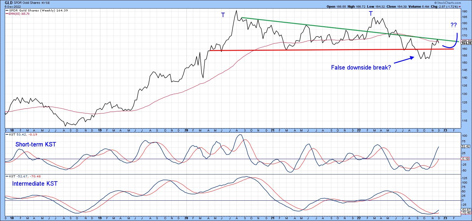
CHART 4: AN UPSIDE BREAKOUT IN GOLD? GLD has now found resistance at the 65-week EMA and the extended green trendline. There's a chance GLD could break out to the upside.
Chart source: StockCharts.com. For illustrative purposes only.
Finally, chart 5 compares the GLD to a Special K (SPK) momentum indicator, which you can read about here. The trend of the price and SPK generally move together, so knowing the long-term direction of the momentum indicator really helps with ascertaining that for the price. The jagged nature of the SPK lends itself to trend line construction and the crossovers of its red signal line also help in identifying trends. This smooths out the jaggedness of the indicator. The SPK has been in a downtrend for some time but isn't far away from crossing above its signal line and 2020–2022 down trendline. A daily close that can hold above the $171-173 area would probably do the trick.
Remember, you can always update this chart going forward by clicking on it.
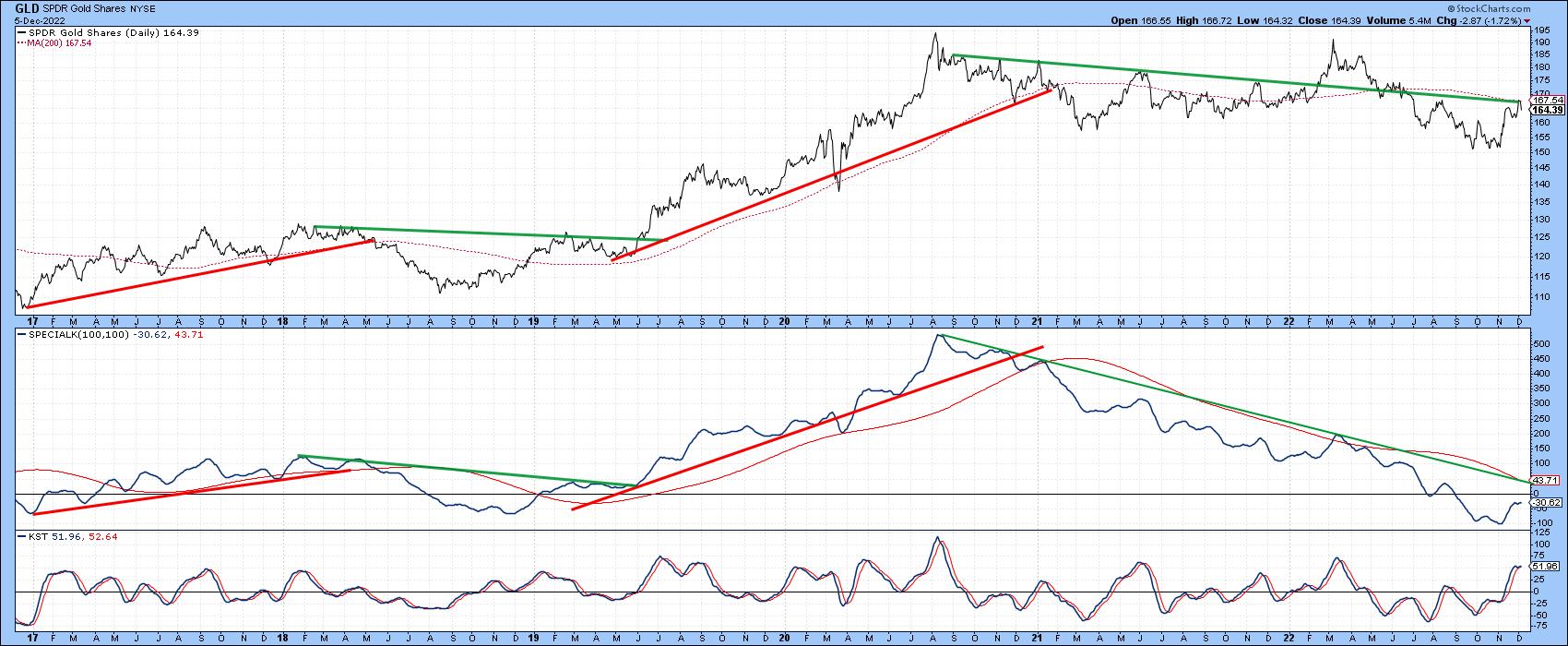
CHART 5: GLD AND ITS LONG-TERM TREND. The KST indicator helps to identify the long-term momentum direction.
Chart source: StockCharts.com. For illustrative purposes only.
The $170 Level in Gold
The longer-term Coppock and PPO indicators are bearish for gold, but there is a possibility that the price may have experienced a false downside break. Evidence in the form of price confirmation is required first. That would likely happen with a Friday close for the GLD that can hold above the $170 area. Until then, the whipsaw scenario remains unproven.
Good luck and good charting,
Martin J. Pring
The views expressed in this article are those of the author and do not necessarily reflect the position or opinion of Pring Turner Capital Groupof Walnut Creek or its affiliates.


