Santa Comes Up Empty-Handed

Statistically speaking, the last half of December is the best seasonal period of the year, part of which serves as what is popularly known as the Santa Claus rally. The first half of the month also has a slight edge to the upside, though that has not worked out so well this year, as the S&P 500 Index ($SPX) has slipped from 4080 on November 30 to 3852 on December 16. That's a loss of around 5.5%. This could set the scene for a robust second half of the month, but, unfortunately, it's not what my interpretation of the technical position is saying.
A Bearish Outside Bar
Chart 1, for instance, shows that last week's action represented a bearish "outside" bar. Notice that I put the quotes around the word outside. That's because it is not a perfect rendition of a true outside bar. To do that, the bar should totally encompass the trading range of its predecessor and then some. While last week's bar takes out the low of the previous one, the high just reaches the previous bar's high. I believe that technical interpretations should follow common sense, which means that it is occasionally appropriate to slightly bend the rules. After all, we are trying to understand the underlying psychology of what is going on and whether things may have changed.
In this example, we see the price open up for the week and quickly rally to the previous week's high. It also touched considerable resistance at the 52-week moving average (MA). By the end of the week, though, sellers had pushed the price below the previous bar's low giving them a decisive victory. Outside bars usually have an effect of between 5–10 bars, which, in this case, would take us through that bullish year-end period. Also supporting a possible negative scenario is that similar "outside" bars can be observed for most of the sectors.

CHART 1: OUTSIDE BAR ON THE S&P 500 INDEX. On this weekly chart of $SPX, you see that the index is trading below its 52-week moving average, there's an outside bar pattern, and the 9-day relative strength index (RSI) is declining. All three point to a potentially negative scenario.
Chart source: StockCharts.com. For illustrative purposes only.
Chart 2 also indicates a high probability that the October lows are about to be probed. First, $SPX has violated its post-October up trendline. Second, price action since mid-November has turned out to be a small head-and-shoulders top; however, the head and right shoulder whipsawed above the 200-day MA. Sometimes, invalid moves such as this are followed by a re-grouping and subsequent push to new highs; that's why it's a good idea to make sure that false upside breaks are confirmed with additional negative evidence. In this case, confirmation has taken the form of two decisive trendline violations and a negative crossover of the 200-day MA.
Finally, we can see that the 9-day relative strength index (RSI) barely moved above its equilibrium point (50), as $SPX was challenging its recovery high, and that the short-term KST, in the lower window, remains in a negative mode.

CHART 2: IS $SPX HEADED TOWARD ITS OCTOBER LOW? A break below the October rally uptrend, a negative crossover of the 200-day MA, and RSI's lack of breaking above the 50 level point to a potential decline in $SPX.
Chart source: StockCharts.com. For illustrative purposes only.
Chart 3 compares $SPX to the NYSE common stock and regular A/D lines. Both have violated small up trendlines, but notably found resistance at their respective 200-day MAs, thereby confirming that the long-term trend remains a negative one.
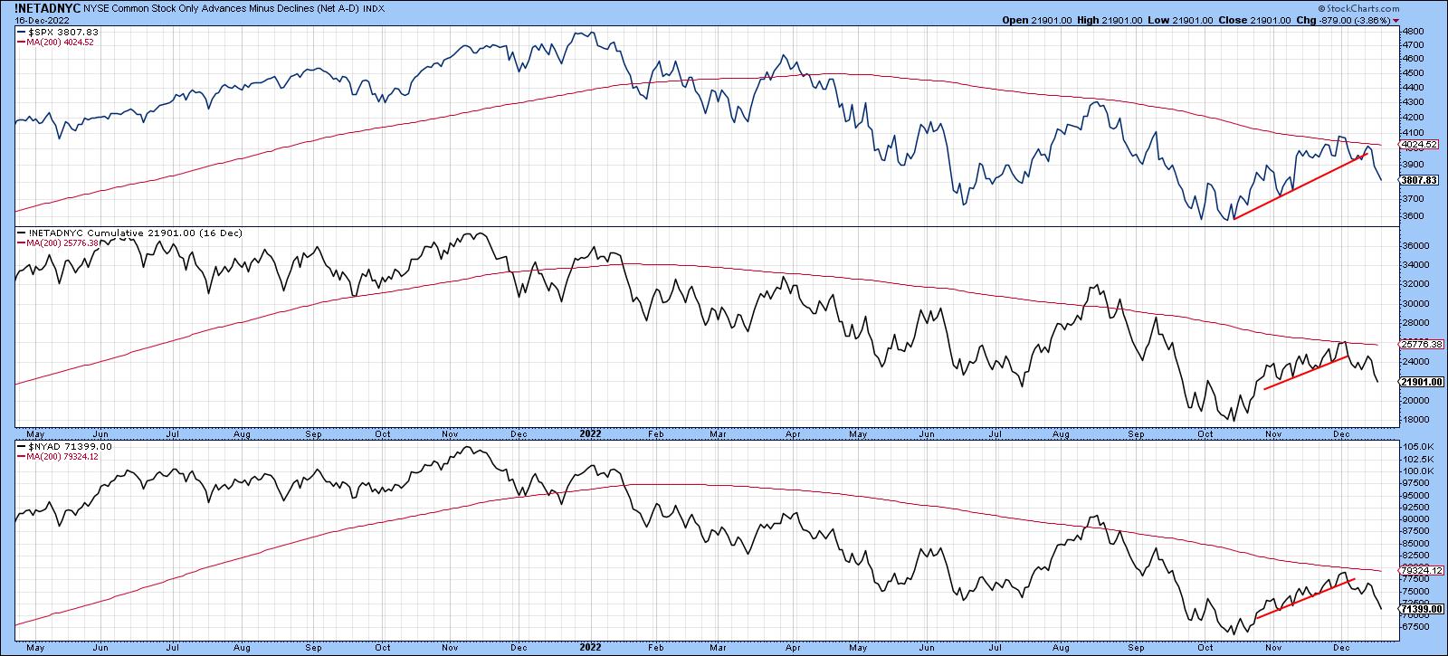
CHART 3: WHAT ARE MARKET BREADTH INDICATORS SUGGESTING? The advances vs. declines indicators have broken below their upward-sloping trendlines and found resistance at their 200-day moving averages.
Chart source: StockCharts.com. For illustrative purposes only.
Chart 4 displays my Dow Diffusion indicator, an oscillator that monitors the number of Dow 30 components in a positive trend, applied to the SPDR Dow Jones Industrial Average ETF (DIA). The Dow outperformed $SPX during the post-October rally, as the Dow, unlike the $SPX, was able to surpass its August high. Unfortunately, this breakout turned out to be false, as the Dow completed and broke down from a small top. To make matters worse, that reversal-type activity has triggered a sell signal from an overextended oscillator. The arrows show that not all such signals have been followed by a decline. Generally speaking, though, it's usually not a great time to be adding to positions, especially following the false upside break.

CHART 4: DOW DIFFUSION INDICATOR TRIGGERED A SELL SIGNAL. A false breakout above a downward sloping trendline along with a sell signal from the Dow Diffusion indicator suggest the Dow also is in a downward trend.
Chart source: StockCharts.com. For illustrative purposes only.
It's also worth noting that things are not looking so well from a global short-term perspective either. The iShares MSCI World ETF (ACWI) continues to extend the series of declining peaks and troughs that began in January. The price has also experienced a false breakout above its bear market trendline and 200-day MA. This has now been confirmed by the completion of a small head-and-shoulders top. The Pring Global A/D Line was never strong enough to challenge the 200-day MA and has now violated its post-October up trendline. Looks like Santa is not going international either!
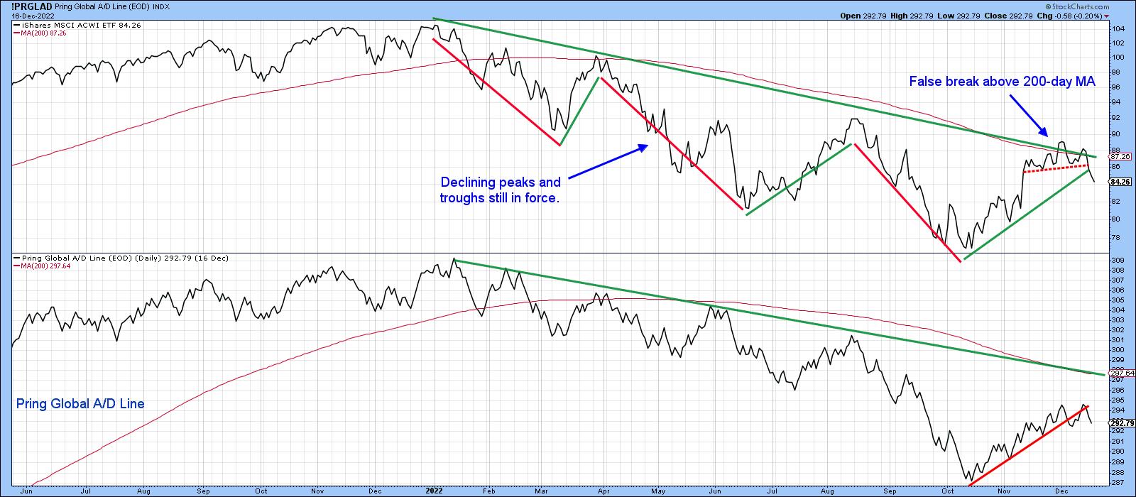
CHART 5: GLOBALLY, IT'S PRETTY MUCH THE SAME STORY. Declining peaks and troughs, a false breakout, and the Pring Global A/D line all suggest that international markets are likely to see a downtrend as well.
Chart source: StockCharts.com. For illustrative purposes only.
Good luck and good charting,
Martin J. Pring
The views expressed in this article are those of the author and do not necessarily reflect the position or opinion of Pring Turner Capital Groupof Walnut Creek or its affiliates.


