The Business Cycle Is Poised for a Stage 1 Signal
One of my favorite chart lists is one called Interasset Ratios. As the name implies, it contains a library of charts that plot various long-term relationships between asset classes, such as the stock/bond ratio, bond/commodity relationship, and so forth. It's not something you want to focus on every day; occasionally, though, these interasset relationships come up with some insightful signals that help identify the prevailing phase of the business cycle and, more importantly, which asset classes look attractive going forward.
The Business Cycle, In Theory
By way of background, Figure 1 shows an idealized business cycle, with the expected chronological peaks and troughs for bonds, stocks, and commodities indicated by the letters B, S, and C. There are three markets, each with two turning points, a top, and a bottom. That means there are six stages to the cycle, each of which has a different investment environment. For example, the diagram shows the current phase, as determined by my models, to be Stage 6. That's one that has historically proved challenging for all asset classes. You can read more about the Six Stages and how they are identified at this link. This approach is also followed closely in my monthlyIntermarket Reviewand is a guiding principle for managing accounts atPring Turner.

Analyzing interasset relationships helps in determining the current stage of the cycle and what to look for next. For example, if the models are correct, and the current environment is indeed a Stage 6, the next step in the sequence should be a transition to Stage 1. The word "should" is emphasized because, in the real world, the cycle does not always progress in an expected way. For example, of the 13 identified cases of a Stage 6 since the mid-1950s, six moved directly into a (bullish for bonds) Stage 1. However, four instances skipped over Stage 1 and went directly to Stage 2, which is bullish for stocks and bonds. The remaining four examples retrograded to Stage 5, where only commodities are positive.
Indications of a Move to Stage 1
If we are close to Stage 1, it would be realistic to see a couple of things happen. First, bonds, which are the only bullish market in Stage 1, should be outperforming commodities.
The reason why bond prices have fallen during and prior to Stage 6 is because of building inflationary pressures. Consequently, if a bond bull market is to get underway, it's important to see those inflationary pressures dissipate and transition to deflationary ones. In that respect, Chart 1 features a long-term KST of the ratio between bonds and commodities. Rising momentum is deflationary because it shows that bonds are outperforming commodities. The green arrows indicate that bottoms in the KST for the $USB/CRB ratio represent good buying opportunities for bonds. The indicator has already begun to turn up, which suggests a likely bottoming, but we really need to see a move above the MA.
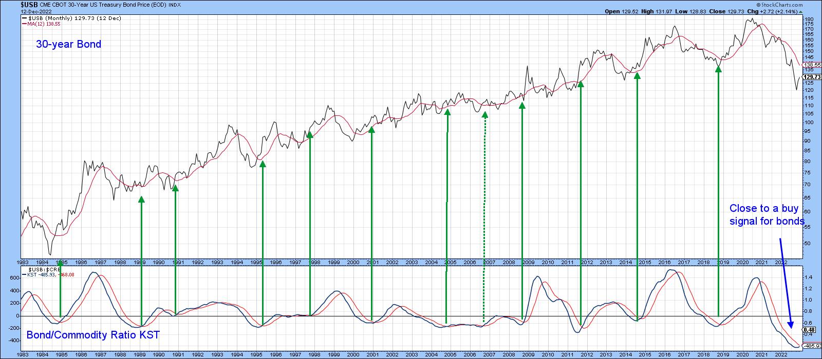
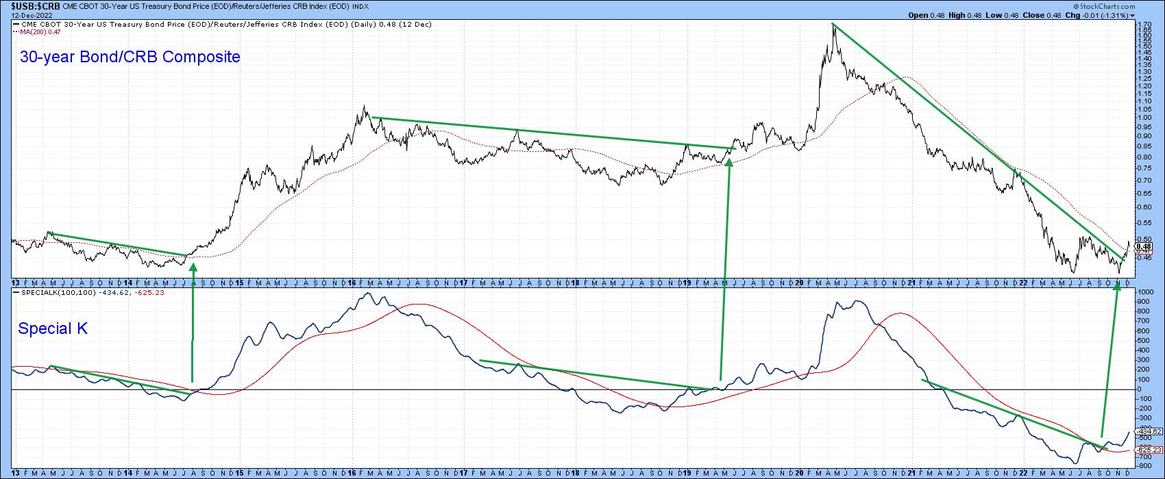
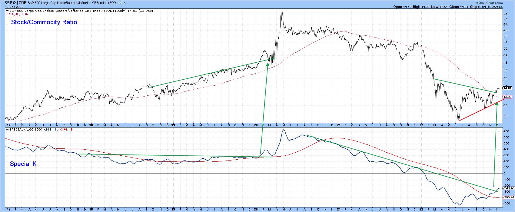
Chart 2 features the actual ratio, together with a Special K (SPK) indicator.The ratio looks like it has bottomed since it has crossed above its 200-day moving average (MA) and surpassed the 2020–2022 down trendline. The SPK has also violated a down trendline. More importantly, it has rallied above its signal line and begun a series of rising peaks and troughs. Given this combination, the odds are strongly in favor of a deflationary trend going forward, which is certainly consistent with a late Stage 6 or early Stage 1.
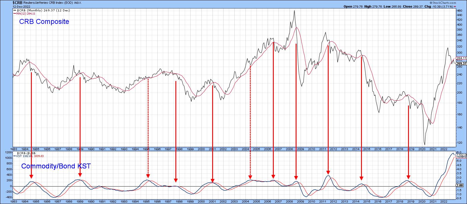
We can also turn this around and look at it from a pure commodity aspect, as in Chart 3, where peaks in the commodity/bond KST can be seen to forecast lower commodity prices in most cases. The peaking action of smoothed momentum suggests commodities are still vulnerable.
Possibility of a Direct Move to Stage 2?
In Stage 2, stocks are rallying and commodities are falling. That means that if the ratio between them is advancing, there is a good chance the cycle may have reached Stage 2. Chart 4 demonstrates that such a transition is possible in the current environment. It features a long-term KST for the stock/commodity ratio. The green arrows tell us when it crosses above its MA for a buy signal. Since 1960, there have been 17 of them, and only one, during the 2007–2009 bear market turned out to be a false positive. In the last month, this momentum indicator has started to flatten, which could be a prelude to an actual upside reversal and positive MA crossover. Stocks look like they are very oversold relative to commodities and are due for a reversal.
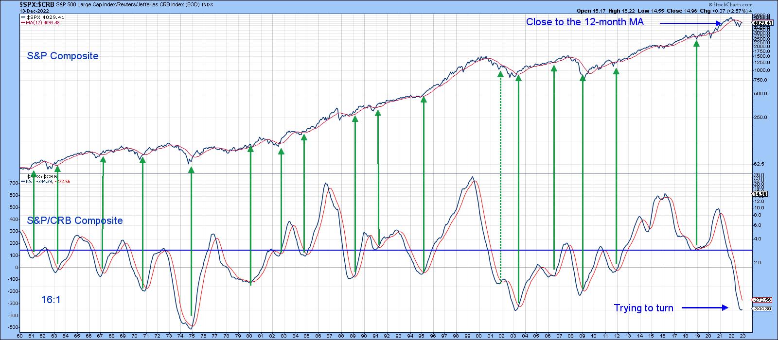
Chart 5, which zeros in on the ratio itself, indicates that it has just broken out from a downward-sloping reverse head-and-shoulders. Furthermore, its SPK has also violated a down trendline and crossed above its signal line. All of this suggests that stocks have halted their cyclical decline against commodities.
Are Stocks at a Turning Point?
Weakening inflationary forces, as evidenced by the relationship between commodities and bonds, suggest that a Stage 1 environment could be close at hand. Moving directly to a Stage 2 phase of the cycle is also a possibility, as the KST for the relationship between stocks and commodities looks as though it may be bottoming. While this is a very reliable indicator, it did disappoint in 2008. At that time, the S&P 500 Index failed to cross above its 12-month MA. It's currently a tad below the average, thereby indicating a very finely balanced technical position that could easily turn in either direction.
Good luck and good charting,
Martin J. Pring
The views expressed in this article are those of the author and do not necessarily reflect the position or opinion of Pring Turner Capital Groupof Walnut Creek or its affiliates.


